🔥 Today Only: Save 30% on Premium — Offer Ends Soon! - Upgrade Now!
Table

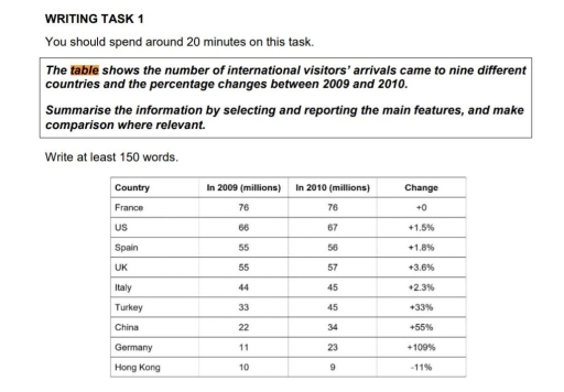
Band 4+: The table shows the number of international visitors' arrivals came to nine countries and the percentage changes between 2009 and 2010.

Image for topic: The table shows the number of international visitors' arrivals came to nine countries and the percentage changes between 2009 and 2010.
Our system will evaluate the answer based on this AI-generated description.
The image displays a table detailing international visitor arrivals to nine countries with specific data points for the years 2009 and 2010, alongside their percentage changes. France saw 76 million visitors in both years with 0% change; the US received 66 million in 2009 and 67 million in 2010, marking a +1.5% change; Spain's visitors remained constant at 55 million, resulting in +1.8% change; the UK had 55 million in 2009 and 57 million in 2010, a +3.6% increase; Italy experienced an increase from 44 million to 45 million, equating to +2.3%; Turkey increased from 33 million to 45 million yielding +33%; China saw a rise from 22 million to 34 million, a significant +55% jump; Germany's visitors increased from 11 million to 23 million, a substantial +109% change; Hong Kong decreased from 10 million to 9 million, showing -11% change.
Given the complexity of the image, the above description may not be entirely accurate.
Note: Both the topic and the answer were created by one of our users.

The table compares the number of visitors arrival different countries and show the results in percentage and how changed between 2009 and 2010.

Overall, the most important data according with the table is Germany, between the years 2009 and 2010 had increase considerably high with a change 109 percentage of visitors, in compare of France not had a change in 2009 and 2010.

After that, the country with most visitors was China, this place had a 22 million of people in 2009 and the visitors increase in 2010 with 34 million that’s indicata a increase of 55 percent. Another important data is the visitor in Hong Kong, where in 2009 only had 10 million of people and than in 2010 the numbers of visitors decrease with 9 million, an a 11 percent lost. And the last one country with less changes between both years was United States that only had increase 1 million of visitor.

Word Count: 155

Answers On The Same Topic:

The table shows the number of international visitors’ arrivals came to nine countries and the percentage changes between 2009 and 2010.

The table illustrates how many visitors came to nine various countries, as well as the changes given in percentages from 2009 to 2010. Overall, it can clearly be seen that the US, Spain, the UK, Italy, Turkey, China and Germany’s figures rose, whereas Hong Kong’s declined, and France’s remained the same. It is also notable […]

The table shows the number of international visitors’ arrivals came to nine countries and the percentage changes between 2009 and 2010.

The table presents date on the number of international visitors who travelled to nine countries in 2009 and 2010, along with the percentage change over the period overall, France remained the most popular destination, attracting 76 million visitors in both years with no change. In contrast, Hong kong exprienced the largest drop, while Germany saw […]

The table shows the number of international visitors’ arrivals came to nine countries and the percentage changes between 2009 and 2010.

The table illustrates the data of nine different countries visited by number of international commuters and their percentage changes during 2009 and 2010. In 2009, France has the highest number of passengers arrival about 76% and remains same at the following year. Similarly, there is no big difference among the percentage of visitors to US, […]

The table shows the number of international visitors’ arrivals came to nine countries and the percentage changes between 2009 and 2010.

The table provides information about how many international visitors arrive at the United States, and the proportion differences between 2009 and 2010. Overall, it is clear that France and the USA accounted for the largest figures, while Hong Kong had the lowest number of international visitors. However, there was market agreement in the number of […]

See All

Other Topics:

The table shows the percentage of household with electronic goods in New Zealand in 1997 and 2002.Summarise the information by selecting and reporting the main features and make comparisons where relevant.

The given table illustrates information about the proportion of household with electronic items in New Zealand, presenting data for six different categories across 1997 and 2002 Overall, it is evident that television was increased in almost every house in New Zealand, whereas Washing Machine showed no change during the period. Looking at the details, Personal […]

The table shows the export values of various products in 2009 and 2010.

The given table indicates the export values of five product categories between 1997 and 2010. Overall, it is obvious that the export values experienced an upward trend in most categories, while the figures for clothing and manufacturing exhibited a reverse pattern. In addition, equipment and telecommunication constituted the highest revenues throughout the surveyed period. Equipment […]

The table shows the export values of various products in 2009 and 2010.

The given table indicates the export values of five products categories between 1997 and 2010 Overall, It is obvious that the export values experienced an upward trend in most categories while the figures for clothing and manufacturing exhibited a reverse pattern. In addition, equipment and telecommunication consititued the highest revenues throughout the surveyed period. Equipment […]

The charts below show response to a questionnaire given by two groups of people (Club members and the general public) who showed their opinions about a new theatre

The tables illustrate data based on survey responses of participants in the club and the audience to a newly constructed theatre. The questionnaire compares opinions on production quality, information about the plays/performances to the public, and facilities in the theatre. It is clear that the vast majority of people surveyed are completely satisfied with the […]

The table below gives information about mangement posiotions held by women in a European country in 2006. summarise the information by selecting ard reporting the main features. and make comparsions where relevant.

The table compares the percentages of women occupying three levels of management across four different industries in a European nation in 2006. Overall, the hospitality industry recorded the highest proportions of women at all three management levels, whereas manufacturing consistently had the lowest figures. Across the four industries, managers accounted for higher percentages than executive […]

The table below gives information about rail transport in four countries in 2007.

The table provides information about the usage of rail transportation if four distinct countries in 2007. Overall, while China was the dominant country in passenger travel, Canada presented the opposite, leading in cargo volume. In contrast, Malaysia and the UAE displayed virtually identical figures across all categories. Regarding passenger travel, China dominated the category with […]

See All
We have detected unusual activity on your device.
Please verify your identity to continue.
Note: This verification step won't sign you in. If you have a premium account, please log in to access the service as usual.
Google/Gmail Verification
Or verify using Email/Code
We've sent a verification code to:
youremail@gmail.com (Not your email?)
Enter it below to complete the verification process.
Ensure your email address is correct, your inbox is not full, and you check your spam folder. If no email arrives, consider using an alternative email.
You will need a Premium plan to perform your action!
Note: If you already have a premium account, please log in to access our services as usual.

Plans & Pricing

Our mission is to make quality education accessible for everyone.
However, to keep our hardworking team running and this service alive, we genuinely need your support!
By opting for a premium plan, not only do you sustain us in achieving the mission, but you also unlock advanced features to enrich your learning experience.

Free

For learners who aren't pressed for time

What's included on Free
100+ Cambridge IELTS Tests
Instant IELTS Writing Task 1 & 2 Evaluation (2 times/month)
Instant IELTS Speaking Part 1, 2, & 3 Evaluation (2 times/month)
Instant IELTS Writing Task 1 & 2 Essay Generator (2 times/month)
500+ Dictation & Shadowing Exercises
100+ Pronunciation Exercises
Flashcards
Other Advanced Tools

Premium

For those serious about advancing their English proficiency, and for IELTS candidates aspiring to boost their band score by 1-2 points (especially in writing & speaking) in just 30 days or less

What's included on Premium
Save Your IELTS Test Progress & Analyze Mistakes By Question Type
Save Your Own Flashcard Sets & Use Them On Any Device
Unlock All Courses, IELTS Tests, Section & Part Practice
Unlimited AI Conversations
Unlimited AI Writing Enhancement Exercises
Unlimited IELTS Writing Task 1 & 2 Evaluation
Unlimited IELTS Speaking Part 1, 2, & 3 Evaluation
Checked Answers Will Not Be Published
Unlimited IELTS Writing Task 1 & 2 Essay Generator
Unlimited IELTS Speaking Part 1, 2, & 3 Sample Generator
Unlimited Usage Of Advanced Tools & AI Features
Priority Support within 24h (12-month plan only)

Due to the nature of our service and the provided free trials, payments are non-refundable.