🔥 Today Only: Save 30% on Premium — Offer Ends Soon! - Upgrade Now!
Multiple Graphs

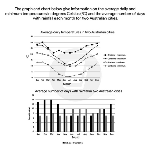
Band 6+: The graph and chart below give information on the average daily maximum and minimum temperatures in degrees Celsius and the average number of days with rainfall each month for two Australian cities. Summarise the information by selecting and reporting the main features and make comparisons where relevant

Image for topic: The graph and chart below give information on the average daily maximum and minimum temperatures in degrees Celsius and the average number of days with rainfall each month for two Australian cities. Summarise the information by selecting and reporting the main features and make comparisons where relevant
Our system will evaluate the answer based on this AI-generated description.
The image contains two graphs; the top graph shows average daily temperatures in two Australian cities with data points for Brisbane maximum (Jan-29, Feb-29, Mar-28, Apr-26, May-23, Jun-21, Jul-21, Aug-22, Sep-24, Oct-26, Nov-27, Dec-29), Canberra maximum (Jan-28, Feb-27, Mar-25, Apr-20, May-16, Jun-12, Jul-11, Aug-13, Sep-16, Oct-19, Nov-23, Dec-26), Brisbane minimum (Jan-21, Feb-21, Mar-20, Apr-17, May-14, Jun-11, Jul-9, Aug-10, Sep-13, Oct-16, Nov-18, Dec-20), Canberra minimum (Jan-13, Feb-13, Mar-11, Apr-7, May-3, Jun-1, Jul-0, Aug-1, Sep-3, Oct-6, Nov-9, Dec-11). The bottom graph shows average number of days with rainfall in two Australian cities with bars representing Brisbane (Jan-11, Feb-12, Mar-14, Apr-11, May-9, Jun-6, Jul-5, Aug-5, Sep-5, Oct-8, Nov-9, Dec-11) and Canberra (Jan-9, Feb-9, Mar-9, Apr-6, May-7, Jun-7, Jul-6, Aug-7, Sep-7, Oct-8, Nov-8, Dec-7).
Given the complexity of the image, the above description may not be entirely accurate.
Note: Both the topic and the answer were created by one of our users.

The given line graph and chart below illustrates the information on the average daily maximum and minimum temperatures in degrees Celsius and the average number of days with rainfall each month for two Australian cities.

Overall, the average daily temperatures changed as well as the average number of days with rainfall: moreover, both charts indicated the same trend from January to December.

Initially, the cities of Brisbane and Canberra had the highest temperatures in the first month, with levels of approximately 27 Celsius. These temperatures then decreased and reached their lowest points between the months of June and July. However, in August, temperatures began to increase again and reached their maximum levels in the last month of the year.

On the other hand, the rates of precipitations in the second town depicted on the bar chart for the first observed area were somewhat unusual. Moreover, when the capital city of Australia experienced a deluge, the other regions had drier conditions at the same time.

Word Count: 164

Answers On The Same Topic:

The graph and chart below give information on the average daily maximum and minimum temperatures in degrees Celsius and the average number of days with rainfall each month for two Australian cities. Summarise the information by selecting and reporting the main features and make comparisons where relevant

The graph and chart show the average daily maximum and minimum temperatures and the average number of rainy days per month in Brisbane and Canberra, Australia. Overall, Brisbane has warmer and more stable temperatures, while Canberra experiences greater seasonal variation. Brisbane also has more rainy days at the beginning and end of the year, whereas […]

The graph and chart below give information on the average daily maximum and minimum temperatures in degrees Celsius and the average number of days with rainfall each month for two Australian cities. Summarise the information by selecting and reporting the main features and make comparisons where relevant

The data illustrate the highest and the lowest temperature daily in degrees Celsius (*C) and the average number of days in each month where was a rainfall in Australian cities (Brisbane and Canberra). Overall, from the high vision, it is obvious that in both data Brisbane had more average temperature and more days with rainfall. […]

The graph and chart below give information on the average daily maximum and minimum temperatures in degrees Celsius and the average number of days with rainfall each month for two Australian cities. Summarise the information by selecting and reporting the main features and make comparisons where relevant

The graph compares the maximum and the minimum temperatures between two cities, namely Brisbane and Canberra. The given chart presents data on the average precipitation in these two mentioned Australian cities. Generally, the maximum and minimum degrees in Brisbane are higher than those in Canberra. Interestingly, whereas Brisbane is the city exhibiting a higher pattern […]

The graph and chart below give information on the average daily maximum and minimum temperatures in degrees Celsius and the average number of days with rainfall each month for two Australian cities. Summarise the information by selecting and reporting the main features and make comparisons where relevant

The line ghaph illustrates the daily average temperatures, while the bar chart illustrates the the same days average number of rainfall in two Australian cities. Looking from an overall perspective, it is evident that the temperatures showed downward trend beginning of the period, whereas then an upward trend end of the time period. However the […]

The graph and chart below give information on the average daily maximum and minimum temperatures in degrees Celsius and the average number of days with rainfall each month for two Australian cities. Summarise the information by selecting and reporting the main features and make comparisons where relevant

The line chart illustrates the monthly average maximum and minimum temperatures for two distinct areas in Australia. The bar chart shows how many days with rainfall in two examined cities in Australia. Overall, the average daily temperatures tend to decrease from February to August throughout the year. In addition, Brisbane often has more days with […]

See All

Other Topics:

The line chart shows the average daily maximum and minimum temperatures in two Australian cities, Brisbane and Canberra, throughout the year. The bar chart illustrates the average number of days with rainfall per month in these two cities.

Given graphs illustrate the weather changes throughout the year in two Australian cities. The line chart shows the average daily maximum and minimum temperatures, while the bar chart illustrates the average number of rainy days per month in Brisbane and Canberra. Overall, it is clear that temperatures in both cities experienced almost the same trend, […]

The graph shows the projected monthly use of a health club in Miami, Florida by all full-time members over the next year. The pie charts show the age profile of male and female members. Summarise the information by selecting and reporting the main features, and make comparisons where relevant.

The bar graph provides information about how many full-time members will attend the health club every month in Miami, Florida over a span of a year. The age profile of males and females is illustrated by the accompanying pie charts. In terms of attendance, more males are expected to use the club compared to females […]

The diagrams below show changes of a cinema from 1980 until now. Summarize the information by selecting and reporting the main features, and make comparisons where relevant.

The diagrams illustrate how a cinema has changed between 1980 and the present day. Overall, the cinema has undergone considerable expansion, with the number of screening rooms increasing from two to five and several new facilities being added. Meanwhile, the former car park has been removed, while the toilet has been relocated. In 1980, a […]

The charts below show information about the number of people using different modes of transport to commute to work in a European city in 2000 and 2020. The table shows the average time (in minutes) that commuters spent travelling to work by each mode of transport in 2020. Summarise the information by selecting and reporting the main features, and make comparisons where relevant.

Both pie charts illustrate the data on the proporations of individuals using different modes of transport to commute to work in a European city. The first pie chart shows data for 2000, while the second presents figures for 2020. The table provides information about the average commuting time for each mode of transport in 2020. […]

The charts below show the changes in ownership of electrical appliances and the amount of time spenting doing housework in one country between 1920 and 2019

The charts below show the changes in ownership of electrical appliances and the amount of time spent doing housework in households in one country between 1920 and 2019. The two line graphs illustrate changes in the proportion of households owning three categories of electrical appliances-washing machines, vacuum cleaners, and refrigerators and the average weekly hours […]

The line graph and the table show the number of trips to other countries by UK residents for various purposes between 1989 and 2001. Summarise the information by selecting and reporting the main features, and make comparisons where relevant.

The table gives information about the UK residents’ total number of trips to other countries, while the line graph illustrates the purposes of these trips from 1989 to 2001. Overall, the majority of the UK residents travelled to other countries on holidays, with other three purposes’ figures being considerably lower than that of holidays. The […]

See All
We have detected unusual activity on your device.
Please verify your identity to continue.
Note: This verification step won't sign you in. If you have a premium account, please log in to access the service as usual.
Google/Gmail Verification
Or verify using Email/Code
We've sent a verification code to:
youremail@gmail.com (Not your email?)
Enter it below to complete the verification process.
Ensure your email address is correct, your inbox is not full, and you check your spam folder. If no email arrives, consider using an alternative email.
You will need a Premium plan to perform your action!
Note: If you already have a premium account, please log in to access our services as usual.

Plans & Pricing

Our mission is to make quality education accessible for everyone.
However, to keep our hardworking team running and this service alive, we genuinely need your support!
By opting for a premium plan, not only do you sustain us in achieving the mission, but you also unlock advanced features to enrich your learning experience.

Free

For learners who aren't pressed for time

What's included on Free
100+ Cambridge IELTS Tests
Instant IELTS Writing Task 1 & 2 Evaluation (2 times/month)
Instant IELTS Speaking Part 1, 2, & 3 Evaluation (2 times/month)
Instant IELTS Writing Task 1 & 2 Essay Generator (2 times/month)
500+ Dictation & Shadowing Exercises
100+ Pronunciation Exercises
Flashcards
Other Advanced Tools

Premium

For those serious about advancing their English proficiency, and for IELTS candidates aspiring to boost their band score by 1-2 points (especially in writing & speaking) in just 30 days or less

What's included on Premium
Save Your IELTS Test Progress & Analyze Mistakes By Question Type
Save Your Own Flashcard Sets & Use Them On Any Device
Unlock All Courses, IELTS Tests, Section & Part Practice
Unlimited AI Conversations
Unlimited AI Writing Enhancement Exercises
Unlimited IELTS Writing Task 1 & 2 Evaluation
Unlimited IELTS Speaking Part 1, 2, & 3 Evaluation
Checked Answers Will Not Be Published
Unlimited IELTS Writing Task 1 & 2 Essay Generator
Unlimited IELTS Speaking Part 1, 2, & 3 Sample Generator
Unlimited Usage Of Advanced Tools & AI Features
Priority Support within 24h (12-month plan only)

Due to the nature of our service and the provided free trials, payments are non-refundable.