🔥 Today Only: Save 30% on Premium — Offer Ends Soon! - Upgrade Now!
Multiple Graphs

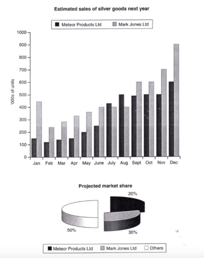
Band 6+: The bar chart below shows the estimated sales nationally of silver goods in '000s of units for two companies next year. The pie chart shows the projected market share of the two companies in silver goods at the end of next year. Silver goods refer to CD players, Walkmans etc. Write a report for a university lecturer describing the information shown below. You should write at least 150 words.

Image for topic: The bar chart below shows the estimated sales nationally of silver goods in '000s of units for two companies next year. The pie chart shows the projected market share of the two companies in silver goods at the end of next year. Silver goods refer to CD players, Walkmans etc. Write a report for a university lecturer describing the information shown below. You should write at least 150 words.
Our system will evaluate the answer based on this AI-generated description.
The image displays two segments: a bar graph estimating monthly silver goods sales next year in thousands of units, increasing from January to December, and a pie chart illustrating projected market share for three entities. Bar graph details: January - Meteor Products Ltd: 200, Mark Jones Ltd: 100; February - Meteor: 300, Mark Jones: 200; March - Meteor: 400, Mark Jones: 300; April - Meteor: 500, Mark Jones: 400; May - Meteor: 500, Mark Jones: 450; June - Meteor: 550, Mark Jones: 500; July - Meteor: 600, Mark Jones: 600; August - Meteor: 650, Mark Jones: 700; September - Meteor: 700, Mark Jones: 750; October - Meteor: 750, Mark Jones: 800; November - Meteor: 800, Mark Jones: 850; December - Meteor: 900, Mark Jones: 850. Pie chart details: Meteor Products Ltd holds 50% market share, Mark Jones Ltd holds 30%, Others hold the remaining 20%.
Given the complexity of the image, the above description may not be entirely accurate.
Note: Both the topic and the answer were created by one of our users.

The chart above is divided into two types of charts as a prediction for next year. The bar chart shows the number of estimated sales between Meteor Products Ltd and Mark Jones Ltd. Meanwhile, the pie chart shows the number of projected market shares between those companies and the other. The first one is informed by the total of units and the second one is by percentages.

To begin with, December has the highest amount of estimated sales for both companies which is almost 100,000 for Mark Lones Ltd and 600,000 for Meteor Products Ltd. Otherwise, February has only reached below 300,000 for both of them. Mark Jones Ltd always gets the highest number from January to December, except for July and August. Not only do they get the highest number for sales, but also projected market shares. It is shown by the second bar chart that informed Mark Jones Ltd has reached 50%.

In conclusion, Mark Lones Ltd leads the number of prediction sales and market sales for next year from January to December rather than the others.

Word Count: 179

Answers On The Same Topic:

The bar chart below shows the estimated sales nationally of silver goods in ‘000s of units for two companies next year. The pie chart shows the projected market share of the two companies in silver goods at the end of next year. Silver goods refer to CD players, Walkmans etc. Write a report for a university lecturer describing the information shown below. You should write at least 150 words.

The graph illustrates predicted national sales of silver goods for two companies- Mark Jones Ltd and Meteor Products Ltd- by the end of the following year. The pie shart demonstrates each company’s projected market share till next year. Overall, the total sales for both companies are expected to rise dramatically by december. Mark Jones Ltd […]

The bar chart below shows the estimated sales nationally of silver goods in ‘000s of units for two companies next year. The pie chart shows the projected market share of the two companies in silver goods at the end of next year. Silver goods refer to CD players, Walkmans etc. Write a report for a university lecturer describing the information shown below. You should write at least 150 words.

The bar chart above shows the estimated sales nationally of silver goods in thousands of units from two companies and the pie chart shows the projected market share of the two companies in silver goods at the end of next year. Mark Jones has the highest average sales in a year and beats Meteor products […]

The bar chart below shows the estimated sales nationally of silver goods in ‘000s of units for two companies next year. The pie chart shows the projected market share of the two companies in silver goods at the end of next year. Silver goods refer to CD players, Walkmans etc. Write a report for a university lecturer describing the information shown below. You should write at least 150 words.

In the following year, meteor products Ltd and Mark Jones Ltd expect to sell silver goods. Another thing is that the pie chart tells the market sales over the period of the year. Overall, it can be anticipated that both businesses’ sales will rise, while the other companies hold 50% of the market. At the […]

See All

Other Topics:

The line graph shows how much money overseas visitors spent in the UK from 1980 - 2010 and the pie charts show the reasons for their visits in 1980 and 2010. Summarise the information by selecting and reporting the main features and make comparisons where relevant. Write at least 150 words.

The chart illustrate the location of dance classes and diferrent age group attending the classes . Overall,it seems to be that private studios seen as good population of dance lover whereas ballet dance are more preffered by both age groups . After analyzing the information it is crystal clear that,loaction of danceare more preffered by […]

The bar charts give information about the salaries and university fees of students from three universities in two spheres - Law and Business. Summarize information by selecting and reporting the main features and make comparisons where relevant

The bar charts compare salaries and expenses of students studying Law and Business in three different universities in Australia. Overall, it is clearly visible that the figure of Law students’ expenses in institution A is the highest among all features, whereas salary of individuals studying Business in university A is the lowest. Interestingly, wages of […]

The line graph and pie charts below show the percentage of the population aged between 18 and 34 years old in a country from 1978 to 2011 and the percentage of this age group of people living in different regions in 1978 and 2011. Summarise the information by selecting and reporting the main features, and make comparisons where relevant. Write at least 150 words.

The line graph shows the percentage of a country’s population aged between 18 and 34 from 1978 to 2011, while the pie charts illustrate where people in this age group lived in 1978 and 2011. Overall, the proportion of 18-34-year-olds increased slightly until 1992, reaching a peak of around 37%, before declining steadily to its […]

The line graph and pie charts below show the percentage of the population aged between 18 and 34 years old in a country from 1978 to 2011 and the percentage of this age group of people living in different regions in 1978 and 2011. Summarise the information by selecting and reporting the main features, and make comparisons where relevant. Write at least 150 words.

The line graph illustrates the proportion of a country’s population aged between 18 and 34 from 1978 to 2011, while the pie charts show the distribution of this age group across cities, towns and rural areas in 1978 and 2011. Overall, the percentage of people aged 18-34 increased slightly until 1992, after which it declined […]

the charts below show the results of a survey of adult education. the first chart shows the reasrons why adult decide to study.The pie chart shows how people think the costs of adult education should be shared

the chart shows the reason why adult decide to study, while the pie chart gives information about the cost of each course should be shared. the figures in pie chart are given as percentages. overall, interest in subject made up the bigest reason for adults to study, while meet people represented the least reason. in […]

Task 1: The pie and bar charts below show the percentage of water consumption and use in Australia in 2004. Summarize the information by selecting and reporting the main features and making comparisons where relevant.

The pie and bar charts illustrate the percentage of water consumption and use in Australia in 2004. Overall, it is visible from both charts the largest consumers of the water were residents. In the pie chart it’s clear that the largest amount of water use for residential purposes at 70%. The rest of the water […]

See All
We have detected unusual activity on your device.
Please verify your identity to continue.
Note: This verification step won't sign you in. If you have a premium account, please log in to access the service as usual.
Google/Gmail Verification
Or verify using Email/Code
We've sent a verification code to:
youremail@gmail.com (Not your email?)
Enter it below to complete the verification process.
Ensure your email address is correct, your inbox is not full, and you check your spam folder. If no email arrives, consider using an alternative email.
You will need a Premium plan to perform your action!
Note: If you already have a premium account, please log in to access our services as usual.

Plans & Pricing

Our mission is to make quality education accessible for everyone.
However, to keep our hardworking team running and this service alive, we genuinely need your support!
By opting for a premium plan, not only do you sustain us in achieving the mission, but you also unlock advanced features to enrich your learning experience.

Free

For learners who aren't pressed for time

What's included on Free
100+ Cambridge IELTS Tests
Instant IELTS Writing Task 1 & 2 Evaluation (2 times/month)
Instant IELTS Speaking Part 1, 2, & 3 Evaluation (2 times/month)
Instant IELTS Writing Task 1 & 2 Essay Generator (2 times/month)
500+ Dictation & Shadowing Exercises
100+ Pronunciation Exercises
Flashcards
Other Advanced Tools

Premium

For those serious about advancing their English proficiency, and for IELTS candidates aspiring to boost their band score by 1-2 points (especially in writing & speaking) in just 30 days or less

What's included on Premium
Save Your IELTS Test Progress & Analyze Mistakes By Question Type
Save Your Own Flashcard Sets & Use Them On Any Device
Unlock All Courses, IELTS Tests, Section & Part Practice
Unlimited AI Conversations
Unlimited AI Writing Enhancement Exercises
Unlimited IELTS Writing Task 1 & 2 Evaluation
Unlimited IELTS Speaking Part 1, 2, & 3 Evaluation
Checked Answers Will Not Be Published
Unlimited IELTS Writing Task 1 & 2 Essay Generator
Unlimited IELTS Speaking Part 1, 2, & 3 Sample Generator
Unlimited Usage Of Advanced Tools & AI Features
Priority Support within 24h (12-month plan only)

Due to the nature of our service and the provided free trials, payments are non-refundable.