Our system will evaluate the answer based on this AI-generated description.
The image includes two line graphs labeled as "Male Prison Population 1911–2001" and "Female Prison Population 1911–2001" in a European country. The male graph shows prison population starting at approximately 4,000 in 1911, dropping to around 3,000 in 1921, slightly increasing to about 3,500 in 1931, decreasing again to around 3,000 in 1941, maintaining until 1951, jumping to approximately 5,000 in 1961, then to about 10,000 in 1971, spiking to around 30,000 in 1981, and reaching nearly 50,000 in 2001. The female graph shows prison population starting at roughly 200 in 1911, decreasing to about 100 in 1921, staying stable until 1931, increasing to around 200 in 1941, slightly decreasing in 1951, surging to about 600 in 1961, then to around 1,000 in 1971, dropping to approximately 800 in 1981, and finally increasing to nearly 3,500 in 2001.
Given the complexity of the image, the above description may not be entirely accurate.
Skyrocket your IELTS band score by 1-2 points in under a month with our premium plan!
Note: Both the topic and the answer were created by one of our users.
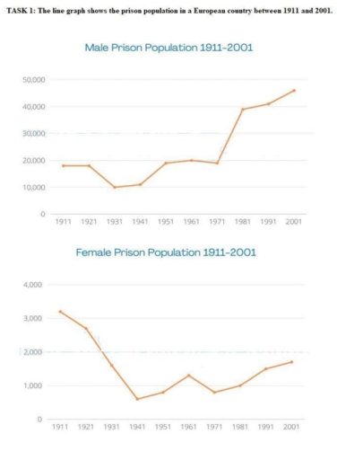
The provided line graphs illustrate the number of million prisoners in both distinct genders in a particular European nation from 1911 to 2001.
In general, the number of male prisoners saw a decrease, while the opposite was true for males. Additionally, men tend to commit a crime significantly more than women.
Concerning male prisoners, in 1911, the figure was roughly 18,000 million before going down dramatically to approximately 10,000 million in 1931. Subsequently, the number of male prisoners increased significantly to about 19,000 million 1971, and then, peaking at nearly 45,000 million at the end of the period.
With respect to female prisoners at the beginning of the period, nearly 3,100 million women were imprisoned; however; its figure decreased significantly to approximately 800 in 1941. Between 1941 and 1961, the figure rose dramatically from 800 to 1200 million before decreasing to roughly 900 million in 1971. Subsequently, the figure in 2001 went down gradually, reaching nearly 1,800 million.
Word Count: 158