🔥 Today Only: Save 30% on Premium — Offer Ends Soon! - Upgrade Now!
Pie Chart

Band 5+: Two pie-chart show the amount of water used in one country in 1988 and 2000

Image for topic: Two pie-chart show the amount of water used in one country in 1988 and 2000
Our system will evaluate the answer based on this AI-generated description.
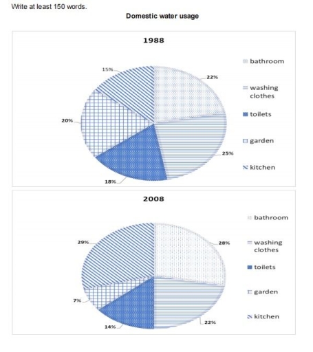
The image contains two pie charts depicting domestic water usage in the years 1988 and 2008. In the 1988 chart, percentages allocated to categories are as follows: bathroom (22%), washing clothes (15%), toilets (25%), garden (20%), and kitchen (18%). In the 2008 chart, the percentages for each category are displayed as: bathroom (28%), washing clothes (14%), toilets (29%), garden (7%), and kitchen (22%). The 2008 chart showcases a significant increase in water usage for bathrooms and toilets compared to the 1988 chart, with a 6% and 4% rise respectively. Conversely, the usage for washing clothes and garden are noticeably decreased by 1% and 13% respectively in the 2008 chart. Kitchen usage stays relatively similar across both years, only showing a slight increase of 4% in the 2008 chart. The charts are titled "Domestic water usage" and labeled with the specific years they represent.
Given the complexity of the image, the above description may not be entirely accurate.
Note: Both the topic and the answer were created by one of our users.

The pie chart illustrates the amount of spending water in five section and in one country from 1988 to 2008.

Overall,it is evident that the most used figure were bathroom and washing clothes, while the users of water in the kitchen increased significantly.In contrast the amount of water for garden reduced dramatically and toilets remained stable.

In 1988, only 22 percent of water had used for bathroom and the water for kitchen had spent 15%.After 20 years , both figure went up to 28% and 29% , respectively.

Besides that , one of the most spent water was in garden with 20 per cent in 1988. However, it has decreased marginally to 7%.Moreover, for toilets and washing machine water percentage numbered 25% and 18% but in 2008 it has shown decline to 22% and 14% .

Word Count: 136

Answers On The Same Topic:

Two pie-chart show the amount of water used in one country in 1988 and 2000

The given two charts illustrate how much water utilized in a country between 1988 and 2000. Overall, it is clear that there were no huge changes without water which was used for kitchen from 1988 to 2000. In addtion, kitchen water increased highest level in last year of question. If we look at the picture […]

Two pie-chart show the amount of water used in one country in 1988 and 2000

Both pie charts illustrate the usage of water in a country, two years that apart by 10 years, in 1988 and 2000. They show the percentages of water used under five categories. those categories are bathroom, washing clothes, toilets, garden and kitchen. Overall, the water used in kitchen had increased significantly while the water used […]

Two pie-chart show the amount of water used in one country in 1988 and 2000

Two pie charts compare information about consumption of water in different ways in one country from 1988 to 2008. Overall, it can be seen that in the beginning of the year water usage of washing clothes had the highest percent however, by the end it changed and kitchen became the highest. what is more, using […]

See All

Other Topics:

The pie charts show the main reasons for migration to and from the Australia in 2010. Summarise the information by selecting and reporting the main features and make comparisons where relevant.

The given pie charts illustrate the main cases of migrations to and from the Australia in 2010. Overall, it is clear that Definite jobs were the most popular reason for immigrants and emigrants to Australia, whereas accompanying and joining are the usual things for them. Looking first at the pie chart, the dominant sector was […]

the pie charts below show some employment patterns in Great Britain in 1992.summarize the information by selecting and reporting the main features, make comparisons where relevant.

The pie charts compare the distribution of male and female workers across six occupational categories in 1992. These categories are divided into manual occupations (craft or similar, general labourers, and other manual jobs) and non-manual occupations (managerial and professional, clerical or related, and other non-manual jobs). Overall, women were predominantly employed in non-manual occupations, whereas […]

The pie charts below show the percentage of people living in four types of accommodation in 1980 and 2020. Summarise the information by selecting and reporting the main features and make comparisons where relevant. Write at least 150 words.

The pie charts give information on various kinds of housing where people lived in 1980 and 2020. As a whole, the majority of individuals were in 3-4 bedroom accommodation in 1980, while 1-2 bedroom flat had the biggest share 40 years later. Moving to the details, in 1980, 37% of individuals stayed ina 3-4 bedroom […]

the charts below show the average percentages in typical meals of three types of nutrients, all of which may be unhealthy if eaten too much. Summarise the information by selecting and reporting the main features, and make comparisons where relevant.

The three pie charts compare the average proportion of sodium, saturated fats and added sugars contained in four typical meals, namely breakfast, lunch, dinner and snacks, in the USA. Overall, the largest shares of sodium and saturated fats are consumed in dinner, whereas the highest proportion of added sugars is found in snacks. It is […]

The charts below show the proportion of people's total spending in a particular European country was spent on different commodities and services in 1958 and in 2008. Summarise the information by selecting and reporting the main features, and make comparisons where relevant.

The given pie charts demonstrate the percentage of expenditure of citizens on several categories in a specific European country between 1958 and 2008. Overall, there was a significant change in spending trends in the 50-year period starting in 1958. Whereas food possessed the highest proportion in 1958, after 50 years, people spent most on housing. […]

See All
We have detected unusual activity on your device.
Please verify your identity to continue.
Note: This verification step won't sign you in. If you have a premium account, please log in to access the service as usual.
Google/Gmail Verification
Or verify using Email/Code
We've sent a verification code to:
youremail@gmail.com (Not your email?)
Enter it below to complete the verification process.
Ensure your email address is correct, your inbox is not full, and you check your spam folder. If no email arrives, consider using an alternative email.
You will need a Premium plan to perform your action!
Note: If you already have a premium account, please log in to access our services as usual.

Plans & Pricing

Our mission is to make quality education accessible for everyone.
However, to keep our hardworking team running and this service alive, we genuinely need your support!
By opting for a premium plan, not only do you sustain us in achieving the mission, but you also unlock advanced features to enrich your learning experience.

Free

For learners who aren't pressed for time

What's included on Free
100+ Cambridge IELTS Tests
Instant IELTS Writing Task 1 & 2 Evaluation (2 times/month)
Instant IELTS Speaking Part 1, 2, & 3 Evaluation (5 times/month)
Instant IELTS Writing Task 1 & 2 Essay Generator (2 times/month)
500+ Dictation & Shadowing Exercises
100+ Pronunciation Exercises
Flashcards
Other Advanced Tools

Premium

For those serious about advancing their English proficiency, and for IELTS candidates aspiring to boost their band score by 1-2 points (especially in writing & speaking) in just 30 days or less

What's included on Premium
Save Your IELTS Test Progress
Unlock All Courses & IELTS Tests
Unlimited AI Conversations
Unlimited AI Writing Enhancement Exercises
Unlimited IELTS Writing Task 1 & 2 Evaluation
Unlimited IELTS Speaking Part 1, 2, & 3 Evaluation
Checked Answers Will Not Be Published
Unlimited IELTS Writing Task 1 & 2 Essay Generator
Unlimited IELTS Speaking Part 1, 2, & 3 Sample Generator
Unlimited Usage Of Advanced Tools
Priority Support within 24h (12-month plan only)

Due to the nature of our service and the provided free trials, payments are non-refundable.
Nếu bạn là người Việt Nam và không có hoặc không muốn trả bằng credit/debit cards, bạn có thể thanh toán bằng phương thức chuyển khoản:


Chọn gói:
419,000₫ 277,000 ₫ cho gói 1 tháng (chỉ 9,233₫/ngày)
1,239,000₫ 597,000 ₫ cho gói 3 tháng (chỉ 6,633₫/ngày)
2,469,000₫ 1,027,000 ₫ cho gói 6 tháng (chỉ 5,706₫/ngày)
4,929,000₫ 1,417,000 ₫ cho gói 12 tháng (chỉ 3,936₫/ngày)


Sau khi chuyển khoản, vui lòng đợi trình duyệt tự động điều hướng bạn trở lại Engnovate và bạn sẽ ngay lập tức nhận được mã kích hoạt tài khoản premium.
Nếu có lỗi xảy ra, bạn có thể liên hệ với team thông qua một trong các phương thức: email đến helloengnovate@gmail.com hoặc nhắn tin qua facebook.com/engnovate.
Vì toàn bộ công cụ trên website đều có thể sử dụng thử miễn phí, Engnovate không hỗ trợ hoàn tiền.