🔥 Today Only: Save 30% on Premium — Offer Ends Soon! - Upgrade Now!
Pie Chart

Band 5+: Two pie-chart show the amount of water used in one country in 1988 and 2000

Image for topic: Two pie-chart show the amount of water used in one country in 1988 and 2000
Our system will evaluate the answer based on this AI-generated description.
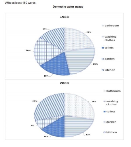
The image contains two pie charts depicting domestic water usage in the years 1988 and 2008. In the 1988 chart, percentages allocated to categories are as follows: bathroom (22%), washing clothes (15%), toilets (25%), garden (20%), and kitchen (18%). In the 2008 chart, the percentages for each category are displayed as: bathroom (28%), washing clothes (14%), toilets (29%), garden (7%), and kitchen (22%). The 2008 chart showcases a significant increase in water usage for bathrooms and toilets compared to the 1988 chart, with a 6% and 4% rise respectively. Conversely, the usage for washing clothes and garden are noticeably decreased by 1% and 13% respectively in the 2008 chart. Kitchen usage stays relatively similar across both years, only showing a slight increase of 4% in the 2008 chart. The charts are titled "Domestic water usage" and labeled with the specific years they represent.
Given the complexity of the image, the above description may not be entirely accurate.
Note: Both the topic and the answer were created by one of our users.

Two pie charts compare information about consumption of water in different ways in one country from 1988 to 2008.

Overall, it can be seen that in the beginning of the year water usage of washing clothes had the highest percent however, by the end it changed and kitchen became the highest. what is more, using water in three factors saw decreasing (washing clothes, toilets and garden) but bathroom and kitchen increased by the ending given period.

In 1988, expenditures for washing clothes had the highest proportion compare to others it was 25% Moreover, after 20 years it went down to 22% and the kitchen witnessed growth from the lowest percentage (15%) to the highest and it doubled to 29% also initially the bathroom was the second highest percentage (22%) and it saw upward to 28% Meanwhile, in the initial year others factors toilets (18%) and garden (20%) had almost similar percent respectively Nonetheless, they dropped to the lowest in usage of water they were at 14% and 7%

Word Count: 168

Answers On The Same Topic:

Two pie-chart show the amount of water used in one country in 1988 and 2000

The givwn two pie-charts illustrates usage of domestic water ( including Bathroom , Washing clothes , Toilets , Garden , Kitchen ) in one country of two different years that is 1988 and 2008 . The data is caliberated in percentage . Overall , the highes usage of domestic water was done by washing clothes […]

Two pie-chart show the amount of water used in one country in 1988 and 2000

The given two charts illustrate how much water utilized in a country between 1988 and 2000. Overall, it is clear that there were no huge changes without water which was used for kitchen from 1988 to 2000. In addtion, kitchen water increased highest level in last year of question. If we look at the picture […]

Two pie-chart show the amount of water used in one country in 1988 and 2000

Both pie charts illustrate the usage of water in a country, two years that apart by 10 years, in 1988 and 2000. They show the percentages of water used under five categories. those categories are bathroom, washing clothes, toilets, garden and kitchen. Overall, the water used in kitchen had increased significantly while the water used […]

Two pie-chart show the amount of water used in one country in 1988 and 2000

The pie chart illustrates the amount of spending water in five section and in one country from 1988 to 2008. Overall,it is evident that the most used figure were bathroom and washing clothes, while the users of water in the kitchen increased significantly.In contrast the amount of water for garden reduced dramatically and toilets remained […]

See All

Other Topics:

The pie chart below shows the proportions of leading online travel companies worldwide. December 2022. Summarise the information by selecting and reporting the main features, and make comparisons where relevant.

The diagram illustrates the total market share of main firms in the travel business, by December 2022. What stands out is that Booking.com occupies the largest portion of the pie chart, accounting for around a half, while the smallest piece is attributed to smaller companies in the field. The vast majority of the total market […]

The charts below show the main reasons why students choose a particular university in the UK, in 1997 and 2007.

The two pie chats below compare the top conseration that students choose a certain university in the UK in the years 1997 and 2007. It is clear that suitable degree courses is the most students’ conseration in both years. Meanwhile, students consider about whether the school is proximately to parent home or having a good […]

The charts below show the main reasons why students choose a particular university in the UK, in 1997 and 2007.

The two pie chats below compare the top conseration that students choose a certain university in the UK in the years 1997 and 2007. It is clear that suitable degree courses is the most students’ conseration in both years. Meanwhile, students consider about whether the school is proximately to parent home or having a good […]

The charts below show changes in the proportion of the energy produced from different resources in a country in 1985 and 2003.

The chart illustrates changes in the proportion of the energy produced in various resources in a country in 1985 and 2003. Overall, the oil energy produced was still the highest percentage, despite a significant decreasing. The number of energy produced in Nuclear reduced dramatically while the percentages of energy produced in Natural gas and Coal […]

The charts below show changes in the proportion of the energy produced from different resources in a country in 1985 and 2003.

The chart illustrates changes in the proportion of the energy produced from various resources in a country in 1985 and 2003. Overall, the oil energy produced was still the highest percentage, despite a significant decrease. The amount of energy produced from Nuclear reduced dramatically while the percentages of energy produced from Natural gas and Coal […]

The two pie charts compare the main household expenses of Australian consumers between 1970 and 1990. Summarise the information by selecting and reporting the main features, and make comparisons where relevant.

The two pie charts illustrate the primary household budget of Australian consumers between 1970 and 1990. Overall, Cars expenses accounted for the largest category in an Australian household in 1970, while electronics was the smallest share in same year. Conversely, budget for food,fuel, and electronics increased over the years, while others decreased. Consequently, Food category […]

See All
We have detected unusual activity on your device.
Please verify your identity to continue.
Note: This verification step won't sign you in. If you have a premium account, please log in to access the service as usual.
Google/Gmail Verification
Or verify using Email/Code
We've sent a verification code to:
youremail@gmail.com (Not your email?)
Enter it below to complete the verification process.
Ensure your email address is correct, your inbox is not full, and you check your spam folder. If no email arrives, consider using an alternative email.
You will need a Premium plan to perform your action!
Note: If you already have a premium account, please log in to access our services as usual.

Plans & Pricing

Our mission is to make quality education accessible for everyone.
However, to keep our hardworking team running and this service alive, we genuinely need your support!
By opting for a premium plan, not only do you sustain us in achieving the mission, but you also unlock advanced features to enrich your learning experience.

Free

For learners who aren't pressed for time

What's included on Free
100+ Cambridge IELTS Tests
Instant IELTS Writing Task 1 & 2 Evaluation (2 times/month)
Instant IELTS Speaking Part 1, 2, & 3 Evaluation (2 times/month)
Instant IELTS Writing Task 1 & 2 Essay Generator (2 times/month)
500+ Dictation & Shadowing Exercises
100+ Pronunciation Exercises
Flashcards
Other Advanced Tools

Premium

For those serious about advancing their English proficiency, and for IELTS candidates aspiring to boost their band score by 1-2 points (especially in writing & speaking) in just 30 days or less

What's included on Premium
Save Your IELTS Test Progress & Analyze Mistakes By Question Type
Save Your Own Flashcard Sets & Use Them On Any Device
Unlock All Courses, IELTS Tests, Section & Part Practice
Unlimited AI Conversations
Unlimited AI Writing Enhancement Exercises
Unlimited IELTS Writing Task 1 & 2 Evaluation
Unlimited IELTS Speaking Part 1, 2, & 3 Evaluation
Checked Answers Will Not Be Published
Unlimited IELTS Writing Task 1 & 2 Essay Generator
Unlimited IELTS Speaking Part 1, 2, & 3 Sample Generator
Unlimited Usage Of Advanced Tools & AI Features
Priority Support within 24h (12-month plan only)

Due to the nature of our service and the provided free trials, payments are non-refundable.