Our system will evaluate the answer based on this AI-generated description.
The image presents a line graph detailing the percentage of Australian-born individuals originating from various global regions between 1976 and 2011. In 1976, the Total was approximately 23%, UK was around 14%, Other was about 8%, and Asia was roughly 0%. By 1981, these figures were roughly 23% Total, about 13% UK, approximately 9% Other, barely 1% Asia. In 1986, percentages were around 24% Total, 12% UK, nearly 10% Other, slightly above 1% Asia. In 1991, Total was approximately 25%, UK was around 11%, Other roughly 11%, Asia nearly 2%. For 1996, Total remained near 25%, around 10% UK, about 12% Other, 3% Asia. By 2001, Total was around 26%, UK was near 8%, Other roughly 13%, Asia slightly below 4%. In 2006, Total was about 27%, UK at nearly 7%, Other at approximately 14%, Asia slightly above 5%. Finally, in 2011, Total reached about 28%, UK stayed around 6%, Other roughly 16%, with Asia just under 7%.
Given the complexity of the image, the above description may not be entirely accurate.
Skyrocket your IELTS band score by 1-2 points in under a month with our premium plan!
Note: Both the topic and the answer were created by one of our users.
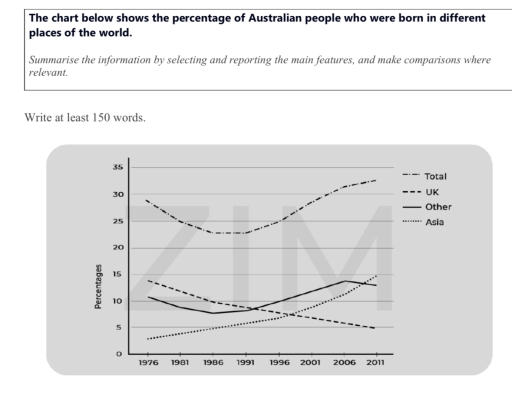
The line graph gives information on the share of australian population originating in four different places worldwide. While the figure of the percentage of Australian people born in UK witnessed downward, the opposite was true for Asia and other places. It is evident that the total trend peaked at the start of the period and then showed significant upward.
Turning to details, having started at 29% in 1976, the total figure fell suddenly by 4% by 1991, exhibiting a significant upward to 35% at the end of the period. In contrast, the share of Australian born in UK saw only downward, with trend beginnig with 14% and ending to 5% over the period.
Regarding the Australians percentage who were born in other places and Asia, we can see that this two patterns increased. at the beginning of the period, the former figure exhibited 11% and there was a slight fall by 5% in 1986. this pattern was on the rise to 14%, declining slightly by 1%.
the latter trend saw only upward steadly to 15% at the end of the period.
Word Count: 181