Our system will evaluate the answer based on this AI-generated description.
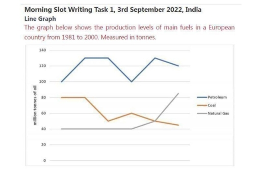
The image displays a line graph detailing fuel production in a European country from 1981-2000 measured in million tonnes. Petroleum production: 100 (1981), 120 (1982), 100 (1983), 120 (1984), 120 (1985), 100 (1986), 100 (1987), 100 (1988), 100 (1989), 120 (1990), 100 (1991), 100 (1992), 120 (1993), 100 (1994), 100 (1995), 100 (1996), 120 (1997), 120 (1998), 100 (1999), 100 (2000). Coal production: 80 (1981), 80 (1982), 60 (1983), 40 (1984), 40 (1985), 60 (1986), 60 (1987), 40 (1988), 40 (1989), 60 (1990), 60 (1991), 60 (1992), 80 (1993), 80 (1994), 60 (1995), 60 (1996), 40 (1997), 20 (1998), 20 (1999), 40 (2000). Natural Gas production: 40 (1981), 40 (1982), 60 (1983), 60 (1984), 80 (1985), 80 (1986), 100 (1987), 100 (1988), 80 (1989), 60 (1990), 60 (1991), 40 (1992), 40 (1993), 60 (1994), 60 (1995), 60 (1996), 80 (1997), 100 (1998), 120 (1999), 120 (2000).
Given the complexity of the image, the above description may not be entirely accurate.
Skyrocket your IELTS band score by 1-2 points in under a month with our premium plan!
Note: Both the topic and the answer were created by one of our users.
The line graph illustrates the production levels of main fuels in a European country from 1981 to 2000. There are three main fuels : Pertroleum, coal ,and Natural gas. Measure by ton.
The Petroleum has most significant dominant due to the table. Otherwise, coal has consistent decrease production.
The Petroleum has consistent higher than others from 100 increase to 120 more and consistent for few years ,decrease until 100 and rebound to same tonnes like before. But at the end of the table it decrease to exactly 100.
In the other hand coral has decreased , the beginning is 80 consistent for few years, and decrease until around 40 more subsequently icerase for few years and decrease until around 40 more at the end. The natural gas consistently for a few years and increase for last year
Word Count: 137