🔥 Today Only: Save 30% on Premium — Offer Ends Soon! - Upgrade Now!
Line Graph

Band 6+: Line Graph The graph below shows the production levels of main fuels in a European country from 1981 to 2000. Measured in tonnes.

Image for topic: Line Graph The graph below shows the production levels of main fuels in a European country from 1981 to 2000. Measured in tonnes.
Our system will evaluate the answer based on this AI-generated description.
The image displays a line graph detailing fuel production in a European country from 1981-2000 measured in million tonnes. Petroleum production: 100 (1981), 120 (1982), 100 (1983), 120 (1984), 120 (1985), 100 (1986), 100 (1987), 100 (1988), 100 (1989), 120 (1990), 100 (1991), 100 (1992), 120 (1993), 100 (1994), 100 (1995), 100 (1996), 120 (1997), 120 (1998), 100 (1999), 100 (2000). Coal production: 80 (1981), 80 (1982), 60 (1983), 40 (1984), 40 (1985), 60 (1986), 60 (1987), 40 (1988), 40 (1989), 60 (1990), 60 (1991), 60 (1992), 80 (1993), 80 (1994), 60 (1995), 60 (1996), 40 (1997), 20 (1998), 20 (1999), 40 (2000). Natural Gas production: 40 (1981), 40 (1982), 60 (1983), 60 (1984), 80 (1985), 80 (1986), 100 (1987), 100 (1988), 80 (1989), 60 (1990), 60 (1991), 40 (1992), 40 (1993), 60 (1994), 60 (1995), 60 (1996), 80 (1997), 100 (1998), 120 (1999), 120 (2000).
Given the complexity of the image, the above description may not be entirely accurate.
Note: Both the topic and the answer were created by one of our users.

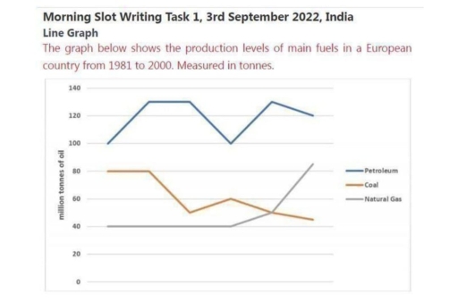
The line chart illustrates the percentage of three main types of fuels (petroleum, coal, and natural gas) manufacture in a Europe between 1891 to 2000.

In 1981, the amounts of petroleum started at 100 milion tonnes. It increased steadily over the next year reach at around 135 million before dropping back to the originall figure at 100 million tonnes in 1989. The accounted of petroleum rose up again to around 130 million in 1995, where the figure represented fluctuated slightly until the end of period.

Coal was the second most produced fuel in 1981, stood at 80 milion tonnes. Coal production remained constant until it dropped to around 50 million in 1985. It rose back to around 60 milion tonnes before slowly decline at just under 50 million tonnes. However, the amounts of natural gas was stable at around 40 million until around 1991 when it began to rise exponentially.

Word Count: 150

Answers On The Same Topic:

Line Graph The graph below shows the production levels of main fuels in a European country from 1981 to 2000. Measured in tonnes.

The graph below shows the production levels of main fuels in a European country from 1981 to 2000. Measured in tonnes.The line graph delineates the production levels of three primary energy sources – petroleum, coal, and natural gas – in a particular European nation over a 19-year period, commencing in 1981. Overall, petroleum remained the […]

Line Graph The graph below shows the production levels of main fuels in a European country from 1981 to 2000. Measured in tonnes.

The line graph shows the production of main fuels in a European country between 1981 and 2000, measured in tonnes. Overall, petroleum was the highest during all period. Coal generally decreased while natural gas increased in the end of the years. In 1981 petroleum was about 100 million tonnes and it quickly rise to around […]

Line Graph The graph below shows the production levels of main fuels in a European country from 1981 to 2000. Measured in tonnes.

The graph shows us the level of main fuels in European country from 1981 to 2000. There are a lot of notible features which we can analyze. Petroleum has the highest capasity of using, moreover, during the years it keeps its indicators between 100 and 130 million tonnes. By the way, ghaph shows that coil […]

Line Graph The graph below shows the production levels of main fuels in a European country from 1981 to 2000. Measured in tonnes.

The line graph illustrates the production levels of main fuels in a European country from 1981 to 2000. There are three main fuels : Pertroleum, coal ,and Natural gas. Measure by ton. The Petroleum has most significant dominant due to the table. Otherwise, coal has consistent decrease production. The Petroleum has consistent higher than others […]

See All

Other Topics:

The graph below shows UK air pollutants in millions of tonnes, from three different sources, between 1990 and 2005.

The presented line chart compares and contrasts the amount of air pollutants, measured in millions of tonnes, originating from 3 different sources, including industry, transport and households over the course of 15 years. Overall, it is obvious that there was a decline in almost all categories, while the opposite is true for transport. Additionally, the […]

The chart below shows the market size of mobile and QR sales in the USA in billions of US dollars.

The chart presents the mobile and QR sales of the market size in the USA in billions of US dollars. Overall, the market size of mobile and QR sales increased from steadily 2017 to 2023. Between 2017 and 2019, the market size considerably raised from approximately 1 billion to 2 billion dollars. From 2019 to […]

Write the description according to the instructions. The line graph shows the number of visitors to four tourist destinations on an island between 1980 and 2015.

The data displays the amount of guests on 4 different tourist attractions on an island from 1980 to 2015. Overall, parks experienced the greatest rise in visitor count, aquariums experienced less, museums was the only attraction to drop in guest count, and zoos went through almost no variation. However, aquariums remain the most popular among […]

The graph below shows the number of shops that closed and the number of the new shops that opened in one country between 2011 and 2018.

The line graph illustrates how many stores were closed down and launched in a particular country from 2011 to 2018. Overall, both categories experienced downward trends with fluctuations, though to varying degrees. Additionally, while the new shops outnumbered the closed ones initially, the former were eventually surpassed by the former. Focusing on the first half […]

The graph below shows the percentage of people visiting a museum at least once a year between 1980 and 2010. Summarise the information by selecting and reporting the main features and make comparisons where relevant.

The give line graph compares the percentages of different aged museum visitors over three decades from 1980 to 2010. Overall, it is clear that figures for 15-24, 25-34 and 35-49 age group experienced an upward trend, while the reverse was true for people aged 50+. It is also worth mentioning that percentages of people aged […]

The line graph below shows the percentage of people using five communication methods from 2000 to 2020

The line graph illustrates the proportion of individuals using different methods for communication between 2000 and 2020. The usage of some methods such as social media, instant messaging and email increased over the years, while letters and phone calls lost their popularity. Looking first at the figures for social media usage, it is clear that […]

See All
We have detected unusual activity on your device.
Please verify your identity to continue.
Note: This verification step won't sign you in. If you have a premium account, please log in to access the service as usual.
Google/Gmail Verification
Or verify using Email/Code
We've sent a verification code to:
youremail@gmail.com (Not your email?)
Enter it below to complete the verification process.
Ensure your email address is correct, your inbox is not full, and you check your spam folder. If no email arrives, consider using an alternative email.
You will need a Premium plan to perform your action!
Note: If you already have a premium account, please log in to access our services as usual.

Plans & Pricing

Our mission is to make quality education accessible for everyone.
However, to keep our hardworking team running and this service alive, we genuinely need your support!
By opting for a premium plan, not only do you sustain us in achieving the mission, but you also unlock advanced features to enrich your learning experience.

Free

For learners who aren't pressed for time

What's included on Free
100+ Cambridge IELTS Tests
Instant IELTS Writing Task 1 & 2 Evaluation (2 times/month)
Instant IELTS Speaking Part 1, 2, & 3 Evaluation (5 times/month)
Instant IELTS Writing Task 1 & 2 Essay Generator (2 times/month)
500+ Dictation & Shadowing Exercises
100+ Pronunciation Exercises
Flashcards
Other Advanced Tools

Premium

For those serious about advancing their English proficiency, and for IELTS candidates aspiring to boost their band score by 1-2 points (especially in writing & speaking) in just 30 days or less

What's included on Premium
Save Your IELTS Test Progress
Unlock All Courses & IELTS Tests
Unlimited AI Conversations
Unlimited AI Writing Enhancement Exercises
Unlimited IELTS Writing Task 1 & 2 Evaluation
Unlimited IELTS Speaking Part 1, 2, & 3 Evaluation
Checked Answers Will Not Be Published
Unlimited IELTS Writing Task 1 & 2 Essay Generator
Unlimited IELTS Speaking Part 1, 2, & 3 Sample Generator
Unlimited Usage Of Advanced Tools
Priority Support within 24h (12-month plan only)

Due to the nature of our service and the provided free trials, payments are non-refundable.
Nếu bạn là người Việt Nam và không có hoặc không muốn trả bằng credit/debit cards, bạn có thể thanh toán bằng phương thức chuyển khoản:


Chọn gói:
419,000₫ 277,000 ₫ cho gói 1 tháng (chỉ 9,233₫/ngày)
1,239,000₫ 597,000 ₫ cho gói 3 tháng (chỉ 6,633₫/ngày)
2,469,000₫ 1,027,000 ₫ cho gói 6 tháng (chỉ 5,706₫/ngày)
4,929,000₫ 1,417,000 ₫ cho gói 12 tháng (chỉ 3,936₫/ngày)


Sau khi chuyển khoản, vui lòng đợi trình duyệt tự động điều hướng bạn trở lại Engnovate và bạn sẽ ngay lập tức nhận được mã kích hoạt tài khoản premium.
Nếu có lỗi xảy ra, bạn có thể liên hệ với team thông qua một trong các phương thức: email đến helloengnovate@gmail.com hoặc nhắn tin qua facebook.com/engnovate.
Vì toàn bộ công cụ trên website đều có thể sử dụng thử miễn phí, Engnovate không hỗ trợ hoàn tiền.