🔥 Today Only: Save 30% on Premium — Offer Ends Soon! - Upgrade Now!
Line Graph

Band 6+: Line Graph The graph below shows the production levels of main fuels in a European country from 1981 to 2000. Measured in tonnes.

Image for topic: Line Graph The graph below shows the production levels of main fuels in a European country from 1981 to 2000. Measured in tonnes.
Our system will evaluate the answer based on this AI-generated description.
The image displays a line graph detailing fuel production in a European country from 1981-2000 measured in million tonnes. Petroleum production: 100 (1981), 120 (1982), 100 (1983), 120 (1984), 120 (1985), 100 (1986), 100 (1987), 100 (1988), 100 (1989), 120 (1990), 100 (1991), 100 (1992), 120 (1993), 100 (1994), 100 (1995), 100 (1996), 120 (1997), 120 (1998), 100 (1999), 100 (2000). Coal production: 80 (1981), 80 (1982), 60 (1983), 40 (1984), 40 (1985), 60 (1986), 60 (1987), 40 (1988), 40 (1989), 60 (1990), 60 (1991), 60 (1992), 80 (1993), 80 (1994), 60 (1995), 60 (1996), 40 (1997), 20 (1998), 20 (1999), 40 (2000). Natural Gas production: 40 (1981), 40 (1982), 60 (1983), 60 (1984), 80 (1985), 80 (1986), 100 (1987), 100 (1988), 80 (1989), 60 (1990), 60 (1991), 40 (1992), 40 (1993), 60 (1994), 60 (1995), 60 (1996), 80 (1997), 100 (1998), 120 (1999), 120 (2000).
Given the complexity of the image, the above description may not be entirely accurate.
Note: Both the topic and the answer were created by one of our users.

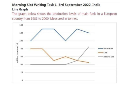
The line graph shows the production of main fuels in a European country between 1981 and 2000, measured in tonnes.

Overall, petroleum was the highest during all period. Coal generally decreased while natural gas increased in the end of the years.

In 1981 petroleum was about 100 million tonnes and it quickly rise to around 130 in 1985. After that it drop to 100 in 1990, then increase again to about 135 before finishing near 120 in 2000.

Coal started around 80 in 1981 and stayed same until 1985. Then it fell sharply to 50 in 1990. After small rise to 60 in 1995, it decreased again and ended about 45.

Natural gas was the lowest at first, around 40, and it almost did not change until 1990. However, after 1995 it increased fast and reached about 85 in 2000.

Word Count: 140

Answers On The Same Topic:

Line Graph The graph below shows the production levels of main fuels in a European country from 1981 to 2000. Measured in tonnes.

The graph below shows the production levels of main fuels in a European country from 1981 to 2000. Measured in tonnes.The line graph delineates the production levels of three primary energy sources – petroleum, coal, and natural gas – in a particular European nation over a 19-year period, commencing in 1981. Overall, petroleum remained the […]

Line Graph The graph below shows the production levels of main fuels in a European country from 1981 to 2000. Measured in tonnes.

The graph shows us the level of main fuels in European country from 1981 to 2000. There are a lot of notible features which we can analyze. Petroleum has the highest capasity of using, moreover, during the years it keeps its indicators between 100 and 130 million tonnes. By the way, ghaph shows that coil […]

Line Graph The graph below shows the production levels of main fuels in a European country from 1981 to 2000. Measured in tonnes.

The line graph illustrates the production levels of main fuels in a European country from 1981 to 2000. There are three main fuels : Pertroleum, coal ,and Natural gas. Measure by ton. The Petroleum has most significant dominant due to the table. Otherwise, coal has consistent decrease production. The Petroleum has consistent higher than others […]

Line Graph The graph below shows the production levels of main fuels in a European country from 1981 to 2000. Measured in tonnes.

The line chart illustrates the percentage of three main types of fuels (petroleum, coal, and natural gas) manufacture in a Europe between 1891 to 2000. In 1981, the amounts of petroleum started at 100 milion tonnes. It increased steadily over the next year reach at around 135 million before dropping back to the originall figure […]

See All

Other Topics:

The graph below shows changes in the share of vehicle registrations of the three most common types of commercial vehicles in the US between 1970 and 2010. Summarise the information by selecting and reporting the main features, and make comparisons where relevant.

The bar chart below show proportion the share of vehicle registrations of the three types of commercial vehicles in the US from 1970 to 2010 Overall, both three type of vehicles have tended to decline in percentage of registration, instead of taxi from 1970 to 2010. In addition, bus registration accounted for lowest proportion in […]

The graph. above shows the stock price of four technology companies between 2011 and 2016. Summarise the information by selecting and reporting the main features, and make comparisons where relevant.

The line graph illustrates the changes in the stock prices of four major technology corporations – Facebook, Google, Apple, and Yahoo – over a six-year period from 2011 to 2016. Overall, it is clear that Facebook experienced steady growth throughout the period, while Yahoo saw a consistent decline. Apple’s stock price was characterized by extreme […]

The graph below gives information on the yearly expenditure made by a particular hotel in 2009.

The line graph illustrates the hotel spending a year in 2009 at 3 category there are food housekeeping and maintanance. Based on the data food is the most higher spend in the hotel, housekeeping is the second higher and maintenance is the lower expenditure. The number of food in january slightly decrease from 10000 to […]

The graph below shows people's level of satisfaction with the health care system in 4 countries between 1991 and 2007.

The line graph illustrates resident’s degree of satisfaction with the medical care system in four countries such as, the Canada, the Netherlands, United Kingdom and the USA from 1991 to 2006. Overall, the medical care system of residents’ degree of satisfaction is in two countries; for instance, the United Kingdom and the USA increased, while […]

Changes in the amount of fast food consumption by Australian teenagers

The graph provides information on changes in the amount of fast food consumption by Australian teenagers. Overall, from my point of view, the consumption of three types of fast food, like pizza and hamburgers, increased, and fish & chips decreased from 1975 to 2000. From 1975 to 1980, pizza consumption grew approximately 18%. In the […]

Changes in the amount of fast food consumption by Australian teenagers

The graph provides tne information changes in the amount of fast food consumption by Australian teenagers. Overall from my point of view three type of fast food like Pizza and Hamburgers increasaed and Fish & Chips decreased from 1975 to 2000. Pizza number of grams 1975 to 1980 approximately 18% grow this five year Pizza […]

See All
We have detected unusual activity on your device.
Please verify your identity to continue.
Note: This verification step won't sign you in. If you have a premium account, please log in to access the service as usual.
Google/Gmail Verification
Or verify using Email/Code
We've sent a verification code to:
youremail@gmail.com (Not your email?)
Enter it below to complete the verification process.
Ensure your email address is correct, your inbox is not full, and you check your spam folder. If no email arrives, consider using an alternative email.
You will need a Premium plan to perform your action!
Note: If you already have a premium account, please log in to access our services as usual.

Plans & Pricing

Our mission is to make quality education accessible for everyone.
However, to keep our hardworking team running and this service alive, we genuinely need your support!
By opting for a premium plan, not only do you sustain us in achieving the mission, but you also unlock advanced features to enrich your learning experience.

Free

For learners who aren't pressed for time

What's included on Free
100+ Cambridge IELTS Tests
Instant IELTS Writing Task 1 & 2 Evaluation (2 times/month)
Instant IELTS Speaking Part 1, 2, & 3 Evaluation (5 times/month)
Instant IELTS Writing Task 1 & 2 Essay Generator (2 times/month)
500+ Dictation & Shadowing Exercises
100+ Pronunciation Exercises
Flashcards
Other Advanced Tools

Premium

For those serious about advancing their English proficiency, and for IELTS candidates aspiring to boost their band score by 1-2 points (especially in writing & speaking) in just 30 days or less

What's included on Premium
Save Your IELTS Test Progress
Unlock All Courses & IELTS Tests
Unlimited AI Conversations
Unlimited AI Writing Enhancement Exercises
Unlimited IELTS Writing Task 1 & 2 Evaluation
Unlimited IELTS Speaking Part 1, 2, & 3 Evaluation
Checked Answers Will Not Be Published
Unlimited IELTS Writing Task 1 & 2 Essay Generator
Unlimited IELTS Speaking Part 1, 2, & 3 Sample Generator
Unlimited Usage Of Advanced Tools
Priority Support within 24h (12-month plan only)

Due to the nature of our service and the provided free trials, payments are non-refundable.
Nếu bạn là người Việt Nam và không có hoặc không muốn trả bằng credit/debit cards, bạn có thể thanh toán bằng phương thức chuyển khoản:


Chọn gói:
419,000₫ 277,000 ₫ cho gói 1 tháng (chỉ 9,233₫/ngày)
1,239,000₫ 597,000 ₫ cho gói 3 tháng (chỉ 6,633₫/ngày)
2,469,000₫ 1,027,000 ₫ cho gói 6 tháng (chỉ 5,706₫/ngày)
4,929,000₫ 1,417,000 ₫ cho gói 12 tháng (chỉ 3,936₫/ngày)


Sau khi chuyển khoản, vui lòng đợi trình duyệt tự động điều hướng bạn trở lại Engnovate và bạn sẽ ngay lập tức nhận được mã kích hoạt tài khoản premium.
Nếu có lỗi xảy ra, bạn có thể liên hệ với team thông qua một trong các phương thức: email đến helloengnovate@gmail.com hoặc nhắn tin qua facebook.com/engnovate.
Vì toàn bộ công cụ trên website đều có thể sử dụng thử miễn phí, Engnovate không hỗ trợ hoàn tiền.