Our system will evaluate the answer based on this AI-generated description.
The image is a bar chart showing the number of US households (in millions) by annual income in 2007, 2011, and 2015. There are four income categories: Less than $25,000; $25,000-$49,999; $50,000-$74,999; $75,000-$99,999; $100,000 or more. In 2007, households earning less than $25,000 were approximately 22 million, $25,000-$49,999 were around 28 million, $50,000-$74,999 were about 26 million, $75,000-$99,999 were close to 16 million, and $100,000 or more were roughly 19 million. In 2011, less than $25,000 increased slightly above 22 million, $25,000-$49,999 remained around 28 million, $50,000-$74,999 dropped below 26 million, $75,000-$99,999 decreased to about 15 million, and $100,000 or more rose slightly above 19 million. In 2015, less than $25,000 decreased to about 21 million, $25,000-$49,999 reduced slightly below 28 million, $50,000-$74,999 increased above 25 million, $75,000-$99,999 rose to just below 16 million, and $100,000 or more grew to approximately 23 million.
Given the complexity of the image, the above description may not be entirely accurate.
Skyrocket your IELTS band score by 1-2 points in under a month with our premium plan!
Note: Both the topic and the answer were created by one of our users.
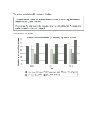
The bar chart compares the number of households in five different categories in the US by their annual income in 2007 , 2011 and 2015 .
It is clear that the highest number of US households by yearly income in 100000 and more. By contrast, the lowest proportion of expenditure on 75000-99999$ throughout the period.
In terms of expenditure, in 2007, the most US household by yearly income in 100000$ or more group at approximately 29 million. This figure decreased to at around 27 million in 2011. After that , it rose significantly to 33 million in 2015. In addition, the second largest category 25000-49999$ was 26 million in 2007. Then, it fluctuated slightly between 2007 and 2015 from 26 million to 27 million.
For the remaining data, there are a number of US expenditure in less than 25000 was 25 million in 2007. it was increase significantly to 28 million, Then, it has also fell to 27 million in 26 million. On the other hand, from 2007 to 2015, $75000-$99999 and $50000-$74999 was the lower group in the among categories, and these figures almost remained stable throughout the period.
Word Count: 190