🔥 Today Only: Save 30% on Premium — Offer Ends Soon! - Upgrade Now!
Line Graph

Band 5+: The line graph shows the average number of weekly patients visiting four clinics of a hospital from 2010 to 2016

Image for topic: The line graph shows the average number of weekly patients visiting four clinics of a hospital from 2010 to 2016
Our system will evaluate the answer based on this AI-generated description.
The image is a line graph with four lines representing the average number of weekly patients to four different clinics - Birth Control, Eye, Diabetic, and Dental - within one hospital from 2010 to 2016; the y-axis ranges from 0 to 400 in increments of 50, and the x-axis is marked at 2010, 2012, 2014, and 2016. The Birth Control clinic starts at approximately 50 patients in 2010, steadily increases to around 350 in 2014, and slightly drops to just below 350 in 2016. The Eye clinic starts at around 200 patients in 2010, remains consistent in 2012, drops to 150 in 2014, and then experiences a small increase to about 175 in 2016. The Diabetic clinic starts at approximately 175 patients in 2010, shows a slight increase to 200 in 2012, a decrease to around 125 in 2014, and a sharp increase to slightly below 350 in 2016. Lastly, the Dental clinic starts at roughly 150 patients in 2010, decreases slightly in 2012, increases to about 225 in 2014, and peaks at 300 in 2016.
Given the complexity of the image, the above description may not be entirely accurate.
Note: Both the topic and the answer were created by one of our users.

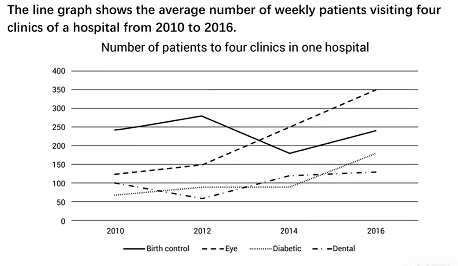
The line graph illustrates how many patients visited the hospital for their particular situation per week between 2010 and 2016.

Overall, there was an increase in the number of medical cases which is related to eye, diabetes, and dental, while a leveling off was seen in birth control leveling. It can also be seen that from 2012, the figure for patient numbers, who had eye issues, increased dramatically to surpass that of birth control making it the most popular issue from mid-2013 onwards.

The number of patients who came to the hospital for birth control started at about 250 people per week (PPW), then it slightly increased and reached a peak of approximately 2754PW in the next 2 years before dropping sharply to the lowest point at just over 175 PPW in 2014 and ending the period with gradual growth. In contrast, the figure for dental issues began with a slight decrease, and reached a low of just over 50PPW in 2012, followed by a marginal rise onwards.

Exactly 125 people visited the hospital for eye issues in 2010, with a subsequent dramatic rise throughout the period. Similarly, the figure for patients who had a diabetic problem rose considerably in the last 2 years after increasing steadily from 2010 to 2014.

Word Count: 211

Answers On The Same Topic:

The line graph shows the average number of weekly patients visiting four clinics of a hospital from 2010 to 2016

The line graph compares the weekly visitor numbers of four clinics in a hospital from 2010 to 2016, focusing on patients with eye pain, toothache, diabetes, and those seeking birth control. Initially, the birth control clinic had the highest demand, but the eye clinic eventually surpassed it, with a rapid increase towards the end of […]

The line graph shows the average number of weekly patients visiting four clinics of a hospital from 2010 to 2016

In this graph, you may see the number of patients for four clinics – birth control, eye, diabetic and dental. It all happened in one hospital and between 2010 and 2016. That is why it will display the demand of the patients for each of the four clinics. The number of patients for each clinic […]

The line graph shows the average number of weekly patients visiting four clinics of a hospital from 2010 to 2016

In this graph, you may see the number patients to four clinics – birth control, eye, diabetic and dental. It all happened in one hospital and between 2010 and 2016 years. That is why it will display the demand of the patients to each four clinics. Number of patients for each clinics is increased, except […]

The line graph shows the average number of weekly patients visiting four clinics of a hospital from 2010 to 2016

The line graph gives information about how many patients visited to a hospital because of various reasons between 2010 and 2016. It can be seen that birth control and dental clinic had slightly fluctuated over the following years, though there was a remarkable increase in the number of eye and diabetic clinic patients. The birth […]

The line graph shows the average number of weekly patients visiting four clinics of a hospital from 2010 to 2016

The displayed chart demonstrates the average number of victims visiting four different clinics every week between 2010 to 2016. It is clear that the number of weekly patients belonging to four distinct clinics grew steadily, but the exception can be seen in Birth control. Notably, the patients with eye problems rose significantly over a period […]

See All

Other Topics:

You should spend about 20 minutes on this task. The line graph below shows the percentage of spending in Turkey, from 1960 to 2000. Summarise the information by selecting and reporting the main features, and make comparisons where relevant. You should write at least 150 words.

The provided line graph illustrates the percentage of Turkey’s expenditure on food, leisure, clothing, transportation and energy between the year 1960 and 2000. Overall, spending on food and leisure gradually reduced throughout the period, while clothing increased steadily. Transport and Energy remained comparatively low and steady. Spending on food slightly dropped from 35% to aproximately […]

The graph below shows the favourite sport of people form the US between 1985 and 2015

The line graph compares the favourite sports of US citizens from 1985 to 2015. Overall, three sports became more popular (American Football, Basketball and Others Sports), and two sports became less popular (Baseball and Hockey). While American football consistently remained the most popular sport, Baseball was overtaken by Basketball, which became the second most popular. […]

The line graph shows the percentage of people using four different forms of transport in a city between 2000 and 2020.

The given line graph illustrates the different kind of transport system usage by people namely, Car, Bicycle, Bus, and by walking in a city from 2000 to 2020. Overall, it can be seen that car accounted highest share over the period except in final year. While walking reported least in all four form of transport. […]

The graph below gives information about the percentage of people living in Australia who were born in Asia, the UK, and other regions.

This graph shows a description about the proportion of citizens living in Australia who were born and grew up in Asia, the UK, and other regions. As we can see, the number of Asians in Australia has increased significantly from 1976 until 2011. The increase reached 15 percent in 2011. Data reveals a high interest […]

The line chart shows the trends of employement in the USA and predictions to the future.

The line chart illustrates employment patterns in the USA and predictions to the future. Overall, only services increased rapidly in the years of 1975 to 2025. On the contrary, agriculture sharply decreased between same years. In 1975, agriculture accounted for the largest share among other trend of employments, approximately 80 percent. In contrast, services and […]

Task 1: The graph shows the number of people taking part in 4 kinds of sports in a particular region between 1985 and 2005.

The graph shows the number of people who participated in particular sports (badminton, basketball, tennis, rugby) over a period of time (1985-2005) in the region. Overall, the number of participants in some sports did not change during the research period, while the number of participants in other sports dramatically increased or decreased. When we look […]

See All
We have detected unusual activity on your device.
Please verify your identity to continue.
Note: This verification step won't sign you in. If you have a premium account, please log in to access the service as usual.
Google/Gmail Verification
Or verify using Email/Code
We've sent a verification code to:
youremail@gmail.com (Not your email?)
Enter it below to complete the verification process.
Ensure your email address is correct, your inbox is not full, and you check your spam folder. If no email arrives, consider using an alternative email.
You will need a Premium plan to perform your action!
Note: If you already have a premium account, please log in to access our services as usual.

Plans & Pricing

Our mission is to make quality education accessible for everyone.
However, to keep our hardworking team running and this service alive, we genuinely need your support!
By opting for a premium plan, not only do you sustain us in achieving the mission, but you also unlock advanced features to enrich your learning experience.

Free

For learners who aren't pressed for time

What's included on Free
100+ Cambridge IELTS Tests
Instant IELTS Writing Task 1 & 2 Evaluation (2 times/month)
Instant IELTS Speaking Part 1, 2, & 3 Evaluation (5 times/month)
Instant IELTS Writing Task 1 & 2 Essay Generator (2 times/month)
500+ Dictation & Shadowing Exercises
100+ Pronunciation Exercises
Flashcards
Other Advanced Tools

Premium

For those serious about advancing their English proficiency, and for IELTS candidates aspiring to boost their band score by 1-2 points (especially in writing & speaking) in just 30 days or less

What's included on Premium
Save Your IELTS Test Progress
Unlock All Courses & IELTS Tests
Unlimited AI Conversations
Unlimited AI Writing Enhancement Exercises
Unlimited IELTS Writing Task 1 & 2 Evaluation
Unlimited IELTS Speaking Part 1, 2, & 3 Evaluation
Checked Answers Will Not Be Published
Unlimited IELTS Writing Task 1 & 2 Essay Generator
Unlimited IELTS Speaking Part 1, 2, & 3 Sample Generator
Unlimited Usage Of Advanced Tools
Priority Support within 24h (12-month plan only)

Due to the nature of our service and the provided free trials, payments are non-refundable.
Nếu bạn là người Việt Nam và không có hoặc không muốn trả bằng credit/debit cards, bạn có thể thanh toán bằng phương thức chuyển khoản:


Chọn gói:
419,000₫ 277,000 ₫ cho gói 1 tháng (chỉ 9,233₫/ngày)
1,239,000₫ 597,000 ₫ cho gói 3 tháng (chỉ 6,633₫/ngày)
2,469,000₫ 1,027,000 ₫ cho gói 6 tháng (chỉ 5,706₫/ngày)
4,929,000₫ 1,417,000 ₫ cho gói 12 tháng (chỉ 3,936₫/ngày)


Sau khi chuyển khoản, vui lòng đợi trình duyệt tự động điều hướng bạn trở lại Engnovate và bạn sẽ ngay lập tức nhận được mã kích hoạt tài khoản premium.
Nếu có lỗi xảy ra, bạn có thể liên hệ với team thông qua một trong các phương thức: email đến helloengnovate@gmail.com hoặc nhắn tin qua facebook.com/engnovate.
Vì toàn bộ công cụ trên website đều có thể sử dụng thử miễn phí, Engnovate không hỗ trợ hoàn tiền.