🔥 Today Only: Save 30% on Premium — Offer Ends Soon! - Upgrade Now!
Line Graph

Band 6+: The graph gives information about the visitors to Cardiff and Dublin from 2010 to 2020.

Image for topic: The graph gives information about the visitors to Cardiff and Dublin from 2010 to 2020.
Our system will evaluate the answer based on this AI-generated description.
The image displays a line graph illustrating the number of visitors to Cardiff and Dublin from 2011 to 2020. In 2011, Cardiff had 2 million visitors which dropped to just under 2 million in 2012, then increased to slightly over 2 million in 2013, and slightly decreased below 2 million in 2014. In 2015, visitors to Cardiff rose to approximately 2.2 million, dropped back just under 2 million in 2016 and 2017, and increased to 2 million in 2018. Cardiff saw a sharp rise in visitors to approximately 4 million in 2019, followed by a small decrease in 2020. For Dublin, visitors started at just over 3 million in 2011, slightly dipped in 2012, and rose to nearly 3.5 million in 2013. The numbers dropped below 3 million in 2014, increased again to nearly 3.5 million in 2015, and remained stable in 2016. However, there was a sharp increase to about 5 million visitors in 2017. In 2018, the number of visitors to Dublin decreased slightly to just below 5 million but surged again to more than 5.5 million in 2019 and 2020.
Given the complexity of the image, the above description may not be entirely accurate.
Note: Both the topic and the answer were created by one of our users.

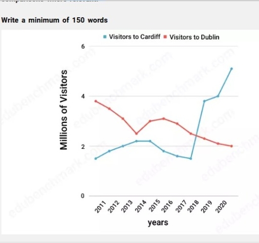
The graph delineates data about the quantity of tourists in Cardiff and Dublin over a period of ten years, from 2010 to 2020.

Overall, both Cardiff and Dublin experienced fluctuations. At the beginning of the period the amount of visitor was higher in Dublin, but at the end of the period Cardiff outraced Dublin.

Starting from 2011 Dublin’s visitor rate rapidly declined, accounting for about 2 million. Nevertheless, the number suddenly rose to approximately 3 million. After that the quantity of tourists slightly reached a low of 2 million, respectively.Taking a closer look at the figure of Cardiff, we can observe a surge to more than 2 million. However the number started to fall starting from 2015 and accounted for about the same rate as at the beggining of the time given. Yet, the figure doubled in rate, skyrocketing from about 2 million to 4 million, roughly. Following that, the figure reached its peak point of 5 million visitors.

Word Count: 159

Answers On The Same Topic:

The graph gives information about the visitors to Cardiff and Dublin from 2010 to 2020.

The chart illustrates the number of tourists who visited two destinations, Cardiff and Dublin, from 2011 to 2020. Overall, it is clear that the number of visitors to Cardiff increased significantly towards the end of the period, while the number of visitors to Dublin saw a slight decrease. In 2011, Dublin was the most popular […]

The graph gives information about the visitors to Cardiff and Dublin from 2010 to 2020.

The line chart compares the number of visitors (in million) to Cardiff and Dublin over the period from 2011 to 2020. In 2011, Dublin attracted approximately 4 million visitors, where Cardiff received about 1.7 million tourists. Over the next few years, Dublin visitors number declined steadily, reaching to just 2.2 million in 2013, then it […]

The graph gives information about the visitors to Cardiff and Dublin from 2010 to 2020.

The line chart illustrates change in visitors of two different destinations Cardiff and Dublin from 2011 to 2020. Overall, it is clear that tourists to Dublin are decreased in early year and it showed downward trend throughout the period while visitors to Cardiff are increased in first year and after that display minor fluctuation and […]

The graph gives information about the visitors to Cardiff and Dublin from 2010 to 2020.

The line graph compares the number of tourists who visited Cardiff and Dublin between 2010 and 2020. Overall, the number of visitors to Cardiff generally experienced a significant upward trend, while the figure for Dublin decreased. Notably, the number of tourists in Cardiff overtook that of Dublin, thus becoming the most popular destination to visit. […]

See All

Other Topics:

the line graph shows three different crimes in England and Wales in 1970-2005

The line graph illustrates three different types of crime in England and Wales over a period of 35 years. Overall, what stands out from the graph is that car theft was by far the most significant crime over the period shown, whereas house burgling and street robbery saw small changes by the end of the […]

The graph below shows the usage of oil in four different countries between 1966 and 2006 as a percentage of total energy use within each nations.

The chart illustrates the oil usage in four countries from 1966 to 2006. Overall, oil usage declined significantly in Sweden and Italy over the period, while Turkey experienced a steady increase, from the bottom to the top. Italy consistently recorded the highest oil consumption percentage, although its figures fluctuated throughout the period. According to the […]

The line graoh shows the percentage of tourists to Scotland who visited four different attractions in Wdinburgh. Summarize the information by selecting and reporting the main features, and make comparisons where relevant.

The line graph illustrates the proportion of tourists who visited four different attractions in Scotland between 1980 and 2010. Overall, it is clear that while the castle experienced a significant rise in popularity to become the most visited attraction, the aquarium and the festival saw long-term declines. Meanwhile, the zoo showed a notable recovery in […]

The graph below shows radio and television audiences throughout the day in 1992. Summarise the information by selecting and reporting the main features, and make comparisons where relevant. Write at least 150 words.

The line graph illustrates the amount of people consuming radio and television all over the day in the period between October and December in UK in 1992. Overall, it could be seen that radio have been using bigger population among audiences in early morning hours, while the number of people who wached TV was considerably […]

Here is your line graph showing trends in two categories (A and B) from 2010 to 2020. You can now describe it for your IELTS Writing Task 1.

The line chart illustrates the value of trends in two categories (A and B) over a period of 10 years, starting from 2010. It can be seen from the graph, both categories witnessed an upward trend. The highest value experienced by group A, while the lowest reported by category B. With the respect of group […]

This line graph illustrates the participation levels for five different activities at a social centre in Melbourne from 2000 to 2020.

The line graph shows the number of participants for five different activities at one cosial centre in Melbourne,Australia between 2000 and 2020. Overall, we can see from the chart that ratio of people who participate for film club and martial arts showed almost steadily growth, while the number of amateur dramatics decreased over the given […]

See All
We have detected unusual activity on your device.
Please verify your identity to continue.
Note: This verification step won't sign you in. If you have a premium account, please log in to access the service as usual.
Google/Gmail Verification
Or verify using Email/Code
We've sent a verification code to:
youremail@gmail.com (Not your email?)
Enter it below to complete the verification process.
Ensure your email address is correct, your inbox is not full, and you check your spam folder. If no email arrives, consider using an alternative email.
You will need a Premium plan to perform your action!
Note: If you already have a premium account, please log in to access our services as usual.

Plans & Pricing

Our mission is to make quality education accessible for everyone.
However, to keep our hardworking team running and this service alive, we genuinely need your support!
By opting for a premium plan, not only do you sustain us in achieving the mission, but you also unlock advanced features to enrich your learning experience.

Free

For learners who aren't pressed for time

What's included on Free
100+ Cambridge IELTS Tests
Instant IELTS Writing Task 1 & 2 Evaluation (2 times/month)
Instant IELTS Speaking Part 1, 2, & 3 Evaluation (5 times/month)
Instant IELTS Writing Task 1 & 2 Essay Generator (2 times/month)
500+ Dictation & Shadowing Exercises
100+ Pronunciation Exercises
Flashcards
Other Advanced Tools

Premium

For those serious about advancing their English proficiency, and for IELTS candidates aspiring to boost their band score by 1-2 points (especially in writing & speaking) in just 30 days or less

What's included on Premium
Save Your IELTS Test Progress
Unlock All Courses & IELTS Tests
Unlimited AI Conversations
Unlimited AI Writing Enhancement Exercises
Unlimited IELTS Writing Task 1 & 2 Evaluation
Unlimited IELTS Speaking Part 1, 2, & 3 Evaluation
Checked Answers Will Not Be Published
Unlimited IELTS Writing Task 1 & 2 Essay Generator
Unlimited IELTS Speaking Part 1, 2, & 3 Sample Generator
Unlimited Usage Of Advanced Tools
Priority Support within 24h (12-month plan only)

Due to the nature of our service and the provided free trials, payments are non-refundable.
Nếu bạn là người Việt Nam và không có hoặc không muốn trả bằng credit/debit cards, bạn có thể thanh toán bằng phương thức chuyển khoản:


Chọn gói:
419,000₫ 277,000 ₫ cho gói 1 tháng (chỉ 9,233₫/ngày)
1,239,000₫ 597,000 ₫ cho gói 3 tháng (chỉ 6,633₫/ngày)
2,469,000₫ 1,027,000 ₫ cho gói 6 tháng (chỉ 5,706₫/ngày)
4,929,000₫ 1,417,000 ₫ cho gói 12 tháng (chỉ 3,936₫/ngày)


Sau khi chuyển khoản, vui lòng đợi trình duyệt tự động điều hướng bạn trở lại Engnovate và bạn sẽ ngay lập tức nhận được mã kích hoạt tài khoản premium.
Nếu có lỗi xảy ra, bạn có thể liên hệ với team thông qua một trong các phương thức: email đến helloengnovate@gmail.com hoặc nhắn tin qua facebook.com/engnovate.
Vì toàn bộ công cụ trên website đều có thể sử dụng thử miễn phí, Engnovate không hỗ trợ hoàn tiền.