🔥 Today Only: Save 30% on Premium — Offer Ends Soon! - Upgrade Now!
Line Graph

Band 7+: The graph gives information about the visitors to Cardiff and Dublin from 2010 to 2020.

Image for topic: The graph gives information about the visitors to Cardiff and Dublin from 2010 to 2020.
Our system will evaluate the answer based on this AI-generated description.
The image displays a line graph illustrating the number of visitors to Cardiff and Dublin from 2011 to 2020. In 2011, Cardiff had 2 million visitors which dropped to just under 2 million in 2012, then increased to slightly over 2 million in 2013, and slightly decreased below 2 million in 2014. In 2015, visitors to Cardiff rose to approximately 2.2 million, dropped back just under 2 million in 2016 and 2017, and increased to 2 million in 2018. Cardiff saw a sharp rise in visitors to approximately 4 million in 2019, followed by a small decrease in 2020. For Dublin, visitors started at just over 3 million in 2011, slightly dipped in 2012, and rose to nearly 3.5 million in 2013. The numbers dropped below 3 million in 2014, increased again to nearly 3.5 million in 2015, and remained stable in 2016. However, there was a sharp increase to about 5 million visitors in 2017. In 2018, the number of visitors to Dublin decreased slightly to just below 5 million but surged again to more than 5.5 million in 2019 and 2020.
Given the complexity of the image, the above description may not be entirely accurate.
Note: Both the topic and the answer were created by one of our users.

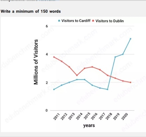
The line graph compares the number of tourists who visited Cardiff and Dublin between 2010 and 2020.

Overall, the number of visitors to Cardiff generally experienced a significant upward trend, while the figure for Dublin decreased. Notably, the number of tourists in Cardiff overtook that of Dublin, thus becoming the most popular destination to visit.

In 2010, about 1.8 million people visited Cardiff, and this number increased consistently, reaching around 2.1 million in 2014. Having levelled off between 2014 and 2015, the rate of tourists then declined to the initial number in 2018. From 2018 onwards, the figure grew dramatically, peaking at roughly 5 million by 2020.

Turning to Dublin, the number of visitors, which stood at just under 4 million in the initial year, fell to around 2.2 million in 2014. After, the relative number went up to 3 million by 2015. Over the following years, however, its figure dropped steadily, bottoming out at 2 million in the final year.

Word Count: 161

Answers On The Same Topic:

The graph gives information about the visitors to Cardiff and Dublin from 2010 to 2020.

The chart illustrates the number of tourists who visited two destinations, Cardiff and Dublin, from 2011 to 2020. Overall, it is clear that the number of visitors to Cardiff increased significantly towards the end of the period, while the number of visitors to Dublin saw a slight decrease. In 2011, Dublin was the most popular […]

The graph gives information about the visitors to Cardiff and Dublin from 2010 to 2020.

The line chart compares the number of visitors (in million) to Cardiff and Dublin over the period from 2011 to 2020. In 2011, Dublin attracted approximately 4 million visitors, where Cardiff received about 1.7 million tourists. Over the next few years, Dublin visitors number declined steadily, reaching to just 2.2 million in 2013, then it […]

The graph gives information about the visitors to Cardiff and Dublin from 2010 to 2020.

The line chart illustrates change in visitors of two different destinations Cardiff and Dublin from 2011 to 2020. Overall, it is clear that tourists to Dublin are decreased in early year and it showed downward trend throughout the period while visitors to Cardiff are increased in first year and after that display minor fluctuation and […]

See All

Other Topics:

Instructions: You should spend about 20 minutes on this task. The graph below presents data on the number of job openings in six different occupations from 2021 to 2026. Summarise the information by selecting and reporting the main features, and make comparisons where relevant. Write at least 150 words.

The line graph illustrates the number of opening job demand trends in six different occupation, namely Data Science, Software Engineer, Graphic Designer, Accountant, Marketing Manager, HR Specialist between 2021 and 2026. Overall, it is clear that the most noticeable trend was seen in Data Science. More trends fluctuated. By the end of period, HR Specialist […]

The charts shows the sales of five different kinds of jam from 2009 to 2014

The line graph illustrates the sales of five different kinds of jam between 2009 and 2014. Overall, while the sales of plum and cherry jam experienced a decline over the period, raspberry and grape jam saw a steady rise, with strawberry jam undergoing the most dramatic increase. In 2009, strawberry jam had the highest sales, […]

write an essay about 150 words about the graph below

The data compares the cinema attendance of different age groups in Great Britain over a 16-year period between 1984 and 2000. Overall, it is noticeable that all groups demonstrated a significant growth, although some of them (15-24 and 7-14) showed a slight decrease by the end of the period. Focusing on 15-24 ages first, it […]

The line graph illustrates the amount of spreads consumed from 1981 to 2007, in grams

The given line graph illustrates the information about three types of spreads which were consumed in a period between 1981 and 2007. The figures are given in grams. Overall, it can be observed that butter showed a downward trend while margarine fluctuated throughout the period. Also, low fat and reduced spreads were not consumed till […]

The canging rates od crime in the inner city from 2003-2012

The data regarding the changes in food consumption by the Chinese citizen from 1985 to 2010 has been illustrated by the line chart. Overall, the meat and fish consumption increased steadily, while the salt consumption has decreased . To begin with, people collected 100 grams of meat for consumption in 1985. After that the expenditure […]

The graph below shows the percentage of workers in 5 different European countries with a day or more absence from 1991 to 2001.

The line graph below illustrates the percentage of employees that took a sick leave with a day or more in 5 European countries during the period of time between 1991 and 2001. Overall, the percentage of workers with illness absence in Sweden, France and the Netherlands showed a significant change, whereas other countries including the […]

See All
We have detected unusual activity on your device.
Please verify your identity to continue.
Note: This verification step won't sign you in. If you have a premium account, please log in to access the service as usual.
Google/Gmail Verification
Or verify using Email/Code
We've sent a verification code to:
youremail@gmail.com (Not your email?)
Enter it below to complete the verification process.
Ensure your email address is correct, your inbox is not full, and you check your spam folder. If no email arrives, consider using an alternative email.
You will need a Premium plan to perform your action!
Note: If you already have a premium account, please log in to access our services as usual.

Plans & Pricing

Our mission is to make quality education accessible for everyone.
However, to keep our hardworking team running and this service alive, we genuinely need your support!
By opting for a premium plan, not only do you sustain us in achieving the mission, but you also unlock advanced features to enrich your learning experience.

Free

For learners who aren't pressed for time

What's included on Free
100+ Cambridge IELTS Tests
Instant IELTS Writing Task 1 & 2 Evaluation (2 times/month)
Instant IELTS Speaking Part 1, 2, & 3 Evaluation (5 times/month)
Instant IELTS Writing Task 1 & 2 Essay Generator (2 times/month)
500+ Dictation & Shadowing Exercises
100+ Pronunciation Exercises
Flashcards
Other Advanced Tools

Premium

For those serious about advancing their English proficiency, and for IELTS candidates aspiring to boost their band score by 1-2 points (especially in writing & speaking) in just 30 days or less

What's included on Premium
Save Your IELTS Test Progress
Unlock All Courses & IELTS Tests
Unlimited AI Conversations
Unlimited AI Writing Enhancement Exercises
Unlimited IELTS Writing Task 1 & 2 Evaluation
Unlimited IELTS Speaking Part 1, 2, & 3 Evaluation
Checked Answers Will Not Be Published
Unlimited IELTS Writing Task 1 & 2 Essay Generator
Unlimited IELTS Speaking Part 1, 2, & 3 Sample Generator
Unlimited Usage Of Advanced Tools
Priority Support within 24h (12-month plan only)

Due to the nature of our service and the provided free trials, payments are non-refundable.
Nếu bạn là người Việt Nam và không có hoặc không muốn trả bằng credit/debit cards, bạn có thể thanh toán bằng phương thức chuyển khoản:


Chọn gói:
419,000₫ 277,000 ₫ cho gói 1 tháng (chỉ 9,233₫/ngày)
1,239,000₫ 597,000 ₫ cho gói 3 tháng (chỉ 6,633₫/ngày)
2,469,000₫ 1,027,000 ₫ cho gói 6 tháng (chỉ 5,706₫/ngày)
4,929,000₫ 1,417,000 ₫ cho gói 12 tháng (chỉ 3,936₫/ngày)


Sau khi chuyển khoản, vui lòng đợi trình duyệt tự động điều hướng bạn trở lại Engnovate và bạn sẽ ngay lập tức nhận được mã kích hoạt tài khoản premium.
Nếu có lỗi xảy ra, bạn có thể liên hệ với team thông qua một trong các phương thức: email đến helloengnovate@gmail.com hoặc nhắn tin qua facebook.com/engnovate.
Vì toàn bộ công cụ trên website đều có thể sử dụng thử miễn phí, Engnovate không hỗ trợ hoàn tiền.