🔥 Today Only: Save 30% on Premium — Offer Ends Soon! - Upgrade Now!
Bar Chart

Band 7+: The chart show the result of a survey about the most important invention in the last 300 years. Summarize the information by selecting and reporting the main features, and make comparisions whare relevant .

Image for topic: The chart show the result of a survey about the most important invention in the last 300 years. Summarize the information by selecting and reporting the main features, and make comparisions whare relevant .
Our system will evaluate the answer based on this AI-generated description.
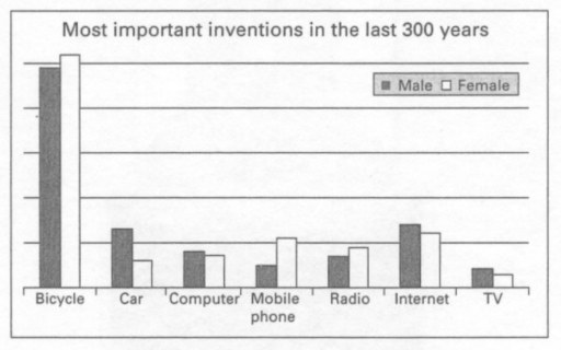
The image is a bar graph titled "Most important inventions in the last 300 years," comparing responses from male and female participants about seven different inventions. The inventions are Bicycle, Car, Computer, Mobile phone, Radio, Internet, TV; arranged on the x-axis. On the y-axis, there are horizontal lines representing percentages, marked at intervals of 5 from 0 to 35. For the Bicycle, Male is approximately 30%, and Female is near 5%. Car responses for Male are around 10%, and Female is about 5%. Computer Male responses are about 2.5%, and Female is roughly 1.5%. Male responses for Mobile phone are around 2.5%, and Female is about 5.5%. Radio has Male at approximately 1.5%, and Female is roughly 2%. Internet responses show Male at about 3.5% and Female at nearly 5%. TV has Male responses at approximately 2.5% and Female at about 2%. Male responses are represented by a darker shade bar, and Female responses by a lighter shade bar, each invention having two bars adjacent to each other for comparison.
Given the complexity of the image, the above description may not be entirely accurate.
Note: Both the topic and the answer were created by one of our users.

The bar chart provided illustrates the significance of various inventions over the past three centuries through a survey. Respondents were asked to rank seven categories bicycle, car, computer, mobile phone, radio, Internet, and TV.

The data reveals that the bicycle stands out as the most momentous invention among both genders which had 59 percent chosen by males and approximately 62 percent by females. The Internet emerges as the second most important creation with over 22 percent of males choosing it and around 21 percent of females ranking it highly.

In contrast, television garnered the lowest proportion of votes, with less than 20 percent overall. While TV was more popular among males which accounted for about 14 percent, females showed less interest with only 12 of the choices recorded. The percentages for the remaining group including car, computer, mobile phone and radio received slightly higher proportions than the TV group.

Overall, the chart showed that the bicycle was the most important creation as a transformative invention, followed by the Internet as a communication tool. It also suggests that television has relatively less significance in comparison.

Word Count: 184

Answers On The Same Topic:

The chart show the result of a survey about the most important invention in the last 300 years. Summarize the information by selecting and reporting the main features, and make comparisions whare relevant .

The bar chart illustrates results of a survey inventions in the last 300 years between male and female. Overall, bicycle was the highest over the period in both gender. The TV the lowest all time between male and female. Both genders similar. The most popular form of communication was the Internet. The bicycle, mobile phone […]

The chart show the result of a survey about the most important invention in the last 300 years. Summarize the information by selecting and reporting the main features, and make comparisions whare relevant .

The given chart indicates an outcome of a survey carried out on men and women about the most important invention in the last 300 year, consisting of bicycle, car, table, mobile phone, radio, internet and TV. Overall, It is evident that the bicycle is the most significant out of all inventions; conversely, TV is considered […]

The chart show the result of a survey about the most important invention in the last 300 years. Summarize the information by selecting and reporting the main features, and make comparisions whare relevant .

The chart represents the opinion of men and women regarding the seven key inventions that have played their most significant role during the past three centuries. Overall, it can be seen that both genders consider bicycles by far the most important innovation, followed by the creation of the Internet. Also, both sides agree that TV […]

The chart show the result of a survey about the most important invention in the last 300 years. Summarize the information by selecting and reporting the main features, and make comparisions whare relevant .

The bar chart illustrates the outcome of a survey about the most significant breakthroughs that happened in the last 300 years. The survey was carried out on two groups, namely males and females. The most striking feature of the chart is that, in polled people’s opinion, the bicycle is the most important invention in the […]

The chart show the result of a survey about the most important invention in the last 300 years. Summarize the information by selecting and reporting the main features, and make comparisions whare relevant .

a) The most noticeable thing from the chart is bicycle. The chart reveals that bicycle is one of the the most important thing in people live in the last 300 years inluding for female and male. b) For females, the most voting partterns is bicycle. According to the chart, revealed that large number of females […]

See All

Other Topics:

the charts below show the percentage of people who ate 5 portions of fruits and vegetables per day in the UK from 2001 to 2008

The bar charts illustrates the proportion of men,women,and children in the UK who consumed five portions of fruit and vegetables per day between 2001-2008. Overall women’s percentage increase faster than men,and children too increase year by year.In 2001-2008 men’s percentage was remain stable,women’s percentage falled 2006 to 2008,children’s percentage slightly reached the level of men. […]

The bar chart shows the percentage of small , medium, large companies which used social media for business purposes between 2012 to 2016. Summarise the information by selecting and reporting the main features, and make comparisons where relevant.

The bar chart illustrates the information about the change in the proportion of the businesses in small, medium, and large size, that used social media from 2012 until 2016. Unit are measured in percentage. Overall, every companies showed an upward trend, and the highest figure was in 2016. Moreover, the figure of large business was […]

You should spend about 20 minutes on this task. The chart below shows the percentage of children in a European country who took part in four kinds of activities in 2009. Summarise the information by selecting and reporting the main features, and make comparisons where relevant. You should write at least 150 words. <

The graph below illustrates the proportion of young people across three age groups in a specific European nation who engaged in four types of activities in 2009. Overall, watching television emerged as the most popular pastime. On the contrary, playing video games recorded the lowest levels of participation among the tracked demographics. In terms of […]

The bar chart shows the average class size in primary schools and lower secondary schools in 6 countries compared to the world average in 2006. Summarize the information by selecting and reporting the main features, and make comparisons where relevant

The given bar chart illustrates the average class size of primary and lower secondary school in south Korea, Japan, UK, Denmark, and Iceland in 2006 and compares it with the world average. Overall, it is evident that the largest classroom size was in South Korea and smallest in Iceland in 2006. In south Korea, Japan, […]

The chart shows the water levels of 6 cities in Australia {Darwin (1), Sydney (2), Melbourne (3). Brisbane (4), Perth (5) and Canberra (6)} in October 2009 and October 2010

The bar chart compares the percentages of water in various Australian city reservoirs in October 2009 and 2010. Overall, it is clear that figures for almost all cities experienced an upward trend except for Darwin which had a reduction in water levels. It is also worth mentioning that although Sydney had the most water in […]

The bar graph below shows the percentage growth in average property prices in three different countries between 2007 and 2010. Summarise the information by selecting and reporting the main features, and make comparisons where relevant.

The bar chart compares the proportion of increase in average property prices in three different countries (Algeria, China, and Argentina) in 2007 and 2010. Overall, while property costs in China and Argentina had a general rise, the figure for Algeria decreased totally. Notably, even though the prices for China was least in the beginning of […]

See All
We have detected unusual activity on your device.
Please verify your identity to continue.
Note: This verification step won't sign you in. If you have a premium account, please log in to access the service as usual.
Google/Gmail Verification
Or verify using Email/Code
We've sent a verification code to:
youremail@gmail.com (Not your email?)
Enter it below to complete the verification process.
Ensure your email address is correct, your inbox is not full, and you check your spam folder. If no email arrives, consider using an alternative email.
You will need a Premium plan to perform your action!
Note: If you already have a premium account, please log in to access our services as usual.

Plans & Pricing

Our mission is to make quality education accessible for everyone.
However, to keep our hardworking team running and this service alive, we genuinely need your support!
By opting for a premium plan, not only do you sustain us in achieving the mission, but you also unlock advanced features to enrich your learning experience.

Free

For learners who aren't pressed for time

What's included on Free
100+ Cambridge IELTS Tests
Instant IELTS Writing Task 1 & 2 Evaluation (2 times/month)
Instant IELTS Speaking Part 1, 2, & 3 Evaluation (5 times/month)
Instant IELTS Writing Task 1 & 2 Essay Generator (2 times/month)
500+ Dictation & Shadowing Exercises
100+ Pronunciation Exercises
Flashcards
Other Advanced Tools

Premium

For those serious about advancing their English proficiency, and for IELTS candidates aspiring to boost their band score by 1-2 points (especially in writing & speaking) in just 30 days or less

What's included on Premium
Save Your IELTS Test Progress
Unlock All Courses & IELTS Tests
Unlimited AI Conversations
Unlimited AI Writing Enhancement Exercises
Unlimited IELTS Writing Task 1 & 2 Evaluation
Unlimited IELTS Speaking Part 1, 2, & 3 Evaluation
Checked Answers Will Not Be Published
Unlimited IELTS Writing Task 1 & 2 Essay Generator
Unlimited IELTS Speaking Part 1, 2, & 3 Sample Generator
Unlimited Usage Of Advanced Tools
Priority Support within 24h (12-month plan only)

Due to the nature of our service and the provided free trials, payments are non-refundable.
Nếu bạn là người Việt Nam và không có hoặc không muốn trả bằng credit/debit cards, bạn có thể thanh toán bằng phương thức chuyển khoản:


Chọn gói:
419,000₫ 277,000 ₫ cho gói 1 tháng (chỉ 9,233₫/ngày)
1,239,000₫ 597,000 ₫ cho gói 3 tháng (chỉ 6,633₫/ngày)
2,469,000₫ 1,027,000 ₫ cho gói 6 tháng (chỉ 5,706₫/ngày)
4,929,000₫ 1,417,000 ₫ cho gói 12 tháng (chỉ 3,936₫/ngày)


Sau khi chuyển khoản, vui lòng đợi trình duyệt tự động điều hướng bạn trở lại Engnovate và bạn sẽ ngay lập tức nhận được mã kích hoạt tài khoản premium.
Nếu có lỗi xảy ra, bạn có thể liên hệ với team thông qua một trong các phương thức: email đến helloengnovate@gmail.com hoặc nhắn tin qua facebook.com/engnovate.
Vì toàn bộ công cụ trên website đều có thể sử dụng thử miễn phí, Engnovate không hỗ trợ hoàn tiền.