🔥 Today Only: Save 30% on Premium — Offer Ends Soon! - Upgrade Now!
Bar Chart

Band 4+: two bar graphs showing how often people exercised europe 2016

Image for topic: two bar graphs showing how often people exercised europe 2016
Our system will evaluate the answer based on this AI-generated description.
The image shows two bar charts depicting percentages of regular, semi-regular, and seldom activity among men and women in four age groups: 15-24, 25-39, 40-54, and 55+. In the Men's chart, Regular activity is highest in the 55+ group at approx 70%, followed by 25-39 at over 50%, then 40-54 at approx 50%, and lowest in 15-24 at less than 20%. Semi-regular activity is relatively uniform across age groups, ranging from approx 20% to 30%. Seldom activity is highest in the 15-24 group at over 60%, decreases with age, with the 55+ group at less than 10%. In the Women's chart, Regular activity is highest in the 55+ group at over 50%, then 40-54 at over 40%, 25-39 at approx 40%, and lowest in 15-24 at less than 20%. Semi-regular activity trends similarly to men, with a range from 20% to slightly over 30%. Seldom activity is highest in the 15-24 group at over 50%, decreases with age, with 55+ at approx 10%.
Given the complexity of the image, the above description may not be entirely accurate.
Note: Both the topic and the answer were created by one of our users.

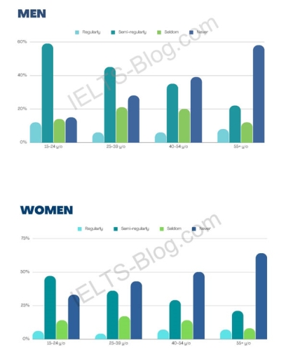
The bar chart shows how often men and women of different age groups exercised in Europe in 2016. In the two diagrams, there are 4 age groups, namely 15–24, 25–39, 40–54, and 55+. In the male diagram, the highest semi-regular activity is at the age of 15–24 with a percentage of less than 60%, followed by the age of 25–39 with 45%, then at the age of 40–54 with about 35%, and finally at the age of 55+ with more than 20%. For almost the same percentage in each age group of less than 20%, the seldom group has a percentage of about 10% to 20%, and the never exercise group is highest at the age of 55+ with less than 60%.

Then, in the female diagram in the semi-regular group, the highest percentage is at the age of 15–24 with less than 50%, then in regular activities, the percentage of each age group is the same, which is less than 10%, then in seldom activities, all age groups are less than 25%, and the highest never activity is in the 55+ group with a percentage of around 60–65%.

So it can be concluded that the 55+ age group is the age group that rarely exercises because they are old, and the percentage of people who are used to exercising is in the 15-24 age group.

Word Count: 226

Answers On The Same Topic:

two bar graphs showing how often people exercised europe 2016

The bar charts illustrate the frequency of European men and women engaged in sports activities, which were divided into four age groups (15 to 24 years old, 25 to 39 years old, 40 to 54 years old, and 55 years old). The graphs revealed that both genders have a similar trend in terms of engaging […]

two bar graphs showing how often people exercised europe 2016

The graphs represent the data about the frequency of training between different age groups of people (15-20, 25-39, 40-54 and 55+ years old) and gender. Overall, young males exercised semi-regularly as the frequency dropped between elderly men. As for the women, they exercise less compared to males in their early years and never train as […]

two bar graphs showing how often people exercised europe 2016

Overall, two bar charts show the average amount of exercise among men and women divided by their ages. Initially, among men, the majority between the ages of 15 and 24 exercise almost regularly. Likewise, older people between 25 and 39. However, as men get older, the rate of exercising is followed by a huge fall. […]

two bar graphs showing how often people exercised europe 2016

The bar charts illustrate how often men and women belonging to different age groups exercise in Europe in the year 2016. Considering the overall age groups in the survey, on average men tend to exercise slightly more than women. In contrast, the former also have a larger percentage who rarely exercise than the latter. People […]

See All

Other Topics:

You should spend about 20 minutes on this task. The bar chart shows the percentage of adult male smokers in seven countries along with the world average in 2000 and 2015. Summarise the information by selecting and reporting the main features and make comparisons where relevant. Write at least 150 words.

The bar chart provides information about the percentage of male smokers in seven countries along with the world average consumption of a cigarette in 2000 and 2015. Overall, countries such as Armenia, Bangladesh, Cuba, Mexico, Autralia have a downward trend. While, Egypt and Lebanon have an upward trend. In addition, the total consumption of a […]

The bar chart shows the percentages of the Canadian workforce in five major industries in 1850 and 2020.

The bar graph illustrates the change of the workforce of the Canadian workers in the five various main industrial areas in 1850 and 2020 with percentages. Overall, it is clear to see that the main power shifted to the services from manufacturing and agriculture, and fishing. In conparison, the differences in construction and energy, and […]

The chart below gives information on the numbers of workers in different occupations who migrated to Australia between 2009 and 2012.

The bar graph illustrates the number of employees in four different occupations who came from different parts of the world to Australia from 2009 to 2012. Overall, the highest number of workers were accountants and the least number of workers were computer programmers in each four years. Cook and software engineer moderately had the equal […]

The chart below shows the number of girls per 100 boys enrolled in different levels of school education. Summarise the information by selecting and reporting the main features, and make comparisons where relevant. You should write at least 150 words.

This picture illustrates the process of numbers of girls per 100 boys enrolled in different level of school education. In 1990, developing countries had three types education system. First Primary education,there were 83 of girls enrolled in different level of education.In secondary,72 number of girls and in tertiary education there were 66 number of girls […]

Summarise the information by selecting and reporting the main features and make comparison where relavant

The bar chart illustrates the level of water in six cities of Australia in 2009 and 2010. Overall, it can be seen that the level of water was high in Canberra in both years, while Melbourne was at lowest point in both years. It is evident that in 2009, the water level was almost equal […]

The bar chart below shows the different leisure activities preferred by boys and girls

The bar graph illustrates the distinct leisure activities preferred by two genders. Overall, it is clear that sport was the boy’s most favorite activities while there were only a small number of them were keen on art and craft. Conversely, most of the girls interested in art and craft while sport wasn’t girls’ favorite leisure […]

See All
We have detected unusual activity on your device.
Please verify your identity to continue.
Note: This verification step won't sign you in. If you have a premium account, please log in to access the service as usual.
Google/Gmail Verification
Or verify using Email/Code
We've sent a verification code to:
youremail@gmail.com (Not your email?)
Enter it below to complete the verification process.
Ensure your email address is correct, your inbox is not full, and you check your spam folder. If no email arrives, consider using an alternative email.
You will need a Premium plan to perform your action!
Note: If you already have a premium account, please log in to access our services as usual.

Plans & Pricing

Our mission is to make quality education accessible for everyone.
However, to keep our hardworking team running and this service alive, we genuinely need your support!
By opting for a premium plan, not only do you sustain us in achieving the mission, but you also unlock advanced features to enrich your learning experience.

Free

For learners who aren't pressed for time

What's included on Free
100+ Cambridge IELTS Tests
Instant IELTS Writing Task 1 & 2 Evaluation (2 times/month)
Instant IELTS Speaking Part 1, 2, & 3 Evaluation (2 times/month)
Instant IELTS Writing Task 1 & 2 Essay Generator (2 times/month)
500+ Dictation & Shadowing Exercises
100+ Pronunciation Exercises
Flashcards
Other Advanced Tools

Premium

For those serious about advancing their English proficiency, and for IELTS candidates aspiring to boost their band score by 1-2 points (especially in writing & speaking) in just 30 days or less

What's included on Premium
Save Your IELTS Test Progress & Analyze Mistakes By Question Type
Save Your Own Flashcard Sets & Use Them On Any Device
Unlock All Courses, IELTS Tests, Section & Part Practice
Unlimited AI Conversations
Unlimited AI Writing Enhancement Exercises
Unlimited IELTS Writing Task 1 & 2 Evaluation
Unlimited IELTS Speaking Part 1, 2, & 3 Evaluation
Checked Answers Will Not Be Published
Unlimited IELTS Writing Task 1 & 2 Essay Generator
Unlimited IELTS Speaking Part 1, 2, & 3 Sample Generator
Unlimited Usage Of Advanced Tools & AI Features
Priority Support within 24h (12-month plan only)

Due to the nature of our service and the provided free trials, payments are non-refundable.