🔥 Today Only: Save 30% on Premium — Offer Ends Soon! - Upgrade Now!
Line Graph

Band 7+: The graph below shows the number of inquiries received by the Tourist Information Office in one city over six months in 2011.

Image for topic: The graph below shows the number of inquiries received by the Tourist Information Office in one city over six months in 2011.
Our system will evaluate the answer based on this AI-generated description.
The image is a line graph with horizontal x-axis labeled with months from Jan to Jun, and a vertical y-axis with values ranging from 0 to 2000 in increments of 200. There are three lines representing different modes of communication; "IN PERSON" starts around 600 in Jan, rises to approximately 800 in Feb, dips slightly below 600 in Mar, increases to roughly 1000 in Apr, and continues to rise steeply to just above 1800 by Jun. "BY LETTER/EMAIL" begins just above 200 in Jan, gradually ascends to nearly 400 in Feb, surpasses 600 in Mar, climbs above 800 in Apr, and reaches nearly 1400 by Jun. "BY TELEPHONE" commences around 1200 in Jan, slightly declines to around 1100 in Feb, drops to about 1000 in Mar, remains stable in April, then mildly increases to just above 1000 in May and continues to just below 1200 in Jun. There are no numerical data points or percentages explicitly shown on the graph, only approximate values can be inferred from the positions of the lines relative to the y-axis.
Given the complexity of the image, the above description may not be entirely accurate.
Note: Both the topic and the answer were created by one of our users.

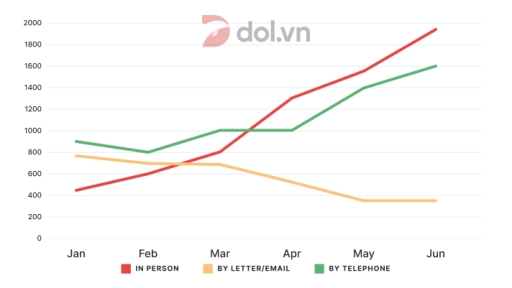
The graph provides information on the number of enquiries received by the Tourist Information Office in a city over a six-month period in 2011, categorized by three methods: face-to-face, by telephone, and by letter/email. Overall, the number of face-to-face and telephone enquiries showed an upward trend, whereas those sent by letter or email gradually declined over time.

From January to March, the number of enquiries made in person increased steadily from around 400 to approximately 800. Meanwhile, telephone enquiries fluctuated slightly, starting at 900 in January, dipping in February, and then rising back to around 1000 in March. In contrast, letter/email enquiries experienced a gradual decline, falling from just under 800 in January to around 700 in March.

Between April and June, face-to-face enquiries saw the most significant rise, surpassing the other methods and reaching nearly 1900 by June. Telephone enquiries also increased steadily, peaking at around 1600 in June. On the other hand, letter/email enquiries continued to decline sharply, dropping to just under 400 in May and remaining at that level in June.

In conclusion, the data indicates that visitors increasingly preferred making enquiries in person or via telephone, while contacting the office through letter or email became less popular over time.

Word Count: 203

Answers On The Same Topic:

The graph below shows the number of inquiries received by the Tourist Information Office in one city over six months in 2011.

The line graph illustrates the information about the changes in the number of inquiries received by the tourist information office in a particular city over six months in 2011. Overall, it is immediately apparent that in person and by telephone experienced the most significant growth, whereas by letter showed a noticeable decline throughout the period. […]

The graph below shows the number of inquiries received by the Tourist Information Office in one city over six months in 2011.

The line graph illustrates how many inquiries were received by a Tourist Information Office in a specific city through three different methods over a six-month period in 2011. Overall, it is clear that inquiries made in person and by telephone showed a significant upward trend, while the number of people sending letters or emails declined […]

The graph below shows the number of inquiries received by the Tourist Information Office in one city over six months in 2011.

The give graph illustrates that the amount of inquiries that Tourist Information Office recieved in one specific city in early 6 month of 2011, categorized by the method of inquiries-in person, by letter/email, or telephone. Overall, an steadily increasing trend can be seen on the Tourist Information Office’s inquries through physical visit and telephone, while […]

The graph below shows the number of inquiries received by the Tourist Information Office in one city over six months in 2011.

The graph depicts the number of inquiries recieved by the tourist information office in one city over six months in 2011. Overall, the number of people questioning the office increase over time by using telephone, or visiting in person. However, the number of people using letter, and email is droping from january to june. With […]

The graph below shows the number of inquiries received by the Tourist Information Office in one city over six months in 2011.

The line graph illustrates the number of questions recorded by the tourist information in a specific city over six months in 2011, starting from January. Looking from an overall perspective, it is readily apparent that all sectors witnessed upward trajectories, except for the inquiries by letter or email. Furthermore, the statistics for enquiries in person […]

See All

Other Topics:

The graph below gives information about the percentage of people living in Australia who were born in Asia, the UK, and other regions.

This graph shows description about The proportion of citizen living in Australia who were born and growth in Asia, UK & other regions. As we can see, Asian in Australia has been increased significantly from 1976 until 2011. The increase reached 15 percent in 2011. Data reveals a high interest among the Asian population in […]

the line graph shows the percentage of people who used five different communication methods between 1998 and 2008.

The line graph delineates the proportions of individuals utilizing five distinct communication methods over a decade, from 1998 to 2008. In summary, while all communication methods, barring landline services, experienced a notable increase in usage, cellular phone services emerged as the predominant choice by the end of the period. In 1998, the proportion of individuals […]

The graph below shows the number of library books read by boys and girls at Starmouth School from 2006 to the present. Summarize the information by selecting and reporting the main features, and make comparisons where relevant.

The chart illustrates the number of library books read by boys and girls at Starmouth School from 2006 to the present. Overall, the boys had a general upward trend at the beginning and decreased minimally at the end. Besides that, the girls increased dramatically over the period. In 2009, the girls read about 25 books. […]

The line graph shows the consumption and production of sugar in India from 2001 to 2011. Summarise the information by selecting and reporting the main features, and make comparisons where relevant.

The provided line graph delineates the consumption and production of sugar in India between 2001 and 2011. Overall, It is clear that the figures for sugar production recorded a fluctuating upward trend, while the data on sugar consumption experienced a relatively stable trajectory over a decade. Regarding the line graph, the index of manufacturing sugar […]

The graph below gives information about the percentage of the population 1030 and 204 counties living in cities from 1970 to 2020, with predictions for Summarise the information by selecting and reporting the main features, and make comparisons where relevant.

The graph below gives information about the percentage of the population in four Asian countries living in cities from 1970 to 2020, with predictions for 2030 and 2040. The line graph illustrates information about the proportion of the population in four Asian countries, namely Philippines, Malaysia, Thailand, Indonesia living in cities from 1970 to 2020, […]

The graph below shows changes in the share of vehicle registrations of the three most common types of commercial vehicles in the US between 1970 and 2010. Summarise the information by selecting and reporting the main features, and make comparisons where relevant.

The bar chart below show proportion the share of vehicle registrations of the three types of commercial vehicles in the US from 1970 to 2010 Overall, both three type of vehicles have tended to decline in percentage of registration, instead of taxi from 1970 to 2010. In addition, bus registration accounted for lowest proportion in […]

See All
We have detected unusual activity on your device.
Please verify your identity to continue.
Note: This verification step won't sign you in. If you have a premium account, please log in to access the service as usual.
Google/Gmail Verification
Or verify using Email/Code
We've sent a verification code to:
youremail@gmail.com (Not your email?)
Enter it below to complete the verification process.
Ensure your email address is correct, your inbox is not full, and you check your spam folder. If no email arrives, consider using an alternative email.
You will need a Premium plan to perform your action!
Note: If you already have a premium account, please log in to access our services as usual.

Plans & Pricing

Our mission is to make quality education accessible for everyone.
However, to keep our hardworking team running and this service alive, we genuinely need your support!
By opting for a premium plan, not only do you sustain us in achieving the mission, but you also unlock advanced features to enrich your learning experience.

Free

For learners who aren't pressed for time

What's included on Free
100+ Cambridge IELTS Tests
Instant IELTS Writing Task 1 & 2 Evaluation (2 times/month)
Instant IELTS Speaking Part 1, 2, & 3 Evaluation (5 times/month)
Instant IELTS Writing Task 1 & 2 Essay Generator (2 times/month)
500+ Dictation & Shadowing Exercises
100+ Pronunciation Exercises
Flashcards
Other Advanced Tools

Premium

For those serious about advancing their English proficiency, and for IELTS candidates aspiring to boost their band score by 1-2 points (especially in writing & speaking) in just 30 days or less

What's included on Premium
Save Your IELTS Test Progress
Unlock All Courses & IELTS Tests
Unlimited AI Conversations
Unlimited AI Writing Enhancement Exercises
Unlimited IELTS Writing Task 1 & 2 Evaluation
Unlimited IELTS Speaking Part 1, 2, & 3 Evaluation
Checked Answers Will Not Be Published
Unlimited IELTS Writing Task 1 & 2 Essay Generator
Unlimited IELTS Speaking Part 1, 2, & 3 Sample Generator
Unlimited Usage Of Advanced Tools
Priority Support within 24h (12-month plan only)

Due to the nature of our service and the provided free trials, payments are non-refundable.
Nếu bạn là người Việt Nam và không có hoặc không muốn trả bằng credit/debit cards, bạn có thể thanh toán bằng phương thức chuyển khoản:


Chọn gói:
419,000₫ 277,000 ₫ cho gói 1 tháng (chỉ 9,233₫/ngày)
1,239,000₫ 597,000 ₫ cho gói 3 tháng (chỉ 6,633₫/ngày)
2,469,000₫ 1,027,000 ₫ cho gói 6 tháng (chỉ 5,706₫/ngày)
4,929,000₫ 1,417,000 ₫ cho gói 12 tháng (chỉ 3,936₫/ngày)


Sau khi chuyển khoản, vui lòng đợi trình duyệt tự động điều hướng bạn trở lại Engnovate và bạn sẽ ngay lập tức nhận được mã kích hoạt tài khoản premium.
Nếu có lỗi xảy ra, bạn có thể liên hệ với team thông qua một trong các phương thức: email đến helloengnovate@gmail.com hoặc nhắn tin qua facebook.com/engnovate.
Vì toàn bộ công cụ trên website đều có thể sử dụng thử miễn phí, Engnovate không hỗ trợ hoàn tiền.