24 Hours Only: Get 39% OFF on Our Premium Plan - Check Out Now!
Line Graph

Band 6+: The line graph below shows the average high and low temperatures in Glasgow, Scotland, over the course of a year, while the table provides information on the average monthly rainfall and sunshine hours. Summarise the information by selecting and reporting the main features, and make comparisons where relevant.

Image for topic: The line graph below shows the average high and low temperatures in Glasgow, Scotland, over the course of a year, while the table provides information on the average monthly rainfall and sunshine hours. Summarise the information by selecting and reporting the main features, and make comparisons where relevant.
Our system will evaluate the answer based on this AI-generated description.
The image displays average monthly temperatures in Glasgow, Scotland, indicating average high (°C) and average low (°C) with precise monthly values: Jan, high 7.0 low 1.0; Feb, high 7.5 low 1.5; Mar, high 9.5 low 2.5; Apr, high 12.0 low 4.0; May, high 15.5 low 7.0; Jun, high 18.0 low 10.0; Jul, high 19.0 low 12.0; Aug, high 18.5 low 11.5; Sep, high 15.5 low 9.5; Oct, high 12.5 low 6.5; Nov, high 9.0 low 3.0; Dec, high 7.5 low 2.0. Table below provides additional numerical metrics: rainfall in mm and sunshine in days, specifically: Jan, rainfall 136 sunshine 13; Feb, rainfall 107 sunshine 23; Mar, rainfall 128 sunshine 46; Apr, rainfall 73 sunshine 98; May, rainfall 58 sunshine 138; Jun, rainfall 71 sunshine 153; Jul, rainfall 69 sunshine 148; Aug, rainfall 88 sunshine 136; Sep, rainfall 96 sunshine 117; Oct, rainfall 112 sunshine 91; Nov, rainfall 131 sunshine 37; Dec, rainfall 139 sunshine 12.
Given the complexity of the image, the above description may not be entirely accurate.
Note: Both the topic and the answer were created by one of our users.

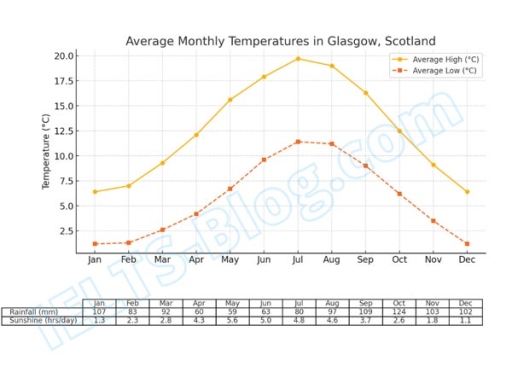
The data presents the average high and low temperatures, rainfalls and sunshine hours for each month in Glasgow, Scotland.

From the overall perspective, both average temperatures increased significantly from January to July. There was a peak and after that they started to drop steadily. Moreover, sunshine hours growth up until the July too and declined in the second part of the year. By contrast, he average monthly rainfall decreased until the midlle of the year.

Generally, the average low temperature rose fpom about 1 degree in the beginning of the year to just over 11 degree in the midlle of the summer and returned to the origin value in December. The same situation was showed us by average high temperature. It grew up from 6 to about 20 degrees in July. In addition, the average number of sunshine hours had a growth from 1.3 ro 5.0 hours per day. However, there was an upward trend in average rainfall from 107 mm in January to 63 mm in June.

Word Count: 168

Answers On The Same Topic:

The line graph below shows the average high and low temperatures in Glasgow, Scotland, over the course of a year, while the table provides information on the average monthly rainfall and sunshine hours. Summarise the information by selecting and reporting the main features, and make comparisons where relevant.

The given charts provide data on the weather for Glasgow – a city in Scotland. Overall, in Glasgow, the temperature and sunshine hours share the same patterns due to the increase over the first 6 months and then fall after that. While there is hotter between June and August, December and January appear to be […]

The line graph below shows the average high and low temperatures in Glasgow, Scotland, over the course of a year, while the table provides information on the average monthly rainfall and sunshine hours. Summarise the information by selecting and reporting the main features, and make comparisons where relevant.

The line and table charts shows the Glasgow’s weather, including temperature, rainfall and sunshine. Overall, it is apparent that, the highest points of temperature and sunshine are in August, while that of rainfall occured in Decemeber. As can be seen, in the January, the average temperature and sunshine is the lowest point throughout 12 months, […]

The line graph below shows the average high and low temperatures in Glasgow, Scotland, over the course of a year, while the table provides information on the average monthly rainfall and sunshine hours. Summarise the information by selecting and reporting the main features, and make comparisons where relevant.

The given mixed charts demonstates average temperature in glasgow meanwhile the table chart illustatres the average rainfall and sunshine, accounting on cm and hours per day, respectively. Overall, the temperature in this area is experienced a dramatical increase in the fist half year, and then it decline reamarkably in last 6 months. In addition, the […]

The line graph below shows the average high and low temperatures in Glasgow, Scotland, over the course of a year, while the table provides information on the average monthly rainfall and sunshine hours. Summarise the information by selecting and reporting the main features, and make comparisons where relevant.

The line graph illustrates the average temperature for a city in Scotland named Glasgow over a year, while the table shows the average number of rainfall and sunshine in the same city during them period. Overall, the highest temperature in Glasgow was recorded in the middle of July and August, while there was a lowest […]

See All

Other Topics:

The line graph shows the percentage of graduates in full-time employment 4 months after graduation from 1999 to 2014.

Line graph demonstrates the porportion of the new student that just finished their studies and got a job within four months after graduation in 4 years. Overall, the dentist are the highest who got hired comparing to the engineers and computer science students. The two line graph of Electronics, Computer Engineer and Computer Science students […]

The chart below gives information about car ownership in the UK from 1975 to 2005

The line graph illustrates the percentage of car ownership in the United Kingdom over a 30-year period from 1975 to 2005. Overall, it is clear that the percentage of ownership with no car experienced a sharp decline during the period. Conversely, the percentage of ownership with only 1 car experienced a dramatic increase, despite an […]

The graph below show the average number of people entering a museum the day, during summer and winter in 2003.

The linegraph compares mean number of people inviting to a museum, Throughout summer an d winter in 2003. Overall, the visitors number show sharply stastics in summer.While at the beginning year, it show increase notecaably and at last years it saw sharply decrease. The winter number exbibeted a bit similar to summer stastics. Looked first […]

A line graph showing the number of international tourists visiting France, Spain, and Italy between 2010 and 2020 (in millions).

We can observe a line graph showing the number of international tourists visiting France, Spain and Italy between 2010 and 2020. As we can see, in 2010 France has nearly 70 million international tourists visiting which gradually went up to 80 millions in 2020. After that, we can see Spain which drastically changed as compare […]

The graph compares employment rates in the 3 sectors of economy. In the UK, 2000-2010. Summarize information by selecting and reporting the main features, and make comparisons where relevant.

The given line graph illustrates the percentage of employment rates in three sectors of the economy in the UK grom 2000 to 2010. Overall while the percentages of public sector and self-employed climbed 2000 to 2010, the data for private sector declined the period shown The percentage of public sector started at about 37% in […]

The graph below shows the number of tourists visiting a particular Carrabien island between 2010 and 2017.Summurise and make comparasions about graph.

the graph illustrates that the number of tourists visiting a particular caribbean island from 2O1O to 2O17 categorized by staying on cruise ships, islan and total visitor. Overall, it is clearly see that the amount of total visitor and who stay on cruise ships both were gradually increased. By contrast the amount of visitors who […]

See All
We have detected unusual activity on your device.
Please verify your identity to continue.
Note: This verification step won't sign you in. If you have a premium account, please log in to access the service as usual.
Google/Gmail Verification
Or verify using Email/Code
We've sent a verification code to:
youremail@gmail.com (Not your email?)
Enter it below to complete the verification process.
Ensure your email address is correct, your inbox is not full, and you check your spam folder. If no email arrives, consider using an alternative email.
You will need a Premium plan to perform your action!
Note: If you already have a premium account, please log in to access our services as usual.

Plans & Pricing

Our mission is to make quality education accessible for everyone.
However, to keep our hardworking team running and this service alive, we genuinely need your support!
By opting for a premium plan, not only do you sustain us in achieving the mission, but you also unlock advanced features to enrich your learning experience.

Free

For learners who aren't pressed for time

What's included on Free
100+ Cambridge IELTS Tests
Instant IELTS Writing Task 1 & 2 Evaluation (2 times/month)
Instant IELTS Speaking Part 1, 2, & 3 Evaluation (5 times/month)
Instant IELTS Writing Task 1 & 2 Essay Generator (2 times/month)
500+ Dictation & Shadowing Exercises
100+ Pronunciation Exercises
Flashcards
Other Advanced Tools

Premium

For those serious about advancing their English proficiency, and for IELTS candidates aspiring to boost their band score by 1-2 points (especially in writing & speaking) in just 30 days or less

What's included on Premium
Save Your IELTS Test Progress
Unlock All Courses & IELTS Tests
Unlimited AI Conversations
Unlimited AI Writing Enhancement Exercises
Unlimited IELTS Writing Task 1 & 2 Evaluation
Unlimited IELTS Speaking Part 1, 2, & 3 Evaluation
Checked Answers Will Not Be Published
Unlimited IELTS Writing Task 1 & 2 Essay Generator
Unlimited IELTS Speaking Part 1, 2, & 3 Sample Generator
Unlimited Usage Of Advanced Tools

Due to the nature of our service and the provided free trials, payments are non-refundable.
Nếu bạn là người Việt Nam và không có hoặc không muốn trả bằng credit/debit cards, bạn có thể thanh toán bằng phương thức chuyển khoản:


Chọn gói:
279,000₫ 157,000 ₫ cho gói 1 tháng (chỉ 5,233₫/ngày)
819,000₫ 397,000 ₫ cho gói 3 tháng (chỉ 4,411₫/ngày)
1,649,000₫ 667,000 ₫ cho gói 6 tháng (chỉ 3,706₫/ngày)
3,299,000₫ 857,000 ₫ cho gói 12 tháng (chỉ 2,381₫/ngày)


Sau khi chuyển khoản, vui lòng đợi trình duyệt tự động điều hướng bạn trở lại Engnovate và bạn sẽ ngay lập tức nhận được mã kích hoạt tài khoản premium.
Nếu có lỗi xảy ra, bạn có thể liên hệ với team thông qua một trong các phương thức: email đến helloengnovate@gmail.com hoặc nhắn tin qua facebook.com/engnovate.
Vì toàn bộ công cụ trên website đều có thể sử dụng thử miễn phí, Engnovate không hỗ trợ hoàn tiền.