🔥 Today Only: Save 30% on Premium — Offer Ends Soon! - Upgrade Now!
Line Graph

Band 5+: The graph below shows the percentage of total spending in five different categories from 1970 to 2010 in one city in Australia.

Image for topic: The graph below shows the percentage of total spending in five different categories from 1970 to 2010 in one city in Australia.
Our system will evaluate the answer based on this AI-generated description.
The image displays a line graph with five categories tracking percentage values from 1970 to 2010: Food starts at 35% in 1970, followed by 30% in 1980, 25% in 1990, 20% in 2000, and roughly 15% in 2010; Leisure starts just above 0% in 1970, rises to approximately 5% in 1980, leaps around 10% in 1990, climbs to around 15% in 2000, and stabilizes close to 22% in 2010; Clothing starts just under 20% in 1970, drops to about 15% in 1980, decreases to nearly 12% in 1990, touches 10% in 2000, and ends just above 5% in 2010; Transport maintains at about 10% in 1970, sees a minor decline under 10% by 1980, dips further to almost 8% in 1990, stays constant towards 10% through 2000, and remains just under 10% in 2010; Health starts below 5% in 1970, follows a steady incline reaching slightly above 5% in 1980, aligns closely with Clothing's drop, nearly 8% in 2000 and remains around 9% in 2010.
Given the complexity of the image, the above description may not be entirely accurate.
Note: Both the topic and the answer were created by one of our users.

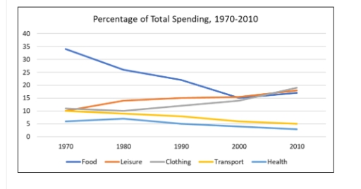
The line graph show percentage of total spending in five category—Food, Leisure, Clothing, Transport and Health—from 1970 to 2010 in one city in Australia.

Overall, spending on Food go down most, while Leisure and Clothing go up over time. Transport and Health spending stay lower and change less.

In 1970, Food had highest spending, around 35%. But, it drop steady and reach about 15% in 2010. Leisure and Clothing both start at about 10% and slowly go up. By 2010, they become the top two category, both close to 20%.

Transport and Health spending more lower compare to other category. Transport start at around 8% and increase little to about 10% by 2010. Health spending stay lowest whole time, start at 5% and go down little at end of period.

In summary, Food spending go down, while Leisure and Clothing become most important expense. Transport and Health stay small part of total spending.

Word Count: 153

Answers On The Same Topic:

The graph below shows the percentage of total spending in five different categories from 1970 to 2010 in one city in Australia.

The data is illustrating the fractions of total expenditure in five different sections between 1970 and 2010 in a single city of Australia. Overall, the percentage of total spending in sectors which are related directly to human well-being, comfort and mobility have declined, whilst categories that include entertainment and fashion have increased throughout the 30 […]

The graph below shows the percentage of total spending in five different categories from 1970 to 2010 in one city in Australia.

The line graph provides a breakdown of how spending patterns evolved across five sectors – food, leisure, clothing, transport, and health – in a particular country between 1970 and 2010. What stands out most is the dramatic shift in consumer priorities over the four decades. While food dominated expenditure in 1970, it was overtaken by […]

The graph below shows the percentage of total spending in five different categories from 1970 to 2010 in one city in Australia.

The line graph shows changes in the percentage of total spending on five categories – food, leisure, clothing, transport, and health – in a particular country between 1970 and 2010. Overall, food accounted for the largest share at the beginning of the period, despite a considerable decline. By 2010, however, clothing had become the highest […]

The graph below shows the percentage of total spending in five different categories from 1970 to 2010 in one city in Australia.

The graph illustrates the data of one Australian city from 1970 to 2010 about the total expenditure in five major categories. Overall, there was a rapid decrease in spending money on food, where rest of the category shows constant movement. Above all categories, there was a noticeable change in food. There was a dramatic decrease […]

The graph below shows the percentage of total spending in five different categories from 1970 to 2010 in one city in Australia.

The line graph illustrates the comparison of the percentage of total spending in five different categories in one city in Australia, between 1970 and 2010. In general, the percentage of spending in five different categories: food, leisure, clothing, transport, and healt. Generally, the food starts at 35% in 1970, and then it decline sharply followed […]

See All

Other Topics:

The charts below show the number of visitors arriving in a particular country for a short trip, and the number of residents leaving that country for a short trip, from 2009 to 2011. Summarise the information by selecting and reporting the main features, and make comparisons where relevant. Write at least 150 words.

The charts illustrate the number of visitors on a short trip to a specific country and the number of indigenes moving out of the country for a short trip starting from 2009 to 2011. Overall, the number of departing residents from the country increased significantly over the years while the number of visitors to the […]

WRITING TASK 1 You should spend about 20 minutes on this task. The line graph below shows the percentage of households with internet access in three different countries between 2005 and 2015. Summarize the information by selecting and reporting the main features, and make comparisons where relevant. Write at least 150 words.

The given line chart depicts the differnces of the percentage of household with internet access in three different countries which are Vietnam-USA and Japan throughout 10 years from 2005 to 2015. A glance at the chart reveals that the USA has the highest percentage during these 10 years however Vietnam has the lowest. Getting back […]

the chart below shows the changes in car ownership in Great Britain between 1961 and 2001

The line chart illustrates, the count of car ownership in terms of no car, 1 car and 2 or more cars in Great Britain for 1961, 1971, 1981, 1991 and 2001. Units are measured in percentage of households. In the chart, one can observe a growing pattern in terms of 2 or more cars, in […]

WRITING TASK 1 You should spend about 20 minutes on this task. The line graph below shows the percentage of households with internet access in three different countries between 2005 and 2015. Summarize the information by selecting and reporting the main features, and make comparisons where relevant. Write at least 150 words.

The graph depicts the figures for households with internet connectivity among Vietnam, the USA and Japan from the period from 2005 to 2015. Overall, it can inferred from the statistics that there was an upward trend in families’ internet access rates, with the USA being the most dominant among three countries. Furthermore, Vietnam witnessed a […]

The graph below shows UK acid rain emmissions, measured in million tonnes, from four different sectors between 1990 and 2007.

The line diagram depicts UK acid rain emissions, measured in millions of tonnes, from various fields: Transport and communication, Electricity, Gas and Water Supply, Other industries and Domestic over a 17 year period, from 1990 to 2007. Overall, it is clear that Transport and communication emissions increased during the observed years, meanwhile the other industries […]

The graph below shows UK acid rain emmissions, measured in million tonnes, from four different sectors between 1990 and 2007.

The line diagram depicts UK acid rain emission, measured in millions of tonnes, from various fields: Transport and communication, Electricity, Gas and Water Supply, Other industries and Domestic over a 17 years period, from 1990 to 2007. Overall, it is clear that Transport and communication increased during the observed years, meanwhile the other industries decreased […]

See All
We have detected unusual activity on your device.
Please verify your identity to continue.
Note: This verification step won't sign you in. If you have a premium account, please log in to access the service as usual.
Google/Gmail Verification
Or verify using Email/Code
We've sent a verification code to:
youremail@gmail.com (Not your email?)
Enter it below to complete the verification process.
Ensure your email address is correct, your inbox is not full, and you check your spam folder. If no email arrives, consider using an alternative email.
You will need a Premium plan to perform your action!
Note: If you already have a premium account, please log in to access our services as usual.

Plans & Pricing

Our mission is to make quality education accessible for everyone.
However, to keep our hardworking team running and this service alive, we genuinely need your support!
By opting for a premium plan, not only do you sustain us in achieving the mission, but you also unlock advanced features to enrich your learning experience.

Free

For learners who aren't pressed for time

What's included on Free
100+ Cambridge IELTS Tests
Instant IELTS Writing Task 1 & 2 Evaluation (2 times/month)
Instant IELTS Speaking Part 1, 2, & 3 Evaluation (5 times/month)
Instant IELTS Writing Task 1 & 2 Essay Generator (2 times/month)
500+ Dictation & Shadowing Exercises
100+ Pronunciation Exercises
Flashcards
Other Advanced Tools

Premium

For those serious about advancing their English proficiency, and for IELTS candidates aspiring to boost their band score by 1-2 points (especially in writing & speaking) in just 30 days or less

What's included on Premium
Save Your IELTS Test Progress
Unlock All Courses & IELTS Tests
Unlimited AI Conversations
Unlimited AI Writing Enhancement Exercises
Unlimited IELTS Writing Task 1 & 2 Evaluation
Unlimited IELTS Speaking Part 1, 2, & 3 Evaluation
Checked Answers Will Not Be Published
Unlimited IELTS Writing Task 1 & 2 Essay Generator
Unlimited IELTS Speaking Part 1, 2, & 3 Sample Generator
Unlimited Usage Of Advanced Tools
Priority Support within 24h (12-month plan only)

Due to the nature of our service and the provided free trials, payments are non-refundable.
Nếu bạn là người Việt Nam và không có hoặc không muốn trả bằng credit/debit cards, bạn có thể thanh toán bằng phương thức chuyển khoản:


Chọn gói:
419,000₫ 277,000 ₫ cho gói 1 tháng (chỉ 9,233₫/ngày)
1,239,000₫ 597,000 ₫ cho gói 3 tháng (chỉ 6,633₫/ngày)
2,469,000₫ 1,027,000 ₫ cho gói 6 tháng (chỉ 5,706₫/ngày)
4,929,000₫ 1,417,000 ₫ cho gói 12 tháng (chỉ 3,936₫/ngày)


Sau khi chuyển khoản, vui lòng đợi trình duyệt tự động điều hướng bạn trở lại Engnovate và bạn sẽ ngay lập tức nhận được mã kích hoạt tài khoản premium.
Nếu có lỗi xảy ra, bạn có thể liên hệ với team thông qua một trong các phương thức: email đến helloengnovate@gmail.com hoặc nhắn tin qua facebook.com/engnovate.
Vì toàn bộ công cụ trên website đều có thể sử dụng thử miễn phí, Engnovate không hỗ trợ hoàn tiền.