🔥 Today Only: Save 30% on Premium — Offer Ends Soon! - Upgrade Now!
Line Graph

Band 4+:  The graph below gives information about international tourist arrivals in five countries

Image for topic:  The graph below gives information about international tourist arrivals in five countries
Our system will evaluate the answer based on this AI-generated description.
The image depicts a line graph titled "International Tourists Arrival in Millions" with 5 countries represented: USA, France, Malaysia, Brazil, and Egypt, over a time frame from 1995 to 2010. The USA shows the highest number of international tourist arrivals, starting at approximately 50 million in 1995, rising to about 65 million in 2000, about 75 million in 2005, and around 90 million in 2010. France follows a similar upward trend starting at about 60 million in 1995, increasing to roughly 70 million in 2000, around 80 million in 2005, and approximately 85 million in 2010. Malaysia's line starts at approximately 7.5 million in 1995, increasing to about 10 million in 2000, 15 million in 2005, and reaching 25 million in 2010. Brazil's line begins at around 2.5 million in 1995, rising slightly to about 5 million in 2000, then around 7.5 million in 2005 and 2010. Egypt's line starts at just above 2.5 million in 1995, going up to about 3 million in 2000, just under 5 million in 2005, and approximately 15 million in 2010. The x-axis is labeled "Years" with intervals at 1995, 2000, 2005, and 2010; the y-axis is labeled "millions" with intervals at 10, 20, 30, 40, 50, 60, 70, 80, 90, 100 million.
Given the complexity of the image, the above description may not be entirely accurate.
Note: Both the topic and the answer were created by one of our users.

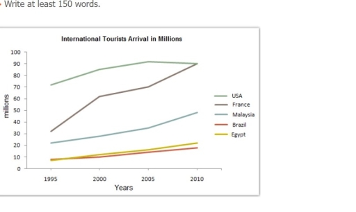
The information about international visitors visited in five different country namely: The USA , France, Malaysia, Brazil, and Egypt for the period between 1995 to 2010 is depicted in the provided line graph.

Looking from an overall perspective, it is readily apparent that overseas tourist arrival were highest in USA while lowest in Brazil and Egypt.

As sown in the data, Approximately 70 million tourist were visit USA country while only under 10 million visitors arrived in Brazil and Egypt in the year 1995.On the other hand France tourist rate had around 30 million in 1995 but it steadily increased from the year 2000 to 2010 and reaching around 80 in the year 2010 which was same as USA.

In contrast, Brazil and Egypt had under 10 million visitor in the year 1995 while it was slightly grown between outgoing year and lastly in the year 2010 it went above 10 million respectively. Malaysia had 20 million tourist in the year 1995.However it was a mere upper trade in the year 2012 exceeding over 40 million significantly.

Word Count: 177

Answers On The Same Topic:

 The graph below gives information about international tourist arrivals in five countries

The data illustrates the number of international tourist visiting USA, France, Malaysia, Brazil and Egypt in year 1995 to 2010. Overall, it can be seen that the illustration depicts the comparison of the total foreign visitors between the year 1995 to 2010 in five countries mentioned. It shows that USA have the highest number of […]

 The graph below gives information about international tourist arrivals in five countries

The line chart compares the number of international tourists arriving in five different countries each year from 1995 to 2010. Overall, all countries saw the number of travellers to their countries grow during this period, but the growth is more significant in some countries than others. France in particular experienced a significant growth in tourism […]

 The graph below gives information about international tourist arrivals in five countries

The line graph illustrates the number of international tourists in five given countries, i.e., the USA, France, Malaysia, Brazil, and Egypt. The graph shows the numbers in millions over a period from 1995 to 2010. Overall, it is clear that there was a significant increase in the number of tourists. If we look at the […]

 The graph below gives information about international tourist arrivals in five countries

The line graph illustrates the number of international tourists in five given countries i.e. USA, France, Malaysia, Brazil and Eqypt. The graph shows the numbers in millions over a period of 1995 to 2010. Overall, it is clear that there was a significant increase in the number of tourists. If we look at start the […]

 The graph below gives information about international tourist arrivals in five countries

The line graph depicts the information about the international tourist arrivals in five countries between 1995 and 2010. The data is calibrated in millions. Overall, highest member of visitors arrived in USA and France, whereas the Brazil received the minimum figures of tourists. To begin with, it is clearly evident that, over 70 millions tourists […]

See All

Other Topics:

The line chart below shows the percentage of people in different age groups who played video games more than ten hours a week between 2010 and 2015

The data presents the percentage of different ages people, who spent more than 10 hours per week by playing video games. In general, the category of people who are from 16 to 24 dominated the graph over the provided period. On the contrary, seniors registered fairly low figures.Those aged from 25 to 64 occupied the […]

he graph below shows the number of immigrants to there countries from 1990 to 2001. Summarise the information by selecting and reporting the main features, and make comparisons where relevant.

The line graph illustrates the persantages of immigrants came in 1990 and 2001. overall USA experienced an upward trend by domanating, whereas Canada and Australia stay stable over the period . in the first year in USA the figure for people came from another country climbed from about 1300 to 1800 in 1992 . however […]

The line chart below shows the percentage of people in different age groups who played video games more than ten hours a week between 2010 and 2015

The data presents the percentage of different aged people, who spent more than 10 hours per week by playing video games. In general, the category of people who are from 16 to 24 were on the top of the graph over the provided period. On the contrary, seniors registered fairly low figures.Those aged from 25 […]

The line shows the number of inquiries received by the Tourist Information Office in one day over six months in 2011 (telephone, letter/email, and in person).

The line graph compares three methods of collecting daily inquiries by the Tourist Information Office during a six-month period in 2011. Overall, most categories observed strong upswings, except for gathering inquiries by letter/email, which showed a reverse pattern. Additionally, the most considerable escalation was witnessed in the in-person criterion. Regarding the two groups with the […]

The graph below shows the investment trends of men and women in the UK since 1950. Summarise the information by selecting and reporting the main features, and make comparisons where relevant.

The chart illustrates information on how men and women made investments in the UK from 1950 to 1980. Overall, the amount of money invested by both men and women rose significantly over the time period. However, while men’s investments fluctuated, the numbers for women grew more consistently. At the start of the time period, the […]

The line graph illustrate thefts per 1000 vehicles in the four different countries over the 9 years.

The line graph provided illustrates the thefts per thousand vehicles between Great Britain, Sweden, France and Canada in 10 years. Overall, Great Britain consistently recorded the highest number of vehicle thefts throughout the period, although there were some fluctuations. In contrast, Sweden experienced a steady increase, while France and Canada remained lower and relatively stable. […]

See All
We have detected unusual activity on your device.
Please verify your identity to continue.
Note: This verification step won't sign you in. If you have a premium account, please log in to access the service as usual.
Google/Gmail Verification
Or verify using Email/Code
We've sent a verification code to:
youremail@gmail.com (Not your email?)
Enter it below to complete the verification process.
Ensure your email address is correct, your inbox is not full, and you check your spam folder. If no email arrives, consider using an alternative email.
You will need a Premium plan to perform your action!
Note: If you already have a premium account, please log in to access our services as usual.

Plans & Pricing

Our mission is to make quality education accessible for everyone.
However, to keep our hardworking team running and this service alive, we genuinely need your support!
By opting for a premium plan, not only do you sustain us in achieving the mission, but you also unlock advanced features to enrich your learning experience.

Free

For learners who aren't pressed for time

What's included on Free
100+ Cambridge IELTS Tests
Instant IELTS Writing Task 1 & 2 Evaluation (2 times/month)
Instant IELTS Speaking Part 1, 2, & 3 Evaluation (5 times/month)
Instant IELTS Writing Task 1 & 2 Essay Generator (2 times/month)
500+ Dictation & Shadowing Exercises
100+ Pronunciation Exercises
Flashcards
Other Advanced Tools

Premium

For those serious about advancing their English proficiency, and for IELTS candidates aspiring to boost their band score by 1-2 points (especially in writing & speaking) in just 30 days or less

What's included on Premium
Save Your IELTS Test Progress
Unlock All Courses & IELTS Tests
Unlimited AI Conversations
Unlimited AI Writing Enhancement Exercises
Unlimited IELTS Writing Task 1 & 2 Evaluation
Unlimited IELTS Speaking Part 1, 2, & 3 Evaluation
Checked Answers Will Not Be Published
Unlimited IELTS Writing Task 1 & 2 Essay Generator
Unlimited IELTS Speaking Part 1, 2, & 3 Sample Generator
Unlimited Usage Of Advanced Tools
Priority Support within 24h (12-month plan only)

Due to the nature of our service and the provided free trials, payments are non-refundable.
Nếu bạn là người Việt Nam và không có hoặc không muốn trả bằng credit/debit cards, bạn có thể thanh toán bằng phương thức chuyển khoản:


Chọn gói:
419,000₫ 277,000 ₫ cho gói 1 tháng (chỉ 9,233₫/ngày)
1,239,000₫ 597,000 ₫ cho gói 3 tháng (chỉ 6,633₫/ngày)
2,469,000₫ 1,027,000 ₫ cho gói 6 tháng (chỉ 5,706₫/ngày)
4,929,000₫ 1,417,000 ₫ cho gói 12 tháng (chỉ 3,936₫/ngày)


Sau khi chuyển khoản, vui lòng đợi trình duyệt tự động điều hướng bạn trở lại Engnovate và bạn sẽ ngay lập tức nhận được mã kích hoạt tài khoản premium.
Nếu có lỗi xảy ra, bạn có thể liên hệ với team thông qua một trong các phương thức: email đến helloengnovate@gmail.com hoặc nhắn tin qua facebook.com/engnovate.
Vì toàn bộ công cụ trên website đều có thể sử dụng thử miễn phí, Engnovate không hỗ trợ hoàn tiền.