🔥 Today Only: Save 30% on Premium — Offer Ends Soon! - Upgrade Now!
Multiple Graphs

Band 6+: Charts A and B show the share of the UK and Australian cinema market in 2001 and cinema admission in the UK and Australia from 1976 to 2006.

Image for topic: Charts A and B show the share of the UK and Australian cinema market in 2001 and cinema admission in the UK and Australia from 1976 to 2006.
Our system will evaluate the answer based on this AI-generated description.
The image consists of two charts labeled Chart A and Chart B. Chart A, titled "Films screened in the UK and Australia, 2001," is a bar chart with percentage on the X-axis ranging from 0% to 90% and categories on the Y-axis labeled "US Films," "UK Films," "Australian Films," and "Others." Data points for Australia: US Films slightly above 80%, UK Films approximately 10%, Australian Films just below 10%, Others nearly 0%. Data points for the UK: US Films slightly under 70%, UK Films just above 20%, Australian Films around 5%, Others close to 5%. Chart B, titled "UK and Australian cinema admissions, 1976 to 2006," is a line graph with years on the X-axis ranging from 1975 to 2005 and "Admissions in millions" on the Y-axis from 0 to 200 in increments of 20. The UK line starts around 100 in 1975, dips to below 60 in the early '80s, rises to 120 in the early '90s, drops to 100 in the mid-90s, and then climbs steadily to just below 180 in 2006. The Australia line starts just above 20 in 1975, climbs to above 40 in the early '80s, hovers around 40 until the early '90s, then rises steadily to just above 80 in 2006.
Given the complexity of the image, the above description may not be entirely accurate.
Note: Both the topic and the answer were created by one of our users.

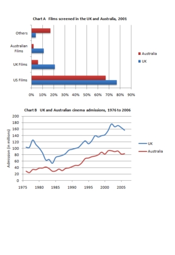
The charts show information about the film industry in the UK and Australia. Chart A compares the types of films screened in both countries in 2001 and chart B shows cinema admissions from 1976 to 2006.

Overall, it is clear that the majority of films shown in the UK and Australia in 2001 were films from the US. Furthermore, cinema admissions increased over the period given, whereas the UK experienced more significant growth than Australia.

Looking at the chart A more closely, approximately 70% of films shown in the UK and Australia were US films. UK movies were more screened in the UK, while films from Australia had the smallest percentage of films shown in both countries. By contrast, other countries’ films had the lowest share in the UK and Australia.

In 1975, the UK had just over then 100 million cinema admissions, but this number sharply decreased until 1985, having nearly 60 million of its admissions. By comparison, Australian cinema admissions accounted for around 30 million in 1975. In the year 2005, the UK cinema admissions went up to 160 million, while Australian one gradually rose by 80 million.

Word Count: 190

Answers On The Same Topic:

Charts A and B show the share of the UK and Australian cinema market in 2001 and cinema admission in the UK and Australia from 1976 to 2006.

The charts compare the rates about screened movies in the United Kingdom and Australia in 2001 and their cinema admission between 1976 and 2006. Overall, the highest records in the chart of films screened was in US whereas other sections were completely below. Nevertheless, it is evident that their admission process showed increases in both […]

Charts A and B show the share of the UK and Australian cinema market in 2001 and cinema admission in the UK and Australia from 1976 to 2006.

The charts provide information about the films screened in the UK and Australia in 2001, and their cinema admissions between 1976 and 2006. Overall, it is evident that the United States dominated the largest segment in the value of the English and Australian markets. The figures for cinema admissions in both countries grew over the […]

Charts A and B show the share of the UK and Australian cinema market in 2001 and cinema admission in the UK and Australia from 1976 to 2006.

The given charts vividly illustrate that the proportion of Australian and the UK cinema market in 2001 and cinema admission between 1976 and 2006 in Australia and the UK. Overall, in 2001 the highest percentage of films screened was US films for both Australia and the UK. In contrast, the least for the UK was […]

Charts A and B show the share of the UK and Australian cinema market in 2001 and cinema admission in the UK and Australia from 1976 to 2006.

Charts A and B illustrate which countries’ films were shown most frequently in UK and Australian cinemas in 2001 and how many tickets were sold in both countries between 1976 and 2006. Overall, American films were the most popular with both Australian and British audiences in 2001. In contrast, Australian films ranked lowest in their […]

See All

Other Topics:

The table and pie chart illustate popution in Australia according to different nationalities and areas.

The pie chart illustrated the proportion of people who lived in Australia, while the table indicated that people tend to live in urban or rual areas. Overall, the majority of the population in Australia was Australian, and most of them lived in the city, especially individuals from China. The pie chart described that in Australia […]

The charts below show the average percentages in typical meals of three nutrients.All of which may be unhealthy if eaten too much

The pie chart illustrates the consumption of 3 different nutrients-classified as unhealthy- in usual meals. Overall, dinner contained the highest amount of sodium and saturated fat, despite breakfast gathering the least figure of three consumptions. Snacks present a greater portion in added sugar than the remaining 3. On the regard of sodium consumption, dinner collected […]

The charts below show the proportion of income spent on different areas by on university, in 2005 and 2015

The pie chart displays the percentages of earnings in a tertiary institution in six different departments from 2005 to 2015. Overall, it can be seen that all of the sections’ proportion of spending in university has changed, except the campus remained the same over the ten years. Training and research study accounted for over 50% […]

The diagrams below show the main reasons workers chose to work from home and the hours males and females worked at home for the year 2019. Summarise the information by selecting and reporting the main features, and make comparisons where relevant.

The diagram illustrates the underlying reasons why employees opted for work from home and the workload of both males and females in the year 2019. Overall, it is clear that the main reason for staying at home was to economise money for both genders. Strikingly, males’ workload was significantly higher than their counterparts. To start […]

The first chart below shows the value of goods that australia imported from china and those exported to china from australia. The second chart shows the types of good imported from china. Summarise the information by selecting and reporting the main features, and make a comparisons where relevant.

The charts illustrate the value of goods imported to and exported from Australia to China over a period of seven years (1998-2004), as well as the value of five different types of goods for the years 2003 and 2004. The values are measured in billions of dollars. Overall, it is evident that the worth of […]

percentage of the average families food budget spent on restaurant meal, and popularity of fast-food and sit-down restaurant meals

The provided pie chart and line graph illustrate the percentage of food budget allocated to restaurant meals by an average middle-class family and the frequency of meals eaten out over a four-decade period. Overall, it is noticeable that while expenditure on home cooking declined consistently, dining out saw a significant rise. Additionally, fast food emerged […]

See All
We have detected unusual activity on your device.
Please verify your identity to continue.
Note: This verification step won't sign you in. If you have a premium account, please log in to access the service as usual.
Google/Gmail Verification
Or verify using Email/Code
We've sent a verification code to:
youremail@gmail.com (Not your email?)
Enter it below to complete the verification process.
Ensure your email address is correct, your inbox is not full, and you check your spam folder. If no email arrives, consider using an alternative email.
You will need a Premium plan to perform your action!
Note: If you already have a premium account, please log in to access our services as usual.

Plans & Pricing

Our mission is to make quality education accessible for everyone.
However, to keep our hardworking team running and this service alive, we genuinely need your support!
By opting for a premium plan, not only do you sustain us in achieving the mission, but you also unlock advanced features to enrich your learning experience.

Free

For learners who aren't pressed for time

What's included on Free
100+ Cambridge IELTS Tests
Instant IELTS Writing Task 1 & 2 Evaluation (2 times/month)
Instant IELTS Speaking Part 1, 2, & 3 Evaluation (5 times/month)
Instant IELTS Writing Task 1 & 2 Essay Generator (2 times/month)
500+ Dictation & Shadowing Exercises
100+ Pronunciation Exercises
Flashcards
Other Advanced Tools

Premium

For those serious about advancing their English proficiency, and for IELTS candidates aspiring to boost their band score by 1-2 points (especially in writing & speaking) in just 30 days or less

What's included on Premium
Save Your IELTS Test Progress
Unlock All Courses & IELTS Tests
Unlimited AI Conversations
Unlimited AI Writing Enhancement Exercises
Unlimited IELTS Writing Task 1 & 2 Evaluation
Unlimited IELTS Speaking Part 1, 2, & 3 Evaluation
Checked Answers Will Not Be Published
Unlimited IELTS Writing Task 1 & 2 Essay Generator
Unlimited IELTS Speaking Part 1, 2, & 3 Sample Generator
Unlimited Usage Of Advanced Tools
Priority Support within 24h (12-month plan only)

Due to the nature of our service and the provided free trials, payments are non-refundable.
Nếu bạn là người Việt Nam và không có hoặc không muốn trả bằng credit/debit cards, bạn có thể thanh toán bằng phương thức chuyển khoản:


Chọn gói:
419,000₫ 277,000 ₫ cho gói 1 tháng (chỉ 9,233₫/ngày)
1,239,000₫ 597,000 ₫ cho gói 3 tháng (chỉ 6,633₫/ngày)
2,469,000₫ 1,027,000 ₫ cho gói 6 tháng (chỉ 5,706₫/ngày)
4,929,000₫ 1,417,000 ₫ cho gói 12 tháng (chỉ 3,936₫/ngày)


Sau khi chuyển khoản, vui lòng đợi trình duyệt tự động điều hướng bạn trở lại Engnovate và bạn sẽ ngay lập tức nhận được mã kích hoạt tài khoản premium.
Nếu có lỗi xảy ra, bạn có thể liên hệ với team thông qua một trong các phương thức: email đến helloengnovate@gmail.com hoặc nhắn tin qua facebook.com/engnovate.
Vì toàn bộ công cụ trên website đều có thể sử dụng thử miễn phí, Engnovate không hỗ trợ hoàn tiền.