🔥 Today Only: Save 30% on Premium — Offer Ends Soon! - Upgrade Now!
Line Graph

Band 5+: Percentage of working adults in Australia using text messaging to communicate in work related situations.

Image for topic: Percentage of working adults in Australia using text messaging to communicate in work related situations.
Our system will evaluate the answer based on this AI-generated description.
The image depicts a line graph with a horizontal axis ranging from 2002 to 2010 and a vertical axis from 10 to 100 with increments of 10. Five lines, corresponding to different age groups, show an upward trend over time with varying slopes. The 19-24 group starts at approximately 10 in 2002, reaching just over 10 in 2003, around 15 in 2004, about 20 in 2005, nearly 30 in 2006, roughly 35 in 2007, approximately 45 in 2008, just under 55 in 2009, and around 65 in 2010. The 25-35 group commences at roughly 20 in 2002, increasing to around 30 in 2003, 40 in 2004, 50 in 2005, nearly 60 in 2006, just above 60 in 2007, about 70 in 2008, around 80 in 2009, and approximately 90 in 2010. The 36-45 group begins at just above 20 in 2002, growing to about 30 in 2003, nearly 40 in 2004, just over 50 in 2005, approximately 60 in 2006, about 70 in 2007, roughly 80 in 2008, close to 90 in 2009, and almost 100 in 2010. The 46-55 group starts at approximately 30 in 2002, increasing to around 40 in 2003, just under 50 in 2004, about 60 in 2005, over 70 in 2006, around 80 in 2007, nearly 90 in 2008, and just below 100 in 2009 and 2010. The 56-65 group initiates at nearly 40 in 2002, rising to almost 50 in 2003, just under 60 in 2004, about 70 in 2005, close to 80 in 2006, approaching 90 in 2007, and reaching 100 in 2008, remaining there in 2009 and 2010. Note: Due to the lack of precision in the graph, the values for each data point are estimated to the nearest increment based on their position on the graph
Given the complexity of the image, the above description may not be entirely accurate.
Note: Both the topic and the answer were created by one of our users.

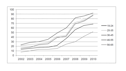
The line graph displays percentage of working adults in Australia using text messaging to interact in job related situations from 2002 to 2010

Overall, average percentages of adults using text messages in work-related scenarios showed steady surge among all age groups dating from 2002 to 2010. Younger generation generally recorded higher figures than older adults,although by the end of the period adults aged 19-24 recorded highest figure.

Looking first to younger age groups, around one quarter among 19-24 years of age used text messaging in the begining,and over time this number rose significantly reaching approximately 92 percent. Second best percentage of using text messaging was shown among adults 20-25 years of age, which was slightly lower than the precentages for the 19-24 age group in 2002 with a figure of roughly 22 percent, but it also sharply increased and ended up at 86 percent.As a result, the gap between figures widened slightly by the end of the period.

Turning to the older age groups, the figures were slightly lower for older age group. In 2002 percentage of seniors aged 36-45 was around 18 percent,while figures for 45-55 and 56-65 groups were slightly lower standing at 10 and 15 percent respectively. All three grops showed continuous increase in figures over time, with a particularysharp rise after 2007. By the end of the recording percentage of adults in 36-45 age group was little lower than in younger groups standing at 84 percent, while 46-55 and 56-65 aged groups showed greater margin in figures, with 67 and 52 percent.

Word Count: 256

Answers On The Same Topic:

Percentage of working adults in Australia using text messaging to communicate in work related situations.

The diagramm illustrates proportion of working citizens using text messaging to communicate in work related situations in Australia from 2002 to 2010. Overall, youger generations between 19 and 24 years old kept higest position through the period, while the oldest workers between 56 and 65 had the lowest percentage. Every generation experienced a steady growth. […]

Percentage of working adults in Australia using text messaging to communicate in work related situations.

The provided line graph depicts the utilization of text messaging for work-related communication among employees of different age groups in Australia from 2002 to 2010. Overall, the trend of using text messaging for workplace communication increased significantly over the given period. Notably, the age groups of 36-45, 19-24, and 25-35 exhibited the most substantial growth […]

Percentage of working adults in Australia using text messaging to communicate in work related situations.

The given line graph illustrates the proportion of employees in Australia aged 19 to 65 using chat for workplace communication purposes over eight years (2002–2010). Overall, it can be seen that the text messaging trend experienced a significant climb within a timeline. However, the rate of growth in each age group is uneven. Those aged […]

See All

Other Topics:

The graph below shows the price of different kinds of bread, in dollars, from 2001 to 2005. Summarise the information by selecting and reporting the main features and make comparisons where relevant.

The graph below depicts the price of different kinds of bread in dollars between 2001 and 2005. Overall, prices of the White and Brown bread are higher in comparison with the Wholergian and Rye. Brown, White and Rye breads started at the same price, which was equal 0,6 dollars, while Wholergian had a higher start […]

The line graph shows the number of overseas tourists (in million) who visited to France, Spain and Japan between 1990 and 2020.

The line graph illustrates the number of foreign travellers who went to three different countries – France, Spain, and Japan – between 1990 and 2020. Overall, although an attendance to both France and Spain showed an upward trend, that for Japan tourists experienced a downward trend. Notably, France remained by far the largest group throughout […]

The graph below shows the average number of UK commuters travelling each day by car, bus or train between 1970 and 2030

The line graph illustrates the number of UK workers commuting by car, bus, and train over a 60-year period from 1970 to 2030. Overall, car travel remained the dominant mode of transport throughout, while bus usage declined gradually and train travel experienced significant growth, eventually overtaking the bus around 2015. In 1970, approximately 5.5 million […]

The chart illustrates Internet usage among a country’s population given by age group in 2010 and 2017. Summarise the information by selecting and reporting the main features, and make comparisons where relevant. Write at least 150 words.

The chart depicts the percentage of internate usage by different age group in a country in 2010 and 2017.A cursory glance is necessary to realize that the percentage of internet usage is high enough among the 16-24 people and least among the people who are aged 65-74. In 2010 the percentage of internet users among […]

Task 1: The graph below shows the percentages of tourists who used different types of transport to travel within a particular nation between 1989 and 2009. Each tourist may have used more than one type of transport.

The line graph illustrates the proportion of visitors who took a varied types of transport to travel in a particular country from 1989 to 2009. Every visitor may have used more than one type of transport. In general, travel by coach and rail increased significantly over the years, while air travel demonstrated a double decline. […]

The graph and table below show the average monthly temperatures and the average number of hours of sunshine per year in three major cities. Summarise the information by selecting and reporting the main features and make comparisons where relevant.

The line graph compares the average monthly temperatures in London, New York and Sydney over the course of a year, while the table shows the total annual hours of sunshine in the three cities. Overall, London and New York follow a similar seasonal pattern, with temperatures rising from the beginning of the year to a […]

See All
We have detected unusual activity on your device.
Please verify your identity to continue.
Note: This verification step won't sign you in. If you have a premium account, please log in to access the service as usual.
Google/Gmail Verification
Or verify using Email/Code
We've sent a verification code to:
youremail@gmail.com (Not your email?)
Enter it below to complete the verification process.
Ensure your email address is correct, your inbox is not full, and you check your spam folder. If no email arrives, consider using an alternative email.
You will need a Premium plan to perform your action!
Note: If you already have a premium account, please log in to access our services as usual.

Plans & Pricing

Our mission is to make quality education accessible for everyone.
However, to keep our hardworking team running and this service alive, we genuinely need your support!
By opting for a premium plan, not only do you sustain us in achieving the mission, but you also unlock advanced features to enrich your learning experience.

Free

For learners who aren't pressed for time

What's included on Free
100+ Cambridge IELTS Tests
Instant IELTS Writing Task 1 & 2 Evaluation (2 times/month)
Instant IELTS Speaking Part 1, 2, & 3 Evaluation (5 times/month)
Instant IELTS Writing Task 1 & 2 Essay Generator (2 times/month)
500+ Dictation & Shadowing Exercises
100+ Pronunciation Exercises
Flashcards
Other Advanced Tools

Premium

For those serious about advancing their English proficiency, and for IELTS candidates aspiring to boost their band score by 1-2 points (especially in writing & speaking) in just 30 days or less

What's included on Premium
Save Your IELTS Test Progress
Unlock All Courses & IELTS Tests
Unlimited AI Conversations
Unlimited AI Writing Enhancement Exercises
Unlimited IELTS Writing Task 1 & 2 Evaluation
Unlimited IELTS Speaking Part 1, 2, & 3 Evaluation
Checked Answers Will Not Be Published
Unlimited IELTS Writing Task 1 & 2 Essay Generator
Unlimited IELTS Speaking Part 1, 2, & 3 Sample Generator
Unlimited Usage Of Advanced Tools
Priority Support within 24h (12-month plan only)

Due to the nature of our service and the provided free trials, payments are non-refundable.
Nếu bạn là người Việt Nam và không có hoặc không muốn trả bằng credit/debit cards, bạn có thể thanh toán bằng phương thức chuyển khoản:


Chọn gói:
419,000₫ 277,000 ₫ cho gói 1 tháng (chỉ 9,233₫/ngày)
1,239,000₫ 597,000 ₫ cho gói 3 tháng (chỉ 6,633₫/ngày)
2,469,000₫ 1,027,000 ₫ cho gói 6 tháng (chỉ 5,706₫/ngày)
4,929,000₫ 1,417,000 ₫ cho gói 12 tháng (chỉ 3,936₫/ngày)


Sau khi chuyển khoản, vui lòng đợi trình duyệt tự động điều hướng bạn trở lại Engnovate và bạn sẽ ngay lập tức nhận được mã kích hoạt tài khoản premium.
Nếu có lỗi xảy ra, bạn có thể liên hệ với team thông qua một trong các phương thức: email đến helloengnovate@gmail.com hoặc nhắn tin qua facebook.com/engnovate.
Vì toàn bộ công cụ trên website đều có thể sử dụng thử miễn phí, Engnovate không hỗ trợ hoàn tiền.