🔥 Today Only: Save 30% on Premium — Offer Ends Soon! - Upgrade Now!
Line Graph

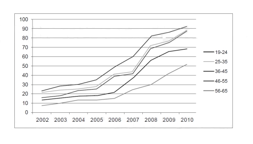
Band 5+: Percentage of working adults in Australia using text messaging to communicate in work related situations.

Image for topic: Percentage of working adults in Australia using text messaging to communicate in work related situations.
Our system will evaluate the answer based on this AI-generated description.
The image depicts a line graph with a horizontal axis ranging from 2002 to 2010 and a vertical axis from 10 to 100 with increments of 10. Five lines, corresponding to different age groups, show an upward trend over time with varying slopes. The 19-24 group starts at approximately 10 in 2002, reaching just over 10 in 2003, around 15 in 2004, about 20 in 2005, nearly 30 in 2006, roughly 35 in 2007, approximately 45 in 2008, just under 55 in 2009, and around 65 in 2010. The 25-35 group commences at roughly 20 in 2002, increasing to around 30 in 2003, 40 in 2004, 50 in 2005, nearly 60 in 2006, just above 60 in 2007, about 70 in 2008, around 80 in 2009, and approximately 90 in 2010. The 36-45 group begins at just above 20 in 2002, growing to about 30 in 2003, nearly 40 in 2004, just over 50 in 2005, approximately 60 in 2006, about 70 in 2007, roughly 80 in 2008, close to 90 in 2009, and almost 100 in 2010. The 46-55 group starts at approximately 30 in 2002, increasing to around 40 in 2003, just under 50 in 2004, about 60 in 2005, over 70 in 2006, around 80 in 2007, nearly 90 in 2008, and just below 100 in 2009 and 2010. The 56-65 group initiates at nearly 40 in 2002, rising to almost 50 in 2003, just under 60 in 2004, about 70 in 2005, close to 80 in 2006, approaching 90 in 2007, and reaching 100 in 2008, remaining there in 2009 and 2010. Note: Due to the lack of precision in the graph, the values for each data point are estimated to the nearest increment based on their position on the graph
Given the complexity of the image, the above description may not be entirely accurate.
Note: Both the topic and the answer were created by one of our users.

The diagramm illustrates proportion of working citizens using text messaging to communicate in work related situations in Australia from 2002 to 2010.

Overall, youger generations between 19 and 24 years old kept higest position through the period, while the oldest workers between 56 and 65 had the lowest percentage. Every generation experienced a steady growth.

In 2002, rates of 19-20 years old workers was almost 25% and increased to over 90% by 2010. The percentage of the citizens between 56 and 65 years old expereanced a moderate rise, from less than 10% in 2002 to 15% approximately in 2006 and over 50% in 2010.

Figures of workers between 25 and 35 and 36-45 years old adults had almost the same trend over the period, reaching almost 90% by 2010. Percentage of 45-55 years old working people had a moderate growth before sharp increasing in 2006-2008. By 2010, it had reached almost 70%

Word Count: 152

Answers On The Same Topic:

Percentage of working adults in Australia using text messaging to communicate in work related situations.

The line graph displays percentage of working adults in Australia using text messaging to interact in job related situations from 2002 to 2010 Overall, average percentages of adults using text messages in work-related scenarios showed steady surge among all age groups dating from 2002 to 2010. Younger generation generally recorded higher figures than older adults,although […]

Percentage of working adults in Australia using text messaging to communicate in work related situations.

The provided line graph depicts the utilization of text messaging for work-related communication among employees of different age groups in Australia from 2002 to 2010. Overall, the trend of using text messaging for workplace communication increased significantly over the given period. Notably, the age groups of 36-45, 19-24, and 25-35 exhibited the most substantial growth […]

Percentage of working adults in Australia using text messaging to communicate in work related situations.

The given line graph illustrates the proportion of employees in Australia aged 19 to 65 using chat for workplace communication purposes over eight years (2002–2010). Overall, it can be seen that the text messaging trend experienced a significant climb within a timeline. However, the rate of growth in each age group is uneven. Those aged […]

See All

Other Topics:

The graph below shows the average length of stay last year (in days) for serious injuries for different age groups in private and public hospitals in Queensland in Australia

The graph illustrates the average continuation of staying for various age groups in private and public hospitals for serious injuries in Queensland, Australia. In general, in every age group, public hospital stays were more than private ones, except the last 85+ age group. One age group demonstrates four-year range. Starting with public hospitals, there were […]

The graph below shows average carbon dioxide (CO2) emissions per person in the Uk, sweden, portugal and italy

The line graph illustrates the mean of carbon dioxide emissions per person in four different european countries in the period of 40 years. Overall, United Kingdom and Sweden were two countries that significantly reduced their carbon dioxide emissions in the period given. Conversly, Italy and Portugal augmented their CO2 emissions per person. Looking at the […]

The chart below shows the percentage of households with different kinds of technology in the UK from 1997 to 2001. Summarise the information by selecting and reporting the main features, and make comparisons where relevant.

The given line chart illustrates how different types of technology were used in households in the UK between 1997 and 2001. Overall, there was an increase in all 5 technological items used in household units, with telephones enjoying the most dramatic growth. In addition, CD players remained the most common items throughout the period. In […]

summarise the information by selecting and the main features and make comparison where relevent

The line graph illustrates the number of guests who visited the British, Science and Natural History Museum in London during the summer between June and September 2013. These data were presented on a monthly basis. Overall, the British Museum started with the largest number of visitors; it immediately climbed to reach the peak, where it […]

You should spend about 20 minutes on this task. The graph below shows the number of passenger railway journeys made in Great Britain between 1950 and 2004/5. Summarize the information by selecting and reporting the main features, and make comparisons where relevant. Write at least 150 words.

The line graph illustrates journeys made in Great Britain in three transit systems named National rail network, London Underground and Light rail& metro systems, based on millions of passengers, from 1950 to 2004/5. Overall, an upward trend was observed in the total amount of public transports. Nationl rail network topping the wnd of the period, […]

The graph below shows the crude marriage rate in five different countries between 1980 and 2020. Summarise the information by selecting and reporting the main features and make comparisons where relevant.

The line graph illustrates the number of marriages per 1,000 people in five different nations (USA, UK, Japan, Italy, and Sweden) between 1980 and 2020. Overall, the number of marriages in almost all selected countries experienced a downward trend over the period, with the exception of Sweden, which fluctuated and peaked at approximately 5.5 marriages […]

See All
We have detected unusual activity on your device.
Please verify your identity to continue.
Note: This verification step won't sign you in. If you have a premium account, please log in to access the service as usual.
Google/Gmail Verification
Or verify using Email/Code
We've sent a verification code to:
youremail@gmail.com (Not your email?)
Enter it below to complete the verification process.
Ensure your email address is correct, your inbox is not full, and you check your spam folder. If no email arrives, consider using an alternative email.
You will need a Premium plan to perform your action!
Note: If you already have a premium account, please log in to access our services as usual.

Plans & Pricing

Our mission is to make quality education accessible for everyone.
However, to keep our hardworking team running and this service alive, we genuinely need your support!
By opting for a premium plan, not only do you sustain us in achieving the mission, but you also unlock advanced features to enrich your learning experience.

Free

For learners who aren't pressed for time

What's included on Free
100+ Cambridge IELTS Tests
Instant IELTS Writing Task 1 & 2 Evaluation (2 times/month)
Instant IELTS Speaking Part 1, 2, & 3 Evaluation (2 times/month)
Instant IELTS Writing Task 1 & 2 Essay Generator (2 times/month)
500+ Dictation & Shadowing Exercises
100+ Pronunciation Exercises
Flashcards
Other Advanced Tools

Premium

For those serious about advancing their English proficiency, and for IELTS candidates aspiring to boost their band score by 1-2 points (especially in writing & speaking) in just 30 days or less

What's included on Premium
Save Your IELTS Test Progress & Analyze Mistakes By Question Type
Save Your Own Flashcard Sets & Use Them On Any Device
Unlock All Courses, IELTS Tests, Section & Part Practice
Unlimited AI Conversations
Unlimited AI Writing Enhancement Exercises
Unlimited IELTS Writing Task 1 & 2 Evaluation
Unlimited IELTS Speaking Part 1, 2, & 3 Evaluation
Checked Answers Will Not Be Published
Unlimited IELTS Writing Task 1 & 2 Essay Generator
Unlimited IELTS Speaking Part 1, 2, & 3 Sample Generator
Unlimited Usage Of Advanced Tools & AI Features
Priority Support within 24h (12-month plan only)

Due to the nature of our service and the provided free trials, payments are non-refundable.