🔥 Today Only: Save 30% on Premium — Offer Ends Soon! - Upgrade Now!
Line Graph

Band 5+: Task 1: The line graph shows the percentage of money spent on advertising, five types of media (TV, Newspaper, Magazine, Radio, Internet). Summarize the information by selecting and reporting the main features and make comparisons where relevant.

Image for topic: Task 1: The line graph shows the percentage of money spent on advertising, five types of media (TV, Newspaper, Magazine, Radio, Internet). Summarize the information by selecting and reporting the main features and make comparisons where relevant.
Our system will evaluate the answer based on this AI-generated description.
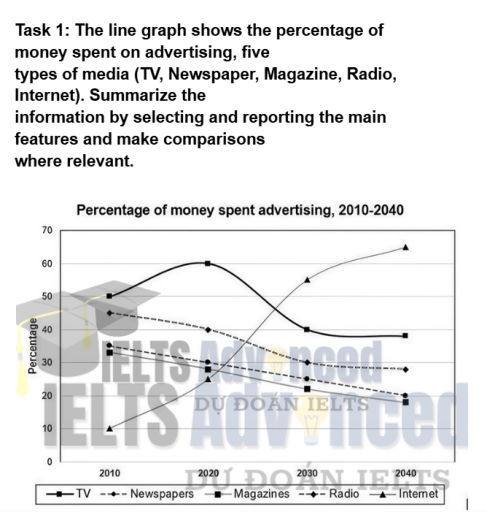
The image shows a line graph detailing the percentage of money spent on advertising through five media types: TV, Newspapers, Magazines, Radio, and Internet, from 2010 to 2040. In 2010, TV registers around 40%, Newspapers at approximately 37%, Magazines close to 10%, Radio about 7%, and Internet just above 5%. By 2020, TV decreases slightly to near 38%, Newspapers drop to about 32%, Magazines remain stable at 10%, Radio reduces to below 5%, and Internet rises to nearly 10%. In 2030, TV slightly declines to approximately 37%, Newspapers fall sharply to around 20%, Magazines dip slightly to 8%, Radio stays stable under 5%, and Internet jumps to over 20%. By 2040, TV sees a further drop to about 32%, Newspapers diminish to 5%, Magazines decrease to around 5%, Radio remains consistent at 3%, and Internet expands to approximately 35%.
Given the complexity of the image, the above description may not be entirely accurate.
Note: Both the topic and the answer were created by one of our users.

The line graph provides data on the percentage of budget spent on advertising in five types of media in france from 2010 to 2040.

Overall, all types of media fluctuated over the 30 years. Internet led on the category with the highest figures in 2040, while magazines had the lowest figures in the end of the year.

In 2010, television was the largest type of media with 35% of money spent on advertising, while the lowest percentage of money spent on internet. The other types of media were on the same level , despite newspapers being the second highest after the television. Between the 2020 and 2030, the figures were changed. Radio and magazines demonstrated exactly the same level of percentage around 5%, while internet started to increase rapidly from 5% to 35%.

In this year, televesion was with the highest figures at 45% again . In contrast, newspapers significantly decreased from 35% to 15% during these years. In 2040, figures were completely changed. Internet replaced the leader’s place with television at 45%. Newspapers stopped decreasing at 35%, while magazines’s figures were smaller than radio’s figures due to decreases.

Word Count: 189

Answers On The Same Topic:

Task 1: The line graph shows the percentage of money spent on advertising, five types of media (TV, Newspaper, Magazine, Radio, Internet). Summarize the information by selecting and reporting the main features and make comparisons where relevant.

he line graph delineates the proportions of money spent on five sorts of advertising, in terms of TV, newspapers, magazines, radio, and Internet, between 2010 to 2040. At a quick glance, until 2020, while the rate of money invested in TV and newspapers increased, the other figures witnessed reverse tendencies. Subsequently, the trends will continue […]

See All

Other Topics:

The line chart below shows the number of goods transported in many ways from 1974 to 2002

The diagram gives comparison of goods transported by different methods between 1974 and 2002 in the UK. Overall, three ways of transportation goods became more demanding (Road, Water, Pipeline), and Rail became stayed the same. While Road consistently remained the most popular way, Rail was overtaken by Water, which became the second most popular. The […]

The graph below shows the number of visitors to five different types of museums in the UK from 1999 to 2019. Summarise the information by selecting and reporting the main features, and make comparisons where relevant.

The line graph compares the number of visitors to five categories of museums in the UK between 1999 and 2019. Overall, attendance figures for all types of museums increased, excepting for history museums and culture museums . During the period, art museums was the category attracted the most visitors. Regarding museums with increasing visitor numbers, […]

The graph below shows the monetary aid from 4 organizations to developing countries in 4 different years. Summarize the information by selecting and reporting the main features and make comparisons where relevant. Write at least 150 words.

The line graph illustrates the monetary aid provided by four various organizations to developing countries over a four-year period , between 2008 and 2011 . Overall , the data shows that particular organizations experienced a moderate increase in funding , especially organization B which had a significant rise , while others demonstrated a noticeable decline […]

The graph below gives information about how much people in the United States and the United Kingdom spend on fuel.

The line graph illustrates the proportion of income allocated to fuel expenditures in the United States and the United Kingdom, categorized by income level. Overall, it is evident that individuals in the United States spend a higher percentage of their income on fuel across all income levels when compared to the UK. Beginning with the […]

This line graph is typical of IELTS writing task 1. It shows three lines and one of the lines doesn't have any data for the first few years. See the model answer below to learn how to tackle this task.

The line graph illustrates the spreads consumption from 1981 to 2007. Overall, there was a striking decrease in the use of butter over the years. The most dramatic consumption is with low fat and reduced spreads which was not consumed for the first half of the period. Margarine consumption was relatively stable throughout the period. […]

This line graph is typical of IELTS writing task 1. It shows three lines and one of the lines doesn't have any data for the first few years. See the model answer below to learn how to tackle this task.

The line graph illustrates the consumption of three types of spreads between 1981 and 2007. Overall, there was a striking decrease in the use of butter over the years. The most notable change was in the consumption of low-fat and reduced-fat spreads which were not consumed during the first half of the period. Meanwhile, margarine […]

See All
We have detected unusual activity on your device.
Please verify your identity to continue.
Note: This verification step won't sign you in. If you have a premium account, please log in to access the service as usual.
Google/Gmail Verification
Or verify using Email/Code
We've sent a verification code to:
youremail@gmail.com (Not your email?)
Enter it below to complete the verification process.
Ensure your email address is correct, your inbox is not full, and you check your spam folder. If no email arrives, consider using an alternative email.
You will need a Premium plan to perform your action!
Note: If you already have a premium account, please log in to access our services as usual.

Plans & Pricing

Our mission is to make quality education accessible for everyone.
However, to keep our hardworking team running and this service alive, we genuinely need your support!
By opting for a premium plan, not only do you sustain us in achieving the mission, but you also unlock advanced features to enrich your learning experience.

Free

For learners who aren't pressed for time

What's included on Free
100+ Cambridge IELTS Tests
Instant IELTS Writing Task 1 & 2 Evaluation (2 times/month)
Instant IELTS Speaking Part 1, 2, & 3 Evaluation (5 times/month)
Instant IELTS Writing Task 1 & 2 Essay Generator (2 times/month)
500+ Dictation & Shadowing Exercises
100+ Pronunciation Exercises
Flashcards
Other Advanced Tools

Premium

For those serious about advancing their English proficiency, and for IELTS candidates aspiring to boost their band score by 1-2 points (especially in writing & speaking) in just 30 days or less

What's included on Premium
Save Your IELTS Test Progress
Unlock All Courses & IELTS Tests
Unlimited AI Conversations
Unlimited AI Writing Enhancement Exercises
Unlimited IELTS Writing Task 1 & 2 Evaluation
Unlimited IELTS Speaking Part 1, 2, & 3 Evaluation
Checked Answers Will Not Be Published
Unlimited IELTS Writing Task 1 & 2 Essay Generator
Unlimited IELTS Speaking Part 1, 2, & 3 Sample Generator
Unlimited Usage Of Advanced Tools
Priority Support within 24h (12-month plan only)

Due to the nature of our service and the provided free trials, payments are non-refundable.
Nếu bạn là người Việt Nam và không có hoặc không muốn trả bằng credit/debit cards, bạn có thể thanh toán bằng phương thức chuyển khoản:


Chọn gói:
419,000₫ 277,000 ₫ cho gói 1 tháng (chỉ 9,233₫/ngày)
1,239,000₫ 597,000 ₫ cho gói 3 tháng (chỉ 6,633₫/ngày)
2,469,000₫ 1,027,000 ₫ cho gói 6 tháng (chỉ 5,706₫/ngày)
4,929,000₫ 1,417,000 ₫ cho gói 12 tháng (chỉ 3,936₫/ngày)


Sau khi chuyển khoản, vui lòng đợi trình duyệt tự động điều hướng bạn trở lại Engnovate và bạn sẽ ngay lập tức nhận được mã kích hoạt tài khoản premium.
Nếu có lỗi xảy ra, bạn có thể liên hệ với team thông qua một trong các phương thức: email đến helloengnovate@gmail.com hoặc nhắn tin qua facebook.com/engnovate.
Vì toàn bộ công cụ trên website đều có thể sử dụng thử miễn phí, Engnovate không hỗ trợ hoàn tiền.