🔥 Today Only: Save 30% on Premium — Offer Ends Soon! - Upgrade Now!
Line Graph

Band 6+: Task 1: You have approximately 20 minutes to complete this task. The chart below gives information on the amount of time taken to manufacture a vehicle by four US-based car producers between 1998 and 2002. Provide an overview of the information by identifying and describing the key details, and include comparisons where appropriate,

Image for topic: Task 1: You have approximately 20 minutes to complete this task. The chart below gives information on the amount of time taken to manufacture a vehicle by four US-based car producers between 1998 and 2002. Provide an overview of the information by identifying and describing the key details, and include comparisons where appropriate,
Our system will evaluate the answer based on this AI-generated description.
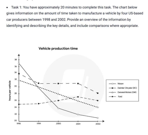
The image displays a line graph charting the vehicle production time in hours per vehicle for Nissan, Daimler Chrysler (DC), General Motors (GM), and Ford from 1998 to 2002. In 1998, Nissan starts just above 32 hours, Daimler Chrysler at 32 hours, General Motors just under 32 hours, and Ford at 30 hours. By 1999, Nissan's production time decreases sharply to 29 hours, Daimler Chrysler continues at 27 hours, General Motors reduces to 28 hours, and Ford drops steeply to 22 hours. In 2000, Nissan further reduces to under 28 hours, Daimler Chrysler moves to 27 hours, General Motors drops to 27 hours, and Ford maintains at 22 hours. In 2001, Nissan's production comes slightly above 26 hours, Daimler Chrysler rises to approximately 28 hours, General Motors increases slightly to 26 hours, and Ford remains around 22 hours. By 2002, Nissan decreases to 22 hours, Daimler Chrysler slightly drops to above 27 hours, General Motors stays under 26 hours, and Ford achieves 21 hours.
Given the complexity of the image, the above description may not be entirely accurate.
Note: Both the topic and the answer were created by one of our users.

The given line graph, which is measured in hours, illustrates data about how much time a car was created by four US-based car producers in the four-year period from 1998 to 2002.

Overall, there was a downward trend in the amount of time which is used to produced vehicles, except from Ford between 1998 and 2002. Nissan’s production time went down considerbly in the time period.

According to the graph, it can be seen that in 1998, the amount of time spending to manufacture Ford was far shorter than others at nearly 25 hours. Nissan, however, took the production team about 35 hours to form it. This amount saw a considerable decrease in 2000 to just over 24 hours. Nevertheless, the figure of Ford climbed substantially by 1 hours. In 2002, car producers spent nearly 26 hours to produce Ford, whereas they took less than 22 hours to create a Nissan.

From the line graph, four experts tended to produce a General Motors (GM) within 32 hours in 1998, while the time they spent for Daimler Chrysler (DC) was 34 hours. In 2000, both GM and DC saw a significant drop in the amount of time spending on manufacturing them. In the last two years, the time experts took to produce GM and DC declined dramatically to nearly 27 hours and just under 32 hours respectively.

Word Count: 226

Answers On The Same Topic:

Task 1: You have approximately 20 minutes to complete this task. The chart below gives information on the amount of time taken to manufacture a vehicle by four US-based car producers between 1998 and 2002. Provide an overview of the information by identifying and describing the key details, and include comparisons where appropriate,

The line graph illustrates information about the amount of time to manufacture a vehicle by four various US manufacturers within four years between 1998 and 2002. Overall, it is celar that there were slight fluctuating trends in DC and Ford, while Nissan and General Motors witnessed sharp declines during the years in question. Another important […]

Task 1: You have approximately 20 minutes to complete this task. The chart below gives information on the amount of time taken to manufacture a vehicle by four US-based car producers between 1998 and 2002. Provide an overview of the information by identifying and describing the key details, and include comparisons where appropriate,

Overall, almost all types of vehicle production accelerated significantly except for Ford, which was the fastest-produced means of transport in the initial year. Nissan figures overtook all other types of transport and changed from the slowest manufacturer to the fastest throughout the period, while General Motors gradually increased productivity. Daimler Chrysler, the only model that, […]

Task 1: You have approximately 20 minutes to complete this task. The chart below gives information on the amount of time taken to manufacture a vehicle by four US-based car producers between 1998 and 2002. Provide an overview of the information by identifying and describing the key details, and include comparisons where appropriate,

Overall, almost all types of vehicle production accelerated significantly except for Ford, which was the fastest-produced means of transport in the initial year. Nissan figures overtook all types of transport, and changed from the slowest manufacturer to the fastest throughout the period, while General Motors gradually increased productivity. Daimler Chrysler, the only model, despite increasing […]

Task 1: You have approximately 20 minutes to complete this task. The chart below gives information on the amount of time taken to manufacture a vehicle by four US-based car producers between 1998 and 2002. Provide an overview of the information by identifying and describing the key details, and include comparisons where appropriate,

The line graph illustrates the amount of time has been taken to manufacture a means of transport by four US-based car manufacturers from 1998 to 2002. Overall, it is clear that there was a downward trend in production time for all car makers, indicating improvements in manufacturing effeciency, especially for Nissan. Looking at the deatails, […]

See All

Other Topics:

The graph below shows the number of undergraduate students in thousands in four counties between 1995 and 2015.

The line graph compares figures for the undergraduate student population in four European countries over the period from 1995 to 2015. Overall, student numbers increased in all countries, with the exception of Sweden. Having been the leading country initially, Sweden experienced a significant decrease. Spain recorded the highest numbers by the end of the period, […]

the line graph shows the percentage of people who used five different communication methods between 1998 and 2008.

The line chart represent the percentage of people who used five specific communication tools with span over ten years, from 1998 to 2008. In the very beginning, the biggest part of all communication was through landline service. Started with only 15 percent, then slightly increased in the next years, additionally between 2000 and 2002 had […]

The line graph below shows the percentage of spending in Turkey from 1960 to 2000

The line graph illustrates the percentage of spending in Turkey, from 1960 to 2000. Overall, it is obsereved that there is significant drop in spending except clothing from 1960 to 2000. There is a huge decline in food spent by turkeish people over the years. In contrast, it is noticed that thre is a slight […]

The graph shows the amount of fruit produced in four countries (France, Spain, Germany, Turkey) from 1970 to 2010. Summarize the information by reporting the main features, and making comparisons where relevant.

The line chart illustrates how much fruit was produced in different countries (France, Spain, Germany, and Turkey) between 1970 and 2010. Overall, while Turkey and France showed upward trends in fruit production, the opposite patterns were seen in the figures for Spain and Germany. Additionally, by the end of the period, Spain still maintained its […]

The graph below gives information about one company's unit sales of 5 different types of jam from 2009 to 2014. Summarise the information by selecting and reporting the main features, and make comparisons where relevant.

The provided line graph demonstrates the revenue in five different types of jam in one company between 2009 and 2014. Generally, it is clear that strawberry is the most common jam so this figure illustrates a dominance during the period shown. In addition, the figures for strawberry, plum and grape experienced an considerable climb, but […]

The graph below shows population figures for India and China since the year 2000 and predicted population growth up until 2050. Summarise the information by selecting and reporting the main features, and make comparisons where relevant.

The graph provides information about population number of India and China since the 2020 and predicted population growth up until 2050. Overall, the figure for residents in India grew steadily in the first few years before being forecasted to reach the highest point in 2050.Additionlly, the number of people in China had a fluctuating trend […]

See All
We have detected unusual activity on your device.
Please verify your identity to continue.
Note: This verification step won't sign you in. If you have a premium account, please log in to access the service as usual.
Google/Gmail Verification
Or verify using Email/Code
We've sent a verification code to:
youremail@gmail.com (Not your email?)
Enter it below to complete the verification process.
Ensure your email address is correct, your inbox is not full, and you check your spam folder. If no email arrives, consider using an alternative email.
You will need a Premium plan to perform your action!
Note: If you already have a premium account, please log in to access our services as usual.

Plans & Pricing

Our mission is to make quality education accessible for everyone.
However, to keep our hardworking team running and this service alive, we genuinely need your support!
By opting for a premium plan, not only do you sustain us in achieving the mission, but you also unlock advanced features to enrich your learning experience.

Free

For learners who aren't pressed for time

What's included on Free
100+ Cambridge IELTS Tests
Instant IELTS Writing Task 1 & 2 Evaluation (2 times/month)
Instant IELTS Speaking Part 1, 2, & 3 Evaluation (5 times/month)
Instant IELTS Writing Task 1 & 2 Essay Generator (2 times/month)
500+ Dictation & Shadowing Exercises
100+ Pronunciation Exercises
Flashcards
Other Advanced Tools

Premium

For those serious about advancing their English proficiency, and for IELTS candidates aspiring to boost their band score by 1-2 points (especially in writing & speaking) in just 30 days or less

What's included on Premium
Save Your IELTS Test Progress
Unlock All Courses & IELTS Tests
Unlimited AI Conversations
Unlimited AI Writing Enhancement Exercises
Unlimited IELTS Writing Task 1 & 2 Evaluation
Unlimited IELTS Speaking Part 1, 2, & 3 Evaluation
Checked Answers Will Not Be Published
Unlimited IELTS Writing Task 1 & 2 Essay Generator
Unlimited IELTS Speaking Part 1, 2, & 3 Sample Generator
Unlimited Usage Of Advanced Tools
Priority Support within 24h (12-month plan only)

Due to the nature of our service and the provided free trials, payments are non-refundable.
Nếu bạn là người Việt Nam và không có hoặc không muốn trả bằng credit/debit cards, bạn có thể thanh toán bằng phương thức chuyển khoản:


Chọn gói:
419,000₫ 277,000 ₫ cho gói 1 tháng (chỉ 9,233₫/ngày)
1,239,000₫ 597,000 ₫ cho gói 3 tháng (chỉ 6,633₫/ngày)
2,469,000₫ 1,027,000 ₫ cho gói 6 tháng (chỉ 5,706₫/ngày)
4,929,000₫ 1,417,000 ₫ cho gói 12 tháng (chỉ 3,936₫/ngày)


Sau khi chuyển khoản, vui lòng đợi trình duyệt tự động điều hướng bạn trở lại Engnovate và bạn sẽ ngay lập tức nhận được mã kích hoạt tài khoản premium.
Nếu có lỗi xảy ra, bạn có thể liên hệ với team thông qua một trong các phương thức: email đến helloengnovate@gmail.com hoặc nhắn tin qua facebook.com/engnovate.
Vì toàn bộ công cụ trên website đều có thể sử dụng thử miễn phí, Engnovate không hỗ trợ hoàn tiền.