🔥 Today Only: Save 30% on Premium — Offer Ends Soon! - Upgrade Now!
Bar Chart

Band 6+: The bar chart below shows average UK salaries, by city. Summarise the information by selecting and reporting the main features, and make comparisons where relevant..

Image for topic: The bar chart below shows average UK salaries, by city. Summarise the information by selecting and reporting the main features, and make comparisons where relevant..
Our system will evaluate the answer based on this AI-generated description.
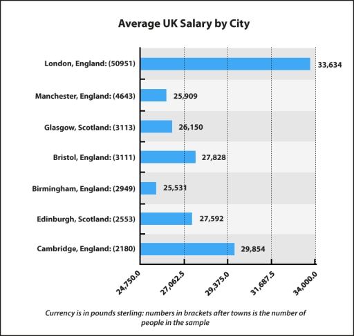
The image displays a bar graph titled "Average UK Salary by City", with seven cities listed along the Y-axis and the average salary amounts displayed in ascending order along the X-axis. London, England has the highest average salary of 33,634 with a sample size of 50951. Cambridge, England has the second-highest salary of 29,854 with a sample size of 2180. Bristol, England follows with a salary of 27,828 and a sample size of 3111. Edinburgh, Scotland has a salary of 27,592 with a sample size of 2553. Glasgow, Scotland's average salary is 26,150 with 3113 people in the sample. Manchester, England has an average salary of 25,909 and a sample size of 4643. The lowest average salary is in Birmingham, England at 25,531 with 2949 people in the sample. The label at the bottom reads "Currency is in pounds sterling; numbers in brackets after towns are the number of people in the sample".
Given the complexity of the image, the above description may not be entirely accurate.
Note: Both the topic and the answer were created by one of our users.

The bar chart illustrates the average salaries in various cities in the UK, with details on the sample sizes for each city.

Overall, London stands out as the city with the highest average salary, while Birmingham has the lowest. The average salaries in most cities are considerably lower than London’s, with Glasgow and Edinburgh in Scotland having similar average salaries.

London leads with an average salary of 33,634 pounds, significantly higher than Manchester and Birmingham, which pay less than 26,000 pounds. In Scotland, Glasgow and Edinburgh offer similar salaries of around 26,000 pounds. There is a substantial difference of 8103 pounds between London and Birmingham. London also had the largest sample size of 50951 respondents, while other cities had fewer participants.

Cambridge follows London with an average salary of 29,854 pounds, followed by Bristol at 27,828 pounds, Edinburgh at 27,592 pounds, Glasgow at 26,150 pounds, Manchester at 25,909 pounds, and Birmingham at 25,531 pounds. Sample sizes range from 2180 participants in Cambridge to 3113 in Glasgow. The data indicates clear disparities in average salaries and sample sizes across the cities.

Word Count: 180

Answers On The Same Topic:

The bar chart below shows average UK salaries, by city. Summarise the information by selecting and reporting the main features, and make comparisons where relevant..

The provided bar graph compares average salaries across seven cities in the United Kingdom, in both England and Scotland. According to the graph, the numbers are expressed in pounds sterling. Overall, it is clear that average salaries varied according to the city. Capital cities, such as London and Edinburgh, recorded the highest figures in their […]

The bar chart below shows average UK salaries, by city. Summarise the information by selecting and reporting the main features, and make comparisons where relevant..

The bar chart demonstrates the average UK income in different cities. Overall, a distinct pattern emerges, revealing the income gap between the capital cities and other cities. Alongside, there are notable variations in the average income between different cities. Initially, a comparison of all cities highlights London, the capital of England, with the highest average […]

The bar chart below shows average UK salaries, by city. Summarise the information by selecting and reporting the main features, and make comparisons where relevant..

The bar chart illustrates the average salaries across seven cities in the United Kingdom. Overall, there is a significant disparity in average wages among the cities, with London leading by a considerable margin, while Birmingham reports the lowest salary figures. London commands the highest average salary at £33,634, based on a substantial sample size of […]

The bar chart below shows average UK salaries, by city. Summarise the information by selecting and reporting the main features, and make comparisons where relevant..

The bar chart illustrates average salaries for each of the eight UK cities. Overall, there is a significant disparity not only in median wages but also in the number of surveyed people; they considerably vary by city. While London has the outstanding average salary, other cities reported much lower figures. However, most of the numbers […]

The bar chart below shows average UK salaries, by city. Summarise the information by selecting and reporting the main features, and make comparisons where relevant..

The graph below illustrates the average salaries in seven cities in the United Kingdom. Overall, employees in most of the cities in England earn more than in Scotland. According to the bar chart, over 50,000 London employees attend this survey, and they gain the highest average wages among seven cities, with 33,634 pounds. In contrast, […]

See All

Other Topics:

The graph below shows the proportion of revenue from three film types - romance, comedies and action/horror - for a Hollywood film studio from 1970 to 2000. Summarise the information by selecting and reporting the main features, and make comparisons where relevant.

The bar chart depicts revenue percentages from three Hollywood film genres, namely, Romance, Comedies and Action/Horror between 1970 and 2000. In general, while the proportion for Romance witnessed a noticeable downward trend and Comedies’ figure remained stable after experiencing a slight increase and a significant decline, there was a steady growth in the percentage of […]

The chart shows the proportion of renewable energy in total energy supply in 4 countries from 1997 to 2010. Summarize the information by selecting and reporting the main features, and make comparisons where relevant.

The bar chart compares how much of the total energy supply comes from renewable energy sources in 4 nations between 1997 and 2010. Overall, compared to Iceland and Turkey, Australia and Sweden relied much less on renewable energy. In addition, while Australia and Turkey experienced a decreasing trend, the opposite was true for Sweden and […]

The graph below shows the number of men and women in further education in Britain in three periods and whether they were studying full-time or part-time.

The bar chart illustrate data about the five different educational degree who owned a computer in 2002 and 2010. Overall, the proportion of computer ownership in each educational level in 2010 was higher than in 2002. Moreover, by the higher educational degree, more students would have owned a computer. In 2002, only 15% people with […]

The chart shows the changes in car ownership in a counrty between 1971 and 2001

the provided bar chart delineates the evolution of car ownership in a specific country over a thirty-year period from 1971 to 2001. Overall, there is a notable decline in the percentage of non-car owners, alongside an increase in individuals possessing two or more cars by the end of the period. In 1971, 48% of the […]

The bar graph below shows the stock price of four different technology companies from 2011 to 2016. Summarise the information by selecting and reporting the main features and make comparisons where relevant.

The illustration presents the stock cost of Facebook, Google, Apple, and Yahoo between 2011 and 2016. Overall, the numbers for Facebook increased steadily, whilst that of Yahoo increased. Apple company experienced dramatic fluctuations. Google stocks remained stable. In 2011, Facebook and Yahoo started off at approximately the same price at around 5500. Both companies exhibited […]

The chart below shows the proportions of the world's oil resources held in different areas, together with the proportions consumed annually in the same areas. Summarise the information by selecting and reporting the main features, and make comparisons where relevant. Write at least 150 words.

The provided chart displays information regarding the percentage of total world oil resources and annual oil consumption. Overall, it is clear that the Middle East is the highest in oil resources, far outstripping its oil consumption. Moreover, in oil consumption, Asia is the highest, while Australia and New Zealand are the lowest in both oil […]

See All
We have detected unusual activity on your device.
Please verify your identity to continue.
Note: This verification step won't sign you in. If you have a premium account, please log in to access the service as usual.
Google/Gmail Verification
Or verify using Email/Code
We've sent a verification code to:
youremail@gmail.com (Not your email?)
Enter it below to complete the verification process.
Ensure your email address is correct, your inbox is not full, and you check your spam folder. If no email arrives, consider using an alternative email.
You will need a Premium plan to perform your action!
Note: If you already have a premium account, please log in to access our services as usual.

Plans & Pricing

Our mission is to make quality education accessible for everyone.
However, to keep our hardworking team running and this service alive, we genuinely need your support!
By opting for a premium plan, not only do you sustain us in achieving the mission, but you also unlock advanced features to enrich your learning experience.

Free

For learners who aren't pressed for time

What's included on Free
100+ Cambridge IELTS Tests
Instant IELTS Writing Task 1 & 2 Evaluation (2 times/month)
Instant IELTS Speaking Part 1, 2, & 3 Evaluation (5 times/month)
Instant IELTS Writing Task 1 & 2 Essay Generator (2 times/month)
500+ Dictation & Shadowing Exercises
100+ Pronunciation Exercises
Flashcards
Other Advanced Tools

Premium

For those serious about advancing their English proficiency, and for IELTS candidates aspiring to boost their band score by 1-2 points (especially in writing & speaking) in just 30 days or less

What's included on Premium
Save Your IELTS Test Progress
Unlock All Courses & IELTS Tests
Unlimited AI Conversations
Unlimited AI Writing Enhancement Exercises
Unlimited IELTS Writing Task 1 & 2 Evaluation
Unlimited IELTS Speaking Part 1, 2, & 3 Evaluation
Checked Answers Will Not Be Published
Unlimited IELTS Writing Task 1 & 2 Essay Generator
Unlimited IELTS Speaking Part 1, 2, & 3 Sample Generator
Unlimited Usage Of Advanced Tools
Priority Support within 24h (12-month plan only)

Due to the nature of our service and the provided free trials, payments are non-refundable.
Nếu bạn là người Việt Nam và không có hoặc không muốn trả bằng credit/debit cards, bạn có thể thanh toán bằng phương thức chuyển khoản:


Chọn gói:
419,000₫ 277,000 ₫ cho gói 1 tháng (chỉ 9,233₫/ngày)
1,239,000₫ 597,000 ₫ cho gói 3 tháng (chỉ 6,633₫/ngày)
2,469,000₫ 1,027,000 ₫ cho gói 6 tháng (chỉ 5,706₫/ngày)
4,929,000₫ 1,417,000 ₫ cho gói 12 tháng (chỉ 3,936₫/ngày)


Sau khi chuyển khoản, vui lòng đợi trình duyệt tự động điều hướng bạn trở lại Engnovate và bạn sẽ ngay lập tức nhận được mã kích hoạt tài khoản premium.
Nếu có lỗi xảy ra, bạn có thể liên hệ với team thông qua một trong các phương thức: email đến helloengnovate@gmail.com hoặc nhắn tin qua facebook.com/engnovate.
Vì toàn bộ công cụ trên website đều có thể sử dụng thử miễn phí, Engnovate không hỗ trợ hoàn tiền.