🔥 Today Only: Save 30% on Premium — Offer Ends Soon! - Upgrade Now!
Bar Chart

Band 5+: The bar chart below shows current health expenditure totals as percentages of GDP* for various European countries for the years 2002, 2007 and 2012. Summarise the information by selecting and reporting the main features, and make comparisons where relevant. You should write at least 150 words. * GDP (Gross Domestic Product) is the total value of goods that are made and services that are provided in a country.

Image for topic: The bar chart below shows current health expenditure totals as percentages of GDP* for various European countries for the years 2002, 2007 and 2012. Summarise the information by selecting and reporting the main features, and make comparisons where relevant. You should write at least 150 words. * GDP (Gross Domestic Product) is the total value of goods that are made and services that are provided in a country.
Our system will evaluate the answer based on this AI-generated description.
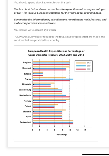
The image displays a bar chart with European Health Expenditure as a Percentage of GDP (Gross Domestic Product) for the years 2002, 2007, and 2012. Belgium's health expenditure percentages are 7.9 (2002), 10.3 (2007), and 10.7 (2012); Denmark's are 8.4 (2002), 9.5 (2007), and 10.4 (2012); Estonia's are 5.0 (2002), 5.7 (2007), and 6.2 (2012); France's are 10.1 (2002), 11.2 (2007), and 11.6 (2012); Lithuania's are 5.6 (2002), 6.2 (2007), and 6.8 (2012); Luxembourg's are 5.9 (2002), 7.1 (2007), and 7.2 (2012); Netherlands' are 8.7 (2002), 9.4 (2007), and 11.9 (2012); Norway's are 7.8 (2002), 8.2 (2007), and 9.3 (2012); Poland's are 4.3 (2002), 6.4 (2007), and 6.6 (2012); Slovenia's are 6.6 (2002), 7.7 (2007), and 8.4 (2012); Spain's are 6.7 (2002), 8.5 (2007), and 9.1 (2012); Switzerland's are 10.4 (2002), 10.7 (2007), and 11.4 (2012).
Given the complexity of the image, the above description may not be entirely accurate.
Note: Both the topic and the answer were created by one of our users.

The bar chart illustrates the proportions of Gross Domestic Product(GDP) that were spent on healthcarfe in twelve European countries during 2002, 2007 and 2012. Overall, Switzerlan, Belgium, Spain and Estonia did not show any changes over the years. In addition, Estonia appeared to be the country were they spent less money on healthcare.

Switzerland, Belgium and France spent the most on healthcare, Health expenditure in those countries accounted for approximately 10% of their GDP. Denmark, Netheralnds, Spain, Slovenia and Norway spent between 8% and 10% of their GDP on healthcare. Health expenditure accounted for less than 8% of the GDP in the remaining countries, namely: Poland, Lituania, Estonia, Luxembourg.

Not all the countries have witnessed changes over the three years. The percentage of GDP used on healthcare increased in Denmark, Norway, Poland and Slovenia, but decreased in Netherland and Luxembourg. When it comes to France, the proportion went up , then decreased.

Word Count: 152

Answers On The Same Topic:

The bar chart below shows current health expenditure totals as percentages of GDP* for various European countries for the years 2002, 2007 and 2012. Summarise the information by selecting and reporting the main features, and make comparisons where relevant. You should write at least 150 words. * GDP (Gross Domestic Product) is the total value of goods that are made and services that are provided in a country.

The bar chart compares the proportion of the European health consumption in GDP, starting from 2002 to 2012. Overall, most countries showed an upward in heath expenditure. Switzerland had the largest proportion whereas Estonia had the lowest. Belgium, Estonia, and Switzerland remained the same over year while other countries exhibited a change. In terms of […]

The bar chart below shows current health expenditure totals as percentages of GDP* for various European countries for the years 2002, 2007 and 2012. Summarise the information by selecting and reporting the main features, and make comparisons where relevant. You should write at least 150 words. * GDP (Gross Domestic Product) is the total value of goods that are made and services that are provided in a country.

The bar chart illustrates the proportion of GDP allocated to health expenditure in twelve European countries in 2002, 2007, and 2012. Overall, Switzerland consistently spent the largest percentage of GDP on health across all three years, while Estonia allocated the least. Although some countries maintained relatively stable expenditure levels over the years, others experienced notable […]

The bar chart below shows current health expenditure totals as percentages of GDP* for various European countries for the years 2002, 2007 and 2012. Summarise the information by selecting and reporting the main features, and make comparisons where relevant. You should write at least 150 words. * GDP (Gross Domestic Product) is the total value of goods that are made and services that are provided in a country.

The bar chart provides data on the health expenses in twelve european countries over 3 different years, five years apart, from 2002 to 2012. Overall, whathever the country, the percentage of health expenditure did’nt fluctuated much during the period. For instance, France seems to have the bigger increase over the decade, with 2% more spending. […]

The bar chart below shows current health expenditure totals as percentages of GDP* for various European countries for the years 2002, 2007 and 2012. Summarise the information by selecting and reporting the main features, and make comparisons where relevant. You should write at least 150 words. * GDP (Gross Domestic Product) is the total value of goods that are made and services that are provided in a country.

The provided bar chart delineates the total percentage of spending on healthcare by twelve European states in 2002,2007, and 2012 utilizing the Gross Domestic Product measure. Overall, Switzerland demonstrated the highest proportion over the period, while in contrast, the lowest belonged to Estonia. To begin with, as it was mentioned before, the Swiss dominated the […]

See All

Other Topics:

the graph below shows the amount of energy generated wind in four countries in the period 1980-2000

The graph illustrates the amount of energy generated by wind in four countries (India, Denmark, Germany and US) between 1980 and 2000. Overall, the amount of energy which produced in Germany and US wittnessed significant roses during the period, while India and Denmark had the lowest figures. Focusing on the increases, US had the drammatic […]

The charts below show the number of the people in Europe who were effected by four types of noise by day and by night in cities and rural areas in 2007.

The pie chart give information about four different types of noice that would affect the people of Europe during the day time and evening time, and this information is represented in 2007. Overall, the chart illustrate that noise polution affected both people who were living in city and also affect countryside people. The first diagram […]

The chart below shows the number of immigrants to Germany by region in 2010 and 2020. Summarise the information by selecting and reporting the main features, and make comparisons where relevant

The bar chart illustrates the proportion of households number of settler moved to Germany in decade region between 2010 and 2020. Overall, the most noticeable feature is that a significant rise was observed in Europe and experienced a sharp declined in some country like Africa, East Asia and South Asia and vice versa. In contrast […]

The graph below shows the number of films produced by five countries in three years. Summarise the information by selecting and reporting the main features, and make comparisons where relevant.

The given graph represents the data about the number of movies released by five countries for following three years. Overall, it is clear that Country A remained the leading producer of movies over the period, while the figures of other countries either fluctuated or remained relatively stable. In detail, on the one hand, although Country […]

The chart below shows the number of immigrants to Germany by region in 2010 and 2020. Summarise the information by selecting and reporting the main features, and make comparisons where relevant

The chart depicts the number of immigrants to Germany in 2000 and 2010, categorized by region. As can be seen from the graph, the vast majority of migrants to Germany came from Europe in 2000, with precisely 30 million, closely followed by America, standing at around 23 million. In addition, Oceania and East Asia had […]

the graph below shows the amount of energy generated wind in four countries in the period 1980-2000

The chart illustrates the figure for generation wind energy across four countries, namely India, Denmark, Germany and United States from 1980 to 2000. Overall, the amount of wind energy generated rose considerably across three countries over the whole period shown, with United States being the only country that experienced a remarkable decline. Looking at the […]

See All
We have detected unusual activity on your device.
Please verify your identity to continue.
Note: This verification step won't sign you in. If you have a premium account, please log in to access the service as usual.
Google/Gmail Verification
Or verify using Email/Code
We've sent a verification code to:
youremail@gmail.com (Not your email?)
Enter it below to complete the verification process.
Ensure your email address is correct, your inbox is not full, and you check your spam folder. If no email arrives, consider using an alternative email.
You will need a Premium plan to perform your action!
Note: If you already have a premium account, please log in to access our services as usual.

Plans & Pricing

Our mission is to make quality education accessible for everyone.
However, to keep our hardworking team running and this service alive, we genuinely need your support!
By opting for a premium plan, not only do you sustain us in achieving the mission, but you also unlock advanced features to enrich your learning experience.

Free

For learners who aren't pressed for time

What's included on Free
100+ Cambridge IELTS Tests
Instant IELTS Writing Task 1 & 2 Evaluation (2 times/month)
Instant IELTS Speaking Part 1, 2, & 3 Evaluation (5 times/month)
Instant IELTS Writing Task 1 & 2 Essay Generator (2 times/month)
500+ Dictation & Shadowing Exercises
100+ Pronunciation Exercises
Flashcards
Other Advanced Tools

Premium

For those serious about advancing their English proficiency, and for IELTS candidates aspiring to boost their band score by 1-2 points (especially in writing & speaking) in just 30 days or less

What's included on Premium
Save Your IELTS Test Progress
Unlock All Courses & IELTS Tests
Unlimited AI Conversations
Unlimited AI Writing Enhancement Exercises
Unlimited IELTS Writing Task 1 & 2 Evaluation
Unlimited IELTS Speaking Part 1, 2, & 3 Evaluation
Checked Answers Will Not Be Published
Unlimited IELTS Writing Task 1 & 2 Essay Generator
Unlimited IELTS Speaking Part 1, 2, & 3 Sample Generator
Unlimited Usage Of Advanced Tools
Priority Support within 24h (12-month plan only)

Due to the nature of our service and the provided free trials, payments are non-refundable.
Nếu bạn là người Việt Nam và không có hoặc không muốn trả bằng credit/debit cards, bạn có thể thanh toán bằng phương thức chuyển khoản:


Chọn gói:
419,000₫ 277,000 ₫ cho gói 1 tháng (chỉ 9,233₫/ngày)
1,239,000₫ 597,000 ₫ cho gói 3 tháng (chỉ 6,633₫/ngày)
2,469,000₫ 1,027,000 ₫ cho gói 6 tháng (chỉ 5,706₫/ngày)
4,929,000₫ 1,417,000 ₫ cho gói 12 tháng (chỉ 3,936₫/ngày)


Sau khi chuyển khoản, vui lòng đợi trình duyệt tự động điều hướng bạn trở lại Engnovate và bạn sẽ ngay lập tức nhận được mã kích hoạt tài khoản premium.
Nếu có lỗi xảy ra, bạn có thể liên hệ với team thông qua một trong các phương thức: email đến helloengnovate@gmail.com hoặc nhắn tin qua facebook.com/engnovate.
Vì toàn bộ công cụ trên website đều có thể sử dụng thử miễn phí, Engnovate không hỗ trợ hoàn tiền.