🔥 Today Only: Save 30% on Premium — Offer Ends Soon! - Upgrade Now!
Bar Chart

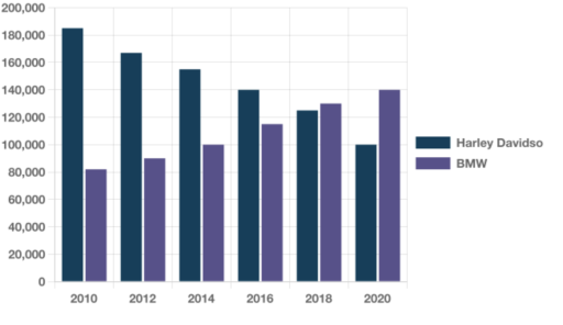
Band 5+: The bar chart below shows the number of new motorcycles sold by Harley Davidson and BMW between 2010 and 2020. Summarize the information by selecting and reporting the main features and make comparisons where relevant

Image for topic: The bar chart below shows the number of new motorcycles sold by Harley Davidson and BMW between 2010 and 2020. Summarize the information by selecting and reporting the main features and make comparisons where relevant
Our system will evaluate the answer based on this AI-generated description.
The image shows a bar chart with motorcycle units sold by two companies, Harley Davidson and BMW, over 6 biennial periods from 2010 to 2020. In 2010, Harley Davidson sold approximately 145,000 units, while BMW sold around 80,000 units. In 2012, Harley Davidson's sales increased to just under 160,000 units, and BMW's sales rose to around 100,000 units. By 2014, both companies saw a slight decrease in sales, with Harley Davidson selling around 150,000 units and BMW selling approximately 90,000 units. In 2016, Harley Davidson's sales dropped to just over 140,000 units, and BMW's sales remained steady at around 90,000 units. In 2018, both companies' sales increased, Harley Davidson sold roughly 155,000 units, and BMW sold about 120,000 units. However, in 2020, Harley Davidson's sales declined to nearly 120,000 units, while BMW's sales increased to just above 120,000 units.
Given the complexity of the image, the above description may not be entirely accurate.
Note: Both the topic and the answer were created by one of our users.

The bar chart shown in the image illustrates the rich amount of mototcycles that had been marketed by both BMW and Harley Davidson in between the year of 2010 and 2020.

In gernearl, the sales of BMW increased starting from 2010 for 10 years straight and the process of Harley Davidso decreased.

In 2010, new motorcycles sold by Harley was approximately over 80,000 while it was slightly over 180,000 for BMW and there was a very obvious large gap between the two of them. Then, in 2016, the difference was shrinking and by 2016, BMW overtook Harley. In 2020, the difference in gap was starting to increase since BMW kept going up while Harley had been going down.

In conclusion, the graph for BMW and Harley went in opposite way as time goes by. By the end of year 2020, it is expected for the gap between them to get larger.

Word Count: 151

Answers On The Same Topic:

The bar chart below shows the number of new motorcycles sold by Harley Davidson and BMW between 2010 and 2020. Summarize the information by selecting and reporting the main features and make comparisons where relevant

The bar chart depicted in the image illustrates the significant number of motorcycles marketed by both BMW and Harley Davidson between the years 2010 and 2020. Overall, the sales of BMW increased consistently over the 10-year period starting from 2010, while Harley Davidson experienced a decline. In 2010, the number of new motorcycles sold by […]

The bar chart below shows the number of new motorcycles sold by Harley Davidson and BMW between 2010 and 2020. Summarize the information by selecting and reporting the main features and make comparisons where relevant

The rate of new motorcycle sold by Harley Davidson and BMW between 2010 and 2020 is illustrated in the chart. Overall, starting from 2010 sales increased gradually in the case of BMW and it went opposite for Harley. Harley Davidson sold over 180,000 motorcycles in the last decade and it was the last time to […]

The bar chart below shows the number of new motorcycles sold by Harley Davidson and BMW between 2010 and 2020. Summarize the information by selecting and reporting the main features and make comparisons where relevant

The chart illustrates the number of new motorcycles sold by Harley-Davidson and BMW from 2010 to 2020. Overall, it is easy to observe that Harley-Davidson declined steadily throughout the period, while BMW increased gradually. Despite this, BMW sold more motorcycles than Harley-Davidson. Harley-Davidson sold over 180,000 motorcycles in 2010, which fell to around 10,000 in […]

See All

Other Topics:

The bar graph. "the chart below gives information about UK's ageing population in 1985, with future predictions for 2035".

The bar chart illustrates the percentage data of the population in the UK in 1985 as well as an estimate for 2035. Overall, the information presents five countries with similar populations aged 65 and over in 1985, with a percentage variation between them (below or above 15%). Wales shows the highest rate at 16%. On […]

The chart below shows the percentage of female employees in three job sectors in Greece from 1990 to 2015.

The bar chart provides information about the percentages of female employees in greece between 1990 and 2015 Overall, call centre’s rate experienced an upward , while both of banking- finance and customer service showed a rise. All three job sectors rates had some fluctuations. Although banking-finance had a lower rate than the other job sectors […]

The bar chart below shows the percentage participation of men in senior development in three companies between 1980 and the year 2010. Summarize the information by selecting and report in the main features, and make comparisons where relevant. Write at least 150 words

The bar chart illustrates the percentage of men working in senior development position in three different companies between 1980 and 2010. Overall, the rate of men working in senior development position in IBM remained the lowest in the first five years and the opposite was true for the figure for Apple. However, the pattern was […]

The graph below shows four methods of dealing with waste in four countries. Summarise the information by selecting and reporting the main features, and make comparisons where relevant.

The bar chart provides the information about dealing with waste by four methods in terms of percentages among four different nations. Overall, recycling became the most common method of waste disposal in the Netherlands, while landfilled categories had the dominant figure in the UK, Italy and Spain. Another notable figure is that the Netherlands and […]

The chart below shows the percentage of the total us population aged 65 and over between 1900 and 2000.

The chart shows the percent of total population age 65 and over between 1900 to 2000 in the USA. It is clear from the chart that the highest percentage of people age between 65 to 74 were in 1990. While in 2000 other groups of age 75 to 84 and 85+ were at their peak […]

The chart shows the division of household tasks by gender in great Britain

The bar chart compares the number of household tasks per day which were divided by gender in Great Britain. Overall, women tend to do household chores more than man, although there were few exceptions. The amount of time spending on cooking baking and washing up was stood at the highest by females, while that of […]

See All
We have detected unusual activity on your device.
Please verify your identity to continue.
Note: This verification step won't sign you in. If you have a premium account, please log in to access the service as usual.
Google/Gmail Verification
Or verify using Email/Code
We've sent a verification code to:
youremail@gmail.com (Not your email?)
Enter it below to complete the verification process.
Ensure your email address is correct, your inbox is not full, and you check your spam folder. If no email arrives, consider using an alternative email.
You will need a Premium plan to perform your action!
Note: If you already have a premium account, please log in to access our services as usual.

Plans & Pricing

Our mission is to make quality education accessible for everyone.
However, to keep our hardworking team running and this service alive, we genuinely need your support!
By opting for a premium plan, not only do you sustain us in achieving the mission, but you also unlock advanced features to enrich your learning experience.

Free

For learners who aren't pressed for time

What's included on Free
100+ Cambridge IELTS Tests
Instant IELTS Writing Task 1 & 2 Evaluation (2 times/month)
Instant IELTS Speaking Part 1, 2, & 3 Evaluation (2 times/month)
Instant IELTS Writing Task 1 & 2 Essay Generator (2 times/month)
500+ Dictation & Shadowing Exercises
100+ Pronunciation Exercises
Flashcards
Other Advanced Tools

Premium

For those serious about advancing their English proficiency, and for IELTS candidates aspiring to boost their band score by 1-2 points (especially in writing & speaking) in just 30 days or less

What's included on Premium
Save Your IELTS Test Progress & Analyze Mistakes By Question Type
Save Your Own Flashcard Sets & Use Them On Any Device
Unlock All Courses, IELTS Tests, Section & Part Practice
Unlimited AI Conversations
Unlimited AI Writing Enhancement Exercises
Unlimited IELTS Writing Task 1 & 2 Evaluation
Unlimited IELTS Speaking Part 1, 2, & 3 Evaluation
Checked Answers Will Not Be Published
Unlimited IELTS Writing Task 1 & 2 Essay Generator
Unlimited IELTS Speaking Part 1, 2, & 3 Sample Generator
Unlimited Usage Of Advanced Tools & AI Features
Priority Support within 24h (12-month plan only)

Due to the nature of our service and the provided free trials, payments are non-refundable.