🔥 Today Only: Save 30% on Premium — Offer Ends Soon! - Upgrade Now!
Bar Chart

Band 6+: The bar chart provides information about seven categories of employment among adults in 2003 and 2013

Image for topic: The bar chart provides information about seven categories of employment among adults in 2003 and 2013
Our system will evaluate the answer based on this AI-generated description.
The image shows a bar chart representing the employment categories of adult population for the years 2003 and 2013. There are seven categories displayed: Education training, Hotel industry, Medical, Building, Business, Self-employed, and Unemployed. In 2003, Education training was around 10%, Hotel industry was slightly above 10%, Medical was around 5%, Building was approximately 40%, Business was slightly above 10%, Self-employed was approximately 17.5%, and Unemployed was slightly above 5%. In 2013, Education training was around 17.5%, Hotel industry was around 15%, Medical was approximately 7.5%, Building was approximately 20%, Business was approximately 32.5%, Self-employed was around 30%, and Unemployed was around 7.5%. There is a notable increase in Business and Self-employed categories, while Building saw a significant decrease from 2003 to 2013.
Given the complexity of the image, the above description may not be entirely accurate.
Note: Both the topic and the answer were created by one of our users.

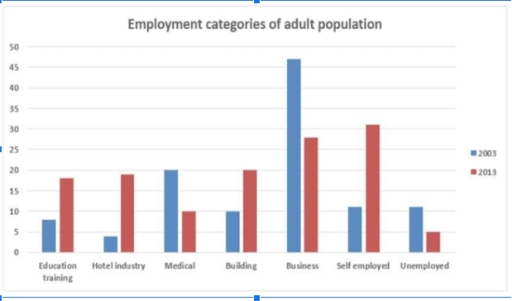
The bar chart gives information about five different employment categories among adults in 2003 and 2013. Overall, there was an increase in the proportion of education training, hotel industry, building, and self-employment, whereas the reverse was true for the other three categories. Additionally, although business rate was the highest in 2003, the leading position was taken by self-employed group after a decade.

Focusing on the increases first, the education training started the trend with just about 8%, a figure that then rose to around 17% by 2013. Likewise, the percentage of hotel industry and self-employed category made up nearly 4% and 11% at the beginning, and they both improved, with respective figures of roughly 19% and 31% over a decade.

Coming to the decreases, the share of business demographic declined dramatically from about 47% to around 28%, which was as twice as more than the decrease of the medical sector making up 10% in 2013. Moreover, the percentage of unemployed adults accounted for just above 10%, but this figure also went down, reaching just 5% at the end.

Word Count: 178

Answers On The Same Topic:

The bar chart provides information about seven categories of employment among adults in 2003 and 2013

The bar chart illustrates occupation categories of adult population in the US over the period Overall, in former year, business was the highest category while unemployment was the lowest category among all the other fields. To begin with, in 2003, the ratio of jobs stood at 7% for education training, that higher than hotel industries […]

The bar chart provides information about seven categories of employment among adults in 2003 and 2013

The bar chart provides information about the professional status of young adults in the US in 2003 and 2013. Overall, it can be seen that the percentage of business and self-employed jobs showed a significant increase during the period, while the proportion jobs of in the building and hotel industries experienced a relatively slower but […]

The bar chart provides information about seven categories of employment among adults in 2003 and 2013

The given chart delineates the proportion of adults recruited in seven distinct categories across the US during 2003 and 2013. It is readily evident that applicants settled for one of the preponderant sectors like business, self employed, unemployed in both years. Additionally, hotel industry and building faced a descending trajectory, the reverse pattern can be […]

The bar chart provides information about seven categories of employment among adults in 2003 and 2013

The bar chart presents data regarding the distribution of employment among adults in 2003 and 2013 Overall, this period depict maginal changes in each occupations. In 2003, the highest proportions of employment were those studying and working in business, in 2013, self employed became the most prevalent option job in the given period. in 2003, […]

See All

Other Topics:

The table below shows the number of international students in three different countries in 2010 and 2020. The bar chart illustrates the percentage of these students enrolled in different fields of study in 2020. Summarize the information by selecting and reporting the main features and make comparisons where relevant. Table: Number of International Students (in thousands) Country 2010 2020 USA 600 750 UK 480 520 Australia 280 420

The bar graph illustrates the percentage of students from three countries, the USA, UK and Australia in different fields of business, engineering, social sciences and others in 2020. Overall, the USA recorded the highest number of scholars in business, followed almost the same by Australia.The least number of students in social studies in the USA. […]

The percentage of men and women executives in six different professions across the UK in 2007 is shown in the graph. Summarize the data by choosing and highlighting the key elements, and make comparisons where necessary.

Enhanced Report The bar chart provides a comparative analysis of the gender composition of executives in six distinct professions within the UK, specifically in the year 2007. Overall, the data reveals a pronounced male predominance in sectors such as construction and manufacturing, whereas women are notably overrepresented in education and health-related fields. In the construction […]

The percentage of men and women executives in six different professions across the UK in 2007 is shown in the graph. Summarize the data by choosing and highlighting the key elements, and make comparisons where necessary.

The bar chart shows the number of men and women executives in six different professions in the UK. Overall, men dominate in some jobs like construction and manufacturing, while women are more in education and health jobs. Some professions have almost similar numbers of both genders. In construction, men are very high, but women are […]

You should spend about 20 minutes on this task. The chart below shows the percentage of children in a European country who took part in four kinds of activities in 2009. Summarise the information by selecting and reporting the main features, and make comparisons where relevant. You should write at least 150 words. <

The given column chart depicts the percentage of children who took part in four kinds of activities in the year 2009 rating them according to their ages. Overall,majority of the young adults watched television while a small percentage played video games that year. The 9 to 11 year olds were the most active that year.They […]

The graph below shows the types of transport used by tourists from five countries who visited New Zealand in 2004. Summarise the information by selecting and reporting the main features, and make comparisons where relevant.

The bar chart illustartes how different kind of transport were used within New Zealand in the year 2004. Overall, at the beginnig period both categories coach and air had the highest proportion, while ferry had the lowest percentage among others categories. Moreover, transport used by tourists was car which had flactuation during these period. The […]

The bar chart below shows the estimated percentage of car trips taken by drivers in 2005. Summarize the information by selecting the main key feature and make comparison where relevant

The provided bar chart above compares data on man and woman drivers regarding the proportion of car trips in 2025. Overall, it is obvious that percentage of women was the highest more in all categories, during the research period. In addition, in terms of work, the rate of male and female was the highest than […]

See All
We have detected unusual activity on your device.
Please verify your identity to continue.
Note: This verification step won't sign you in. If you have a premium account, please log in to access the service as usual.
Google/Gmail Verification
Or verify using Email/Code
We've sent a verification code to:
youremail@gmail.com (Not your email?)
Enter it below to complete the verification process.
Ensure your email address is correct, your inbox is not full, and you check your spam folder. If no email arrives, consider using an alternative email.
You will need a Premium plan to perform your action!
Note: If you already have a premium account, please log in to access our services as usual.

Plans & Pricing

Our mission is to make quality education accessible for everyone.
However, to keep our hardworking team running and this service alive, we genuinely need your support!
By opting for a premium plan, not only do you sustain us in achieving the mission, but you also unlock advanced features to enrich your learning experience.

Free

For learners who aren't pressed for time

What's included on Free
100+ Cambridge IELTS Tests
Instant IELTS Writing Task 1 & 2 Evaluation (2 times/month)
Instant IELTS Speaking Part 1, 2, & 3 Evaluation (5 times/month)
Instant IELTS Writing Task 1 & 2 Essay Generator (2 times/month)
500+ Dictation & Shadowing Exercises
100+ Pronunciation Exercises
Flashcards
Other Advanced Tools

Premium

For those serious about advancing their English proficiency, and for IELTS candidates aspiring to boost their band score by 1-2 points (especially in writing & speaking) in just 30 days or less

What's included on Premium
Save Your IELTS Test Progress
Unlock All Courses & IELTS Tests
Unlimited AI Conversations
Unlimited AI Writing Enhancement Exercises
Unlimited IELTS Writing Task 1 & 2 Evaluation
Unlimited IELTS Speaking Part 1, 2, & 3 Evaluation
Checked Answers Will Not Be Published
Unlimited IELTS Writing Task 1 & 2 Essay Generator
Unlimited IELTS Speaking Part 1, 2, & 3 Sample Generator
Unlimited Usage Of Advanced Tools
Priority Support within 24h (12-month plan only)

Due to the nature of our service and the provided free trials, payments are non-refundable.
Nếu bạn là người Việt Nam và không có hoặc không muốn trả bằng credit/debit cards, bạn có thể thanh toán bằng phương thức chuyển khoản:


Chọn gói:
419,000₫ 277,000 ₫ cho gói 1 tháng (chỉ 9,233₫/ngày)
1,239,000₫ 597,000 ₫ cho gói 3 tháng (chỉ 6,633₫/ngày)
2,469,000₫ 1,027,000 ₫ cho gói 6 tháng (chỉ 5,706₫/ngày)
4,929,000₫ 1,417,000 ₫ cho gói 12 tháng (chỉ 3,936₫/ngày)


Sau khi chuyển khoản, vui lòng đợi trình duyệt tự động điều hướng bạn trở lại Engnovate và bạn sẽ ngay lập tức nhận được mã kích hoạt tài khoản premium.
Nếu có lỗi xảy ra, bạn có thể liên hệ với team thông qua một trong các phương thức: email đến helloengnovate@gmail.com hoặc nhắn tin qua facebook.com/engnovate.
Vì toàn bộ công cụ trên website đều có thể sử dụng thử miễn phí, Engnovate không hỗ trợ hoàn tiền.