24 Hours Only: Get 39% OFF on Our Premium Plan - Check Out Now!
Multiple Graphs

Band 7+: The bar chart shows the number of tourists visiting Country X from various parts of the world and the table displays the income of different businesses in the nation in 2007 and 2008.

Image for topic: The bar chart shows the number of tourists visiting Country X from various parts of the world and the table displays the income of different businesses in the nation in 2007 and 2008.
Our system will evaluate the answer based on this AI-generated description.
The image includes a bar graph showing the number of foreign tourists visiting XCountry from Europe, US, Canada, China, Japan, and Australia in 2007 and 2008; the numbers range from 0 to 30000 with 2007's highest number coming from Europe at just over 20000 and 2008's highest number coming from the US at just over 15000; below the graph is a table showing the annual income of various businesses in XCountry for 2007 and 2008; the tourism industry's income in 2007 included Hotel & Resort at 3.5, Restaurant, Bar, & Souvenir Shops at 2.4, Transportation & Travel Agent at 1.3, and Tour Guides, Small Vendors, and Other Services at 1.4; the same industries in 2008 saw a decrease with Hotel & Resort at 0.5, Restaurant, Bar, & Souvenir Shops at 1.2, Transportation & Travel Agent at 0.4, and Tour Guides, Small Vendors, and Other Services at 1.1; annual income is presented in million dollars.
Given the complexity of the image, the above description may not be entirely accurate.
Note: Both the topic and the answer were created by one of our users.

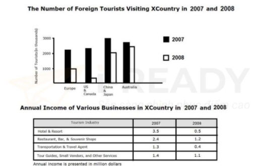
The provided charts combine a bar chart with a data table to show the number of non-domestic travelers who visited XCountry and the revenue earned by different businesses annually between 2007 and 2008.

Overall, the data indicates that the figures for two destinations in 2007 were higher than in 2008. China & Japan and the hotel & resort sectors lost their top spots, which were taken over by Australia and the restaurant, bar & souvenir shops categories, respectively.

Looking at the bar chart, it is evident that China & Japan were the most visited countries, attracting approximately 3 million tourists from various regions. However, their numbers saw a decline the following year, with slightly over 2 million tourists recorded. Therefore, in 2008, Australia became the most popular destination for overseas tourists, with around 2.4 million visitors.

Moreover, the number of foreign travelers to Europe and the US & Canada was nearly equal in 2007, with about 2.1 million tourists each. Surprisingly, their visitor numbers experienced a more significant decrease compared to Europe and other regions after a year, making them the least popular destinations for overseas tourists.

Word Count: 187

Answers On The Same Topic:

The bar chart shows the number of tourists visiting Country X from various parts of the world and the table displays the income of different businesses in the nation in 2007 and 2008.

The provided image presents a bar graph depicting the number of foreign tourists from Europe, US, Canada, China, Japan, and Australia who visited Xcountry in the years 2007 and 2008, along with a table showing the yearly income of various businesses in Xcountry for the same period. The bar chart illustrates the fluctuations in the […]

The bar chart shows the number of tourists visiting Country X from various parts of the world and the table displays the income of different businesses in the nation in 2007 and 2008.

The bar chart showed the quantity of foreign visitors going to a particular country in 2019 and 2020 while the table compared the yearly salary of four businesses in XCountry from 2007 to 2008. Overall, in 2007,there was a slight decline in the quantity of foreign visitors to XCountry between 2007 and 2008, wherein China […]

The bar chart shows the number of tourists visiting Country X from various parts of the world and the table displays the income of different businesses in the nation in 2007 and 2008.

The bar chart shows the total number of travelers visiting Nation X from different parts of the world, and the table delineates the income of different businesses in the nation from 2007 to 2008. Overall, the number of visitors from China and Japan consistently accounted for higher volumes, while the number from Europe was the […]

The bar chart shows the number of tourists visiting Country X from various parts of the world and the table displays the income of different businesses in the nation in 2007 and 2008.

The given bar chart illustrate the number of visitors from Europe,US,Canada,China,Japan and Australia visited x county in 2007 and 2008. While, the table shows the annual revenue of various business in x country in 2007 and 2008. The number of outsiders represented in thousands and the income are in million dollars. Overall, it showed that […]

The bar chart shows the number of tourists visiting Country X from various parts of the world and the table displays the income of different businesses in the nation in 2007 and 2008.

The bar chart shows foreign visitor numbers to country X in 2007 and 2008, while the table details revenue data for various tourism-related businesses during the same period. Overall, there was a noticeable decrease in tourist arrivals to country X between 2007 and 2008. Although there was only a slight decrease in visitors from China […]

See All

Other Topics:

The table below shows the number of students at a primary school and a secondary school in Malaysia in 2005. The chart show survey results of what these students favourite sport was.

The tables illustrates percentage of primary and secondary schools favourite sports based on survey results. The survey was taking a place in Malaysia in 2005 . The first table shows that most popular sport in primary school was tennis which is 40 percents however the secon place in the survey took football with 30 percents […]

The first chart below shows how energy is used in an average British household. The second chart shows the greenhouse gas emissions which result from this energy use. Summarise the information by selecting and reporting the main fea- tures, and make comparisons where relevant.

The first pie chart illustrates the percentage of household energy that is used in Australia in five areas while the other pie chart compares the amount of gas emissions released as a result of energy use. It clearly seems that people consume the most energy for heating and water heating. The least greenhouse gas is […]

Task 1: The pie charts show the proportion of users across different age groups on three apps:Twitter, Facebook and YouTube. Summarise the information by selecting and reporting the main features, and make comparisons where relevant.

The given pie chart provides a detailed comparison of how certain nation different age citizens using social media. Overall, it is evident from the chart that Twitter accounted for the majority share between 18-34 group of people,while thrity-five to fourty-nine group of people prefer using all social media such as Facebook, Youtube, and Twitter. To […]

The chart gives information about the proportion os students choosing different science subjects in a university in 1992 and 2012

The bar chart illustrates the number of students selecting varity types of science subjects in a university in 1992 and 2000. Overall, males were more than females. Additionally, in both years, biology was the most popular, while the computer science was selected by the lowest number of students. To be more spesific, in 1992, females […]

The pie charts show the labour force by gender in three separate sectors in countries A and B.

The pie charts illustrate the proportion of male and female workers in three primary sectors: Industry, Agriculture and Service in two different countries, namely country A and country B. Overall, it is clear that service sectors is a predominant workforce for both genders in two countries. Whereas, Industry reflects a much smaller percentage of workers, […]

The chart below shows the average percentage in typical meals of three types of nutrients, all of which may be unhealthy if eaten too much

The three pie charts illustrate the average proportions of sodium, saturated fat, and added sugar consumed in typical meals in the USA, namely breakfast, lunch, dinner, and snacks. Overall, it is evident that dinner accounts for the highest intake of sodium and saturated fat, whereas snacks contribute the most to added sugar consumption. In contrast, […]

See All
We have detected unusual activity on your device.
Please verify your identity to continue.
Note: This verification step won't sign you in. If you have a premium account, please log in to access the service as usual.
Google/Gmail Verification
Or verify using Email/Code
We've sent a verification code to:
youremail@gmail.com (Not your email?)
Enter it below to complete the verification process.
Ensure your email address is correct, your inbox is not full, and you check your spam folder. If no email arrives, consider using an alternative email.
You will need a Premium plan to perform your action!
Note: If you already have a premium account, please log in to access our services as usual.

Plans & Pricing

Our mission is to make quality education accessible and free for everyone.
However, to keep our hardworking team running and this service alive, we genuinely need your support!
By opting for a premium plan, not only do you sustain us in achieving the mission, but you also unlock advanced features to enrich your learning experience.

Free

For learners who aren't pressed for time

What's included on Free
1000+ IELTS Tests & Samples
Instant IELTS Writing Task 1 & 2 Evaluation (2 times/month)
Instant IELTS Speaking Part 1, 2, & 3 Evaluation (5 times/month)
Instant IELTS Writing Task 1 & 2 Essay Generator (2 times/month)
500+ Dictation & Shadowing Exercises
100+ Pronunciation Exercises
Flashcards
Other Advanced Tools

Premium

For those serious about advancing their English proficiency, and for IELTS candidates aspiring to boost their band score by 1-2 points (especially in writing & speaking) in just 30 days or less

What's included on Premium
Save Your IELTS Test Progress
Unlock All Courses & Content
Unlimited AI Conversations
Unlimited AI Writing Enhancement Exercises
Unlimited IELTS Writing Task 1 & 2 Evaluation
Unlimited IELTS Speaking Part 1, 2, & 3 Evaluation
Checked Answers Will Not Be Published
Unlimited IELTS Writing Task 1 & 2 Essay Generator
Unlimited IELTS Speaking Part 1, 2, & 3 Sample Generator
Unlimited Usage Of Advanced Tools

Due to the nature of our service and the provided free trials, payments are non-refundable.
Nếu bạn là người Việt Nam và không có hoặc không muốn trả bằng credit/debit cards, bạn có thể thanh toán bằng phương thức chuyển khoản:


Chọn gói:
279,000₫ 157,000 ₫ cho gói 1 tháng (chỉ 5,233₫/ngày)
819,000₫ 397,000 ₫ cho gói 3 tháng (chỉ 4,411₫/ngày)
1,649,000₫ 667,000 ₫ cho gói 6 tháng (chỉ 3,706₫/ngày)
3,299,000₫ 857,000 ₫ cho gói 12 tháng (chỉ 2,381₫/ngày)


Sau khi chuyển khoản, vui lòng đợi trình duyệt tự động điều hướng bạn trở lại Engnovate và bạn sẽ ngay lập tức nhận được mã kích hoạt tài khoản premium.
Nếu có lỗi xảy ra, bạn có thể liên hệ với team thông qua một trong các phương thức: email đến helloengnovate@gmail.com hoặc nhắn tin qua facebook.com/engnovate.
Vì toàn bộ công cụ trên website đều có thể sử dụng thử miễn phí, Engnovate không hỗ trợ hoàn tiền.