🔥 Today Only: Save 30% on Premium — Offer Ends Soon! - Upgrade Now!
Multiple Graphs

Band 7+: The bar chart shows the total number of tigers at all the tiger reserves in India, 1972—2002. The line graph shows the number of tigers at five individual tiger reserves in India.

Image for topic: The bar chart shows the total number of tigers at all the tiger reserves in India, 1972—2002. The line graph shows the number of tigers at five individual tiger reserves in India.
Our system will evaluate the answer based on this AI-generated description.
The image displays two graphs; the first graph shows the total population of tigers in 11 tiger reserves in India for the years 1972, 1979, 1984, 1989, 1993, 1995, 1997, and 2002, with the respective populations at 268, 711, 1211, 1336, 1657, 1448, 1576, and 1576. The second graph depicts the number of tigers at five different tiger reserves over several years from 1972 to 2002. For Bandipur, the number of tigers increased from around 10 in 1972 to over 70 in 2002. In Corbett, the count began at about 45 in 1972 and rose to just under 160 in 2002. For Kanha, the initial count was around 25 in 1972, peaking at 100 in 1995 before falling to around 80 in 2002. Similipal's tiger population started at slightly above 0 and fluctuated, peaking around 115 in 1989 and ending close to 90 in 2002. Lastly, Buxa started with 0 tigers in 1972, reached a peak of around 20 in the 1980s, and concluded with 5 in 2002.
Given the complexity of the image, the above description may not be entirely accurate.
Note: Both the topic and the answer were created by one of our users.

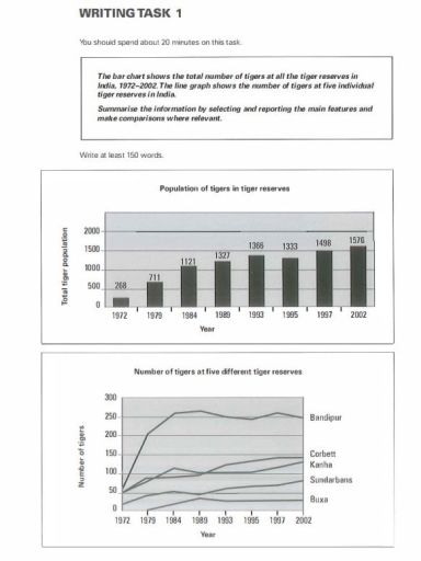
The graphs illustrate the statistics of tiger reserves in India over three decades spanning between 1972 and 2002. We are able to compare the total tiger population as well as the distribution of them amongst five different reserves.

The total population of tigers in these three decades has steadily risen, with the highest recorded in 2002 (1576), compared to the lowest in 1972 (268). Except for the year 1995, when there was a small decrease in population, the overall trend shows a growing number of tigers.

Reflecting the total population, the numbers in individual reserves have also increased over the years, with the highest rate of increase seen between 1972 to 1984, especially in Bandipur. The slowest rate is in Buxa. After 1984, the numbers have almost plateued. Bandipur gained roughly 200 tigers, which was five times more than Buxa, which only gained about 40 animals.

Overall, the graphs illustrate the growing trend in the population of tigers in India, with the highest growth seen in the Bandipur reserve. Although the growth is positive in all 5 reserves that were analysed, the growth rate varies between them.

Word Count: 187

Answers On The Same Topic:

The bar chart shows the total number of tigers at all the tiger reserves in India, 1972—2002. The line graph shows the number of tigers at five individual tiger reserves in India.

The bar graph illustrates changes in the population of tigers in all India’s regions between 1972 and 2002. The line graph demonstrates how many tiger species were exactly at the Bandipur, Corbett, Kanha, Sunderbans, and Buxa reserves during this period. Overall, it can be seen that the total number of tigers inhabiting India rose gradually […]

The bar chart shows the total number of tigers at all the tiger reserves in India, 1972—2002. The line graph shows the number of tigers at five individual tiger reserves in India.

The bar graph illustrates information about the tiger population at tiger reserves in India between 1972 and 2002 while the number of tigers at five different preservations are described in the second chart, a line graph. Overall, it is evident that the tiger population started to see significant upward trends over a 2-decade period while […]

See All

Other Topics:

percentage of the average families food budget spent on restaurant meal, and popularity of fast-food and sit-down restaurant meals

The provided pie chart and line graph illustrate the percentage of food budget allocated to restaurant meals by an average middle-class family and the frequency of meals eaten out over a four-decade period. Overall, it is noticeable that while expenditure on home cooking declined consistently, dining out saw a significant rise. Additionally, fast food emerged […]

The charts below show the percentage of students at an adult education centre taking various courses offered in 1985 and this year. Summarise the information by selecting and reporting the main features, and make comparisons where relevant.

The pie charts compare the proportion of students who chose different courses in 1985 and now. Overall, it is clear that while modern languages were the most popular choice in 1985, they have been overtaken by IT in the present day. Looking at the data from 1985, It was modern languages ranked first at 24% […]

The charts below show the percentage of electricity used by different sectors in Eastern Australia in 2007 and 2010. Summarize the information by selecting and reporting and the main features, and make comparisons where relevant.

The pie chart presents a clear insight of the percentage of electricity which was used in America in 2007 and 2010. Overall, there are eight sectors and three types of differences: proportion that stayed the same – in transport, residential, commercial, agriculture and mining spheres. Also which grew a little or dropped. Moving to the […]

Writing task 1 The graph below shows the viewership of different TV programs among three different age groups. Summarise the information by selecting and reporting the main features, and make comparisons where relevant.

The pie chart provides information about program viewership by age groups ( ages 10-15, 16-20, 21-25) in sport, cartoon, film, drama, and news. Overall, it is clear that news viewership was the most popular among adults although it accounted for the smallest share among children, while the opposite was true for sport. Notably, drama, cartoon, […]

Mixed graphs. Summarize the information by selecting key information and make comparison where relevant.

The provided pie chart illustrates information about the population of six different nationalities – Australian, British, New Zealander, Chinese, Dutch, and other – in Australia, while the table presents data about the proportion of those who live in an urban or suburban place. Overall, it is evident that individuals prefer to live in the city […]

See All
We have detected unusual activity on your device.
Please verify your identity to continue.
Note: This verification step won't sign you in. If you have a premium account, please log in to access the service as usual.
Google/Gmail Verification
Or verify using Email/Code
We've sent a verification code to:
youremail@gmail.com (Not your email?)
Enter it below to complete the verification process.
Ensure your email address is correct, your inbox is not full, and you check your spam folder. If no email arrives, consider using an alternative email.
You will need a Premium plan to perform your action!
Note: If you already have a premium account, please log in to access our services as usual.

Plans & Pricing

Our mission is to make quality education accessible for everyone.
However, to keep our hardworking team running and this service alive, we genuinely need your support!
By opting for a premium plan, not only do you sustain us in achieving the mission, but you also unlock advanced features to enrich your learning experience.

Free

For learners who aren't pressed for time

What's included on Free
100+ Cambridge IELTS Tests
Instant IELTS Writing Task 1 & 2 Evaluation (2 times/month)
Instant IELTS Speaking Part 1, 2, & 3 Evaluation (5 times/month)
Instant IELTS Writing Task 1 & 2 Essay Generator (2 times/month)
500+ Dictation & Shadowing Exercises
100+ Pronunciation Exercises
Flashcards
Other Advanced Tools

Premium

For those serious about advancing their English proficiency, and for IELTS candidates aspiring to boost their band score by 1-2 points (especially in writing & speaking) in just 30 days or less

What's included on Premium
Save Your IELTS Test Progress
Unlock All Courses & IELTS Tests
Unlimited AI Conversations
Unlimited AI Writing Enhancement Exercises
Unlimited IELTS Writing Task 1 & 2 Evaluation
Unlimited IELTS Speaking Part 1, 2, & 3 Evaluation
Checked Answers Will Not Be Published
Unlimited IELTS Writing Task 1 & 2 Essay Generator
Unlimited IELTS Speaking Part 1, 2, & 3 Sample Generator
Unlimited Usage Of Advanced Tools
Priority Support within 24h (12-month plan only)

Due to the nature of our service and the provided free trials, payments are non-refundable.
Nếu bạn là người Việt Nam và không có hoặc không muốn trả bằng credit/debit cards, bạn có thể thanh toán bằng phương thức chuyển khoản:


Chọn gói:
419,000₫ 277,000 ₫ cho gói 1 tháng (chỉ 9,233₫/ngày)
1,239,000₫ 597,000 ₫ cho gói 3 tháng (chỉ 6,633₫/ngày)
2,469,000₫ 1,027,000 ₫ cho gói 6 tháng (chỉ 5,706₫/ngày)
4,929,000₫ 1,417,000 ₫ cho gói 12 tháng (chỉ 3,936₫/ngày)


Sau khi chuyển khoản, vui lòng đợi trình duyệt tự động điều hướng bạn trở lại Engnovate và bạn sẽ ngay lập tức nhận được mã kích hoạt tài khoản premium.
Nếu có lỗi xảy ra, bạn có thể liên hệ với team thông qua một trong các phương thức: email đến helloengnovate@gmail.com hoặc nhắn tin qua facebook.com/engnovate.
Vì toàn bộ công cụ trên website đều có thể sử dụng thử miễn phí, Engnovate không hỗ trợ hoàn tiền.