🔥 Today Only: Save 30% on Premium — Offer Ends Soon! - Upgrade Now!
Bar Chart

Band 6+: The bar graph illustrates the proportion of English and Welsh house owners and tenants from 1918 to 2011.

Image for topic: The bar graph illustrates the proportion of English and Welsh house owners and tenants from 1918 to 2011.
Our system will evaluate the answer based on this AI-generated description.
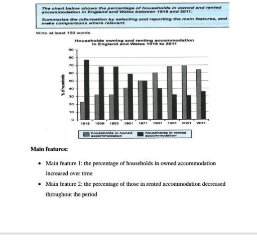
The image shows a bar graph with two types of data - households in owned accommodation and households in rented accommodation in England and Wales from the years 1918 to 2011. Households in owned accommodation in 1918 have a percentage of approximately 23, which increases to approximately 31 in 1939, approximately 32 in 1953, approximately 42 in 1961, approximately 51 in 1971, approximately 57 in 1981, approximately 68 in 1991, approximately 69 in 2001, and approximately 64 in 2011. Households in rented accommodation in 1918 have a percentage of approximately 77, which decreases to approximately 69 in 1939, approximately 68 in 1953, approximately 58 in 1961, approximately 49 in 1971, approximately 43 in 1981, approximately 32 in 1991, approximately 31 in 2001, and approximately 36 in 2011. The bar graph demonstrates two main features: 1) an increase in the percentage of households in owned accommodation and 2) a decrease in the percentage of households in rented accommodation over the period from 1918 to 2011.
Given the complexity of the image, the above description may not be entirely accurate.
Note: Both the topic and the answer were created by one of our users.

The given chart illustrates the compares informations about huseholds in owned and rented accomodation in England and Wales over the period from 1918 to 2011.

Overall, it is clear that the proportion of households living in owned accomodation increased steadily over the period,whereas the percentage of those renting declined significantly.

In households owned accomodation, the highest percentage was recorded in 2001,at around 70%,while the lowest figure was seen in 1918, at approximately 20%.

A distinct pattern can be observed in households in rented accomodation, where percentages rates from just over 70% in 1918 to nearly 30% in 2001.

Between 1918 and 1971, renting remained the dominant form of housing. However, it decreased over time. During the same period, the proportion of households owning their homes declined an equal level with renting . After that, home ownership became more common and continued to increase until it peaked in 2001. Also there was a slight decline in owned accomodation in 2011.

Word Count: 159

Answers On The Same Topic:

The bar graph illustrates the proportion of English and Welsh house owners and tenants from 1918 to 2011.

The given bar chart provides information about the percentages of households in owned and rented accommodation in England and Wales from 1918 to 2011. Overall, it can be seen that households in rented accommodation had the largest proportion, while households in owned accommodation had the smallest proportion during the period. To start with, in 1918, […]

The bar graph illustrates the proportion of English and Welsh house owners and tenants from 1918 to 2011.

the graph below shows the percentage of English and Welsh property owners and renters starting from 1918 to 2011. Overall, the number of house owners kept increasing untill 2011, while the number of tenants oppositely fell. The highest percentage of rented households was in 1918 (about 78%), the nuber remained almost the same during 1939 […]

The bar graph illustrates the proportion of English and Welsh house owners and tenants from 1918 to 2011.

The bar chart illustrates the proportion of households owning and renting accommodation in England and Wales over a period from 1918 to 2011. In 1918, the majority of households were in rented accommodation, with the figure standing at around 77%, while only about 23% of households owned their accommodation. Over the next few decades, the […]

The bar graph illustrates the proportion of English and Welsh house owners and tenants from 1918 to 2011.

The bar chart illustrates the percentage of households that either owned or rented accommodation in England and Wales between 1918 and 2011. Overall, the percentage of households renting accommodation decreased steadily over the period, while home ownership rose. By 1971, both ownership and renting were equal. and by 2001, ownership had overtaken renting significantly, though […]

See All

Other Topics:

The bar chart below compares the nationality of tourists to Dubai in 2010, 2015 and 2020. Summarise the information by selecting and reporting the main features and make comparisons where relevant.

The bar chart illustrates changes in the proportion of nationality of tourists visited from three different countries to Dubai between 2010 and 2020. In general, it is noticeable that different trends were observed in all the given years. While Saudi recorded the highest percentage of visitors at the beginning of the year, the opposite was […]

The world health organization recommends that people shoud eat five or more portions of fruits and vegetables per day. The chart below shows the percetage of males and females in the UK by age group in 2006.

Some health experts recommend that individuals must eat five or more portions of fruit and vegetables daily. The chart demonstrates the proportion of males and females in the UK by age category in 2006. Overall, women consumed more fruit and vegetables than their counterparts across all age groups. Females in 55-64 age bracket stood out […]

the chart below shows the annual consumption of rice per person in three Asian countries between 1995 and 2015

The bar chart illustrates the amount of rice consumption per person in three Asian nations from 1995 to 2015. Overall, it can be seen that most nations saw an increase in the annual rice consumption over the period. Indonesia’s rice consumption experienced a significant increase throughout the years, while the figures for India and China […]

The graph below shows annual water usage (in million of cubic meters) by industries in some countries

The graph below illustrates yearly liquid usage by different facilities in some countries shown in millions cubic metres. Overall, the industry that uses the most water is chemical industry with 670 million cubic metres of water per year, and on the other hand we have fuel that uses only 80 per year. The second place […]

The chart below shows the expenditure on three categories among different age groups of residents in the UK in 2004. Summarize the information by selecting and reporting the main features, and make comparisons where relevant.

The chart shows data about percentages of the expenditure on three different categories among several age groups of citizens in the UK in 2004. Overall, the chart clearly shows that almost all age people allocated their income more for food and drink expect young adults while with ages individuals spent less and less money for […]

See All
We have detected unusual activity on your device.
Please verify your identity to continue.
Note: This verification step won't sign you in. If you have a premium account, please log in to access the service as usual.
Google/Gmail Verification
Or verify using Email/Code
We've sent a verification code to:
youremail@gmail.com (Not your email?)
Enter it below to complete the verification process.
Ensure your email address is correct, your inbox is not full, and you check your spam folder. If no email arrives, consider using an alternative email.
You will need a Premium plan to perform your action!
Note: If you already have a premium account, please log in to access our services as usual.

Plans & Pricing

Our mission is to make quality education accessible for everyone.
However, to keep our hardworking team running and this service alive, we genuinely need your support!
By opting for a premium plan, not only do you sustain us in achieving the mission, but you also unlock advanced features to enrich your learning experience.

Free

For learners who aren't pressed for time

What's included on Free
100+ Cambridge IELTS Tests
Instant IELTS Writing Task 1 & 2 Evaluation (2 times/month)
Instant IELTS Speaking Part 1, 2, & 3 Evaluation (5 times/month)
Instant IELTS Writing Task 1 & 2 Essay Generator (2 times/month)
500+ Dictation & Shadowing Exercises
100+ Pronunciation Exercises
Flashcards
Other Advanced Tools

Premium

For those serious about advancing their English proficiency, and for IELTS candidates aspiring to boost their band score by 1-2 points (especially in writing & speaking) in just 30 days or less

What's included on Premium
Save Your IELTS Test Progress
Unlock All Courses & IELTS Tests
Unlimited AI Conversations
Unlimited AI Writing Enhancement Exercises
Unlimited IELTS Writing Task 1 & 2 Evaluation
Unlimited IELTS Speaking Part 1, 2, & 3 Evaluation
Checked Answers Will Not Be Published
Unlimited IELTS Writing Task 1 & 2 Essay Generator
Unlimited IELTS Speaking Part 1, 2, & 3 Sample Generator
Unlimited Usage Of Advanced Tools
Priority Support within 24h (12-month plan only)

Due to the nature of our service and the provided free trials, payments are non-refundable.
Nếu bạn là người Việt Nam và không có hoặc không muốn trả bằng credit/debit cards, bạn có thể thanh toán bằng phương thức chuyển khoản:


Chọn gói:
419,000₫ 277,000 ₫ cho gói 1 tháng (chỉ 9,233₫/ngày)
1,239,000₫ 597,000 ₫ cho gói 3 tháng (chỉ 6,633₫/ngày)
2,469,000₫ 1,027,000 ₫ cho gói 6 tháng (chỉ 5,706₫/ngày)
4,929,000₫ 1,417,000 ₫ cho gói 12 tháng (chỉ 3,936₫/ngày)


Sau khi chuyển khoản, vui lòng đợi trình duyệt tự động điều hướng bạn trở lại Engnovate và bạn sẽ ngay lập tức nhận được mã kích hoạt tài khoản premium.
Nếu có lỗi xảy ra, bạn có thể liên hệ với team thông qua một trong các phương thức: email đến helloengnovate@gmail.com hoặc nhắn tin qua facebook.com/engnovate.
Vì toàn bộ công cụ trên website đều có thể sử dụng thử miễn phí, Engnovate không hỗ trợ hoàn tiền.