🔥 Today Only: Save 30% on Premium — Offer Ends Soon! - Upgrade Now!
Multiple Graphs

Band 4+: The chart and table below show the results of a survey of library users at a university. Summarise the information by selecting and reporting the main features, and make comparisons where relevant.

Image for topic: The chart and table below show the results of a survey of library users at a university. Summarise the information by selecting and reporting the main features, and make comparisons where relevant.
Our system will evaluate the answer based on this AI-generated description.
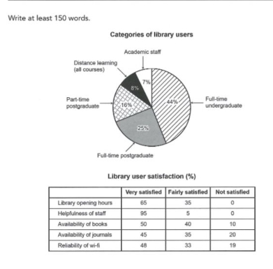
The image contains a pie chart titled 'Categories of library users' and a table titled 'Library user satisfaction (%)'. The pie chart breaks down library users as follows: Full-time undergraduate 44%, Full-time postgraduate 25%, Part-time postgraduate 16%, Distance learning (all courses) 8%, and Academic staff 7%. The table shows satisfaction levels for five categories: For Library opening hours, 65% were Very satisfied, 35% Fairly satisfied, and 0% Not satisfied. For Helpfulness of staff, 95% were Very satisfied, 5% Fairly satisfied, and 0% Not satisfied. For Availability of books, 50% were Very satisfied, 40% Fairly satisfied, and 10% Not satisfied. For Availability of journals, 45% were Very satisfied, 35% Fairly satisfied, and 20% Not satisfied. For Reliability of wi-fi, 48% were Very satisfied, 33% Fairly satisfied, and 19% Not satisfied.
Given the complexity of the image, the above description may not be entirely accurate.
Note: Both the topic and the answer were created by one of our users.

The results of a survey of library users at a university is displayed by the chart and table which is shown below.

Overall, it is clear that major students which consume the knowledge in library are full-time undergraduate followed by the full- time postgraduate students and other categories contribute about 6% more than a quarter. Progressively, Most students which are staisfied by the staff performance in helping the students and the least staisfied by the availability of journals.

To begin with, chart about 6% less than of a half of knowledge consumers use the library and the least users are academic staff which is not interested in the library. A quarter of students which are full- time postgraduates and attend the library hours for study. The 16% part-time postgraduate students accounted for the library use.

The highest satisfaction ratio is the behaviour of staff and staff help the students in all their problems. Amout more than half proportion of studnets are satisfied by the library opening time. Students are disstaisfied by the availability of books.

Word Count: 175

Answers On The Same Topic:

The chart and table below show the results of a survey of library users at a university. Summarise the information by selecting and reporting the main features, and make comparisons where relevant.

The pie chart illustrates the categories of library users, while the table demonstrates the results of a survey regarding library user satisfaction at a university. Overall, it is remarkable that the full-time undergraduate students constituted the largest share in total library users. Regarding user satisfaction, the helpfulness of staff and library opening hours were the […]

The chart and table below show the results of a survey of library users at a university. Summarise the information by selecting and reporting the main features, and make comparisons where relevant.

The pie chart illustrates the distribution of library users at a university, while the accompanying table summarises the results of a survey regarding their levels of satisfaction with five different library services, with figures given in percentages. Overall, full-time undergraduates made up by far the largest proportion of library users, whereas academic staff represented the […]

The chart and table below show the results of a survey of library users at a university. Summarise the information by selecting and reporting the main features, and make comparisons where relevant.

The pie chart illustrates the distribution of library users by category, while the table delineates the satisfaction levels of these users with various library services. Overall, full-time undergraduates constitute the largest proportion of library users, and the helpfulness of staff emerges as the most highly rated service, with a significant majority expressing extreme satisfaction. The […]

The chart and table below show the results of a survey of library users at a university. Summarise the information by selecting and reporting the main features, and make comparisons where relevant.

The pie chart shows the different groups of people who use a university library, and the table gives information about how satisfied they are with the library services. Overall, full-time undergraduate students are the largest group of library users. Also, most people are satisfied with the library, especially with the staff and the opening hours. […]

The chart and table below show the results of a survey of library users at a university. Summarise the information by selecting and reporting the main features, and make comparisons where relevant.

The pie chart and table chart demonstraiting us results of questionnaire of library users at a university. Outline the information by selecting and reporting the main charateristic, and make comparisons. Overall, in the first chart the most visited categories of library is full-time undergraduated and majority of people satisfied of reading room. However many people […]

See All

Other Topics:

The graphs below show the average prices for different types of housing in Canada and the percentage of Canadian households living in them between 2000 and 2020. Summarise the information by selecting and reporting the main features, and make comparisons where relevant.

This essay will explain two graphs that represent the average prices for different types of housing, which are detached house, semi-detached house, townhouse, and apartment/condo in Canada and the proportion of households by housing type between 2000 and 2020. Overall, the average price across all house types is gradually increasing from 2000 to 2020. Although, […]

The percentage of total water used by domestic, agriculture and industrial in six countries in 2003.

The pie charts provide data about three different ways of utilizing water in six regions of the world in 2003. Overall, all countries mostly used water in domestic areas, except for the North America and Europe, with agriculture not being prioritized in any of them. It is not surprising that the most populated continents consumed […]

The pie chart below shows the average household expenditures in a country in 1950 and 2010. Write a report for a university lecturer describing the information below.

The pie charts below illustrate the average household expenditure in a country in 1950 and 2010. Overall, housing was the largest expense in 1950, while food accounted for the highest proportion in 2010. There were significant changes in household spending over the 60-year period. In 1950, housing made up 72.1% of total expenditure, followed by […]

The chart below shows the results of a survey of library users at university. Summarise the information by selecting and reporting the main features, and make comparisons where relevant.

The pie chart illutstrate the categories of library visitors at a university, while the table gives the information about results of library user satisfaction survey for five diffferent facilities (library opening hours, helpfulness of staff, availability of books, availability of journals, reliability of wi-fi). Overall, the overwhelming majority of library visitors were full-time undergraduated students, […]

The pie charts below show the percentage of time working adults spent on different activities in a particular country in 1959 and 2008. Summarize the information and by selecting and reporting the main features and make comparison where relevant.

The pie charts illustrate the amount of time employed adults spent on five different cathegories of activities (working, relaxing at home, sleeping, travelling to work, going out and other interests or playing sports), in 1959 and 2008, in a certain country. Datas are expressed using percentages. Overall, in both years the major percentage of time […]

The pie charts show the main reasons for migration to and from the UK in 2007. Summarize the information by selecting and reporting the main features and make comparisons where relevant.

The pie chat present several reasons for people moved in and left the UK in 2007. Overall, it is clear that the most important purpose for people either immigrates or emigrates moved out of this country was due to definite job. Even though formal study accounted for big proportions for immigration, the same reason for […]

See All
We have detected unusual activity on your device.
Please verify your identity to continue.
Note: This verification step won't sign you in. If you have a premium account, please log in to access the service as usual.
Google/Gmail Verification
Or verify using Email/Code
We've sent a verification code to:
youremail@gmail.com (Not your email?)
Enter it below to complete the verification process.
Ensure your email address is correct, your inbox is not full, and you check your spam folder. If no email arrives, consider using an alternative email.
You will need a Premium plan to perform your action!
Note: If you already have a premium account, please log in to access our services as usual.

Plans & Pricing

Our mission is to make quality education accessible for everyone.
However, to keep our hardworking team running and this service alive, we genuinely need your support!
By opting for a premium plan, not only do you sustain us in achieving the mission, but you also unlock advanced features to enrich your learning experience.

Free

For learners who aren't pressed for time

What's included on Free
100+ Cambridge IELTS Tests
Instant IELTS Writing Task 1 & 2 Evaluation (2 times/month)
Instant IELTS Speaking Part 1, 2, & 3 Evaluation (2 times/month)
Instant IELTS Writing Task 1 & 2 Essay Generator (2 times/month)
500+ Dictation & Shadowing Exercises
100+ Pronunciation Exercises
Flashcards
Other Advanced Tools

Premium

For those serious about advancing their English proficiency, and for IELTS candidates aspiring to boost their band score by 1-2 points (especially in writing & speaking) in just 30 days or less

What's included on Premium
Save Your IELTS Test Progress & Analyze Mistakes By Question Type
Save Your Own Flashcard Sets & Use Them On Any Device
Unlock All Courses, IELTS Tests, Section & Part Practice
Unlimited AI Conversations
Unlimited AI Writing Enhancement Exercises
Unlimited IELTS Writing Task 1 & 2 Evaluation
Unlimited IELTS Speaking Part 1, 2, & 3 Evaluation
Checked Answers Will Not Be Published
Unlimited IELTS Writing Task 1 & 2 Essay Generator
Unlimited IELTS Speaking Part 1, 2, & 3 Sample Generator
Unlimited Usage Of Advanced Tools & AI Features
Priority Support within 24h (12-month plan only)

Due to the nature of our service and the provided free trials, payments are non-refundable.