Our system will evaluate the answer based on this AI-generated description.
The image shows population growth (in thousands) from 1992 to 2016 for Melbourne, Sydney, and Brisbane. In 1992: Melbourne 20, Sydney 40, Brisbane slightly above 20. In 1993: Melbourne around 20, Sydney 40, Brisbane slightly below 20. In 1994: Melbourne below 40, Sydney around 25, Brisbane between 20-40. In 1995: Melbourne around 40, Sydney below 20, Brisbane below 40. In 1996: Melbourne around 40, Sydney below 40, Brisbane around 40. In 1997: Melbourne slightly above 40, Sydney around 25, Brisbane around 40. In 1998: Melbourne around 40, Sydney around 40, Brisbane below 40. In 1999: Melbourne above 40, Sydney around 40, Brisbane around 40. In 2000: Melbourne above 40, Sydney slightly above 40, Brisbane below 40. In 2001: Melbourne around 60, Sydney around 60, Brisbane below 40. In 2002: Melbourne 80, Sydney around 80, Brisbane slightly above 40. In 2003: Melbourne around 80, Sydney below 40, Brisbane around 60. In 2004-2005: Melbourne around 80, Sydney below 40, Brisbane below 40. In 2006: Melbourne around 100, Sydney above 60, Brisbane above 40. In 2007: Melbourne around 120, Sydney above 80, Brisbane around 40. In 2008: Melbourne around 120, Sydney above 40, Brisbane around 60. In 2009: Melbourne below 100, Sydney above 60, Brisbane around 60. In 2010: Melbourne below 100, Sydney below 60, Brisbane around 40. In 2011: Melbourne slightly above 100, Sydney below 80, Brisbane below 60. In 2012: Melbourne slightly below 120, Sydney slightly above 80, Brisbane below 60. In 2013: Melbourne around 120, Sydney around 100, Brisbane around 60. In 2014: Melbourne 100 to 80, Sydney below 80, Brisbane above 60. In 2015: Melbourne above 100, Sydney slight drop then up from slightly below 80 to around 100
Given the complexity of the image, the above description may not be entirely accurate.
Skyrocket your IELTS band score by 1-2 points in under a month with our premium plan!
Note: Both the topic and the answer were created by one of our users.
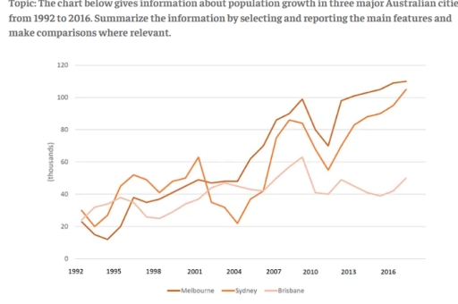
The line graph illustrates the number of population growth in three distinct Australian cities over a period spanning from 1992 to 2016. Overall, the data reveals a significant upward trend in population growth of both Melbourne and Sydney, whereas population growth of Brisbane exhibit a small growth compared to the other cities during the same period.
In 1992, Sydney growth population accounted for approximately 30 thousands, and despite some fluctuations, it significantly increased to around 105 thousands. Similarly, Melbourne growth population started at just above 20 thousands, but this city experienced a major increase, resulting in the most populated city out of the three with approximately 110 thousand people.
On the other hand, the population growth for Brisbane displays a different trend compared to the others. Although it started roughly with the same population as Melbourne, Brisbane shows a lot of fluctuations in the population growth and displayed a gradual increase up to 50 thousand people in population growth. This data underscores the outstanding population growth that Melbourne and Sydney experienced in contrast to Brisbane.
Word Count: 175