Our system will evaluate the answer based on this AI-generated description.
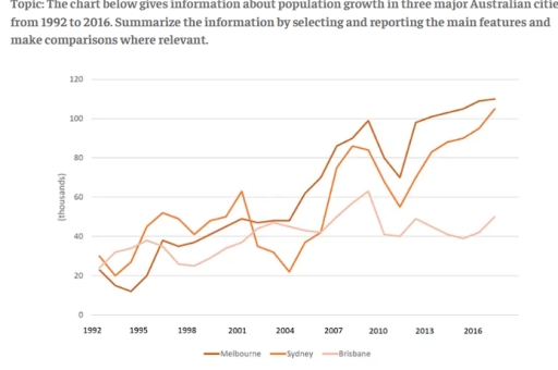
The image shows population growth (in thousands) from 1992 to 2016 for Melbourne, Sydney, and Brisbane. In 1992: Melbourne 20, Sydney 40, Brisbane slightly above 20. In 1993: Melbourne around 20, Sydney 40, Brisbane slightly below 20. In 1994: Melbourne below 40, Sydney around 25, Brisbane between 20-40. In 1995: Melbourne around 40, Sydney below 20, Brisbane below 40. In 1996: Melbourne around 40, Sydney below 40, Brisbane around 40. In 1997: Melbourne slightly above 40, Sydney around 25, Brisbane around 40. In 1998: Melbourne around 40, Sydney around 40, Brisbane below 40. In 1999: Melbourne above 40, Sydney around 40, Brisbane around 40. In 2000: Melbourne above 40, Sydney slightly above 40, Brisbane below 40. In 2001: Melbourne around 60, Sydney around 60, Brisbane below 40. In 2002: Melbourne 80, Sydney around 80, Brisbane slightly above 40. In 2003: Melbourne around 80, Sydney below 40, Brisbane around 60. In 2004-2005: Melbourne around 80, Sydney below 40, Brisbane below 40. In 2006: Melbourne around 100, Sydney above 60, Brisbane above 40. In 2007: Melbourne around 120, Sydney above 80, Brisbane around 40. In 2008: Melbourne around 120, Sydney above 40, Brisbane around 60. In 2009: Melbourne below 100, Sydney above 60, Brisbane around 60. In 2010: Melbourne below 100, Sydney below 60, Brisbane around 40. In 2011: Melbourne slightly above 100, Sydney below 80, Brisbane below 60. In 2012: Melbourne slightly below 120, Sydney slightly above 80, Brisbane below 60. In 2013: Melbourne around 120, Sydney around 100, Brisbane around 60. In 2014: Melbourne 100 to 80, Sydney below 80, Brisbane above 60. In 2015: Melbourne above 100, Sydney slight drop then up from slightly below 80 to around 100
Given the complexity of the image, the above description may not be entirely accurate.
Skyrocket your IELTS band score by 1-2 points in under a month with our premium plan!
Note: Both the topic and the answer were created by one of our users.
The line graph illustrates the demographic growth in three big Australian cities between 1992 to 2016.
Overall, it is easy to notice that all three city’s population fluctuated over the period. In addition, Melbourne’s population reached the highest population by the end of period, while Brisbane’s population fluctuated until the end of the phase.
In 1992, the amount of demographic situation of Melbourne and Brisbane were similar, just above 20,000. Between 1995 and 1998, population situation of two countries faced in nearly 37,000 individuals. In 2003, they had the second meet in about 45,000 people. By 2012, both cities population grew: Melbourne demographic situation dipped to just below 100,000 nation, after plunge in 2011. At that time, Brisbane’s population is also increased but slightly to 48,000. The following years Melbourne’s population see gradually rise, reaching peak to 110,000 in 2016, whereas Brisbane reached only around 50,000, remained the lowest demographic situation.
Sydney’s population was the highest one in the beginning of the period, at 30,000. In 2001, after fluctuation population rose to 61,000. Following that, until 2016, there were two dip, reaching the second position in graph, at 105,000 people.
Word Count: 190
