24 Hours Only: Get 39% OFF on Our Premium Plan - Check Out Now!
Line Graph

Band 8+: The chart below gives information about population growth in three major Australian citie from 1992 to 2016. Summarize the information by selecting and reporting the main features and make comparisons where relevant.

Image for topic: The chart below gives information about population growth in three major Australian citie from 1992 to 2016. Summarize the information by selecting and reporting the main features and make comparisons where relevant.
Our system will evaluate the answer based on this AI-generated description.
The image shows population growth (in thousands) from 1992 to 2016 for Melbourne, Sydney, and Brisbane. In 1992: Melbourne 20, Sydney 40, Brisbane slightly above 20. In 1993: Melbourne around 20, Sydney 40, Brisbane slightly below 20. In 1994: Melbourne below 40, Sydney around 25, Brisbane between 20-40. In 1995: Melbourne around 40, Sydney below 20, Brisbane below 40. In 1996: Melbourne around 40, Sydney below 40, Brisbane around 40. In 1997: Melbourne slightly above 40, Sydney around 25, Brisbane around 40. In 1998: Melbourne around 40, Sydney around 40, Brisbane below 40. In 1999: Melbourne above 40, Sydney around 40, Brisbane around 40. In 2000: Melbourne above 40, Sydney slightly above 40, Brisbane below 40. In 2001: Melbourne around 60, Sydney around 60, Brisbane below 40. In 2002: Melbourne 80, Sydney around 80, Brisbane slightly above 40. In 2003: Melbourne around 80, Sydney below 40, Brisbane around 60. In 2004-2005: Melbourne around 80, Sydney below 40, Brisbane below 40. In 2006: Melbourne around 100, Sydney above 60, Brisbane above 40. In 2007: Melbourne around 120, Sydney above 80, Brisbane around 40. In 2008: Melbourne around 120, Sydney above 40, Brisbane around 60. In 2009: Melbourne below 100, Sydney above 60, Brisbane around 60. In 2010: Melbourne below 100, Sydney below 60, Brisbane around 40. In 2011: Melbourne slightly above 100, Sydney below 80, Brisbane below 60. In 2012: Melbourne slightly below 120, Sydney slightly above 80, Brisbane below 60. In 2013: Melbourne around 120, Sydney around 100, Brisbane around 60. In 2014: Melbourne 100 to 80, Sydney below 80, Brisbane above 60. In 2015: Melbourne above 100, Sydney slight drop then up from slightly below 80 to around 100
Given the complexity of the image, the above description may not be entirely accurate.
Note: Both the topic and the answer were created by one of our users.

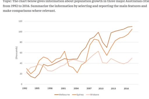
The line graph illustrates changes in population growth across Melbourne, Sydney and Brisbane over a 24-year period, from 1992 to 2016.

Overall, Melbourne experienced the most substantial and uninterrupted rise, eventually becoming the fastest-growing city. Sydney’s trend was far more volatile, while Brisbane showed only modest and steady increases throughout.

At the beginning of the period, population growth in Melbourne stood at roughly 20,000, lower than both Sydney and Brisbane, which each recorded around 30,000. However, by 1998, Melbourne overtook Brisbane and matched Sydney at approximately 50,000, despite a brief surge in Sydney’s figures to above 60,000.

From 2001 onwards, Melbourne’s growth accelerated markedly, rising from 40,000 to just under 90,000 by 2010, before reaching a peak of over 110,000 in 2016. In contrast, Sydney fluctuated significantly: it dropped to around 40,000 in the early 2000s, rebounded to nearly 70,000 in 2010, and then climbed more gradually to above 80,000 by the final year.

Brisbane, by comparison, remained the slowest-growing city. Its figures hovered between 30,000 and 40,000 for most of the period, with a slight rise towards 50,000 by 2016.

Word Count: 181

Answers On The Same Topic:

The chart below gives information about population growth in three major Australian citie from 1992 to 2016. Summarize the information by selecting and reporting the main features and make comparisons where relevant.

The line graph illustrates the number of population growth in three distinct Australian cities over a period spanning from 1992 to 2016. Overall, the data reveals a significant upward trend in population growth of both Melbourne and Sydney, whereas population growth of Brisbane exhibit a small growth compared to the other cities during the same […]

The chart below gives information about population growth in three major Australian citie from 1992 to 2016. Summarize the information by selecting and reporting the main features and make comparisons where relevant.

The line chart compares the number of population growth in three different major Australian cities between 1992 and 2016. It is clear that the highest number of population growth was in the city of Melbourne in Australia in the year of 2016. By contrast, the number of population growth in Brisbane was the lowest in […]

The chart below gives information about population growth in three major Australian citie from 1992 to 2016. Summarize the information by selecting and reporting the main features and make comparisons where relevant.

The line graph compares population growth in Melbourne, Sydney and Brisbane between 1992 and 2016. Overall, all three cities experienced upward trends, but Melbourne saw the most dramatic and consistent growth, while Brisbane grew more slowly. Sydney fluctuated noticeably throughout the period. In 1992, Melbourne’s population increase was around 20,000, slightly lower than Sydney and […]

The chart below gives information about population growth in three major Australian citie from 1992 to 2016. Summarize the information by selecting and reporting the main features and make comparisons where relevant.

The line graph illustrates the demographic growth in three big Australian cities between 1992 to 2016. Overall, it is easy to notice that all three city’s population fluctuated over the period. In addition, Melbourne’s population reached the highest population by the end of period, while Brisbane’s population fluctuated until the end of the phase. In […]

See All

Other Topics:

The graph below shows the percentage of households using the internet in three different countries from 2010 to 2020.

The line graph illustrates the percentage of people using the Internet in Germany, the UK, and France between 2010 and 2020. Overall, it is clear that internet usage increased in all three countries, with France experiencing the most significant growth, while Germany remained the highest throughout most of the period. In detail, France started at […]

The graph below shows the changing patterns of access to modern technology in homes in the UK. Summarize by selecting and reporting the main features and make comparisons where relevant

The line graph illustrates information about the changes in patterns of access to modern technology, namely CD player, moblie phone, DVD player, and internet connection, in homes in the UK, over the period from 1994 to 2008. Overall, it is immediately apparent that mobile phone, DVD player, and internet connection experienced the most significant growth […]

The graph below shows the use of railway tracks by four countries between 1980 and 2010.

The line graph illustrates the use of railway tracks by four countries from 1980 to 2010. Overall, it can be seen that China and India exhibited an upward trend, with Russia and the USA witnessing a drop over the years. In general, China and India were at the lower end of the spectrum, whereas Russia […]

The line graph provides information about the number of young people aged under 23, who went to the cinema in Russia to watch four types of movies.

The line graph illustrates information about the changes in number of young people aged under 23, who went to the cinema in Russia to watch four types of movies, namely adventure, romance, horror, and sci-fi, over the period from 2015 to 2012. Overall,, it is immediately apparent that adventure and history experienced the most significant […]

The line graph below shows monthly revenue in 2008 in four shops of a jewelry company

The line graph illustrates the monthly earnings of four different retail outlets (Shop 1 to 4) over the course of 2008. Overall, it is clear that while Shops 1, 2, and 3 experienced a general increase in revenue by the end of the year, Shop 4 followed a much more volatile and downward trajectory. Shop […]

The line graph below shows the percentage of tourists to Scotland who visited four different attractions inEdinburgh. Summarize the information by selecting and reporting the main features, and make comparisons where relevant

The line graph illustrates the proportion of travellers to Scotland who made trips to various attractions in Edinburgh between 1980 and 2010. Overall, the percentage of people who visited the castle and the zoo increased, while the opposed was true for the figure for individuals travelling to the aquarium and the festival. Additionally, visiting the […]

See All
We have detected unusual activity on your device.
Please verify your identity to continue.
Note: This verification step won't sign you in. If you have a premium account, please log in to access the service as usual.
Google/Gmail Verification
Or verify using Email/Code
We've sent a verification code to:
youremail@gmail.com (Not your email?)
Enter it below to complete the verification process.
Ensure your email address is correct, your inbox is not full, and you check your spam folder. If no email arrives, consider using an alternative email.
You will need a Premium plan to perform your action!
Note: If you already have a premium account, please log in to access our services as usual.

Plans & Pricing

Our mission is to make quality education accessible and free for everyone.
However, to keep our hardworking team running and this service alive, we genuinely need your support!
By opting for a premium plan, not only do you sustain us in achieving the mission, but you also unlock advanced features to enrich your learning experience.

Free

For learners who aren't pressed for time

What's included on Free
1000+ IELTS Tests & Samples
Instant IELTS Writing Task 1 & 2 Evaluation (2 times/month)
Instant IELTS Speaking Part 1, 2, & 3 Evaluation (5 times/month)
Instant IELTS Writing Task 1 & 2 Essay Generator (2 times/month)
500+ Dictation & Shadowing Exercises
100+ Pronunciation Exercises
Flashcards
Other Advanced Tools

Premium

For those serious about advancing their English proficiency, and for IELTS candidates aspiring to boost their band score by 1-2 points (especially in writing & speaking) in just 30 days or less

What's included on Premium
Save Your IELTS Test Progress
Unlock All Courses & Content
Unlimited AI Conversations
Unlimited AI Writing Enhancement Exercises
Unlimited IELTS Writing Task 1 & 2 Evaluation
Unlimited IELTS Speaking Part 1, 2, & 3 Evaluation
Checked Answers Will Not Be Published
Unlimited IELTS Writing Task 1 & 2 Essay Generator
Unlimited IELTS Speaking Part 1, 2, & 3 Sample Generator
Unlimited Usage Of Advanced Tools

Due to the nature of our service and the provided free trials, payments are non-refundable.
Nếu bạn là người Việt Nam và không có hoặc không muốn trả bằng credit/debit cards, bạn có thể thanh toán bằng phương thức chuyển khoản:


Chọn gói:
279,000₫ 157,000 ₫ cho gói 1 tháng (chỉ 5,233₫/ngày)
819,000₫ 397,000 ₫ cho gói 3 tháng (chỉ 4,411₫/ngày)
1,649,000₫ 667,000 ₫ cho gói 6 tháng (chỉ 3,706₫/ngày)
3,299,000₫ 857,000 ₫ cho gói 12 tháng (chỉ 2,381₫/ngày)


Sau khi chuyển khoản, vui lòng đợi trình duyệt tự động điều hướng bạn trở lại Engnovate và bạn sẽ ngay lập tức nhận được mã kích hoạt tài khoản premium.
Nếu có lỗi xảy ra, bạn có thể liên hệ với team thông qua một trong các phương thức: email đến helloengnovate@gmail.com hoặc nhắn tin qua facebook.com/engnovate.
Vì toàn bộ công cụ trên website đều có thể sử dụng thử miễn phí, Engnovate không hỗ trợ hoàn tiền.