24 Hours Only: Get 39% OFF on Our Premium Plan - Check Out Now!
Bar Chart

Band 7+: The chart below gives information on UK acid rain emissions, measured in millions of tonnes, from four different sectors between 1990 and 2007. Write a report for a university lecturer describing the information shown below. Make comparisons where relevant.

Image for topic: The chart below gives information on UK acid rain emissions, measured in millions of tonnes, from four different sectors between 1990 and 2007. Write a report for a university lecturer describing the information shown below. Make comparisons where relevant.
Our system will evaluate the answer based on this AI-generated description.
The image shows a line graph of UK acid rain emissions in million tonnes from four different sectors between 1990 to 2007. The graph displays four lines: Transport and communication, Other industries, Electricity, Gas and Water Supply, and Domestic. Transport and communication started at approximately 0.7 million tonnes in 1990, peaked at around 0.75 million tonnes in 1992, and declined to almost 0.5 million tonnes by 2007. Other industries began at 1 million tonnes in 1990, saw an increase to 1.1 million tonnes in 1991, and gradually decreased to just above 0.5 million tonnes by 2007. Electricity, Gas, and Water Supply had the highest value, starting at 3.1 million tonnes, experiencing a steep decline to 2.3 million tonnes in 1993, gradually decreasing to 1.6 million tonnes in 2007. The domestic sector started at 0.7 million tonnes and experienced a slight fluctuation within the 0.6-0.9 million tonnes range before ending at about 0.65 million tonnes in 2007.
Given the complexity of the image, the above description may not be entirely accurate.
Note: Both the topic and the answer were created by one of our users.

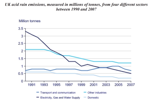
The line graph illustrates how much acid rain emissions were caused by four different factors in the UK from 1990 to 2007.

Overall, there was a decrease in the amount of acid rain emissions from all sectors examined, with the most significant decline being seen in the figures for electricity, gas, and water supply. In addition, domestic consistently had the lowest figures throughout the period.

The amount of acid rain emitted from transport and communication started at about 0.95 million tonnes, after which it experienced some fluctuations, before ending the period at 0.75 million tonnes. Similar changes, but to a greater extent, can be seen in the figures for domestic, which declined from just over 0.5 million tonnes at the beginning of the period to 0.25 million tonnes in 2007.

Approximately 3.45 million tonnes of acid rain released from electricity, gas, and water supply were recorded in the first year, with a subsequent drop to exactly 0.5 million tonnes in 2007. Similarly, the figures for other industries decreased from north of 2 million tonnes to around 1.35 million tonnes over the shown period.

Word Count: 183

Answers On The Same Topic:

The chart below gives information on UK acid rain emissions, measured in millions of tonnes, from four different sectors between 1990 and 2007. Write a report for a university lecturer describing the information shown below. Make comparisons where relevant.

The image above shows a graph,which gives us informations on the UK acid rain emissions,measured in millions of tonnes,from four diferent sectors between 1991 and 2007:transport and communication;electricity,gas and water supply;domestic and other industries. Except the “transport and communication” line,other lines seem to be decrease from time to time.The “electricity,gas and water supply” is the […]

The chart below gives information on UK acid rain emissions, measured in millions of tonnes, from four different sectors between 1990 and 2007. Write a report for a university lecturer describing the information shown below. Make comparisons where relevant.

The diagram illustrates United Kingdom acid rain emissions, gauged in millions of tones, from four distinct industries across 1990 and 2007. Overall, the graph clarify four indusries from UK between 1990 and 2007 that have a harmful impact on the environment through acid emissions. Through the given graph, we can see that electricity, gas and […]

The chart below gives information on UK acid rain emissions, measured in millions of tonnes, from four different sectors between 1990 and 2007. Write a report for a university lecturer describing the information shown below. Make comparisons where relevant.

The line chart illustrates the emitted amount of acid rain from four various areas in the period of 17 years, from 1990 to 2007, in UK. It can be seen from the chart that amount of acid rain from most of the areas have declined significantly by the time of 2007. Whereas the value even […]

The chart below gives information on UK acid rain emissions, measured in millions of tonnes, from four different sectors between 1990 and 2007. Write a report for a university lecturer describing the information shown below. Make comparisons where relevant.

The Line chart compares the amount of acid rain emitted from 4 different sectors in the UK from 1990 and 2007. It is clear that acid rain emissions in the UK decreased between 1990 and 2007. mean while electricity gas and water supply saw the biggest fall in emissions over the 17- year period. In […]

The chart below gives information on UK acid rain emissions, measured in millions of tonnes, from four different sectors between 1990 and 2007. Write a report for a university lecturer describing the information shown below. Make comparisons where relevant.

The line chat compares the amount of acid rain emmited in the UK from four different sectors from 1990 to 2007. Overall,the highest amount of acid rain emmited from Electricity, Gas and Water Supply,while the amount of acid rain emmited from Domestic was lowest in the UK in the given year In terms of emmiting […]

See All

Other Topics:

The chart shows the production by weight of four types of fruit in one Australian state in 1995, 2005 and 2015.

The bar graph provides the information of the production of fruits (Oranges, Apples, Pears, Peaches) in the one state of the Australia in 1995, 2005, and 2005 Overall, The noticeable feature is that the production of Pears were dominated. Furthermore, Apples were significantly higher as compared to Peaches all over the periods. In 1995, The […]

The chart below shows the percentage of people of different age groups attending three types of concerts.

The bar chart delineates the proportions of attendance at three types of music events of different age groups. Overall, classical concerts were the least popular type of event among all age groups, except for the age group over 55, who even watched the popular concert was lower. The three youngest age groups between 15 and […]

The bar chart illustrates the percentage of how parents in a country spent time taking care their children in the evening in 2022. Summarise the information by selecting and reporting the main features and make comparisons where relevant.

The bar chart illustrates the percentage of now parents in a country use time taking protect their children in the evening in 2022. Overall, what stands out from the graph is that there were considerable upward trends in the taking care of both mothers and both parents together, while the taking care of fathers saw […]

Leisure time in a typical week in hours- by sex and employment status, 1998-1999

The bar chart illustrates the average amount of leisure time enjoyed by men and women in various employment categories during a typical week in the period 1998-99. Overall, a clear inverse relationship exists between formal employment hours and leisure time. It is also evident that men consistently accessed more hours of recreation than their female […]

The graph shows the number of fatal injuries (resulting in death) of workers in New Zealand between 1992 and 2010.

The bar chart illustrates the annual number of workplace fatalities in New Zealand from 1992 to 2010. Overall, the graph shows a gradual downward trend in the number of fatal injuries over the given time line. Although there were periods of fluctuation, the figures at the end were significantly lower than those at the beginning. […]

See All
We have detected unusual activity on your device.
Please verify your identity to continue.
Note: This verification step won't sign you in. If you have a premium account, please log in to access the service as usual.
Google/Gmail Verification
Or verify using Email/Code
We've sent a verification code to:
youremail@gmail.com (Not your email?)
Enter it below to complete the verification process.
Ensure your email address is correct, your inbox is not full, and you check your spam folder. If no email arrives, consider using an alternative email.
You will need a Premium plan to perform your action!
Note: If you already have a premium account, please log in to access our services as usual.

Plans & Pricing

Our mission is to make quality education accessible and free for everyone.
However, to keep our hardworking team running and this service alive, we genuinely need your support!
By opting for a premium plan, not only do you sustain us in achieving the mission, but you also unlock advanced features to enrich your learning experience.

Free

For learners who aren't pressed for time

What's included on Free
1000+ IELTS Tests & Samples
Instant IELTS Writing Task 1 & 2 Evaluation (2 times/month)
Instant IELTS Speaking Part 1, 2, & 3 Evaluation (5 times/month)
Instant IELTS Writing Task 1 & 2 Essay Generator (2 times/month)
500+ Dictation & Shadowing Exercises
100+ Pronunciation Exercises
Flashcards
Other Advanced Tools

Premium

For those serious about advancing their English proficiency, and for IELTS candidates aspiring to boost their band score by 1-2 points (especially in writing & speaking) in just 30 days or less

What's included on Premium
Save Your IELTS Test Progress
Unlock All Courses & Content
Unlimited AI Conversations
Unlimited AI Writing Enhancement Exercises
Unlimited IELTS Writing Task 1 & 2 Evaluation
Unlimited IELTS Speaking Part 1, 2, & 3 Evaluation
Checked Answers Will Not Be Published
Unlimited IELTS Writing Task 1 & 2 Essay Generator
Unlimited IELTS Speaking Part 1, 2, & 3 Sample Generator
Unlimited Usage Of Advanced Tools

Due to the nature of our service and the provided free trials, payments are non-refundable.
Nếu bạn là người Việt Nam và không có hoặc không muốn trả bằng credit/debit cards, bạn có thể thanh toán bằng phương thức chuyển khoản:


Chọn gói:
279,000₫ 157,000 ₫ cho gói 1 tháng (chỉ 5,233₫/ngày)
819,000₫ 397,000 ₫ cho gói 3 tháng (chỉ 4,411₫/ngày)
1,649,000₫ 667,000 ₫ cho gói 6 tháng (chỉ 3,706₫/ngày)
3,299,000₫ 857,000 ₫ cho gói 12 tháng (chỉ 2,381₫/ngày)


Sau khi chuyển khoản, vui lòng đợi trình duyệt tự động điều hướng bạn trở lại Engnovate và bạn sẽ ngay lập tức nhận được mã kích hoạt tài khoản premium.
Nếu có lỗi xảy ra, bạn có thể liên hệ với team thông qua một trong các phương thức: email đến helloengnovate@gmail.com hoặc nhắn tin qua facebook.com/engnovate.
Vì toàn bộ công cụ trên website đều có thể sử dụng thử miễn phí, Engnovate không hỗ trợ hoàn tiền.