🔥 Today Only: Save 30% on Premium — Offer Ends Soon! - Upgrade Now!
Bar Chart

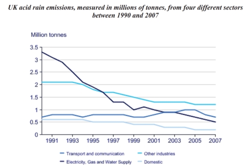
Band 4+: The chart below gives information on UK acid rain emissions, measured in millions of tonnes, from four different sectors between 1990 and 2007. Write a report for a university lecturer describing the information shown below. Make comparisons where relevant.

Image for topic: The chart below gives information on UK acid rain emissions, measured in millions of tonnes, from four different sectors between 1990 and 2007. Write a report for a university lecturer describing the information shown below. Make comparisons where relevant.
Our system will evaluate the answer based on this AI-generated description.
The image shows a line graph of UK acid rain emissions in million tonnes from four different sectors between 1990 to 2007. The graph displays four lines: Transport and communication, Other industries, Electricity, Gas and Water Supply, and Domestic. Transport and communication started at approximately 0.7 million tonnes in 1990, peaked at around 0.75 million tonnes in 1992, and declined to almost 0.5 million tonnes by 2007. Other industries began at 1 million tonnes in 1990, saw an increase to 1.1 million tonnes in 1991, and gradually decreased to just above 0.5 million tonnes by 2007. Electricity, Gas, and Water Supply had the highest value, starting at 3.1 million tonnes, experiencing a steep decline to 2.3 million tonnes in 1993, gradually decreasing to 1.6 million tonnes in 2007. The domestic sector started at 0.7 million tonnes and experienced a slight fluctuation within the 0.6-0.9 million tonnes range before ending at about 0.65 million tonnes in 2007.
Given the complexity of the image, the above description may not be entirely accurate.
Note: Both the topic and the answer were created by one of our users.

The image above shows a graph,which gives us informations on the UK acid rain emissions,measured in millions of tonnes,from four diferent sectors between 1991 and 2007:transport and communication;electricity,gas and water supply;domestic and other industries.

Except the “transport and communication” line,other lines seem to be decrease from time to time.The “electricity,gas and water supply” is the steapest but the “domestic” is the lowest of them all.

No other sectors had been effect by the acid rain as much as the transport and communication.In 1991, electricity,gas and water supply is the highest,along with other industries,transport and communication and domestic.At this rate,the government need to be concern more about the electricity,gas and water supply, because it’s going to be a big problem for the citizens.But in 2007,things had been slightly change when other industries is in the first place ,transport and communication becomes second, electricity,gas and water supply third,while domestic still remain its place.

Word Count: 151

Answers On The Same Topic:

The chart below gives information on UK acid rain emissions, measured in millions of tonnes, from four different sectors between 1990 and 2007. Write a report for a university lecturer describing the information shown below. Make comparisons where relevant.

The diagram illustrates United Kingdom acid rain emissions, gauged in millions of tones, from four distinct industries across 1990 and 2007. Overall, the graph clarify four indusries from UK between 1990 and 2007 that have a harmful impact on the environment through acid emissions. Through the given graph, we can see that electricity, gas and […]

The chart below gives information on UK acid rain emissions, measured in millions of tonnes, from four different sectors between 1990 and 2007. Write a report for a university lecturer describing the information shown below. Make comparisons where relevant.

The line chart illustrates the emitted amount of acid rain from four various areas in the period of 17 years, from 1990 to 2007, in UK. It can be seen from the chart that amount of acid rain from most of the areas have declined significantly by the time of 2007. Whereas the value even […]

The chart below gives information on UK acid rain emissions, measured in millions of tonnes, from four different sectors between 1990 and 2007. Write a report for a university lecturer describing the information shown below. Make comparisons where relevant.

The Line chart compares the amount of acid rain emitted from 4 different sectors in the UK from 1990 and 2007. It is clear that acid rain emissions in the UK decreased between 1990 and 2007. mean while electricity gas and water supply saw the biggest fall in emissions over the 17- year period. In […]

The chart below gives information on UK acid rain emissions, measured in millions of tonnes, from four different sectors between 1990 and 2007. Write a report for a university lecturer describing the information shown below. Make comparisons where relevant.

The line chat compares the amount of acid rain emmited in the UK from four different sectors from 1990 to 2007. Overall,the highest amount of acid rain emmited from Electricity, Gas and Water Supply,while the amount of acid rain emmited from Domestic was lowest in the UK in the given year In terms of emmiting […]

See All

Other Topics:

COFEE AND TEA BUYING AND DRINKING HABITS IN FIVE CITIES IN AUSTRALIA

The bar chart provides information about the proportion of citizens who drink tea and coffee in different ways across five Australian cities over the past 4 weeks. Looking from an overall perspective, it is readily apparent that, while in almost every city bringing coffee or tea from a café showed the highest figures, only in […]

COFEE AND TEA BUYING AND DRINKING HABITS IN FIVE CITIES IN AUSTRALIA

The bar chart provides information about proportion of citizens who drink tea and coffee in different ways across five Australian cities over the past 4 weeks. Looking from an overall perspective, it is readily apparent that, while almost in every city bringing coffee or tea from café showed the highest figures, only in Adelaide instant […]

The chart below shows the numbers of three types of visitors to a museum between 1997 and 2012. Summarise the information by selecting and reporting the main features, and make comparisons where relevant.

The bar chart compares the numbers of three kinds of visitors to a museum from 1997 to 2012. Overall, special exhibition visitors and adult visitors generally followed an upward trajectory, while the opposite pattern was recorded in the number of visitors aged under 15. It is also worth noting that adult visitors held a substantial […]

the graph below shows the amount of energy generated wind in four countries in the period 1980-2000

The bar chart demonstrates the amount of wind-generated energy in four countries (India, Denmark, Germany and United States) from 1980 to 2000. Overall, most of the countries expressed positive trend with Denmark becoming the leader and United States, India and Germany ranked second, third and fourth respectively. Starting off with Denmark, the number was at […]

the graph below shows the amount of energy generated wind in four countries in the period 1980-2000

The bar chart compares how much wind power was produced in four distinct countries, starting from 1980 to 2000. Overall, in all countries the wind generation was risen, especially in Denmark. While wind power in the US saw a least increase, it was still on top among other countries almost in all the given time […]

The chart below shows the amount of energy generated from wind in four countries from 1985 to 2000. Summarize the information by selecting and reporting the main features and make comparisons where relevant.

The graph compares wind generated energy in megawatts in india, Denmark, Germany and united states between 1985 and 2000. Overall, a considerable increase can be observed in the amount of energy generated by wind across al four counties. It is worth mentioning that not only the highest rise but also the greatest figure was recorded […]

See All
We have detected unusual activity on your device.
Please verify your identity to continue.
Note: This verification step won't sign you in. If you have a premium account, please log in to access the service as usual.
Google/Gmail Verification
Or verify using Email/Code
We've sent a verification code to:
youremail@gmail.com (Not your email?)
Enter it below to complete the verification process.
Ensure your email address is correct, your inbox is not full, and you check your spam folder. If no email arrives, consider using an alternative email.
You will need a Premium plan to perform your action!
Note: If you already have a premium account, please log in to access our services as usual.

Plans & Pricing

Our mission is to make quality education accessible for everyone.
However, to keep our hardworking team running and this service alive, we genuinely need your support!
By opting for a premium plan, not only do you sustain us in achieving the mission, but you also unlock advanced features to enrich your learning experience.

Free

For learners who aren't pressed for time

What's included on Free
100+ Cambridge IELTS Tests
Instant IELTS Writing Task 1 & 2 Evaluation (2 times/month)
Instant IELTS Speaking Part 1, 2, & 3 Evaluation (2 times/month)
Instant IELTS Writing Task 1 & 2 Essay Generator (2 times/month)
500+ Dictation & Shadowing Exercises
100+ Pronunciation Exercises
Flashcards
Other Advanced Tools

Premium

For those serious about advancing their English proficiency, and for IELTS candidates aspiring to boost their band score by 1-2 points (especially in writing & speaking) in just 30 days or less

What's included on Premium
Save Your IELTS Test Progress & Analyze Mistakes By Question Type
Save Your Own Flashcard Sets & Use Them On Any Device
Unlock All Courses, IELTS Tests, Section & Part Practice
Unlimited AI Conversations
Unlimited AI Writing Enhancement Exercises
Unlimited IELTS Writing Task 1 & 2 Evaluation
Unlimited IELTS Speaking Part 1, 2, & 3 Evaluation
Checked Answers Will Not Be Published
Unlimited IELTS Writing Task 1 & 2 Essay Generator
Unlimited IELTS Speaking Part 1, 2, & 3 Sample Generator
Unlimited Usage Of Advanced Tools & AI Features
Priority Support within 24h (12-month plan only)

Due to the nature of our service and the provided free trials, payments are non-refundable.