🔥 Today Only: Save 30% on Premium — Offer Ends Soon! - Upgrade Now!
Line Graph

Band 4+: The chart below shows purchase levels of four meats in the UK from 1974 to 2011

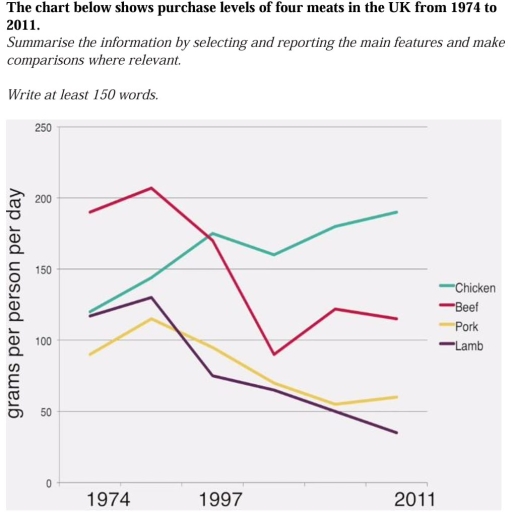
Image for topic: The chart below shows purchase levels of four meats in the UK from 1974 to 2011
Our system will evaluate the answer based on this AI-generated description.
The image presents a line graph tracking the purchase levels of four meats - chicken, beef, pork, and lamb - in the UK for the years 1974, 1997, and 2011. The y-axis displays the weight of meat in grams per person per day ranging from 0 to 250, with markers at intervals of 50. The x-axis represents the years in question. In 1974, beef had the highest purchase level at just over 200g, followed by chicken at just under 150g, then lamb at approximately 150g, and pork was the least purchased at around 100g. By 1997, chicken saw a dramatic increase to around 250g, becoming the most purchased meat, while beef and lamb experienced a significant decline to approximately 100g and 50g respectively, and pork remained relatively stable at around 100g. In 2011, chicken maintained its top position at nearly 250g, pork increased slightly to around 150g, beef continued to decrease to just over 50g, and lamb hit its lowest point at about 25g. Overall, chicken's popularity grew substantially, pork saw a small rise, while beef and lamb faced a steep downward trend over the 37-year period.
Given the complexity of the image, the above description may not be entirely accurate.
Note: Both the topic and the answer were created by one of our users.

The line graph gives data on the figure for purchasing chicken,beef,pork and lamb meat in the UK between 1974 and 2011.

Overall,it is clearly seen that the amount of beef,pork and lamb which was purchased experienced a significant decrease while the levels of chicken meat showed popularity in consuming in the UK over a period of 37 years.

Looking at the details,the purchasing level of beef was dominant in consuming meat which stood at just under 200 grams in 1974.However,the levels of beef meat decreased dramatically in around 1978 at well under 100 grams and there was a considerable rose in purchasing beef meat at well over 100 grams in 2011.Chicken meat in 1974 started to grow untill 1997 at well over 150 grams and then 1997 saw a sharp reduction at approximately 150 grams

Word Count: 135

Answers On The Same Topic:

The chart below shows purchase levels of four meats in the UK from 1974 to 2011

The line chart illustrates the total amount of grams per person purched over 4 different type of meat from individuals living in UK over the period 1974 and 2011. Overall it is apparent that chicken had gown up significantly over the years and never had a downfall, while beef even though it startet with large […]

The chart below shows purchase levels of four meats in the UK from 1974 to 2011

The line graph illustrates the amount of four types of meat – chicken, beef, lamb, and pork – purchased per person per day in the UK between 1974 and 2011. Overall, chicken consumption rose sharply over the period, becoming the most popular meat by 2011, while the consumption of beef, lamb, and pork all declined, […]

The chart below shows purchase levels of four meats in the UK from 1974 to 2011

The line graph shows the amount of meat-chicken, beef, pork and lamb- bought by the UK population from 1974 to 2011. Units are measured in grams per capita per week. Overall, purchase levels of all the meats saw a decline, with the exception of chicken. However, total consumption of meat didn’t change over the period. […]

The chart below shows purchase levels of four meats in the UK from 1974 to 2011

The line chart illustrates the data on how popular 4 different types of meat, namely chicken, beef, pork, and lamb, were in the UK during a 37-year period between 1974 and 2011. Overall, it is clear that demand for all the types of meat declined in all years, with the exception of chicken. In terms […]

The chart below shows purchase levels of four meats in the UK from 1974 to 2011

The line chart illustrates the data on how popular 4 different types of meat, namely chicken, beef, pork, and lamb was in the UK during 37-year period between 1974 and 2011. Overall, it is clear that demand for all the types of meat declined in all years, with the exception of chicken. In terms of […]

See All

Other Topics:

The graph below compares changes in the birth rates of China and the USA between 1920 and 2000. Summarise the information by selecting and reporting the main features, and make comparisons where relevant

The line graph shows the birth rates of China and the US over the period from 1920 to 2000 changed. Overall, the birth rates in both countries declined over the 80-year period. The two trends are quite similar in terms of their overall decline. In most years, although there was an overall decline in both […]

The graph below shows the number of international tourists visiting three different countries between 2000 and 2010.

The line chart illustrates the number of international tourist arrivals in three countries between 2000 and 2010. Overall, all three countries followed a similar rising trend, especially France, which experienced a surge to become the country holding the leading position in the volume of incoming travelers. Regarding the USA, this country maintained an upward trajectory. […]

The graph below compares changes in the birth rates of China and the USA between 1920 and 2000. Summarise the information by selecting and reporting the main features, and make comparisons where relevant

The line graph shows the birth rates of China and the US over the period from 1920 to 2000 changed. Overall, the birth rates in both countries declined over the 80-year period. The two trends are quite similar in terms of their overall decline. In most years, although there was an overall decline in both […]

The line graph illustrates the amount of spreads consumed from 1981 to 2007, in grams

The shown line graph illustrates the information on the consumption of 3 spreads: butter, lowfat and reduced spreads, and margarine over the period between 1981 and 2007. The data presented in grams. Overall, it can be seen that the consumption of lowfat and reduced spreads experienced a significant growth over the years, while the consumption […]

The chart below gives information about car ownership in the UK from 1975 to 2005

The line graph compares car ownership among UK household from 1975 to 2005. Overall, one-car ownership increased throughout the period, while the proportion of without car declined. The remaining two graphs growing up at the end of the year. In 1975, household of one-car showed considerable decrease of approximately 37%. Consequently, it increases by the […]

The graph below shows the percentage of female members of parliament in five European countries between 2000 and 2012.

The line chart compares the percentage of parliament who are female in Germany, Spain, Belgium, the UK and Italy. Overall, the data of five countries experienced an upward trend. To be specific, the figure of Spain and Belgium rose sharply from 2000 to 2004 while that of the UK and Italy skyrocketed from 2004 onwards. […]

See All
We have detected unusual activity on your device.
Please verify your identity to continue.
Note: This verification step won't sign you in. If you have a premium account, please log in to access the service as usual.
Google/Gmail Verification
Or verify using Email/Code
We've sent a verification code to:
youremail@gmail.com (Not your email?)
Enter it below to complete the verification process.
Ensure your email address is correct, your inbox is not full, and you check your spam folder. If no email arrives, consider using an alternative email.
You will need a Premium plan to perform your action!
Note: If you already have a premium account, please log in to access our services as usual.

Plans & Pricing

Our mission is to make quality education accessible for everyone.
However, to keep our hardworking team running and this service alive, we genuinely need your support!
By opting for a premium plan, not only do you sustain us in achieving the mission, but you also unlock advanced features to enrich your learning experience.

Free

For learners who aren't pressed for time

What's included on Free
100+ Cambridge IELTS Tests
Instant IELTS Writing Task 1 & 2 Evaluation (2 times/month)
Instant IELTS Speaking Part 1, 2, & 3 Evaluation (2 times/month)
Instant IELTS Writing Task 1 & 2 Essay Generator (2 times/month)
500+ Dictation & Shadowing Exercises
100+ Pronunciation Exercises
Flashcards
Other Advanced Tools

Premium

For those serious about advancing their English proficiency, and for IELTS candidates aspiring to boost their band score by 1-2 points (especially in writing & speaking) in just 30 days or less

What's included on Premium
Save Your IELTS Test Progress & Analyze Mistakes By Question Type
Save Your Own Flashcard Sets & Use Them On Any Device
Unlock All Courses, IELTS Tests, Section & Part Practice
Unlimited AI Conversations
Unlimited AI Writing Enhancement Exercises
Unlimited IELTS Writing Task 1 & 2 Evaluation
Unlimited IELTS Speaking Part 1, 2, & 3 Evaluation
Checked Answers Will Not Be Published
Unlimited IELTS Writing Task 1 & 2 Essay Generator
Unlimited IELTS Speaking Part 1, 2, & 3 Sample Generator
Unlimited Usage Of Advanced Tools & AI Features
Priority Support within 24h (12-month plan only)

Due to the nature of our service and the provided free trials, payments are non-refundable.