🔥 Today Only: Save 30% on Premium — Offer Ends Soon! - Upgrade Now!
Multiple Graphs

Band 6+: The chart below shows the amount of money per week spent on fast foods in Britain. The graph shows the trends in consumption of fast foods.

Image for topic: The chart below shows the amount of money per week spent on fast foods in Britain. The graph shows the trends in consumption of fast foods.
Our system will evaluate the answer based on this AI-generated description.
The image contains two graphs related to fast food consumption in the UK. The first graph, "Expenditure (Pence per person per week) on fast foods, by income groups, UK 1990" shows three income groups: High Income, Average Income, Low Income, with their expenditure on three types of fast foods: Hamburger, Fish & Chips, Pizza. High Income spends around 40 on Hamburgers, 25 on Fish & Chips, and 15 on Pizza. Average Income spends around 25 on Hamburgers, 30 on Fish & Chips, and 15 on Pizza. Low Income spends around 15 on Hamburgers, 20 on Fish & Chips, and 10 on Pizza. The second graph, "Consumption of fast food per person in gram (1970-1990)" is a line graph with three lines representing Pizza, Hamburgers, and Fish & Chips from 1970 to 1990. In 1970, Pizza is around 25 grams, Hamburgers 50 grams, and Fish & Chips 300 grams. In 1975, Pizza is around 50 grams, Hamburgers 150 grams, and Fish & Chips 375 grams. In 1980, Pizza is around 100 grams, Hamburgers 200 grams, and Fish & Chips 375 grams. In 1985, Pizza is around 200 grams, Hamburgers 325 grams, and Fish & Chips 350 grams. In 1990, Pizza is around 300 grams, Hamburgers 475 grams, and Fish & Chips 300 grams.
Given the complexity of the image, the above description may not be entirely accurate.
Note: Both the topic and the answer were created by one of our users.

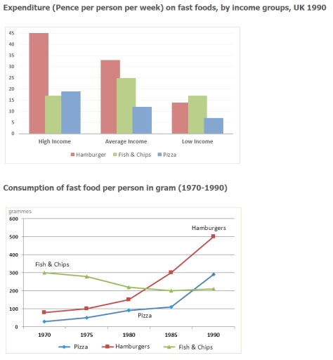
The bar chart compares the amount of money spent weekly by three groups of people segregated by their income on three fast foods (hamburger, fish&chips and pizza) in Britain. When the line graph represents rates of consumption of fast foods between 1970 and 1990.

Overall, people with low income eat the fewest quantities of fast food. They spend about 17 pounds on fish&chips, which is the most popular type of food among them. People of average income consume two times more fast food. Moreover, they prefer hamburgers, fish&chips and pizza in this order with approximately 33, 25, and 12 pounds spend weekly on them respectively. People with high income consume a quarter more fast food than people with average income. Nonetheless, their favorite food is hamburgers which result three times exceeds the results of the rivals and comprises 45 pounds, compared to only an average of 18 pounds spent on each fish&chips and pizza.

Overall, the popularity of hamburgers and pizza increased between 1970 and 1990 while the quantity consumed fish&chips was constantly declining over the period.

Word Count: 177

Answers On The Same Topic:

The chart below shows the amount of money per week spent on fast foods in Britain. The graph shows the trends in consumption of fast foods.

The bar chart and line graph illustrate weekly expenditure on fast foods in Britain and trends in fast food consumption from 1970 to 1990. Overall, hamburgers were the most popular fast food in terms of both spending and consumption. While the consumption of hamburgers and pizza rose over the period, the consumption of fish and […]

The chart below shows the amount of money per week spent on fast foods in Britain. The graph shows the trends in consumption of fast foods.

its being seen the comparetion between three type of income group which are expend on three type of food mostly. the high income of group are spending in hamburger more then the others two around 40% per week and other fish&chips and pizza are around 15% to 20% pizza is more. the average income group […]

The chart below shows the amount of money per week spent on fast foods in Britain. The graph shows the trends in consumption of fast foods.

The bar chart compares weekly expenditure on three types of fast food among different income groups in the UK in 1990, while the line graph shows changes in the consumption of these foods between 1970 and 1990 in the same country. Overall, hamburgers were the most popular fast food, particularly among high-income groups, and their […]

The chart below shows the amount of money per week spent on fast foods in Britain. The graph shows the trends in consumption of fast foods.

The line graph demonstrates the quantity of budget for one week spent on Fast Food to Britain people. As an overall trend,the indicator of consumption of fast food in the UK were very differences. According to the graph each line was in various level which illustrates their level after. It can be clearly seen that […]

The chart below shows the amount of money per week spent on fast foods in Britain. The graph shows the trends in consumption of fast foods.

The bar chart illustrates the weekly expenditure of British people on fast foods, while the line chart depicts the number of fast foods consumed between 1970 and 1990 in grammes. People with average and high incomes prefer to consume expensive hamburgers rather than pizza and fish and chips. They are willing to spend approximately 34 […]

See All

Other Topics:

The charts below show the main reasons for study among students of different age groups and the amount of support they received from employers. Summarise the information by selecting and reporting the main features, and make comparisons where relevant.

The bar chart compares the main reasons for study among different age groups. Overall, people under 26 recorded the highest figure for career, whereas the oldest cohort got enrolled in studies mainly due to interest. The intrest for studies increased with the age, while the popularity of studies mainly to build career decreased with the […]

The pie graphs below show the result of a survey of children's activities. The first graph shows the cultural and leisure activities that boys participate in, whereas the second graph shows the activities in which the girls participate. Write at least 150 words.

The pie graph illustrate the information about the statistic of children’s activities. The first graph depict boys cultural and leisure activities and in the second graph tasks where girls participate in. Overall, it is clear that, listening to music have the same interest in youngest, while computer games and reading have different hight of result. […]

The proportion of holiday markers using 4 different types of accommodation in 3 different years

The pie charts illustrates the figures of travellers using for types of layouts within three decades, from 1988,1998 to 2008. Overall, it can be seen that, staying with family and friends were more likely over the given period, while using rented aportments had grown by the time. Looking at the details, staying with family and […]

1 What does the table show? 2 Which is the most common means of transport? 3 Which is the least common? 4 Which group of travellers has the highest average age? 5 Which group of travellers has the lowest average age? 6 What does the chart show? 7 Which forms of transport cause little or no pollution? 8 Which form of transport causes the most pollution?

The table and chart provide information about four different means of transport: buses, cars, trains and bicycles. The table illustrates the average age of people who use each form of transport, while the chart compares their environmental impact in terms of pollution. Overall, cars appear to be the most commonly used means of transportation, whereas […]

proportion of journeys made in the netherlands according to transport type

The pie charts show the number of people in the Netherlands using vehicles for travel between 1975 and 2000. Overall, the number of people who used cars increased over that period, while the number of people in the Netherlands who traveled by bicycle decreased. In 1975, people who traveled by car, bicycle, and train had […]

The charts below illustrate which of 3 fast-food restaurants were the most preferred amongst teenagers in Vietnam and Indonesia in 2017 and predictions for 2027.

The pie charts illustrate the preferred fast food restaurants among teenagers in Vietnam and Indonesia in 2017, alongside predicted figures for 2027. Overall, fast food choices differed noticeably between the two nations and are projected to remain distinct in the end of the period. McDonald’s and Burger King dominate the market in both countries, while […]

See All
We have detected unusual activity on your device.
Please verify your identity to continue.
Note: This verification step won't sign you in. If you have a premium account, please log in to access the service as usual.
Google/Gmail Verification
Or verify using Email/Code
We've sent a verification code to:
youremail@gmail.com (Not your email?)
Enter it below to complete the verification process.
Ensure your email address is correct, your inbox is not full, and you check your spam folder. If no email arrives, consider using an alternative email.
You will need a Premium plan to perform your action!
Note: If you already have a premium account, please log in to access our services as usual.

Plans & Pricing

Our mission is to make quality education accessible for everyone.
However, to keep our hardworking team running and this service alive, we genuinely need your support!
By opting for a premium plan, not only do you sustain us in achieving the mission, but you also unlock advanced features to enrich your learning experience.

Free

For learners who aren't pressed for time

What's included on Free
100+ Cambridge IELTS Tests
Instant IELTS Writing Task 1 & 2 Evaluation (2 times/month)
Instant IELTS Speaking Part 1, 2, & 3 Evaluation (2 times/month)
Instant IELTS Writing Task 1 & 2 Essay Generator (2 times/month)
500+ Dictation & Shadowing Exercises
100+ Pronunciation Exercises
Flashcards
Other Advanced Tools

Premium

For those serious about advancing their English proficiency, and for IELTS candidates aspiring to boost their band score by 1-2 points (especially in writing & speaking) in just 30 days or less

What's included on Premium
Save Your IELTS Test Progress & Analyze Mistakes By Question Type
Save Your Own Flashcard Sets & Use Them On Any Device
Unlock All Courses, IELTS Tests, Section & Part Practice
Unlimited AI Conversations
Unlimited AI Writing Enhancement Exercises
Unlimited IELTS Writing Task 1 & 2 Evaluation
Unlimited IELTS Speaking Part 1, 2, & 3 Evaluation
Checked Answers Will Not Be Published
Unlimited IELTS Writing Task 1 & 2 Essay Generator
Unlimited IELTS Speaking Part 1, 2, & 3 Sample Generator
Unlimited Usage Of Advanced Tools & AI Features
Priority Support within 24h (12-month plan only)

Due to the nature of our service and the provided free trials, payments are non-refundable.