🔥 Today Only: Save 30% on Premium — Offer Ends Soon! - Upgrade Now!
Line Graph

Band 6+: The chart below shows the average cost of a monthly contract from four different mobile phone providers in a Buropean country. Summarize the information by selecting

Image for topic: The chart below shows the average cost of a monthly contract from four different mobile phone providers in a Buropean country. Summarize the information by selecting
Our system will evaluate the answer based on this AI-generated description.
The image displays line data showing monetary aid from four organizations to developing countries from 2008 to 2011. In 2008, Organization A provided 1 billion dollars, Organization B gave 0.5 billion dollars, Organization C donated 1 billion dollars, and Organization D granted 0.2 billion dollars. In 2009, Organization A remained at 1 billion dollars, Organization B increased to 0.7 billion dollars, Organization C donated 1 billion dollars, and Organization D stayed at 0.2 billion dollars. In 2010, Organization A reached around 1.3 billion dollars, Organization B grew to 2 billion dollars, Organization C remained at 1 billion dollars, and Organization D held steady at 0.2 billion dollars. By 2011, Organization A maintained nearly 1.3 billion dollars, Organization B surged to 3 billion dollars, Organization C was consistent at 1 billion dollars, and Organization D remained approximately 0.2 billion dollars.
Given the complexity of the image, the above description may not be entirely accurate.
Note: Both the topic and the answer were created by one of our users.

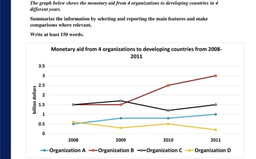
The line graph illustrates the amount of money for econoomy help to developing countries from 4 organizations over a period of 4 years.

It is clear that, B Organization’s average amount for aid was by far the highest during the period shown. In contrast, D Organization’s average capital exhibited a gradual decrease, especially noticeable in the last year.

In 2008, C Organization’s capital was among the highest at 1.5 billion dollars. Both A and D Organizations generated 0.5 billion dollars for monetary aid, while B and D orgaizations ranked high in financing. Just one year later, B Organization’s capital overtook C Organization’s, becoming the primary provider of helping for to developing countries.

Between 2008 and 2011, A Organizations money gradually increased, reaching 1 billion dollars. In contrast, D Organization’s average capital witnessed a down trend to 0.2 billion dollars by 2011. C Organization’s money fluctuated between 1.2 and 1.5 billion dollars for 3 year, and then as the first start-up year remained 1 billion dollars in 2011. Meanwhile, B Organization donated a raped increase, reaching 3 billion dollars by 2011.

Word Count: 180

Answers On The Same Topic:

The chart below shows the average cost of a monthly contract from four different mobile phone providers in a Buropean country. Summarize the information by selecting

The line chart illustrates three numbers of potatoes, pasta and rice consumed in European countries between 1976 and 2006, measured in grams per head. Overall, it is evident that the consumption of potatoes and rice experienced downward trends, while the pasta reached a peak. According to the data, the figure for potatoes increased to 450 […]

The chart below shows the average cost of a monthly contract from four different mobile phone providers in a Buropean country. Summarize the information by selecting

The graph illustrates the amount of money received by countries with developing economies from four different organizations. Overall, while tree countries fluctuated slightly, organization B increased significantly over the given period. Unites are measured in billions of dollars. In 2008, organizations Band C sent equal quality of money to developing countries, which was 1.5 billion […]

See All

Other Topics:

The graph shows data about the annual earnings of three bakeries in London, 2000-2010. Summarize the information by selecting and reporting the main features, and make comparisons where relevant.

The line graph illustrates the annual net income of three bakeries in London between 2000 and 2010. Overall, Robbie’s Bakery experienced a substantial increase in revenue and became the most profitable bakery by the end of the period. By contrast, Bernie’s Buns fluctuated considerably and finished with the lowest income, while Lovely Loaves rose steadily […]

The graph below gives information about three different ways of communication used by teenagers in the United States between 1990 and 2020

The line graph delineates the evolution of three distinct modes of communication employed by adolescents in the United States from 1990 to 2020. Overall, there is a marked increase in text messaging as a preferred communication method among teenagers, while both calls and face-to-face interactions exhibit a significant decline over the specified period. In 1990, […]

The graph below gives information about three different ways of communication used by teenagers in the United States between 1990 and 2020

The line chart illustrates information about three various methods of conversation utilized by young people in United States from 1990 to 2020. Overall, at the beginning of the period, the figure for face to face interaction was highest figure among other figures, whereas text messages recorded the lowest figure at the starting point. Nevertheless, over […]

The graph below shows the number of enquuiries received by teh tourist information office in one city over a six-month period in 2011Summarize the information by selecting and reporting the main features and take comparisons where relevant You should write at least 150 words.

Based on the graphs, there are more enquuiries by in person compare by letter and by telephone. From January to February, enquuiries by in person is less than enquuiries by telephone and by letter. The people most prefer to make enquuiries bytelephone and by letter. In my perspection that because January and February are early […]

IELTS Writing Task 1 Practice: Line Graph - You should write between 150 - 180 words and spend only 20 minutes. - Make sure you have studied how Writing Task 1 is organized.

The line chart depicts the sales of different kinds of books in millions between 2002 and 2006 in one country.Overall, it is evident that children’s books exhibited the highest sales compared to adult and educational books. In 2002, children’s fiction were above 30 million sales which increased steadily by around 10 million in 2003.The figure […]

Writing task 1 The line graph illustrates the amount of spreads consumed from 1981 to 2007, in grams per person per week

The line graph illustates of tree spreads consumption (margarine, butter, low fat and reduced spreads) since from the period 1981 to 2007. The measured are grams. Overall, the consumption margarine and butter was decreased over the given period, while low fat and reduced spreads rose. At start of the period butter was the most popular […]

See All
We have detected unusual activity on your device.
Please verify your identity to continue.
Note: This verification step won't sign you in. If you have a premium account, please log in to access the service as usual.
Google/Gmail Verification
Or verify using Email/Code
We've sent a verification code to:
youremail@gmail.com (Not your email?)
Enter it below to complete the verification process.
Ensure your email address is correct, your inbox is not full, and you check your spam folder. If no email arrives, consider using an alternative email.
You will need a Premium plan to perform your action!
Note: If you already have a premium account, please log in to access our services as usual.

Plans & Pricing

Our mission is to make quality education accessible for everyone.
However, to keep our hardworking team running and this service alive, we genuinely need your support!
By opting for a premium plan, not only do you sustain us in achieving the mission, but you also unlock advanced features to enrich your learning experience.

Free

For learners who aren't pressed for time

What's included on Free
100+ Cambridge IELTS Tests
Instant IELTS Writing Task 1 & 2 Evaluation (2 times/month)
Instant IELTS Speaking Part 1, 2, & 3 Evaluation (5 times/month)
Instant IELTS Writing Task 1 & 2 Essay Generator (2 times/month)
500+ Dictation & Shadowing Exercises
100+ Pronunciation Exercises
Flashcards
Other Advanced Tools

Premium

For those serious about advancing their English proficiency, and for IELTS candidates aspiring to boost their band score by 1-2 points (especially in writing & speaking) in just 30 days or less

What's included on Premium
Save Your IELTS Test Progress
Unlock All Courses & IELTS Tests
Unlimited AI Conversations
Unlimited AI Writing Enhancement Exercises
Unlimited IELTS Writing Task 1 & 2 Evaluation
Unlimited IELTS Speaking Part 1, 2, & 3 Evaluation
Checked Answers Will Not Be Published
Unlimited IELTS Writing Task 1 & 2 Essay Generator
Unlimited IELTS Speaking Part 1, 2, & 3 Sample Generator
Unlimited Usage Of Advanced Tools
Priority Support within 24h (12-month plan only)

Due to the nature of our service and the provided free trials, payments are non-refundable.
Nếu bạn là người Việt Nam và không có hoặc không muốn trả bằng credit/debit cards, bạn có thể thanh toán bằng phương thức chuyển khoản:


Chọn gói:
419,000₫ 277,000 ₫ cho gói 1 tháng (chỉ 9,233₫/ngày)
1,239,000₫ 597,000 ₫ cho gói 3 tháng (chỉ 6,633₫/ngày)
2,469,000₫ 1,027,000 ₫ cho gói 6 tháng (chỉ 5,706₫/ngày)
4,929,000₫ 1,417,000 ₫ cho gói 12 tháng (chỉ 3,936₫/ngày)


Sau khi chuyển khoản, vui lòng đợi trình duyệt tự động điều hướng bạn trở lại Engnovate và bạn sẽ ngay lập tức nhận được mã kích hoạt tài khoản premium.
Nếu có lỗi xảy ra, bạn có thể liên hệ với team thông qua một trong các phương thức: email đến helloengnovate@gmail.com hoặc nhắn tin qua facebook.com/engnovate.
Vì toàn bộ công cụ trên website đều có thể sử dụng thử miễn phí, Engnovate không hỗ trợ hoàn tiền.