🔥 Today Only: Save 30% on Premium — Offer Ends Soon! - Upgrade Now!
Line Graph

Band 8+: The chart below shows the average cost of monthly contract for four different mobile (cell phones) in a European country from January to September 2002, measured in euro.

Image for topic: The chart below shows the average cost of monthly contract for four different mobile (cell phones) in a European country from January to September 2002, measured in euro.
Our system will evaluate the answer based on this AI-generated description.
The image is a line graph with four lines labeled Domo, Lex, Slim TX, and Alpha, showing data from January to September. Domo begins at approximately 7, rises to about 8.5 in February, drops slightly in March to around 8, falls to about 7 in April, climbs sharply to 12 in May, continues to rise to 18 in June, 20 in July, nearly 22 in August, and spikes to roughly 25 in September. Lex starts at approximately 11, fluctuates between 11 and 13 from February to May, rises slightly to around 14 in June, jumps to approximately 17 in July, continues the rise to about 18.5 in August, and maintains the same value in September. Slim TX begins at about 6, dips to roughly 5.5 in February, sees a minor increase to 6 in March, maintains until a sharp rise to 10 in April, gradually climbs to 11 in May, further rises to nearly 14 in June, remains stable until a sharp increase to around 19 in August, and peaks to approximately 20 in September. Alpha starts at nearly 24, dips to around 23 in February, drops sharply to 14 in March, continues the fall to about 9 in April, sees a minor climb to around 10 in May, drops slightly below 10 in June, begins to rise in July to approximately 10.5, continues the rise to about 12 in August, and sees a sharp peak to roughly 20 in September. The scale is from 0 to 30, and data points are marked with shapes corresponding to each line.
Given the complexity of the image, the above description may not be entirely accurate.
Note: Both the topic and the answer were created by one of our users.

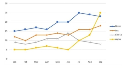
The line chart illustrates the average monthly cost for mobile phone contracts from four different providers, labelled Domo, Lex, Sim TX, and Alpha, in a European country over a period from January to September 2002, with costs quantified in euros.

Overall, the chart presents an upward trend for two providers, while the other two exhibit fluctuations throughout the period. Notably, Domo’s average cost increases markedly, indicating the most significant change among the four providers.

Initially, in January, Domo’s average cost was around 5 euros, the lowest among the four, but by September, it had increased gradually to nearly 30 euros, becoming the highest. Likewise, Lex also saw its cost rise but less dramatically, climbing from around 10 euros to approximately 22 euros by the end of the period.

In contrast, Sim TX’s cost underwent fluctuations, undergoing an initial increase from just below 15 euros in January to a peak of nearly 20 euros in May before experiencing a slight decline and then stabilizing at about 15 euros from June to September. Similarly, Alpha’s average cost periodically(theo định kì, chu kì) oscillated (dao động, biến động), starting at around 15 euros, peaking at roughly 18 euros in June, before finishing the period at about the same value as it began. While Domo and Lex’s contracts showed a continuous rise in costs, Sim TX and Alpha demonstrated more variable patterns over the nine months.

Word Count: 232

Answers On The Same Topic:

The chart below shows the average cost of monthly contract for four different mobile (cell phones) in a European country from January to September 2002, measured in euro.

The graph exhibits the average cost of monthly agreement for four dissimilar cell phones in a European nation from January to September 2002, it is mentioned in euro. At a quick glance, both Lex and Alpha unveiled and augmenting trend, whereas the opposite is true for Domo and Sim TX and figures are shown in […]

The chart below shows the average cost of monthly contract for four different mobile (cell phones) in a European country from January to September 2002, measured in euro.

The chart illustrates the average monthly cost of contracts for four different mobile phone companies in a European country between January and September 2002, measured in euros. Overall, it is clear that the prices varied considerably across the companies, with some showing steady growth while others experienced sharp changes. At the beginning of the period, […]

The chart below shows the average cost of monthly contract for four different mobile (cell phones) in a European country from January to September 2002, measured in euro.

The graph illustrates the average price of monthly plan for four various cellular phones in a European nation for nine months in 2002. Overall, the information that stood out from the graph was very striking showcasing the performance of Alpha mobile who surged highest cost in september, whereas SIM TX who started better than Alpha […]

The chart below shows the average cost of monthly contract for four different mobile (cell phones) in a European country from January to September 2002, measured in euro.

The chart illustrates the average price of monthly plans from four cell phone contractors in a European nation in the first three quarters of 2002. Overall, there was an increase in the figures for all companies, except for Sim TX whose price remained unchanged over the period shown. In addition, the monthly cost of Alpha’s […]

See All

Other Topics:

The line graph below shows the electricity consumption in four different sectors (A, B, C, and D) between 2005 and 2020, measured in terawatt hours (TWh).

The line graph illustrates the consumption by four sectors during the period from 2005 to 2020. Overall, it is obvious that the amount of electricity consumed by sector A and D witnessed a steady increase, whereas the figure by sector B experienced a gradual decline over the period shown. Besides, that of sector C showed […]

The graph below shows the information about green transportation users from 1980 to 2020.

The line graph compares the number of monthy commuters traveling by 4 different types of transportation including subway, bus, tram ; and bike share over a period of 50 years from 1980 to 2030. As an overall trend it can be clearly seen that subway had the highest level of commuters over the time while […]

The grapgh below shows China's population by age group starting in 1960 and including forecast to 2050.

The graph above demonstrates the changes in the number of people grouped by different intervals of ages in China since 1960 and including a forecast to 2050. Overall, people aged between 15 and 64 are the most populated group in China while it is expected that the number of elderly people will exceed that of […]

Describe the graph shows the number of books read by men and women

The line graph compares the number of books read by men and women at Burnaby Public Library from 2011 to 2014. Overall, the number of books read by men increased gradually over the period. It is also noticeable that the figure for female readers increased initially but declined by the end of the period. In […]

The graph below shows the number of overseas visitors to three different areas of a European country between 1987 and 2007.

The line chart illustrates the number of overseas visitors to three various areas of a European country from 1987 to 2007. Overall, the coast area had the most visitors over the time of period. By contrast, the number of visitors of the lakes were the lowest at beginning and increased significantly over the period. In […]

Summarise the information by selecting and reporting the main features, and make comparison where relevent

The line graph illustrates varous activities at one social centre and their amount of participants in Melbourne, Australia between 2000 to 2020. It is evident that the most people participanted for film club among other activities despite of being stable over twenty years. Moreover, number of musical performances and that of table tennis increased. However, […]

See All
We have detected unusual activity on your device.
Please verify your identity to continue.
Note: This verification step won't sign you in. If you have a premium account, please log in to access the service as usual.
Google/Gmail Verification
Or verify using Email/Code
We've sent a verification code to:
youremail@gmail.com (Not your email?)
Enter it below to complete the verification process.
Ensure your email address is correct, your inbox is not full, and you check your spam folder. If no email arrives, consider using an alternative email.
You will need a Premium plan to perform your action!
Note: If you already have a premium account, please log in to access our services as usual.

Plans & Pricing

Our mission is to make quality education accessible for everyone.
However, to keep our hardworking team running and this service alive, we genuinely need your support!
By opting for a premium plan, not only do you sustain us in achieving the mission, but you also unlock advanced features to enrich your learning experience.

Free

For learners who aren't pressed for time

What's included on Free
100+ Cambridge IELTS Tests
Instant IELTS Writing Task 1 & 2 Evaluation (2 times/month)
Instant IELTS Speaking Part 1, 2, & 3 Evaluation (5 times/month)
Instant IELTS Writing Task 1 & 2 Essay Generator (2 times/month)
500+ Dictation & Shadowing Exercises
100+ Pronunciation Exercises
Flashcards
Other Advanced Tools

Premium

For those serious about advancing their English proficiency, and for IELTS candidates aspiring to boost their band score by 1-2 points (especially in writing & speaking) in just 30 days or less

What's included on Premium
Save Your IELTS Test Progress
Unlock All Courses & IELTS Tests
Unlimited AI Conversations
Unlimited AI Writing Enhancement Exercises
Unlimited IELTS Writing Task 1 & 2 Evaluation
Unlimited IELTS Speaking Part 1, 2, & 3 Evaluation
Checked Answers Will Not Be Published
Unlimited IELTS Writing Task 1 & 2 Essay Generator
Unlimited IELTS Speaking Part 1, 2, & 3 Sample Generator
Unlimited Usage Of Advanced Tools
Priority Support within 24h (12-month plan only)

Due to the nature of our service and the provided free trials, payments are non-refundable.
Nếu bạn là người Việt Nam và không có hoặc không muốn trả bằng credit/debit cards, bạn có thể thanh toán bằng phương thức chuyển khoản:


Chọn gói:
419,000₫ 277,000 ₫ cho gói 1 tháng (chỉ 9,233₫/ngày)
1,239,000₫ 597,000 ₫ cho gói 3 tháng (chỉ 6,633₫/ngày)
2,469,000₫ 1,027,000 ₫ cho gói 6 tháng (chỉ 5,706₫/ngày)
4,929,000₫ 1,417,000 ₫ cho gói 12 tháng (chỉ 3,936₫/ngày)


Sau khi chuyển khoản, vui lòng đợi trình duyệt tự động điều hướng bạn trở lại Engnovate và bạn sẽ ngay lập tức nhận được mã kích hoạt tài khoản premium.
Nếu có lỗi xảy ra, bạn có thể liên hệ với team thông qua một trong các phương thức: email đến helloengnovate@gmail.com hoặc nhắn tin qua facebook.com/engnovate.
Vì toàn bộ công cụ trên website đều có thể sử dụng thử miễn phí, Engnovate không hỗ trợ hoàn tiền.