🔥 Today Only: Save 30% on Premium — Offer Ends Soon! - Upgrade Now!
Line Graph

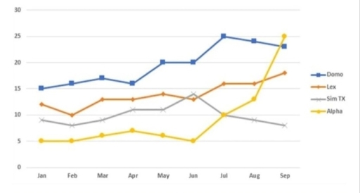
Band 7+: The chart below shows the average cost of monthly contract for four different mobile (cell phones) in a European country from January to September 2002, measured in euro.

Image for topic: The chart below shows the average cost of monthly contract for four different mobile (cell phones) in a European country from January to September 2002, measured in euro.
Our system will evaluate the answer based on this AI-generated description.
The image is a line graph with four lines labeled Domo, Lex, Slim TX, and Alpha, showing data from January to September. Domo begins at approximately 7, rises to about 8.5 in February, drops slightly in March to around 8, falls to about 7 in April, climbs sharply to 12 in May, continues to rise to 18 in June, 20 in July, nearly 22 in August, and spikes to roughly 25 in September. Lex starts at approximately 11, fluctuates between 11 and 13 from February to May, rises slightly to around 14 in June, jumps to approximately 17 in July, continues the rise to about 18.5 in August, and maintains the same value in September. Slim TX begins at about 6, dips to roughly 5.5 in February, sees a minor increase to 6 in March, maintains until a sharp rise to 10 in April, gradually climbs to 11 in May, further rises to nearly 14 in June, remains stable until a sharp increase to around 19 in August, and peaks to approximately 20 in September. Alpha starts at nearly 24, dips to around 23 in February, drops sharply to 14 in March, continues the fall to about 9 in April, sees a minor climb to around 10 in May, drops slightly below 10 in June, begins to rise in July to approximately 10.5, continues the rise to about 12 in August, and sees a sharp peak to roughly 20 in September. The scale is from 0 to 30, and data points are marked with shapes corresponding to each line.
Given the complexity of the image, the above description may not be entirely accurate.
Note: Both the topic and the answer were created by one of our users.

The line graph illustrates how much was spent on contracts per month, on average, for different mobile phone providers in a European country between January and September 2002.

Overall, DOMO was consistently the most expensive for almost the entire period, except for the end. In contrast, while being the cheapest for the majority of the time, ALPHA had the most significant rise. It can also be seen that only the monthly subscription costs of SIM TX experienced a downward trend while the other three underwent an opposite pattern.

Starting at just approximately 16 euros in January, DOMO gradually increased its monthly expenses to 18 euros in March. Afterward, the figure slightly fluctuated before finishing the period at around 23 euros. Meanwhile, people only had to spend roughly 5 euros on ALPHA per month in January, about one-third of DOMO’s figure at that time. However, the figure remained relatively unchanged for 6 months later, followed by a surge to 25 euros in September, surpassing DOMO and becoming the most expensive mobile.

The cost of LEX mobile was around 12 euros per month in January, it then rose with some fluctuations before ending at exactly 18 euros. Meanwhile, the monthly subscription expense of SIM TX was just below 9 euros at the beginning, it then witnessed a similar trend to LEX for 6 months, before experiencing a decrease to about 7 euros and becoming the least expensive mobile plan.

Word Count: 237

Answers On The Same Topic:

The chart below shows the average cost of monthly contract for four different mobile (cell phones) in a European country from January to September 2002, measured in euro.

The graph exhibits the average cost of monthly agreement for four dissimilar cell phones in a European nation from January to September 2002, it is mentioned in euro. At a quick glance, both Lex and Alpha unveiled and augmenting trend, whereas the opposite is true for Domo and Sim TX and figures are shown in […]

The chart below shows the average cost of monthly contract for four different mobile (cell phones) in a European country from January to September 2002, measured in euro.

The chart illustrates the average monthly cost of contracts for four different mobile phone companies in a European country between January and September 2002, measured in euros. Overall, it is clear that the prices varied considerably across the companies, with some showing steady growth while others experienced sharp changes. At the beginning of the period, […]

The chart below shows the average cost of monthly contract for four different mobile (cell phones) in a European country from January to September 2002, measured in euro.

The graph illustrates the average price of monthly plan for four various cellular phones in a European nation for nine months in 2002. Overall, the information that stood out from the graph was very striking showcasing the performance of Alpha mobile who surged highest cost in september, whereas SIM TX who started better than Alpha […]

The chart below shows the average cost of monthly contract for four different mobile (cell phones) in a European country from January to September 2002, measured in euro.

The graph illustrates the average price of monthly plan for four various cellular phones in a European nation for nine months in 2002. Overall, the information that stood out from the graph was very striking showcasing the performance of Alpha mobile who surged highest cost in september, whereas SIM TX who started better than Alpha […]

The chart below shows the average cost of monthly contract for four different mobile (cell phones) in a European country from January to September 2002, measured in euro.

The chart illustrates the average price of monthly plans from four cell phone contractors in a European nation in the first three quarters of 2002. Overall, there was an increase in the figures for all companies, except for Sim TX whose price remained unchanged over the period shown. In addition, the monthly cost of Alpha’s […]

See All

Other Topics:

The graph below shows the number of cell phone subscribers in a particular city; by gender. Summarize the information by selecting and reporting the main features1 and make comparisons where relevant.

The line graph depicts information about how many mobile phone users newly subscribed in Marysville city between 1995 and 2015, catagorised by gender. Overall, it is clear that there was an upward trend in mobile phone subscribing for both men and women throughout the period, but at certain point, the figure for men overtook women […]

The figure shows demographic trends in Scotland. Summarise the information by selecting and reporting the main feature.

The line chart illustrates the rate of birth, death, and population growth in Scotland from 1940 to 2020. Overall the population growth rate was correlated with the birth rate. Despite fluctuating, the percentage of birth and population growth generally decreased, while death rate remained stable in most of the time. The birth and population growth […]

The line graph below illustrates the proportion of electricity generated from renewable sources in five different countries (USA, Germany, China, Brazil, and India) between 2000 and 2020. Summarize the information by selecting and reporting the main features, and make comparisons where relevant.

The line graph highlights the volume of electricity in percentage , generating from renewable sources across five countries over 20 years of period from 2000 to 2020. Overall, it is immediately apparent that Brazil recorded the highest proportion of electricity generation while USA accounted for the lowest proportion until the end. Additionally, all the countries […]

The line graph illustrates the number of magazine sales by a publisher in 4 European contries betwenn 1999 and 2002.

The line graph clearly and very simply shows the sales of magazine by a publisher in four different European countries very clearly between 1999 and 2002. Overall, sales in France and Belgium went up over the period, while sales in Germany went down. In addition, Belgium experienced the most big growth of all the nations. […]

The graph below shows the number of students enrolled in two different schools. Summarize the information by selecting and reporting the main features, and make comparisons where relevant.

The graph below shows how the number of students enrolling the Litchfield School and the Riverside School changed in 3 years. Overall, the number of the Litchfield students experienced a significant increase, and the figure for the Riverside saw a gradual but contious drop. Statistics for the Litchfield school climbed progessively over the period, the […]

the graph shows comparison of the number of jobs in three different industries in the United States

The graph illustrates the number of jobs in three different indstrues in the United States. Overall, all three industries developed in different ways, but all of them changed a lot in 1980. In particular, the services raised the most. From 1975 to 1979 it showed small growth from 10 to roughly 17, but after 1979 […]

See All
We have detected unusual activity on your device.
Please verify your identity to continue.
Note: This verification step won't sign you in. If you have a premium account, please log in to access the service as usual.
Google/Gmail Verification
Or verify using Email/Code
We've sent a verification code to:
youremail@gmail.com (Not your email?)
Enter it below to complete the verification process.
Ensure your email address is correct, your inbox is not full, and you check your spam folder. If no email arrives, consider using an alternative email.
You will need a Premium plan to perform your action!
Note: If you already have a premium account, please log in to access our services as usual.

Plans & Pricing

Our mission is to make quality education accessible for everyone.
However, to keep our hardworking team running and this service alive, we genuinely need your support!
By opting for a premium plan, not only do you sustain us in achieving the mission, but you also unlock advanced features to enrich your learning experience.

Free

For learners who aren't pressed for time

What's included on Free
100+ Cambridge IELTS Tests
Instant IELTS Writing Task 1 & 2 Evaluation (2 times/month)
Instant IELTS Speaking Part 1, 2, & 3 Evaluation (2 times/month)
Instant IELTS Writing Task 1 & 2 Essay Generator (2 times/month)
500+ Dictation & Shadowing Exercises
100+ Pronunciation Exercises
Flashcards
Other Advanced Tools

Premium

For those serious about advancing their English proficiency, and for IELTS candidates aspiring to boost their band score by 1-2 points (especially in writing & speaking) in just 30 days or less

What's included on Premium
Save Your IELTS Test Progress & Analyze Mistakes By Question Type
Save Your Own Flashcard Sets & Use Them On Any Device
Unlock All Courses, IELTS Tests, Section & Part Practice
Unlimited AI Conversations
Unlimited AI Writing Enhancement Exercises
Unlimited IELTS Writing Task 1 & 2 Evaluation
Unlimited IELTS Speaking Part 1, 2, & 3 Evaluation
Checked Answers Will Not Be Published
Unlimited IELTS Writing Task 1 & 2 Essay Generator
Unlimited IELTS Speaking Part 1, 2, & 3 Sample Generator
Unlimited Usage Of Advanced Tools & AI Features
Priority Support within 24h (12-month plan only)

Due to the nature of our service and the provided free trials, payments are non-refundable.