🔥 Today Only: Save 30% on Premium — Offer Ends Soon! - Upgrade Now!
Line Graph

Band 8+: The chart below shows the changes in wage levels of full-time U.S. male workers by education for 1964-2012. Summarise the information by selecting and reporting the main features, and make comparisons where relevant.

Image for topic: The chart below shows the changes in wage levels of full-time U.S. male workers by education for 1964-2012. Summarise the information by selecting and reporting the main features, and make comparisons where relevant.
Our system will evaluate the answer based on this AI-generated description.
The image shows a line chart of wage levels for full-time U.S. male workers by education from 1964 to 2012. In 1964, less than high school was at 1.0, high school graduate at 1.0, some college at 1.0, bachelor's degree at approximately 1.54, and >bachelor's degree at approximately 1.68. By 1972, less than high school rose slightly above 1.0, high school graduate was at 1.2, some college at 1.25, bachelor's degree just under 1.8, and >bachelor's degree at approximately 1.9. In 1984, levels were as follows: less than high school at 1.1, high school graduate below 1.3, some college at approximately 1.4, bachelor's degree at 1.6, and >bachelor's degree peaking at 1.9. By 1996, less than high school dropped below 1.0, high school graduate near 1.1, some college about 1.2, bachelor's degree above 1.5, and >bachelor's degree at 1.8. In 2004, less than high school remained at 0.9, high school graduate just above 1.0, some college near 1.2, bachelor's degree around 1.6, >bachelor's degree at 1.9. Finally, in 2012, less than high school stayed at 0.8, high school graduate at 1.0, some college at 1.2, bachelor's at 1.6, with >bachelor's degree reaching 1.9.
Given the complexity of the image, the above description may not be entirely accurate.
Note: Both the topic and the answer were created by one of our users.

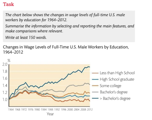
The line chart illustrates differences in the wage levels of U.S. male employees working full-time between 1964 and 2012, according to the type of their education.

Overall, it is clear from the chart that higher education provided workers with a good salary throughout the period. In contrast, men without a degree earned considerably less.

It can be seen that in 1964, all educational groups started from the same point, slightly above 1.0%. However, the income of those with more than a Bachelor’s degree experienced a significant rise, nearly doubling by 2012. In contrast, salary growth among Bachelor’s degree holders was less prominent, reaching around 1.4%.

Meanwhile, wages of those with a college or high school education fluctuated over the period. The highest percentage was slightly above 1.2% in 1972, whereas in 2008 it plummeted to almost 0.8%, making men with only a High School diploma the lowest-paid group.

In conclusion, the data suggests a strong correlation between educational level and wage growth among full-time U.S. male workers over the 48-year period.

Word Count: 171

Answers On The Same Topic:

The chart below shows the changes in wage levels of full-time U.S. male workers by education for 1964-2012. Summarise the information by selecting and reporting the main features, and make comparisons where relevant.

The line chart illustrates the disparities in income levels, categorized by educational attainment, among male employees in the United States from 1964 to 2012. In general, individuals possessing a bachelor’s degree or higher consistently earn higher wages than workers with a college degree or lower. Over the years, a consistent pattern has been observed regarding […]

The chart below shows the changes in wage levels of full-time U.S. male workers by education for 1964-2012. Summarise the information by selecting and reporting the main features, and make comparisons where relevant.

The information provided by the Line chart illustrates that percent of changes in wage levels of U.S Male workers as compared by their education who are working full-time within the 48 years time period of 1964-2012. The data is demonstrated in comparison by the education that the U.S male workers persists. Their educational specifics consists […]

The chart below shows the changes in wage levels of full-time U.S. male workers by education for 1964-2012. Summarise the information by selecting and reporting the main features, and make comparisons where relevant.

The line chart illustrates differences in wage levels of U.S. male employees working full-time between 1964 and 2012 according to the type of their education. Overall, it is clear from the chart that higher education provided workers with a good salary throughout the period. In contrast, men without a degree earned considerably less. It can […]

The chart below shows the changes in wage levels of full-time U.S. male workers by education for 1964-2012. Summarise the information by selecting and reporting the main features, and make comparisons where relevant.

The chart below describes changes in wage levels as a percentage of full-time U.S. male workers by education from 1964 to 2012. Overall, this graph shows clear growth in the wages of all men who had completed their education; however, the wages of those who had not finished even school had declined. In this graph, […]

See All

Other Topics:

IELTS Academic Writing Task 1: You should spend about 20 minutes on this task. The graph below gives information about the percentage of the population in four Asian countries living in cities from 1970 to 2020, with predictions for 2030 and 2040. Summarise the information by selecting and reporting the main features, and make comparisons where relevant.

The line chart depicts how the populations of urban areas have changed from 1970 to 2020, with the predictions for 2030 and 2040 among four Asian countries. Overall, it is evident that city residents in all Asian countries experienced an upward trend, and it will continue into the forecasted year. While Malaysia will be the […]

summarise the information by selecting and reporting the main features, and make comparisons where relevante

The line graph compares the number of people attending various activities at one social center in Melbourne, Australia, from 2000 to 2020. Overall, film club dominated the number of participants over the period. Additionally, amateur dramatics showed decrease, while table tennis saw a increase. Moreover, a new activity arised, called musical performances for given years. […]

The graph below gives historical information and projections about changes in population in the United States, Nigeria and Japan.

The provided line graph presents data regarding changes in population in the US, Nigeria and Japan from 1950 to 2050. Overall, all nations are expected to witness an upward trajectory in their population; however, Nigeria is anticipated to experience the most pronounced growth, surpassing the other two countries, as opposed to a slight rise in […]

The graph shows information about the number of people in Australia who used Chinese, Arabic, Italian, and Greek as their first language.

The line graph illustrates the amount of native speakers of Chinese,Arabic,Italian and Greek in Australia. Overall, the number of Chinese and Arabic language speakers increased significantly over the period,while the figure for Greek and Italian first language speakers dropped. The number of Chinese speakers stood out other categories showing the highest number in last years. […]

The chart below shows the percentage of Australian people who were born in different places of the world.

Tha graph illustrate the data about percentage of Australian flok where were born in different areas of the world in the given period which is from 1976 to 2011 Overall, there are four places where Australians were born, which is uk, asia, total amount of borns and other areas. There are three places in the […]

The line graph below shows the number of overseas tourists (in millions) who visited France, Spain, and Japan between 1990 and 2020. Summarise the information by selecting and reporting the main features, and make comparisons where relevant.

The provided line graph illustrates the total number of tourists exploring three different foreign countries over the period of 30 years, from 1990 to 2020. Overall, the number of visitors in Spain and France surged significantly, whereas Japan increased slightly until 2000 and then declined throughout the period. Furthermore, France remained the dominant destination over […]

See All
We have detected unusual activity on your device.
Please verify your identity to continue.
Note: This verification step won't sign you in. If you have a premium account, please log in to access the service as usual.
Google/Gmail Verification
Or verify using Email/Code
We've sent a verification code to:
youremail@gmail.com (Not your email?)
Enter it below to complete the verification process.
Ensure your email address is correct, your inbox is not full, and you check your spam folder. If no email arrives, consider using an alternative email.
You will need a Premium plan to perform your action!
Note: If you already have a premium account, please log in to access our services as usual.

Plans & Pricing

Our mission is to make quality education accessible for everyone.
However, to keep our hardworking team running and this service alive, we genuinely need your support!
By opting for a premium plan, not only do you sustain us in achieving the mission, but you also unlock advanced features to enrich your learning experience.

Free

For learners who aren't pressed for time

What's included on Free
100+ Cambridge IELTS Tests
Instant IELTS Writing Task 1 & 2 Evaluation (2 times/month)
Instant IELTS Speaking Part 1, 2, & 3 Evaluation (5 times/month)
Instant IELTS Writing Task 1 & 2 Essay Generator (2 times/month)
500+ Dictation & Shadowing Exercises
100+ Pronunciation Exercises
Flashcards
Other Advanced Tools

Premium

For those serious about advancing their English proficiency, and for IELTS candidates aspiring to boost their band score by 1-2 points (especially in writing & speaking) in just 30 days or less

What's included on Premium
Save Your IELTS Test Progress
Unlock All Courses & IELTS Tests
Unlimited AI Conversations
Unlimited AI Writing Enhancement Exercises
Unlimited IELTS Writing Task 1 & 2 Evaluation
Unlimited IELTS Speaking Part 1, 2, & 3 Evaluation
Checked Answers Will Not Be Published
Unlimited IELTS Writing Task 1 & 2 Essay Generator
Unlimited IELTS Speaking Part 1, 2, & 3 Sample Generator
Unlimited Usage Of Advanced Tools
Priority Support within 24h (12-month plan only)

Due to the nature of our service and the provided free trials, payments are non-refundable.
Nếu bạn là người Việt Nam và không có hoặc không muốn trả bằng credit/debit cards, bạn có thể thanh toán bằng phương thức chuyển khoản:


Chọn gói:
419,000₫ 277,000 ₫ cho gói 1 tháng (chỉ 9,233₫/ngày)
1,239,000₫ 597,000 ₫ cho gói 3 tháng (chỉ 6,633₫/ngày)
2,469,000₫ 1,027,000 ₫ cho gói 6 tháng (chỉ 5,706₫/ngày)
4,929,000₫ 1,417,000 ₫ cho gói 12 tháng (chỉ 3,936₫/ngày)


Sau khi chuyển khoản, vui lòng đợi trình duyệt tự động điều hướng bạn trở lại Engnovate và bạn sẽ ngay lập tức nhận được mã kích hoạt tài khoản premium.
Nếu có lỗi xảy ra, bạn có thể liên hệ với team thông qua một trong các phương thức: email đến helloengnovate@gmail.com hoặc nhắn tin qua facebook.com/engnovate.
Vì toàn bộ công cụ trên website đều có thể sử dụng thử miễn phí, Engnovate không hỗ trợ hoàn tiền.