🔥 Today Only: Save 30% on Premium — Offer Ends Soon! - Upgrade Now!
Bar Chart

Band 4+: The chart below shows the figures for imprisonment in five countries between 1930 and 1980. Write a report for a university, lecturer describing the information shown below.

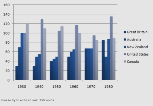
Image for topic: The chart below shows the figures for imprisonment in five countries between 1930 and 1980. Write a report for a university, lecturer describing the information shown below.
Our system will evaluate the answer based on this AI-generated description.
The image shows a bar graph with data from 5 countries—Great Britain, Australia, New Zealand, United States, and Canada—across 6 decades—1930, 1940, 1950, 1960, 1970, 1980. Units on Y-axis range from 0 to 160 with intervals of 20. In 1930, Great Britain and Australia have identical highest values at 120, followed by New Zealand at 100, the United States at 80, and Canada at 60. In 1940, Australia leads at 160, Great Britain at 140, New Zealand at 120, the United States at 100, and Canada at 80. For 1950, Australia's value decreases to 140, Great Britain and New Zealand both at 120, the United States at 100, and Canada at 80. In 1960, New Zealand's data rises to 140, Great Britain at 120, Canada increases to 100, Australia drops to 100, and the United States remains at 100. The 1970 data show New Zealand and Great Britain both at 120, the United States at 100, Australia at 80, and Canada at 60. Finally, in 1980, Australia, United States, and Canada are at 100, Great Britain at 80, and New Zealand drops to 60.
Given the complexity of the image, the above description may not be entirely accurate.
Note: Both the topic and the answer were created by one of our users.

The provided bar chart compares the different figures of prisons in five different countries from 1930 to 1980.

Overall, after analyzing this bar chart, it can be noted that the US has the highest number of prisons, whereas Great Britain had the lowest.

Initially, in 1930, Canada had the largest figure of prisons, which scored 120,000, while Britain slightly hit roughly 30,000. Surprisingly, both United Stated and New Zealand had the same figures of prisons, reaching 100,000. Similarly, New Zealand, Australia, Britain showed identical figure of prisoners, all at below 80% in1970.

In addition, in 1980, the number of prisons in Canada was the highest, making it the most popular country in committing crimes at nearly 135,000 prions. In contrast, Australia had a small figure of prisons, which registered roughly 50,000 prisons in 1980, . Canada and New Zealand nearly hit similar numbers of prisons, scoring 90,000 and 85,000 respectively.

Word Count: 150

Answers On The Same Topic:

The chart below shows the figures for imprisonment in five countries between 1930 and 1980. Write a report for a university, lecturer describing the information shown below.

The given bar chart illustrates the number of imprisonment in five different countries for 50 years of period, from 1950 to 1980. Overall, United States had the highest rate of imprisonment, while Great Britain had the lowest. In 1930, Canada had the highest rate of imprisonment with 120 thousand prisoners, at the same time, Great […]

The chart below shows the figures for imprisonment in five countries between 1930 and 1980. Write a report for a university, lecturer describing the information shown below.

The information given in the chart makes comparisons in the number of prisoners in five different countries from 1930 to 1980. While the figures for imprisonment fluctuated over the period shown, it is clear that the United States had the highest number of prisoners overall. Great Britain, on the other hand, had the lowest number […]

The chart below shows the figures for imprisonment in five countries between 1930 and 1980. Write a report for a university, lecturer describing the information shown below.

The table illustrates the number of prisoners, measured in thousands, in five different countries between the years 1930 and 1980. Overall, in all countries, the figures for imprisonment fluctuated throughout the period, except Great Britain. While the United States ranked as the highest country in number of prisoners in 1980, Canada was the highest-ranking country […]

The chart below shows the figures for imprisonment in five countries between 1930 and 1980. Write a report for a university, lecturer describing the information shown below.

The table illustrates the number of prisoners, measured in thousands, in five different countries between the years 1930 and 1980. Overall, in all countries, the figures for imprisonment fluctuated throughout the period, except Great Britain. While the United States ranked as the highest country in number of prisoners in 1980, Canada was the highest-ranking country […]

The chart below shows the figures for imprisonment in five countries between 1930 and 1980. Write a report for a university, lecturer describing the information shown below.

The chart shows the number of people imprisoned, on the scale of the thousands, between 1930 and 1980. The data refer to 5 countries: Great Britain, Australia, New Zealand, the United States, and Canada. The most prominent feature of the table is the clear precedence of Canada and the United States, with the former reaching […]

See All

Other Topics:

The bar charts below show the prevalence of obesity among boys and girls aged 12 to 19 years by ethnicity, in the United States for the years 2004 and 2014.

The rendered bar graphs presents the occurence of obesity in boys and girls of 12 to 19 aged group, on the basis of ethnicity. It covers the year 2004 and 2014 data of USA. Overall, irrespective of ethnicity in both the genders increase in obesity percentage is encountered from 2004 to 2014. The hispanic boys […]

The chart below shows the aid from six developed countries to developing countries from 2008-2010. Summarize the information by selecting and reporting the main features, and make a comparison where relevant.

The bar chart illustrates the aid from six developed countries (USA, UK, Germany, Japan, Netherlands, Sweden) to developing countries from 2008 to 2010. Overall, USA has dominated the aid catagory for the year form 2008 to 2010. Contrast, to Sweden with the lowest aid recored. Throughout the time periond the highest aid recored is 25 […]

The chart below shows the percentage of households with internet access in four countries in 2010 and 2020. Summarise the information by selecting and reporting the main features, and make comparisons where relevant.

The bar chart compares the proportion of households with internet access in four countries over a 10-year period. It is clear from the chart that internet access increased considerably in all four nations over the period shown. The UK and Japan had the highest figures in both years, whereas India consistently recorded the lowest proportion. […]

The chart below shows the percentage of households with internet access in four countries in 2010 and 2020. Summarise the information by selecting and reporting the main features, and make comparisons where relevant.

The bar chart illustrates the proportion of households with access to the online connection in four nations in two different years; 2010 and 2020. Overall, the UK and Japan demonstrated the highest percentages in both years, while India and Brazil remained the lowest. In 2010, the UK had the highest proportion of households connected to […]

You should spend about 20 minutes on this task. The bar chart shows the percentage of adult male smokers in seven countries along with the world average in 2000 and 2015. Summarise the information by selecting and reporting the main features and make comparisons where relevant. Write at least 150 words.

The bar chart provides information about the percentage of male smokers in seven countries along with the world average consumption of a cigarette in 2000 and 2015. Overall, countries such as Armenia, Bangladesh, Cuba, Mexico, Autralia have a downward trend. While, Egypt and Lebanon have an upward trend. In addition, the total consumption of a […]

The bar chart shows the percentages of the Canadian workforce in five major industries in 1850 and 2020.

The bar graph illustrates the change of the workforce of the Canadian workers in the five various main industrial areas in 1850 and 2020 with percentages. Overall, it is clear to see that the main power shifted to the services from manufacturing and agriculture, and fishing. In conparison, the differences in construction and energy, and […]

See All
We have detected unusual activity on your device.
Please verify your identity to continue.
Note: This verification step won't sign you in. If you have a premium account, please log in to access the service as usual.
Google/Gmail Verification
Or verify using Email/Code
We've sent a verification code to:
youremail@gmail.com (Not your email?)
Enter it below to complete the verification process.
Ensure your email address is correct, your inbox is not full, and you check your spam folder. If no email arrives, consider using an alternative email.
You will need a Premium plan to perform your action!
Note: If you already have a premium account, please log in to access our services as usual.

Plans & Pricing

Our mission is to make quality education accessible for everyone.
However, to keep our hardworking team running and this service alive, we genuinely need your support!
By opting for a premium plan, not only do you sustain us in achieving the mission, but you also unlock advanced features to enrich your learning experience.

Free

For learners who aren't pressed for time

What's included on Free
100+ Cambridge IELTS Tests
Instant IELTS Writing Task 1 & 2 Evaluation (2 times/month)
Instant IELTS Speaking Part 1, 2, & 3 Evaluation (2 times/month)
Instant IELTS Writing Task 1 & 2 Essay Generator (2 times/month)
500+ Dictation & Shadowing Exercises
100+ Pronunciation Exercises
Flashcards
Other Advanced Tools

Premium

For those serious about advancing their English proficiency, and for IELTS candidates aspiring to boost their band score by 1-2 points (especially in writing & speaking) in just 30 days or less

What's included on Premium
Save Your IELTS Test Progress & Analyze Mistakes By Question Type
Save Your Own Flashcard Sets & Use Them On Any Device
Unlock All Courses, IELTS Tests, Section & Part Practice
Unlimited AI Conversations
Unlimited AI Writing Enhancement Exercises
Unlimited IELTS Writing Task 1 & 2 Evaluation
Unlimited IELTS Speaking Part 1, 2, & 3 Evaluation
Checked Answers Will Not Be Published
Unlimited IELTS Writing Task 1 & 2 Essay Generator
Unlimited IELTS Speaking Part 1, 2, & 3 Sample Generator
Unlimited Usage Of Advanced Tools & AI Features
Priority Support within 24h (12-month plan only)

Due to the nature of our service and the provided free trials, payments are non-refundable.