🔥 Today Only: Save 30% on Premium — Offer Ends Soon! - Upgrade Now!
Line Graph

Band 5+: The chart below shows the movement of people from rural to urban areas in three countries and predictions for future years. Summarize the information by selecting and reporting the main features, and make comparisons where relevant.

Image for topic: The chart below shows the movement of people from rural to urban areas in three countries and predictions for future years. Summarize the information by selecting and reporting the main features, and make comparisons where relevant.
Our system will evaluate the answer based on this AI-generated description.
The image displays a line graph showing the number of people (millions) moving from rural to urban areas in Country A, Country B, and Country C from 2000 to 2025. In 2000, Country A had ~10 million, Country B had ~5 million, and Country C had ~2 million. By 2005, Country A rose to ~15 million, Country B remained at ~5 million, and Country C reached ~7 million. In 2010, Country A increased to ~25 million, Country B stayed at ~5 million, and Country C surged to ~20 million. By 2015, Country A was at ~40 million, Country B showed a slight rise to ~10 million, and Country C continued a rapid increase to ~40 million. In 2020, Country A's number dramatically leaped to ~60 million, Country B modestly increased to ~20 million, and Country C peaked at ~80 million. The 2025 projections show Country A leveling off at ~85 million, Country B moderately rising to ~35 million, and Country C slightly exceeding 100 million.
Given the complexity of the image, the above description may not be entirely accurate.
Note: Both the topic and the answer were created by one of our users.

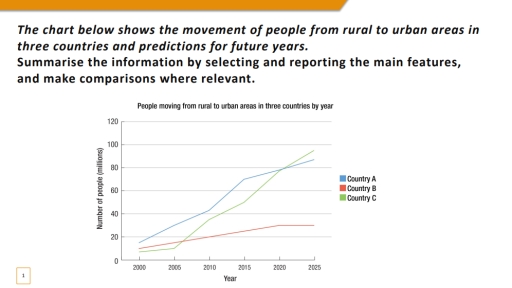
The line graph shows a migration from countrysides to cities in three countries across six years: 2000,2005,2010,2015,2020,2025. Overall, these three lines did not have any decreasing rates between twenty five years.

Speaking about Country A, there was a highest level at the begging and progressive increase. Between 2010 and 2015, the line experienced a sharp and marked increase (of millions of people). This makes Country A is the place where most people’s moving from rural culture to urban life.

The line graph Country B wasn’t that same as the Country A. The chart increased slightly between 2000 and 2020. By the last five years the schedule has (had) been going smoothly with no changes of increase or decrease.

The line graph of Country C had the lowest number at the beginning and not a sharp rise between 2000 and 2005 . However, the line saw significant and consistent growth , since 2005. Every five years the chart had moments of increase. This makes this line the Country C with the most moving from rural areas to urban centres.

Word Count: 178

Answers On The Same Topic:

The chart below shows the movement of people from rural to urban areas in three countries and predictions for future years. Summarize the information by selecting and reporting the main features, and make comparisons where relevant.

The line chart compares the number of people migrating internally in three different nations and showing the predictions for future years. Overall, in all three countries, the internal migrant figures increased over the period. Additionally, country C witnessed a biggest change, from having the lowest into the highest migrants. Regarding the Country B, where there […]

The chart below shows the movement of people from rural to urban areas in three countries and predictions for future years. Summarize the information by selecting and reporting the main features, and make comparisons where relevant.

The line chart shows the movement of people from rural to urban areas in three countries between 2000 and 2025, including predictions for the future. Overall, all three countries experienced an increase in the number of people moving to cities. Country A and Country C showed strong growth, while Country B increased more slowly. In […]

The chart below shows the movement of people from rural to urban areas in three countries and predictions for future years. Summarize the information by selecting and reporting the main features, and make comparisons where relevant.

The line chart compares the number of people migrating internally in three different nations and showing the predictions for future years. Overall, in all three countries, the internal migrant figures increased over the period. Additionally, country C witnessed a biggest change, from having the lowest into the highest migrants. Regarding the Country B, where there […]

The chart below shows the movement of people from rural to urban areas in three countries and predictions for future years. Summarize the information by selecting and reporting the main features, and make comparisons where relevant.

The line graph illustrates the population that have moved from countrysides to cities in three countries (A, B, and C) from 2000 to 2025. Overall, all three countries have experienced significant increase in the number of people who move to urban areas, but to varying extents. Country A and C presented a similar pattern compared […]

See All

Other Topics:

line graph shows the changes in the use of internet for different activities in the future.

This line graph depicts the changes in the use of internet for different activities in the future. It is clear from the graph that there is a lot of differences of how people are going to use the internet in the future. According to what is shown in the graph it is clear that using […]

You should spend about 20 minutes on this task. The graph below shows the percentage of money spent on advertising in five types of media in France from 2010 and projected spending to 2040. Summarise the information by selecting and reporting the main features, and make comparisons where relevant. You should write at least 150 words. Writing Task 1

The provided graph illustrates the distribution of advertising expenditure across five media types in France from 2010, with projections reaching 2040. Overall, the most significant trend is the dramatic rise of Internet advertising, which is expected to become the dominant medium. Conversely, traditional media like Newspapers, Magazines, and Radio show a steady decline, while Television […]

The graph below show the population size of four different types of wild birds in canada between 1992 and 2006

The line graph presents data on the population four distinct of wild birds in canda from 1992 to 2006. Overall, Canda goose of breeds increased throughout the given period. In contrast, America black duck and blue-winged teal showed gradually decreased, while mallard the most fluctuation over years and reached of peak off. In 1992, both […]

The graph illustrates the percentage of materials recycled from 1982 to 2010 in a particular country.

The line chart illustrates the percentage of selected materials that were recycled in several countries. It shows four materials, represented in different colors and shapes, during the period from 1982 to 2010. Paper and cardboard showed the highest percentage of recycling rates throughout all of the years and reached the peak of 80%. Glass container […]

the graph below shows the number of overseas visitors who went to the uj for different putposes

The line graph gives information about how many foreigners visited the UK with 3 kinds of reasons over a period of 20 years, from 1989 to 2009. Overall, it is clear that there was a substantial increase in the number of tourists, who visited the country for all 3 reasons, namely business, holiday, and meeting […]

the graph below shows the number of overseas visitors who went to the uj for different putposes

The line graph gives information about how many foreigners visited the UK with 3 kinds of reasons over a period of 20 years, from 1989 to 2009. Overall, it is clear that there was a substantial increase in the number of tourists, who visited the country for all 3 reasons, namely, business, holiday and meeting […]

See All
We have detected unusual activity on your device.
Please verify your identity to continue.
Note: This verification step won't sign you in. If you have a premium account, please log in to access the service as usual.
Google/Gmail Verification
Or verify using Email/Code
We've sent a verification code to:
youremail@gmail.com (Not your email?)
Enter it below to complete the verification process.
Ensure your email address is correct, your inbox is not full, and you check your spam folder. If no email arrives, consider using an alternative email.
You will need a Premium plan to perform your action!
Note: If you already have a premium account, please log in to access our services as usual.

Plans & Pricing

Our mission is to make quality education accessible for everyone.
However, to keep our hardworking team running and this service alive, we genuinely need your support!
By opting for a premium plan, not only do you sustain us in achieving the mission, but you also unlock advanced features to enrich your learning experience.

Free

For learners who aren't pressed for time

What's included on Free
100+ Cambridge IELTS Tests
Instant IELTS Writing Task 1 & 2 Evaluation (2 times/month)
Instant IELTS Speaking Part 1, 2, & 3 Evaluation (5 times/month)
Instant IELTS Writing Task 1 & 2 Essay Generator (2 times/month)
500+ Dictation & Shadowing Exercises
100+ Pronunciation Exercises
Flashcards
Other Advanced Tools

Premium

For those serious about advancing their English proficiency, and for IELTS candidates aspiring to boost their band score by 1-2 points (especially in writing & speaking) in just 30 days or less

What's included on Premium
Save Your IELTS Test Progress
Unlock All Courses & IELTS Tests
Unlimited AI Conversations
Unlimited AI Writing Enhancement Exercises
Unlimited IELTS Writing Task 1 & 2 Evaluation
Unlimited IELTS Speaking Part 1, 2, & 3 Evaluation
Checked Answers Will Not Be Published
Unlimited IELTS Writing Task 1 & 2 Essay Generator
Unlimited IELTS Speaking Part 1, 2, & 3 Sample Generator
Unlimited Usage Of Advanced Tools
Priority Support within 24h (12-month plan only)

Due to the nature of our service and the provided free trials, payments are non-refundable.
Nếu bạn là người Việt Nam và không có hoặc không muốn trả bằng credit/debit cards, bạn có thể thanh toán bằng phương thức chuyển khoản:


Chọn gói:
419,000₫ 277,000 ₫ cho gói 1 tháng (chỉ 9,233₫/ngày)
1,239,000₫ 597,000 ₫ cho gói 3 tháng (chỉ 6,633₫/ngày)
2,469,000₫ 1,027,000 ₫ cho gói 6 tháng (chỉ 5,706₫/ngày)
4,929,000₫ 1,417,000 ₫ cho gói 12 tháng (chỉ 3,936₫/ngày)


Sau khi chuyển khoản, vui lòng đợi trình duyệt tự động điều hướng bạn trở lại Engnovate và bạn sẽ ngay lập tức nhận được mã kích hoạt tài khoản premium.
Nếu có lỗi xảy ra, bạn có thể liên hệ với team thông qua một trong các phương thức: email đến helloengnovate@gmail.com hoặc nhắn tin qua facebook.com/engnovate.
Vì toàn bộ công cụ trên website đều có thể sử dụng thử miễn phí, Engnovate không hỗ trợ hoàn tiền.