🔥 Today Only: Save 30% on Premium — Offer Ends Soon! - Upgrade Now!
Bar Chart

Band 6+: The chart below shows the results of a survey about people's coffee and tea buying and drinking habits in five Australians cites. Summarlse the information by selecting and reporting the main features, and make a comparisons where relevant.

Image for topic: The chart below shows the results of a survey about people's coffee and tea buying and drinking habits in five Australians cites. Summarlse the information by selecting and reporting the main features, and make a comparisons where relevant.
Our system will evaluate the answer based on this AI-generated description.
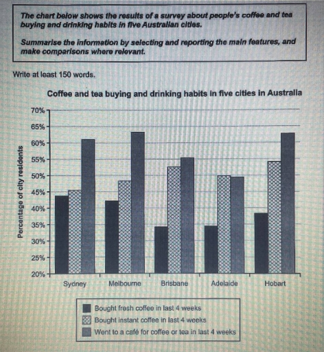
The image shows a bar graph of coffee and tea buying and drinking habits in five Australian cities: Sydney, Melbourne, Brisbane, Adelaide, and Hobart. The graph compares three categories: bought fresh coffee in the last 4 weeks, bought instant coffee in the last 4 weeks, and went to a café for coffee or tea in the last 4 weeks. In Sydney, 45% of respondents bought fresh coffee, 40% bought instant coffee, and 60% went to a café. In Melbourne, 40% bought fresh coffee, 45% bought instant coffee, and 60% went to a café. In Brisbane, 35% bought fresh coffee, 35% bought instant coffee, and 55% went to a café. In Adelaide, 40% bought fresh coffee, 40% bought instant coffee, and 50% went to a café. In Hobart, 30% bought fresh coffee, 35% bought instant coffee, and 65% went to a café. Overall, going to a café was the most popular option across all cities, with the highest percentage in Hobart. Buying fresh coffee was least popular in Hobart, while buying instant coffee had relatively similar percentages across all cities.
Given the complexity of the image, the above description may not be entirely accurate.
Note: Both the topic and the answer were created by one of our users.

The bar chart represents the information in relation to the percentage about people’s drinking habits in different Australian cities.

At first, it can be seen that the amount of people who went to a café in last 4 weeks was the highest in all cities, except Adelaide, where this number almost flattened out with the number of people who were buying instant coffee, achieving approximately 50%.

Concerning people who bought fresh coffee, their number hit the highest point in Sydney, almost achieving 55%, but in general, this amount has always been the lowest in all cities. At the same time, it becomes obvious that the amount of people who bought instant coffee was approximately similar in all cities, varying between 45% and 55%.

Overall, it’s apparent that most of people preferred to buy coffee or tea at a café much more than fresh or instant coffee while the most unpopular drinking habit among people has always been buying fresh coffee

Word Count: 160

Answers On The Same Topic:

The chart below shows the results of a survey about people’s coffee and tea buying and drinking habits in five Australians cites. Summarlse the information by selecting and reporting the main features, and make a comparisons where relevant.

Coffee and tea buying and drinking habits for in five cities are represented by a line graph.The data varies among Sydney,Melbourne,Brisbane,Adelaide and Hobart in last 4weeks. The vertical axis depicts the persentages while the horizontal shows subjects. Looking for an overall perspective is readily apparent that the most highest were Melbourne and Hobart while the […]

The chart below shows the results of a survey about people’s coffee and tea buying and drinking habits in five Australians cites. Summarlse the information by selecting and reporting the main features, and make a comparisons where relevant.

The chart shows he results of survey buying and drinking habits in Australian cities about people’s coffee and tea. In bought fresh coffee in last 4 weeks the higest was Seydney was almost 45%. The lowest was in Brisbane was little bit lower than 35%. Melbourne was higer to 10% than in Brisbane. In bought […]

The chart below shows the results of a survey about people’s coffee and tea buying and drinking habits in five Australians cites. Summarlse the information by selecting and reporting the main features, and make a comparisons where relevant.

The bar chart illustrates the percentage of individuals buying coffee and tea in five Australian cities. Overall, instant coffee was more popular than its fresh counterpart based on the percentage of residents who purchased each of them in the past one month in all the surveyed cities. In addition, going to a coffee shop for […]

The chart below shows the results of a survey about people’s coffee and tea buying and drinking habits in five Australians cites. Summarlse the information by selecting and reporting the main features, and make a comparisons where relevant.

The bar graph illustrates the outcome of a survey about people’s tea and coffee buying as well as drinking habits in five Australians cites. Overall,among all five cities residents in Australia most popular went to cafe for coffee ,where least amount people were interested about buy fresh coffee . However, only in Hobart city people […]

The chart below shows the results of a survey about people’s coffee and tea buying and drinking habits in five Australians cites. Summarlse the information by selecting and reporting the main features, and make a comparisons where relevant.

The bar chart illustrates information regarding the percentages of resident’s buying and drinking habits of coffee and tea dividing into three categories such as fresh and instant coffee and those who went to café from the result of a survey in five cities of Australia. Overall, we can observe that people bought more fresh coffee […]

See All

Other Topics:

The charts below show the amount of money spent on advertising in the UK and Australia across five different media types in 2010 and 2020. Summarise the information by selecting and reporting the main features, and make comparisons where relevant.

Two bar charts illustrate the money spent on five distict media types in the UK and Australia, for 2010 and 2020. Overall both countries showed same spending patterns, in 2010 television accounted for the greatest expenditure and in 2020 the biggest expense was internet advertisement for the countries. In 2010, advertising mediums in the UK […]

The graph shows the average grows in domestic products in wealthy countries, countries that have adopted a global approach to business, and countries that have not.

The bar chart illustrates the proportion of domestic products in wealthy countries, globalisers and non-globalisers from 1960 to 1990. Overall, although the percentage of domestic products in wealthy country was the highest at the beginning, the globalisers reached a peak at the end of the period. Firstly, the proportion of domestic products in wealthy countries […]

The chart below shows the way in which men and women used the Internet in Canada in 2000.Summarise the information by selecting and reporting the main features, and make comparisons where relevant.

A quick glance at the chart depicts the percentage of males and females who used the internet for six activities in 2000. By and large, what stands out from the chart is that the highest percentage of users consumed from internet email in 2000. There was the lowest pattern of internet usage for research and […]

The chart below shows the main reasons why people choose to make or break friendship connections on a popular social media site. Summarise the information by selecting and reporting the main features, and make comparisons where relevant.

The bar chart compares the main factors that lead people to add or remove friends on a popular social networking site. Overall, personal connections from everyday life dominate the reasons for making friends online, while negative behaviour is the primary cause of unfriending. In terms of adding friends, knowing someone in real life is by […]

Task 1: The bar chart below shows the percentage of share of total world production by Asia, Europe and other parts of the world from the years 1840 to 2000.

The provided bar graph compares the proportion of share of total world production in Asia, Europe and other parts of the world between 1840 and 2000. Overall, what stands out is that with the exception of the rest of the world experienced an upward trend, albeit to varying extents and fluctuations, while Asia and Europe […]

The chart below shows the main reasons why people choose to make or break friendship connections on a popular social media site. Summarise the information by selecting and reporting the main features, and make comparisons where relevant.

The bar chart compares the main factors that lead people to add or remove friends on a popular social networking site. Overall, personal connections from everyday life dominate the reasons for making friends online, while negative behaviour is the primary cause of unfriending. In terms of adding friends, knowing someone in real life is by […]

See All
We have detected unusual activity on your device.
Please verify your identity to continue.
Note: This verification step won't sign you in. If you have a premium account, please log in to access the service as usual.
Google/Gmail Verification
Or verify using Email/Code
We've sent a verification code to:
youremail@gmail.com (Not your email?)
Enter it below to complete the verification process.
Ensure your email address is correct, your inbox is not full, and you check your spam folder. If no email arrives, consider using an alternative email.
You will need a Premium plan to perform your action!
Note: If you already have a premium account, please log in to access our services as usual.

Plans & Pricing

Our mission is to make quality education accessible for everyone.
However, to keep our hardworking team running and this service alive, we genuinely need your support!
By opting for a premium plan, not only do you sustain us in achieving the mission, but you also unlock advanced features to enrich your learning experience.

Free

For learners who aren't pressed for time

What's included on Free
100+ Cambridge IELTS Tests
Instant IELTS Writing Task 1 & 2 Evaluation (2 times/month)
Instant IELTS Speaking Part 1, 2, & 3 Evaluation (2 times/month)
Instant IELTS Writing Task 1 & 2 Essay Generator (2 times/month)
500+ Dictation & Shadowing Exercises
100+ Pronunciation Exercises
Flashcards
Other Advanced Tools

Premium

For those serious about advancing their English proficiency, and for IELTS candidates aspiring to boost their band score by 1-2 points (especially in writing & speaking) in just 30 days or less

What's included on Premium
Save Your IELTS Test Progress & Analyze Mistakes By Question Type
Save Your Own Flashcard Sets & Use Them On Any Device
Unlock All Courses, IELTS Tests, Section & Part Practice
Unlimited AI Conversations
Unlimited AI Writing Enhancement Exercises
Unlimited IELTS Writing Task 1 & 2 Evaluation
Unlimited IELTS Speaking Part 1, 2, & 3 Evaluation
Checked Answers Will Not Be Published
Unlimited IELTS Writing Task 1 & 2 Essay Generator
Unlimited IELTS Speaking Part 1, 2, & 3 Sample Generator
Unlimited Usage Of Advanced Tools & AI Features
Priority Support within 24h (12-month plan only)

Due to the nature of our service and the provided free trials, payments are non-refundable.