🔥 Today Only: Save 30% on Premium — Offer Ends Soon! - Upgrade Now!
Bar Chart

Band 5+: The chart show the result of a survey about the most important invention in the last 300 years. Summarize the information by selecting and reporting the main features, and make comparisions whare relevant .

Image for topic: The chart show the result of a survey about the most important invention in the last 300 years. Summarize the information by selecting and reporting the main features, and make comparisions whare relevant .
Our system will evaluate the answer based on this AI-generated description.
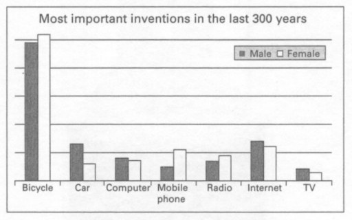
The image is a bar graph titled "Most important inventions in the last 300 years," comparing responses from male and female participants about seven different inventions. The inventions are Bicycle, Car, Computer, Mobile phone, Radio, Internet, TV; arranged on the x-axis. On the y-axis, there are horizontal lines representing percentages, marked at intervals of 5 from 0 to 35. For the Bicycle, Male is approximately 30%, and Female is near 5%. Car responses for Male are around 10%, and Female is about 5%. Computer Male responses are about 2.5%, and Female is roughly 1.5%. Male responses for Mobile phone are around 2.5%, and Female is about 5.5%. Radio has Male at approximately 1.5%, and Female is roughly 2%. Internet responses show Male at about 3.5% and Female at nearly 5%. TV has Male responses at approximately 2.5% and Female at about 2%. Male responses are represented by a darker shade bar, and Female responses by a lighter shade bar, each invention having two bars adjacent to each other for comparison.
Given the complexity of the image, the above description may not be entirely accurate.
Note: Both the topic and the answer were created by one of our users.

The bar chart describes that the outcomes of a test about the most essential inventions over the past three centuries. The inventions decided seven categories: bicycle, car, tablet, mobile phone, radio, internet and TV.

Overall, the bicycle was selected the most important invention by more females than males. Whilst, the television was chosen the most less invention by more men than women.

Looking at the chart, four items: car, tablet internet and TV were more famous between males than females. The car was chosen by considerably more men than women. In addition, three items: bicycle, mobile phone and radio were less selected by fewer males than women. Slightly fewer men than female selected the bicycle.

Three items: bicycle, mobile phone and radio were more selected by kore women than males. The bicycle was more chosen than other inventions. Mobile phone and radio were more voted by considerably more females than men. The least TV was selected by more women than males. Females voted car, tablet and internet less than males.

Word Count: 170

Answers On The Same Topic:

The chart show the result of a survey about the most important invention in the last 300 years. Summarize the information by selecting and reporting the main features, and make comparisions whare relevant .

The bar chart illustrates results of a survey inventions in the last 300 years between male and female. Overall, bicycle was the highest over the period in both gender. The TV the lowest all time between male and female. Both genders similar. The most popular form of communication was the Internet. The bicycle, mobile phone […]

The chart show the result of a survey about the most important invention in the last 300 years. Summarize the information by selecting and reporting the main features, and make comparisions whare relevant .

The given chart indicates an outcome of a survey carried out on men and women about the most important invention in the last 300 year, consisting of bicycle, car, table, mobile phone, radio, internet and TV. Overall, It is evident that the bicycle is the most significant out of all inventions; conversely, TV is considered […]

The chart show the result of a survey about the most important invention in the last 300 years. Summarize the information by selecting and reporting the main features, and make comparisions whare relevant .

The chart represents the opinion of men and women regarding the seven key inventions that have played their most significant role during the past three centuries. Overall, it can be seen that both genders consider bicycles by far the most important innovation, followed by the creation of the Internet. Also, both sides agree that TV […]

The chart show the result of a survey about the most important invention in the last 300 years. Summarize the information by selecting and reporting the main features, and make comparisions whare relevant .

The bar chart illustrates the outcome of a survey about the most significant breakthroughs that happened in the last 300 years. The survey was carried out on two groups, namely males and females. The most striking feature of the chart is that, in polled people’s opinion, the bicycle is the most important invention in the […]

The chart show the result of a survey about the most important invention in the last 300 years. Summarize the information by selecting and reporting the main features, and make comparisions whare relevant .

a) The most noticeable thing from the chart is bicycle. The chart reveals that bicycle is one of the the most important thing in people live in the last 300 years inluding for female and male. b) For females, the most voting partterns is bicycle. According to the chart, revealed that large number of females […]

See All

Other Topics:

The chart below shows the percentage of females aged 16-25 in a particular country who participated in sports, compared with the percentage of people who watched them in 2000. Summarise the information by selecting and reporting the main features, and make comparisons where relevant.

The bar chart compares the percentage of females participants aged between 16 to 25 and the viewers percentage in a specific country in the year 2000. Overall,The percentage of viewers was relatively higher compare to the female participants in all sports.Moreover, Basketball participants and viewers had almost the similar percentage.In addition,tennis have the highest watchers […]

The bar chart below shows the percentages of students who found employment in Molovia in 1995, and 2000.

The given bar chart depicts proportion of students who within 6 months of graduation employed over seven various faculties, in the years 1995 and 2005 in Molovia. Overall, computer Science students remained prominent in both years with highest percentages. In contrast, Arts students got the lowest employment over the studied years. During the year 1995, […]

'The chart below shows how frequently people in the USA ate in fast food restorants between 2003 and 2013.

The bar chart illustrates the frequency od eating at fast food restaurants among individuals in the USA in 2003, 2006 and 2013. Overall, it can be seen that people tend to consume fast food once a week or once/twice a month in all three years. While individuals usually ate in fast food restaurants once a […]

The chart below shows the amount of energy generated from wind in four countries from 1985 to 2000. Summarise the information by selecting and reporting the main features, and make comparisons where relevant.

The bar chart compares the proportion of energy obtained from wind in four countries between 1985 and 2000. Overall, the production of electricity rose over the years in all the countries, especially in Denmark and India, where it multiplied more than sixfold. Of particular note, United States, the leading country for approximately 10 years, and […]

the graph below shows the amount of energy generated wind in four countries in the period 1980-2000

The diagramm illustrates the total of wind power produced in India, Denmark, Germany and US in 1985, 1990, 1995 and 2000. It is clear that, US was the major producer of wind energy untill 1995, whereas Denmark overcome every country in generating of reliable energy by 2000. Overall, all four countries increased its amount of […]

The following bar chart shows the share in modes of transport in 2014 of three cities: New York, Sydney and Hong Kong. Summarize the information by selecting and reporting the main features and make comparisons where relevant.

The bar chart illustrates the percentage of transportation using in three cities: New York, Sydney and Hong Kong in 2014. Overall, private transport was the vast majority transportation using by populations in Sydney, while people chose to travel by bus more than other ways in Hong Kong. In New York, walking was the most popular […]

See All
We have detected unusual activity on your device.
Please verify your identity to continue.
Note: This verification step won't sign you in. If you have a premium account, please log in to access the service as usual.
Google/Gmail Verification
Or verify using Email/Code
We've sent a verification code to:
youremail@gmail.com (Not your email?)
Enter it below to complete the verification process.
Ensure your email address is correct, your inbox is not full, and you check your spam folder. If no email arrives, consider using an alternative email.
You will need a Premium plan to perform your action!
Note: If you already have a premium account, please log in to access our services as usual.

Plans & Pricing

Our mission is to make quality education accessible for everyone.
However, to keep our hardworking team running and this service alive, we genuinely need your support!
By opting for a premium plan, not only do you sustain us in achieving the mission, but you also unlock advanced features to enrich your learning experience.

Free

For learners who aren't pressed for time

What's included on Free
100+ Cambridge IELTS Tests
Instant IELTS Writing Task 1 & 2 Evaluation (2 times/month)
Instant IELTS Speaking Part 1, 2, & 3 Evaluation (5 times/month)
Instant IELTS Writing Task 1 & 2 Essay Generator (2 times/month)
500+ Dictation & Shadowing Exercises
100+ Pronunciation Exercises
Flashcards
Other Advanced Tools

Premium

For those serious about advancing their English proficiency, and for IELTS candidates aspiring to boost their band score by 1-2 points (especially in writing & speaking) in just 30 days or less

What's included on Premium
Save Your IELTS Test Progress
Unlock All Courses & IELTS Tests
Unlimited AI Conversations
Unlimited AI Writing Enhancement Exercises
Unlimited IELTS Writing Task 1 & 2 Evaluation
Unlimited IELTS Speaking Part 1, 2, & 3 Evaluation
Checked Answers Will Not Be Published
Unlimited IELTS Writing Task 1 & 2 Essay Generator
Unlimited IELTS Speaking Part 1, 2, & 3 Sample Generator
Unlimited Usage Of Advanced Tools
Priority Support within 24h (12-month plan only)

Due to the nature of our service and the provided free trials, payments are non-refundable.
Nếu bạn là người Việt Nam và không có hoặc không muốn trả bằng credit/debit cards, bạn có thể thanh toán bằng phương thức chuyển khoản:


Chọn gói:
419,000₫ 277,000 ₫ cho gói 1 tháng (chỉ 9,233₫/ngày)
1,239,000₫ 597,000 ₫ cho gói 3 tháng (chỉ 6,633₫/ngày)
2,469,000₫ 1,027,000 ₫ cho gói 6 tháng (chỉ 5,706₫/ngày)
4,929,000₫ 1,417,000 ₫ cho gói 12 tháng (chỉ 3,936₫/ngày)


Sau khi chuyển khoản, vui lòng đợi trình duyệt tự động điều hướng bạn trở lại Engnovate và bạn sẽ ngay lập tức nhận được mã kích hoạt tài khoản premium.
Nếu có lỗi xảy ra, bạn có thể liên hệ với team thông qua một trong các phương thức: email đến helloengnovate@gmail.com hoặc nhắn tin qua facebook.com/engnovate.
Vì toàn bộ công cụ trên website đều có thể sử dụng thử miễn phí, Engnovate không hỗ trợ hoàn tiền.