🔥 Today Only: Save 30% on Premium — Offer Ends Soon! - Upgrade Now!
Multiple Graphs

Band 5+: The charts provide information about people's travel in one country.

Image for topic: The charts provide information about people's travel in one country.
Our system will evaluate the answer based on this AI-generated description.
The image shows a bar and line graph titled "Travel Over Time" with distance traveled in miles and time taken in hours from 1995 to 2015. The graph shows distance traveled: 6700 (1995), 7100 (2000), 7200 (2005), 6800 (2010), 6600 (2015) and time taken (hours): 375 (1995), 385 (2000), 390 (2005), 380 (2010), 375 (2015). The second section is a bar chart depicting "Mode of Travel" with walking/cycling, other private transport, and public transport percentages for each year. For 1995: 28% walking/cycling, 62% other private transport, 9% public transport. For 2000: 27% walking/cycling, 64% other private transport, 9% public transport. For 2005: 25% walking/cycling, 65% other private transport, 10% public transport. For 2010: 24% walking/cycling, 65% other private transport, 11% public transport. For 2015: 24% walking/cycling, 65% other private transport, 11% public transport.
Given the complexity of the image, the above description may not be entirely accurate.
Note: Both the topic and the answer were created by one of our users.

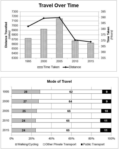
The charts gives information about the journey of the people in one particular country.Overall, although people more travel in 2005, a least travel distances and times registered in 2015. The majority of people took a journey by car.

On the first chart, travel distance rate started just above the 6700 miles in 1995, with the time of about 382 hours.This was followed by an increase to aproximately 7150 miles. Five years later, the both rates were reach peak, with 7200 miles of distance and and 390 hours to travel.However, after a decade, the rates experienced a downward trajectory which distance rate stood at under the 6700 miles and in terms of the time, it accounted about 368.

There is no significant change in the context of travel’s modes.More people(62%) traveled by their private car.This figure increased and accounted for 65% in the final years of the survey. Around 9% people opted for the public transport to go on a trip and this was experinced a slight rise to 11% in the 2015.The opposite was true for the rate of walking/cycling which decreased from 28% in 1995 to 24% in 2015.

Word Count: 190

Answers On The Same Topic:

The charts provide information about people’s travel in one country.

The supplied charts illustrate how people travel within a country in terms of distance, time, and mode of transportation over the ten years, starting from 1995. Overall, the total distance travelled figure experienced a descending pattern after half of the periods; meanwhile, at that time (2005), the amount of time taken by travelers was the […]

The charts provide information about people’s travel in one country.

The data depicts about the travelling in a country and different modes of travelling.From the data maximum amount time taken to travel highest distance was in 2005 and most of times the mode of travel was private transport only for all the years mentioned. Firstly, during 1995 distance travelled was bit more than in 2015 […]

The charts provide information about people’s travel in one country.

The charts illustrate the distance traveled and the time spent by travelers, and three different modes of transport, including walking, private vehicles, and public vehicles, in one country. The data was collected over the period of 20 years, from 1995 to 2015. Overall, distance was a clear predictor for the change in the time taken […]

The charts provide information about people’s travel in one country.

The chart illustrates the travelling of people from one country . overall the highest distance travel is from 7100 km in 2005 at 390 hour . and the lowest is the 6600 in 2015 at370 hour. The distance travelled in 1995 was 6700 . and it increased to 6900 after 5 years in 2000. it […]

See All

Other Topics:

The charts show (illustrate, depict, delineate, indicate, present, represent) the time spent on two devices according to various categories.

The two pie charts depict the percentage of time spent on smartphones and tablets as per six different categories of software, ranging from games to social networking, utilities and several others. Overall, while both platforms are heavily used for entertainment via gaming, tablets are preferred for media consumption, whereas smartphones are favoured for social networking […]

Select and report main features of the pei charts .

The pie chart illustrates average percentages in normal meal c three types of nutrients namely sodium, saturated fats and added sugars in the USA, overeating of thes three nutrients may have severe health consequences. Overall, average percentages of both sodium and saturated fa intake are quite high in dinner while added sugar intake is high […]

The graph and pie chart below give information on in-house training courses in a large financial company. Summarise the information by selecting and reporting the main features, and make comparisons where relevant.

The bar graph provides details of office workers attitude to in-house training courses, while the pie chart shows the number of training hours per year in a large financial organisation. Overall, technical courses accounts for 30% of the time spent on training while health and safety represents the least time. Managers had a positive attitude […]

The charts below show the average percentages in typical meals of three types of nutrients all of which may be unhealthy if eaten too much

The pie graphs illustrate the mean proportions of three nutrients in common food intake, each of which can be harmful to health if consumed in excess. Overall, dinner is the primary source of both sodium and saturated fat intake for people, while snacks contribute the highest percentage of added sugar. In contrast, breakfast consistently accounts […]

The table and graph below show the number of international tourists and the income of tourism in four countries in East Asia from 2000 to 2014.

The table and graph illustrate the figure for incoming tourists visiting four different countries, namely Thailand, South Korea, Japan, and Singapore, and the revenue generated from tourism from 2000 to 2014. Overall, there was a dramatic shift in terms of the turnover from 2000 to 2014. In addition, Thailand emerged as the most dominate category […]

The chart displays the percentage of people using internet, and the pie chart shows the average of spending on shopping on the internet in different countries.

The bar chart illustrates data regarding the percentage of using internet among the five different countries. The pie chart demonstrates the typical time of spending on online shopping per person in the same countries. Overall, what stands out from the charts is that Sweden has make up the highest proportion in the population of using […]

See All
We have detected unusual activity on your device.
Please verify your identity to continue.
Note: This verification step won't sign you in. If you have a premium account, please log in to access the service as usual.
Google/Gmail Verification
Or verify using Email/Code
We've sent a verification code to:
youremail@gmail.com (Not your email?)
Enter it below to complete the verification process.
Ensure your email address is correct, your inbox is not full, and you check your spam folder. If no email arrives, consider using an alternative email.
You will need a Premium plan to perform your action!
Note: If you already have a premium account, please log in to access our services as usual.

Plans & Pricing

Our mission is to make quality education accessible for everyone.
However, to keep our hardworking team running and this service alive, we genuinely need your support!
By opting for a premium plan, not only do you sustain us in achieving the mission, but you also unlock advanced features to enrich your learning experience.

Free

For learners who aren't pressed for time

What's included on Free
100+ Cambridge IELTS Tests
Instant IELTS Writing Task 1 & 2 Evaluation (2 times/month)
Instant IELTS Speaking Part 1, 2, & 3 Evaluation (5 times/month)
Instant IELTS Writing Task 1 & 2 Essay Generator (2 times/month)
500+ Dictation & Shadowing Exercises
100+ Pronunciation Exercises
Flashcards
Other Advanced Tools

Premium

For those serious about advancing their English proficiency, and for IELTS candidates aspiring to boost their band score by 1-2 points (especially in writing & speaking) in just 30 days or less

What's included on Premium
Save Your IELTS Test Progress
Unlock All Courses & IELTS Tests
Unlimited AI Conversations
Unlimited AI Writing Enhancement Exercises
Unlimited IELTS Writing Task 1 & 2 Evaluation
Unlimited IELTS Speaking Part 1, 2, & 3 Evaluation
Checked Answers Will Not Be Published
Unlimited IELTS Writing Task 1 & 2 Essay Generator
Unlimited IELTS Speaking Part 1, 2, & 3 Sample Generator
Unlimited Usage Of Advanced Tools
Priority Support within 24h (12-month plan only)

Due to the nature of our service and the provided free trials, payments are non-refundable.
Nếu bạn là người Việt Nam và không có hoặc không muốn trả bằng credit/debit cards, bạn có thể thanh toán bằng phương thức chuyển khoản:


Chọn gói:
419,000₫ 277,000 ₫ cho gói 1 tháng (chỉ 9,233₫/ngày)
1,239,000₫ 597,000 ₫ cho gói 3 tháng (chỉ 6,633₫/ngày)
2,469,000₫ 1,027,000 ₫ cho gói 6 tháng (chỉ 5,706₫/ngày)
4,929,000₫ 1,417,000 ₫ cho gói 12 tháng (chỉ 3,936₫/ngày)


Sau khi chuyển khoản, vui lòng đợi trình duyệt tự động điều hướng bạn trở lại Engnovate và bạn sẽ ngay lập tức nhận được mã kích hoạt tài khoản premium.
Nếu có lỗi xảy ra, bạn có thể liên hệ với team thông qua một trong các phương thức: email đến helloengnovate@gmail.com hoặc nhắn tin qua facebook.com/engnovate.
Vì toàn bộ công cụ trên website đều có thể sử dụng thử miễn phí, Engnovate không hỗ trợ hoàn tiền.