🔥 Today Only: Save 30% on Premium — Offer Ends Soon! - Upgrade Now!
Multiple Graphs

Band 5+: The Comparison of the Production and the Consumption of Rice in X Country The Comparison of Rice and Other Food Crops Consumed in X Country

Image for topic: The Comparison of the Production and the Consumption of Rice in X Country The Comparison of Rice and Other Food Crops Consumed in X Country
Our system will evaluate the answer based on this AI-generated description.
The image presents two graphs related to rice in X Country, with timelines from 1990 to 2040. The top graph, marking "Rice Production" in solid lines and "Rice Consumption" in dashed lines, displays a quantitative increase in million tons: production rises from roughly 25 in 1990, stays near 50 in 2010 and 2020, anticipated to escalate near 75 by 2040; consumption initiates around 20 in 1990, approximates 40 by 2010 and 2020, predicting a rise to about 60 by 2040. The bottom graph contrasts the percentages of "Rice" versus "Other Food Crops" consumed over the same periods: in 1990, Rice accounts for nearly 45%, other crops at 55%, in 2000, rice slightly drops below 40%, other crops surpassing 60%, by 2010 rice ascends back to 45%, maintaining a balance near 55% for other crops, displaying a notable increase in rice at about 55% with other crops lessening around 45% for 2020, with a speculated continuous trend leading to 2040 showing rice possibly near 60% and other crops at 40%.
Given the complexity of the image, the above description may not be entirely accurate.
Note: Both the topic and the answer were created by one of our users.

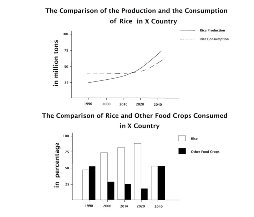
The first line graph compares the production and consumption of rice in X country in million tons from 1990 to 2040.While, the second chart compares rice and other food commodities consumed in the same country.

Overall, the number of rice and other food crops increased significantly over the given period in same place.

In contrast, in the first chart, rice production jumped dramatically from nearly 25 million tons in 1990 to about 75 million tons at the end of the period.Yet, rice consumption from 1990 to 2020 remained balanced at nearly 35 million tons.

In addition in the second chart,the percentage of rice consumption in 1990 was lower than other food crops.

Nevertheless, rice consumption between 2000 and 2020 had increased on average from nearly 75% to about 85%.

Word Count: 129

Answers On The Same Topic:

The Comparison of the Production and the Consumption of Rice in X Country The Comparison of Rice and Other Food Crops Consumed in X Country

The first chart compares how much rice was and will be consumed in X country from 1990 to 2040, while the second chart illustrates how much rice was consumed in the past and will be consumed in the future (down the line) rather than other food crops in the same period. Overall, although there was […]

The Comparison of the Production and the Consumption of Rice in X Country The Comparison of Rice and Other Food Crops Consumed in X Country

The provide graph shows the comparison of producing and consuming of rice start from 1990 to 2024 in predict time, while the table compares between rice and other cops consumed in the same country during the same period. Overall, in the first data shows that both of production and consumption of rice significantly increased. Meanwhile, […]

The Comparison of the Production and the Consumption of Rice in X Country The Comparison of Rice and Other Food Crops Consumed in X Country

The given charts illustrate the comparison of rice production and consumption in X country. While the first chart compares rice production and consumption in million tons from 1990 to 2040, the second chart compares rice and other food crops consumed in that country. Generally speaking, it is apparent that rice production increased markedly during this […]

The Comparison of the Production and the Consumption of Rice in X Country The Comparison of Rice and Other Food Crops Consumed in X Country

The given bar chart provides data on the amount of consumed rice and other types of food crops in percentages over a 50-year period, with projections until 2040, while the provided line graph compares the production and consumption of rice in tons over the given time frame. Looking from an overall perspective, it is readily […]

See All

Other Topics:

the bar chart gives information about the life expectancy in Japan, Korea, the USA, and Indonesia, and the table shows the change in life expectancy between 1953 and 2008.

The bar chart compares life expectancy in Japan, Korea, the United States and Indonesia in 2018, while the table presents the increase in life expectancy in these countries between 1953 and 2008. Overall, Japan had the highest life expectancy, whereas Indonesia recorded the lowest figure. Furthermore, Indonesia and Korea experienced much greater increases in life […]

The pie charts below show the comparison of exports in Great Britian over five years

The two pie charts illustrate the percentages of five different categories of goods exported from Great Britain in 2010 and 2015. Overall, machinery and vehicles were two largest export categories in both years. However the share of pharmaceuticals deacreased significantly, while the proportions of plastics and organic chemicals increased over the five year period. In […]

The pie charts below illustrate the age distribution of the populations of Brazil and Germany in 2000 and projections for the year 2050. Summarise the information by selecting and reporting the main features, and make comparisons where relevant.

The pie charts depict the demographic breakdown of Brazil and Germany in 2000 and the predict figures for 2050. Overall, analyzing both charts the vast majority of them is take by the adults, in 2000. In the Brazil’s case the trend will be growing while in Germany will plummer. The sector of the youth in […]

The graph and the chart below show the number of students choosing different kinds of courses in a university in 2012. Summarise the information by selecting and reporting the main features, and make comparisons where relevant.

The graph compares the popularity of different directions among young people in 2012. Overall, with the booming of science in that years, this option was the leader compared to other professions, which only 2000-3000 students choose them. At the same time, agriculture registered around 500 students who have chosen it, lagging behind its counterparts. Focusing […]

The graphs below show four categories of citrus fruits and the top three countries to which these were exported (in thousand tonnes) in 2012. Summarise the information by selecting and reporting the main features and make comparisons where relevant.

The graph illustrates categories of oranges, lemons, grapefruits and other fruits and the top three countries to which these were imported in 2012. Overall, countries produced biggest numbers of grapefruits, while oranges and lemons performed average. In contrast, other fruits were produced at less, only Mexico represented upward trend. It is clear that, turkey produced […]

The Number of Foreign Tourists Visiting Country in 2007 and 2008

The bar chart compares the number of foreign tourists visiting XCountry in 2007 and 2008, while the table presents the annual income earned by different tourism businesses during those years. Overall, Australia remained the most popular destination in both years. Although the number of tourists decreased in some regions in 2008, several tourism businesses still […]

See All
We have detected unusual activity on your device.
Please verify your identity to continue.
Note: This verification step won't sign you in. If you have a premium account, please log in to access the service as usual.
Google/Gmail Verification
Or verify using Email/Code
We've sent a verification code to:
youremail@gmail.com (Not your email?)
Enter it below to complete the verification process.
Ensure your email address is correct, your inbox is not full, and you check your spam folder. If no email arrives, consider using an alternative email.
You will need a Premium plan to perform your action!
Note: If you already have a premium account, please log in to access our services as usual.

Plans & Pricing

Our mission is to make quality education accessible for everyone.
However, to keep our hardworking team running and this service alive, we genuinely need your support!
By opting for a premium plan, not only do you sustain us in achieving the mission, but you also unlock advanced features to enrich your learning experience.

Free

For learners who aren't pressed for time

What's included on Free
100+ Cambridge IELTS Tests
Instant IELTS Writing Task 1 & 2 Evaluation (2 times/month)
Instant IELTS Speaking Part 1, 2, & 3 Evaluation (5 times/month)
Instant IELTS Writing Task 1 & 2 Essay Generator (2 times/month)
500+ Dictation & Shadowing Exercises
100+ Pronunciation Exercises
Flashcards
Other Advanced Tools

Premium

For those serious about advancing their English proficiency, and for IELTS candidates aspiring to boost their band score by 1-2 points (especially in writing & speaking) in just 30 days or less

What's included on Premium
Save Your IELTS Test Progress
Unlock All Courses & IELTS Tests
Unlimited AI Conversations
Unlimited AI Writing Enhancement Exercises
Unlimited IELTS Writing Task 1 & 2 Evaluation
Unlimited IELTS Speaking Part 1, 2, & 3 Evaluation
Checked Answers Will Not Be Published
Unlimited IELTS Writing Task 1 & 2 Essay Generator
Unlimited IELTS Speaking Part 1, 2, & 3 Sample Generator
Unlimited Usage Of Advanced Tools
Priority Support within 24h (12-month plan only)

Due to the nature of our service and the provided free trials, payments are non-refundable.
Nếu bạn là người Việt Nam và không có hoặc không muốn trả bằng credit/debit cards, bạn có thể thanh toán bằng phương thức chuyển khoản:


Chọn gói:
419,000₫ 277,000 ₫ cho gói 1 tháng (chỉ 9,233₫/ngày)
1,239,000₫ 597,000 ₫ cho gói 3 tháng (chỉ 6,633₫/ngày)
2,469,000₫ 1,027,000 ₫ cho gói 6 tháng (chỉ 5,706₫/ngày)
4,929,000₫ 1,417,000 ₫ cho gói 12 tháng (chỉ 3,936₫/ngày)


Sau khi chuyển khoản, vui lòng đợi trình duyệt tự động điều hướng bạn trở lại Engnovate và bạn sẽ ngay lập tức nhận được mã kích hoạt tài khoản premium.
Nếu có lỗi xảy ra, bạn có thể liên hệ với team thông qua một trong các phương thức: email đến helloengnovate@gmail.com hoặc nhắn tin qua facebook.com/engnovate.
Vì toàn bộ công cụ trên website đều có thể sử dụng thử miễn phí, Engnovate không hỗ trợ hoàn tiền.